Source Code
<div class="scene">
  <div class="cards">
    <article class="card">
      <div class="thumb" style="background:linear-gradient(135deg,#6366f1,#8b5cf6)">
        <span class="read-time">5 min read</span>
      </div>
      <div class="body">
        <div class="meta"><span class="cat">Design</span><span class="date">May 28, 2026</span></div>
        <h3>Building Design Systems That Scale Across Large Teams</h3>
        <p>A practical guide to tokens, component libraries, and governance models that keep your UI consistent.</p>
        <div class="footer">
          <div class="author"><div class="av" style="background:#6366f1">PS</div><span>Puneet Sharma</span></div>
          <button class="save-btn" onclick="this.classList.toggle('saved')">
            <svg width="14" height="14" viewBox="0 0 24 24" fill="none" stroke="currentColor" stroke-width="2"><path d="M19 21l-7-5-7 5V5a2 2 0 0 1 2-2h10a2 2 0 0 1 2 2z"/></svg>
          </button>
        </div>
      </div>
    </article>
    <article class="card">
      <div class="thumb" style="background:linear-gradient(135deg,#0ea5e9,#10b981)">
        <span class="read-time">8 min read</span>
      </div>
      <div class="body">
        <div class="meta"><span class="cat">CSS</span><span class="date">May 26, 2026</span></div>
        <h3>Modern CSS Techniques Every Frontend Dev Should Know in 2026</h3>
        <p>Container queries, cascade layers, subgrid, and view transitions — all production-ready.</p>
        <div class="footer">
          <div class="author"><div class="av" style="background:#0ea5e9">AJ</div><span>Alex Johnson</span></div>
          <button class="save-btn saved">
            <svg width="14" height="14" viewBox="0 0 24 24" fill="none" stroke="currentColor" stroke-width="2"><path d="M19 21l-7-5-7 5V5a2 2 0 0 1 2-2h10a2 2 0 0 1 2 2z"/></svg>
          </button>
        </div>
      </div>
    </article>
  </div>
</div>
* { box-sizing: border-box; margin: 0; padding: 0; }
body { font-family: system-ui, sans-serif; background: #f1f5f9; display: flex; align-items: center; justify-content: center; min-height: 100vh; padding: 20px; }
.cards { display: flex; gap: 16px; flex-wrap: wrap; justify-content: center; }
.card { background: #fff; border-radius: 16px; overflow: hidden; width: 260px; border: 1px solid #e2e8f0; transition: box-shadow 0.15s, transform 0.15s; }
.card:hover { box-shadow: 0 8px 28px rgba(0,0,0,0.1); transform: translateY(-3px); }
.thumb { height: 130px; position: relative; }
.read-time { position: absolute; bottom: 10px; left: 12px; font-size: 10px; font-weight: 700; background: rgba(0,0,0,0.35); color: #fff; padding: 3px 8px; border-radius: 4px; backdrop-filter: blur(4px); }
.body { padding: 16px; display: flex; flex-direction: column; gap: 10px; }
.meta { display: flex; align-items: center; gap: 8px; }
.cat { font-size: 10px; font-weight: 700; text-transform: uppercase; letter-spacing: 0.5px; color: #6366f1; background: #eef2ff; padding: 2px 7px; border-radius: 4px; }
.date { font-size: 11px; color: #94a3b8; }
h3 { font-size: 14px; font-weight: 700; color: #1e293b; line-height: 1.45; }
p { font-size: 12.5px; color: #64748b; line-height: 1.6; }
.footer { display: flex; align-items: center; justify-content: space-between; padding-top: 4px; }
.author { display: flex; align-items: center; gap: 7px; }
.av { width: 24px; height: 24px; border-radius: 50%; color: #fff; font-size: 9px; font-weight: 700; display: flex; align-items: center; justify-content: center; }
.author span { font-size: 12px; font-weight: 500; color: #475569; }
.save-btn { width: 28px; height: 28px; border-radius: 6px; border: 1px solid #e2e8f0; background: none; color: #94a3b8; cursor: pointer; display: flex; align-items: center; justify-content: center; transition: all 0.15s; }
.save-btn.saved { background: #eef2ff; border-color: #6366f1; color: #6366f1; }
.save-btn.saved svg { fill: #6366f1; }Learn Coding Visually
Learn to code with interactive, live-preview playgrounds — HTML, CSS, JavaScript, React & more.
 HTML Playground42 lessons · Click-based · Live preview
 CSS PlaygroundLearn CSS with a live editor
 JavaScript Playground60 lessons · DOM · Async · Canvas
 React PlaygroundLearn React with a live code editor
 GSAP PlaygroundLearn GSAP animation interactively
 SVG Playground44 lessons · shapes · paths · animation
 SCSS Playground45 lessons · Sass modules · tokens
 Tailwind PlaygroundLearn Tailwind CSS with a live editor
 Bootstrap 5 Playground50 lessons · live preview
Article Card — Free HTML CSS Blog Card Snippet
Article / Blog Card · Cards · Plain HTML & CSS · Live preview
What's included
Features
About this UI Snippet
Article Card — Category Tag, Author Row, Read Time & Bookmark Toggle
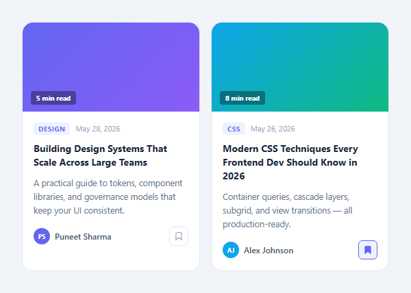
An article card is the fundamental content listing unit for blog posts, news articles, tutorials, and documentation pages. It condenses all the information a visitor needs to decide whether to click through: a visual thumbnail, a colour-coded category tag, the article title, a read-more excerpt, the author's identity, the publish date, and an estimated read time. When built well, an article card grid (laid out with the responsive card grid) is one of the highest-converting content surfaces on any content-driven website.
The thumbnail area with gradient placeholder
Each card opens with a .thumb div at a fixed 130px height. In this snippet, the thumbnail uses a CSS gradient as a placeholder — background: linear-gradient(135deg, #6366f1, #8b5cf6) — which ensures the card looks complete even without a real image. A position: absolute read-time badge sits in the bottom-left corner of the thumbnail using a frosted glass effect: background: rgba(0,0,0,0.35); backdrop-filter: blur(4px). This overlays cleanly on any thumbnail colour.
The category tag and date meta row
The .meta row sits at the top of the card body. The .cat span uses text-transform: uppercase; letter-spacing: 0.5px for the pill label style, with a colour-coordinated background that signals the content topic at a glance. The .date span shows the publish date in a muted secondary colour. Both sit in a flex row with gap: 8px for tight, compact spacing.
The title and excerpt
The article title uses font-size: 14px; font-weight: 700; line-height: 1.45 for compact readability. The excerpt paragraph uses line-height: 1.6 for comfortable reading at 12.5px. For real implementations, CSS line-clamp limits the excerpt to 2–3 lines: -webkit-line-clamp: 3; -webkit-box-orient: vertical; overflow: hidden.
The author footer with bookmark button
The card footer uses justify-content: space-between to push the author avatar+name to the left and the save/bookmark button to the right. The bookmark button uses classList.toggle('saved') on click — a single line of inline JavaScript that toggles the saved state. When .saved is active, the button fills with the accent colour and the SVG bookmark icon receives a fill, giving clear visual feedback without any additional state management.
The hover lift effect
.card:hover { box-shadow: 0 8px 28px rgba(0,0,0,0.1); transform: translateY(-3px); } lifts the card on hover. Both properties are hardware-accelerated by the browser's compositor, ensuring the animation is smooth at 60fps even with many cards on screen simultaneously. The transition duration of 0.15s feels snappy and responsive without being abrupt.
Build with AI
Build, Understand, Optimize, and Extend It With AI
Since this card has almost no JavaScript, the real learning is in the CSS layout choices. Paste the HTML and CSS into an AI coding assistant like Claude and ask it to explain exactly why flex: 1 with min-width: 240px on the cards produces responsive wrapping without a single media query, or how the backdrop-filter blur on the read-time badge interacts with the gradient thumbnail underneath it. The same assistant can help optimize it — ask whether the fixed 130px thumbnail height should switch to an aspect-ratio property for cleaner responsive image cropping, or whether the hover lift transform and box-shadow transition could be combined into a single will-change hint for smoother compositing on lower-end devices. It's also useful for extending the card: ask it to add a real line-clamp to the excerpt, wire the save button's classList.toggle into persisted state, or generate the whole grid from a CMS data array. Treat the code less like a finished artifact and more like a starting point for a conversation.
Prompt to recreate it
Copy this into your AI assistant of choice to build the effect from scratch, or as a jumping-off point for your own variant:
Build a responsive "article/blog card" grid in plain HTML, CSS, and a single line of inline JavaScript — no framework, no build step.

Requirements:
- A flex-wrap container of cards where each card uses flex: 1 with a min-width (e.g. 240px), so cards reflow from multiple per row down to a single column purely through flex-item sizing — no @media breakpoints controlling the column count.
- Each card has a fixed-height thumbnail area (a gradient placeholder is fine) with an absolutely positioned read-time badge in a corner, using a semi-transparent dark background and backdrop-filter blur so it reads clearly over any thumbnail color.
- Below the thumbnail: a category tag styled as an uppercase letter-spaced pill with a topic-appropriate color, a muted publish date next to it, a bold title, and an excerpt paragraph limited to a fixed number of lines using the line-clamp technique (display: -webkit-box, -webkit-line-clamp, -webkit-box-orient: vertical, overflow: hidden).
- A footer row with justify-content: space-between containing an author avatar circle with initials plus name on the left, and a bookmark/save icon button on the right.
- The save button must toggle a "saved" class using nothing but a single inline onclick handler calling classList.toggle — no separate script file or event listener setup — and the saved state must visibly change the button's background, border, and icon fill color.
- The whole card must lift on hover using a combined transform: translateY and box-shadow transition, without causing layout shift in surrounding cards.
Want to tighten it up first? Run this prompt through the AI Prompt Studio to score it across 8 quality dimensions, catch anti-patterns, and tune the wording for Claude, ChatGPT, or Gemini before you paste it in.
Step by step
How to Use
- 1Preview the two article cards in the flex gridThe preview shows two article cards in a flex-wrap container. Each card has a gradient thumbnail with read-time badge, category tag, title, excerpt, author avatar with initials, and a bookmark toggle button. Hover over a card to see the lift animation.
- 2Update the article content in each cardIn the HTML panel, change the gradient colour in the .thumb style attribute, update the read-time badge text, change the .cat span text and its style colour, update the h3 title, p excerpt, author initials and name in .av and .author span, and the date text in .date.
- 3Replace the gradient thumbnail with a real imageReplace the <div class='thumb' style='background:...'> element with <img class='thumb' src='your-image.jpg' alt='Article title' />. In the CSS panel, add display: block; width: 100%; height: 130px; object-fit: cover; to the .thumb rule so the image fills the fixed height area without distortion.
- 4Change the category tag colour per topicIn the CSS panel, add variant classes for each category: .cat.design { background: #fce7f3; color: #be185d; } .cat.css { background: #dcfce7; color: #166534; } Apply the variant class in HTML: <span class='cat design'>Design</span>.
- 5Try clicking the bookmark buttonClick the bookmark icon button in the card footer to toggle the saved state. The .saved class fills the button with the accent colour and fills the SVG bookmark icon. This uses classList.toggle('saved') as an inline onclick handler — no separate JS needed.
- 6Export as HTML, JSX, or Tailwind for your projectClick 'HTML' to download a standalone file, 'JSX' to get a React ArticleCard component with category, title, excerpt, author, date, readTime, and thumbnailSrc as props, or 'Tailwind' for a Tailwind CSS version ready for a Next.js or Vite React project.
Real-world uses
Common Use Cases
Got questions?
Frequently Asked Questions
The .cards container uses display: flex; flex-wrap: wrap; gap: 16px. Each .card has flex: 1; min-width: 240px. Flex-wrap allows items to flow to new rows when they cannot fit side by side at their minimum width. When the container is narrower than 2 × 240px (480px), the second card wraps to a new row, creating a single-column layout. This responsive reflow happens purely in CSS through flex item sizing rules, without any @media query breakpoints.
Replace the <div class='thumb' style='background:linear-gradient(...)'></div> with an img element: <img class='thumb' src='article-thumbnail.jpg' alt='Article title describing the image' />. In the CSS .thumb rule, change the display and sizing: display: block; width: 100%; height: 130px; object-fit: cover; object-position: center. The object-fit: cover ensures the image fills the fixed-height container without stretching, cropping from the center by default. Adjust object-position to control which part of the image is visible.
Apply CSS line-clamp to the excerpt paragraph: display: -webkit-box; -webkit-line-clamp: 2; -webkit-box-orient: vertical; overflow: hidden. Change the number in -webkit-line-clamp to control how many lines are shown before the text is cut with an ellipsis. This CSS property is now supported in all modern browsers without the -webkit prefix as well, though including both ensures maximum compatibility with older Safari versions.
The standard read time formula is Math.ceil(wordCount / 200) + ' min read' — the average adult reads approximately 200 words per minute for online content. To get the word count from article body text: const wordCount = articleBodyText.trim().split(/s+/).length. For a CMS integration, calculate this server-side and store it as a field on the article object. Display the result as the .read-time badge content in the thumbnail area or the .date meta row.