Source Code
<div class="spr-ring-wrap">
  <svg class="spr-ring" viewBox="0 0 64 64">
    <circle class="spr-track" cx="32" cy="32" r="27"></circle>
    <circle class="spr-fill" cx="32" cy="32" r="27"></circle>
  </svg>
  <span class="spr-pct" aria-hidden="true"></span>
</div>
<article class="spr-article">
  <h1>A Corner Progress Ring, No JavaScript Required</h1>
  <p>Scroll this page. The ring fixed in the top-right corner sweeps from 0% to 100% purely from CSS <code>animation-timeline: scroll(root)</code> driving <code>stroke-dashoffset</code> — there is no scroll event listener anywhere in this snippet.</p>
  <section><h2>01 · Why a ring instead of a bar</h2><p>A slim top-of-page bar is the most common scroll progress indicator, but a corner ring reads well as a persistent, low-profile companion that does not compete with a sticky header or nav for the same strip of real estate.</p></section>
  <section><h2>02 · The mechanism</h2><p>The circle's <code>stroke-dasharray</code> is set to its own circumference. A single <code>@keyframes</code> block animates <code>stroke-dashoffset</code> from the full circumference down to <code>0</code>. That keyframe animation is bound to <code>animation-timeline: scroll(root)</code>, so its 0%–100% progress is driven directly by how far the document has scrolled — not by time.</p></section>
  <section><h2>03 · Combine with a percentage label</h2><p>A small counter-style <code>::after</code> content trick or a second animation can drive the numeric label alongside the ring, so sighted users get both the visual sweep and an exact number.</p></section>
  <section><h2>04 · Browser support</h2><p>Chromium-based browsers (Chrome, Edge, Opera, Brave) support <code>animation-timeline: scroll()</code> today. Firefox and Safari support is still landing, so this snippet includes an <code>@supports</code> fallback that shows a static full ring rather than a broken or invisible one.</p></section>
  <section><h2>05 · Keep scrolling</h2><p>By the time this final section reaches the middle of the viewport, the ring above should read at or near 100% — entirely computed by the browser's compositor, off the main thread.</p></section>
</article>*{box-sizing:border-box;margin:0;padding:0}
body{font-family:system-ui,-apple-system,sans-serif;background:#0b0f19;color:#e6e9f2}
.spr-ring-wrap{position:fixed;top:20px;right:20px;width:56px;height:56px;z-index:10}
.spr-ring{width:100%;height:100%;transform:rotate(-90deg)}
.spr-track{fill:none;stroke:#1c2333;stroke-width:5}
.spr-fill{
fill:none;stroke:#6366f1;stroke-width:5;stroke-linecap:round;
stroke-dasharray:169.6;stroke-dashoffset:169.6;
animation:spr-sweep linear both;
animation-timeline:scroll(root);
}
@keyframes spr-sweep{ to{ stroke-dashoffset:0 } }
.spr-pct{
position:absolute;inset:0;display:flex;align-items:center;justify-content:center;
font-size:11px;font-weight:700;color:#a5adc7;
}
.spr-pct::after{
content:"0%";
animation:spr-count 100 linear both;
animation-timeline:scroll(root);
}
@keyframes spr-count{
0%{content:"0%"} 10%{content:"10%"} 20%{content:"20%"} 30%{content:"30%"}
40%{content:"40%"} 50%{content:"50%"} 60%{content:"60%"} 70%{content:"70%"}
80%{content:"80%"} 90%{content:"90%"} 100%{content:"100%"}
}
.spr-article{max-width:620px;margin:0 auto;padding:8vh 24px 40vh}
h1{font-size:clamp(26px,5vw,38px);letter-spacing:-.02em;margin-bottom:16px}
h2{font-size:18px;color:#c7cce0;margin-bottom:8px}
p{color:#9aa3c0;line-height:1.75;font-size:15px}
section{margin-top:12vh}
code{background:rgba(99,102,241,.16);color:#c7d2fe;padding:2px 6px;border-radius:5px;font-size:.9em;font-family:ui-monospace,Consolas,monospace}
@supports not (animation-timeline: scroll()){
.spr-fill{stroke-dashoffset:0;animation:none}
.spr-pct::after{content:"—";animation:none}
}// The ring's sweep and the percentage label are both driven entirely by
// CSS animation-timeline: scroll(root) — this script only reports whether
// the browser supports the feature, it never touches scroll position.
const supportsScrollTimeline = typeof CSS !== 'undefined' && CSS.supports('animation-timeline: scroll()');
console.log('[native-scroll-progress-ring] animation-timeline: scroll() supported:', supportsScrollTimeline);
if (!supportsScrollTimeline) {
document.querySelector('.spr-pct').textContent = 'N/A';
}Learn Coding Visually
Learn to code with interactive, live-preview playgrounds — HTML, CSS, JavaScript, React & more.
 HTML Playground42 lessons · Click-based · Live preview
 CSS PlaygroundLearn CSS with a live editor
 JavaScript Playground60 lessons · DOM · Async · Canvas
 React PlaygroundLearn React with a live code editor
 GSAP PlaygroundLearn GSAP animation interactively
 SVG Playground44 lessons · shapes · paths · animation
 SCSS Playground45 lessons · Sass modules · tokens
 Tailwind PlaygroundLearn Tailwind CSS with a live editor
 Bootstrap 5 Playground50 lessons · live preview
Native CSS Scroll Progress Ring — No JavaScript
Native CSS Scroll Progress Ring · Scroll · Plain HTML, CSS & JS · Live preview
What's included
Features
About this UI Snippet
Native CSS Scroll Progress Ring — animation-timeline: scroll() on an SVG Circle
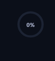
A scroll progress ring is a small circular indicator, usually pinned to a corner of the viewport, that fills up as the reader moves through a page. It is a more compact alternative to a full-width top bar (see CSS Scroll-Driven Progress Bar) and works especially well alongside a header that already owns the top strip of the screen. This version is built with zero JavaScript scroll handling — the entire sweep runs off the native CSS Scroll-Driven Animations API.
The SVG circle trick
The ring is a standard SVG <circle> with stroke-dasharray set to its own circumference (2 * PI * r, here 169.6 for a radius of 27) and stroke-dashoffset starting at that same value — which visually hides the entire stroke. Animating stroke-dashoffset down to 0 reveals the stroke progressively around the circle, exactly the same trick used by countless JavaScript-driven progress rings, except here nothing but a @keyframes block and animation-timeline moves the number.
animation-timeline: scroll(root)
Rather than binding the spr-sweep keyframe animation to a duration in seconds, animation-timeline: scroll(root) binds its 0%–100% playback position directly to the document's scroll position — 0% is the top of the page, 100% is the bottom. There is no requestAnimationFrame loop, no scroll event listener, and no manual getBoundingClientRect math; the browser's compositor updates the stroke on every frame of scroll, even scroll driven by inertia after the user's finger leaves a trackpad.
Faking a numeric readout with content steps
Real numeric interpolation isn't yet exposed to plain CSS custom properties without @property, so the percentage label here uses a discrete-step trick: a second animation-timeline-bound keyframe animation swaps the content of a ::after pseudo-element across ten evenly spaced percentage strings ("10%", "20%", and so on) using animation-timeline-range steps rather than a smooth linear easing. It is coarse compared to a JS-driven counter, but it is enough for a glanceable readout and it costs zero script.
Comparing to the top progress bar
CSS Scroll-Driven Progress Bar and Scroll Timeline Nav Progress Indicator both apply the same animation-timeline: scroll(root) primitive to a horizontal bar's transform: scaleX(). This snippet proves the same primitive generalizes to any animatable property, including an SVG stroke offset — the timeline itself does not care what it is driving.
Browser support and the fallback
Chromium-based browsers (Chrome, Edge, Opera, Brave, and Chromium-based Arc) support animation-timeline: scroll() as of recent versions. Firefox and Safari support is still landing behind ongoing standards work, so this snippet wraps the animation in @supports not (animation-timeline: scroll()), which resets stroke-dashoffset to a static value and swaps the label to an em dash rather than leaving the ring stuck at 0% or fully invisible in unsupported browsers.
Customizing it
Change the circle's r and recompute stroke-dasharray to resize the ring, swap scroll(root) for scroll(nearest) to track a scrollable panel instead of the whole document, or replace the color with a CSS gradient using stroke on a linear gradient defined via <defs> for a more branded look. Pair it with a Scroll-to-Top Button fixed in the same corner once the ring nears 100%.
Build with AI
Build, Understand, Optimize, and Extend It With AI
You don't have to work out the stroke-dasharray math or the scroll-timeline wiring by hand. Paste this snippet's HTML, CSS, and JS into an AI coding assistant like Claude and ask it to explain exactly why stroke-dasharray is set to the circle's circumference and why animating stroke-dashoffset toward 0 reveals more of the stroke, and how animation-timeline: scroll(root) replaces what would otherwise be a scroll event listener and a getBoundingClientRect calculation. The same assistant can help you extend it — ask it to make the numeric label count up smoothly using a registered @property with a numeric syntax instead of the discrete content-swap trick, add a color transition from one hue to another as the ring fills, or wire the ring to scroll(nearest) so it tracks a scrollable sidebar instead of the whole document. Treat the code less like a finished artifact and more like a starting point for a conversation.
Prompt to recreate it
Copy this into your AI assistant of choice to build the effect from scratch, or as a jumping-off point for your own variant:
Build a circular scroll-progress ring fixed in a page corner using only the native CSS animation-timeline: scroll() API — no JavaScript scroll event listeners, no requestAnimationFrame loop.

Requirements:
- An SVG circle used as a progress ring: a static background track circle plus a foreground fill circle whose stroke-dasharray equals its own computed circumference.
- A single @keyframes animation on the fill circle that animates stroke-dashoffset from the full circumference down to 0, bound via animation-timeline: scroll(root) so its 0%-to-100% playback position tracks the document's scroll position directly, with no duration in seconds.
- A small numeric percentage label rendered near the center of the ring that also updates as the page scrolls, without using JavaScript to read scroll position — driven by the same or a second scroll(root) timeline.
- Wrap the animation in an @supports not (animation-timeline: scroll()) block that provides a sane static fallback (a fully visible ring, not one stuck invisible or at 0%) for browsers that do not yet support the feature.
- Keep any JavaScript limited to a one-time CSS.supports('animation-timeline: scroll()') feature check for a console message or fallback label text — it must never drive or read scroll position itself.
Want to tighten it up first? Run this prompt through the AI Prompt Studio to score it across 8 quality dimensions, catch anti-patterns, and tune the wording for Claude, ChatGPT, or Gemini before you paste it in.
Step by step
How to Use
- 1Paste the HTML, CSS, and JSThe ring, label, and a long scrollable article render immediately.
- 2Scroll the page slowlyWatch the ring's stroke sweep and the percentage label step upward.
- 3Resize the ringChange the SVG circle's r attribute and recompute stroke-dasharray to match its new circumference.
- 4Change the colorEdit stroke on .spr-fill, or swap it for a gradient stroke via an SVG <linearGradient>.
- 5Track a panel instead of the pageSwap scroll(root) for scroll(nearest) and apply overflow: auto to the ring's positioned ancestor.
- 6Export in your formatClick "HTML" for a standalone file, "JSX" for a React component, or "Tailwind" for a React + Tailwind version.
Real-world uses
Common Use Cases
Got questions?
Frequently Asked Questions
No. The ring's sweep and the percentage label are both entirely driven by CSS animation-timeline: scroll(root). The included JavaScript only logs whether the browser supports the feature and swaps the label to an em dash if it does not — it never reads scroll position or drives the animation.
It is a standard SVG circle with stroke-dasharray set to its own circumference and stroke-dashoffset animated from that same value down to 0 via a @keyframes block. Revealing stroke-dashoffset progressively reveals more of the ring's stroke — the classic SVG progress-ring technique, just driven by a scroll timeline instead of a duration.
Plain CSS content on a pseudo-element cannot interpolate arbitrary numeric strings smoothly without registering a custom @property, so this snippet swaps between ten fixed percentage strings across the scroll timeline. It is a deliberate simplicity trade-off — swap in a small JS ResizeObserver-free scroll listener only if you need smooth digit counting.
The @supports not (animation-timeline: scroll()) block resets the ring to a static stroke-dashoffset: 0 (a full, non-animating ring) and swaps the label to an em dash, so Firefox and Safari users see a stable static indicator rather than one stuck at 0% or a broken animation.
Yes. Change animation-timeline: scroll(root) to animation-timeline: scroll(nearest) and make sure the ring's positioned ancestor is the scrollable element with overflow: auto — the timeline then tracks that container's scroll range instead of the document's.
The ring is marked aria-hidden since it is a supplementary visual indicator, not primary content. If it conveys information not available elsewhere, expose an equivalent programmatically via aria-valuenow on a role="progressbar" element updated alongside the CSS animation.