Source Code
<div class="scene">
  <p class="sub">Move your mouse across the headline</p>
  <h1 class="spotlight-heading" data-text="Light follows every letter">Light follows every letter</h1>
</div>
* { box-sizing: border-box; margin: 0; padding: 0; }
body { font-family: system-ui, sans-serif; background: #0a0a12; display: flex; align-items: center; justify-content: center; min-height: 100vh; padding: 20px; }
.scene { text-align: center; max-width: 820px; }
.sub { font-size: 12px; font-weight: 700; letter-spacing: 1.5px; text-transform: uppercase; color: #4c1d95; margin-bottom: 18px; }
.spotlight-heading {
position: relative;
font-size: clamp(28px, 7vw, 58px);
font-weight: 800;
letter-spacing: -0.01em;
line-height: 1.15;
color: #2a2a38;
}
.spotlight-heading::after {
content: attr(data-text);
position: absolute;
inset: 0;
color: #fff;
background: linear-gradient(90deg, #a855f7, #ec4899, #f97316);
-webkit-background-clip: text;
background-clip: text;
-webkit-text-fill-color: transparent;
-webkit-mask-image: radial-gradient(circle 140px at var(--x, 50%) var(--y, 50%), #000 0%, #000 30%, transparent 75%);
mask-image: radial-gradient(circle 140px at var(--x, 50%) var(--y, 50%), #000 0%, #000 30%, transparent 75%);
pointer-events: none;
}const heading = document.querySelector('.spotlight-heading');
function moveSpotlight(clientX, clientY) {
const rect = heading.getBoundingClientRect();
const x = ((clientX - rect.left) / rect.width) * 100;
const y = ((clientY - rect.top) / rect.height) * 100;
heading.style.setProperty('--x', x + '%');
heading.style.setProperty('--y', y + '%');
}
window.addEventListener('pointermove', (e) => moveSpotlight(e.clientX, e.clientY));
window.addEventListener('pointermove', (e) => {
const rect = heading.getBoundingClientRect();
const inside = e.clientX >= rect.left && e.clientX <= rect.right && e.clientY >= rect.top && e.clientY <= rect.bottom;
heading.style.opacity = inside ? '' : '';
});
let angle = 0;
function idleSweep() {
const rect = heading.getBoundingClientRect();
const cx = 50 + Math.sin(angle) * 30;
const cy = 50 + Math.cos(angle * 0.7) * 20;
angle += 0.015;
heading.style.setProperty('--x', cx + '%');
heading.style.setProperty('--y', cy + '%');
requestAnimationFrame(idleSweep);
}
requestAnimationFrame(idleSweep);
window.addEventListener('pointermove', () => {
cancelAnimationFrame(idleSweep);
}, { once: true });Learn Coding Visually
Learn to code with interactive, live-preview playgrounds — HTML, CSS, JavaScript, React & more.
 HTML Playground42 lessons · Click-based · Live preview
 CSS PlaygroundLearn CSS with a live editor
 JavaScript Playground60 lessons · DOM · Async · Canvas
 React PlaygroundLearn React with a live code editor
 GSAP PlaygroundLearn GSAP animation interactively
 SVG Playground44 lessons · shapes · paths · animation
 SCSS Playground45 lessons · Sass modules · tokens
 Tailwind PlaygroundLearn Tailwind CSS with a live editor
 Bootstrap 5 Playground50 lessons · live preview
Cursor Spotlight Text Fill — Mask-Image Reveal JS
Cursor Spotlight Text Fill · Animations · Plain HTML, CSS & JS · Live preview
What's included
Features
About this UI Snippet
Cursor Spotlight Text Fill — mask-image radial-gradient Tracking CSS Custom Properties
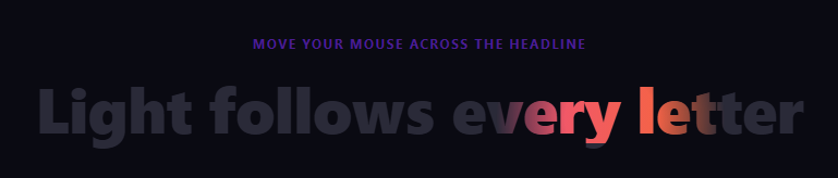
A cursor spotlight text fill shows a headline in a muted flat color by default, with a small circle of full gradient color that follows the mouse across the letters — as if the reader were holding a flashlight over dim text. It is a more restrained cousin of animated gradient text: instead of the whole headline shimmering continuously, only the area under the cursor lights up, which draws attention exactly where the user is looking rather than everywhere at once. Pair it with cursor spotlight reveal for a matching background treatment.
Two overlapping copies of the same text
The trick relies on content: attr(data-text) inside a ::after pseudo-element that sits exactly on top of the real heading via position: absolute; inset: 0. The base <h1> text renders in a flat muted grey (color: #2a2a38). The ::after copy renders in a gradient using the same background-clip: text technique as animated gradient text — but crucially, that gradient copy is masked so only a small circular region around the cursor is actually visible.
The radial-gradient mask that follows the cursor
mask-image: radial-gradient(circle 140px at var(--x, 50%) var(--y, 50%), #000 0%, #000 30%, transparent 75%) defines a circular mask centered at CSS custom properties --x and --y. Where the mask is opaque black, the gradient-colored ::after text shows through; where it fades to transparent, the muted base heading shows instead. Because radial-gradient's center accepts any length or percentage — including a custom property — updating --x/--y in JavaScript moves the visible "hole" in real time without touching any other CSS.
Updating custom properties from pointermove
moveSpotlight(clientX, clientY) converts the pointer's viewport coordinates into a percentage relative to the heading's own getBoundingClientRect(), then calls heading.style.setProperty('--x', x + '%') and the same for --y. Because the mask-image reads these custom properties directly, no re-render of the mask string is needed — the browser just recomputes the radial-gradient's center on every pointer move, which is cheap because masking is GPU-composited.
The idle sweep before the first interaction
Before any pointermove event has fired, the spotlight would otherwise sit static at 50%/50%. idleSweep() runs a requestAnimationFrame loop that walks --x/--y through a lissajous-style path using Math.sin/Math.cos at different frequencies, so the spotlight glides across the headline on its own to hint at the effect. The loop cancels itself the first time the user actually moves the pointer, handing control over to moveSpotlight.
Build with AI
Build, Understand, Optimize, and Extend It With AI
Paste this snippet's HTML, CSS, and JS into an AI coding assistant like Claude and ask it to explain step by step how a masked, absolutely positioned ::after duplicate of the heading text combines with a radial-gradient mask-image bound to CSS custom properties to create the spotlight — try changing the mask's 30%/75% stop positions together and see how the falloff softness changes. It is also worth a robustness conversation: ask what happens on touch devices where pointermove behaves differently than on desktop, and how you would add a touchmove-driven fallback. For extending it, ask for a version where the spotlight radius grows the longer the cursor stays still, one that reveals a completely different font weight or color scheme instead of a gradient, or one that uses multiple independent spotlights for a multi-cursor / multiplayer effect. Treat the code less like a finished artifact and more like a starting point for a conversation.
Prompt to recreate it
Copy this into your AI assistant of choice to build the effect from scratch, or as a jumping-off point for your own variant:
Build a headline where a small circular "spotlight" of gradient color follows the mouse cursor across the letters, while the rest of the text stays a flat muted color, using plain HTML, CSS, and vanilla JavaScript — no canvas, no SVG.

Requirements:
- Render the heading text twice: once as the real, flat-colored element, and once as a duplicate layer (using a pseudo-element reading the text from a data attribute is fine) positioned exactly on top of the first, styled with a gradient background clipped to the text shape using background-clip: text and a transparent text fill color.
- Apply a CSS mask-image to the gradient duplicate layer using a radial-gradient whose center coordinates are driven by CSS custom properties, and whose center is fully opaque while its edges fade to fully transparent, so only a soft circular region of the gradient layer is visible at any time.
- On every pointer move over the page, compute the pointer's position as a percentage relative to the heading element's own bounding box, and update the two CSS custom properties controlling the mask's center accordingly so the visible gradient circle tracks the cursor smoothly.
- Before the user has moved the pointer at all, automatically animate the same two custom properties through a smooth looping path (for example using sine and cosine at different speeds) via requestAnimationFrame, so the spotlight is doing something even with no interaction yet — and make that idle animation stop permanently the first time a real pointer movement is detected.
- Include both the standard mask-image property and the -webkit-mask-image prefixed version for Safari support.
Want to tighten it up first? Run this prompt through the AI Prompt Studio to score it across 8 quality dimensions, catch anti-patterns, and tune the wording for Claude, ChatGPT, or Gemini before you paste it in.
Step by step
How to Use
- 1Move the mouse over the headlineA small circle of gradient color follows the cursor across the letters. Before moving the mouse, an idle sweep animates the spotlight automatically.
- 2Change the headline textUpdate both the visible text inside <h1> and its data-text attribute in the HTML panel — they must match exactly since data-text drives the ::after gradient copy.
- 3Adjust the spotlight sizeIn the CSS panel, change 140px inside the two radial-gradient() calls (mask-image and -webkit-mask-image) — larger reveals more text at once.
- 4Change the gradient colorsEdit the linear-gradient stops on .spotlight-heading::after in the CSS panel to match your brand palette.
- 5Change the base (unlit) text colorUpdate color: #2a2a38 on .spotlight-heading — this is what shows outside the spotlight radius.
- 6Export in your formatClick "HTML" for a standalone file, "JSX" for a React component, or "Tailwind" for a React + Tailwind version.
Real-world uses
Common Use Cases
Got questions?
Frequently Asked Questions
A ::after pseudo-element duplicates the heading text in a gradient color and sits exactly on top of the base heading via position: absolute; inset: 0. A mask-image radial-gradient centered on the cursor position makes only a small circular region of that gradient copy opaque — everywhere else it is fully transparent, letting the flat-colored base heading show through instead.
radial-gradient() accepts any valid length for its center, including var(--x) and var(--y). Updating those two custom properties with element.style.setProperty() on every pointermove is far cheaper than reconstructing and reassigning the entire mask-image string every frame, and the browser only needs to recompute the gradient center.
Without any pointer interaction, --x and --y would sit at their default 50%/50%, leaving the spotlight static and easy to miss on page load. A requestAnimationFrame loop drives the spotlight through a slow, automatic sine/cosine path until the user actually moves their mouse, at which point the loop cancels itself.
pointermove fires for touch drags but not for simple taps, so on mobile the idle sweep is the primary way the effect is seen. Consider adding a touchmove listener that mirrors moveSpotlight for a touch-and-drag variant.
The base <h1> renders its normal text content in the flat color. The gradient copy comes from content: attr(data-text) on the ::after pseudo-element, which reads a separate data-text attribute rather than the element's own text — the two must be kept in sync manually when you edit the headline.
Yes. Click "JSX" for a React component. Use a ref on the heading, update its style custom properties directly in a pointermove handler via ref.current.style.setProperty(), and drive the idle sweep from a useEffect-managed requestAnimationFrame loop that you cancel on unmount.