Source Code
<form class="fs-form" id="fsForm">
  <div class="fs-field" data-empty="true">
    <select class="fs-select" id="fsCountry">
      <option value="" disabled selected hidden></option>
      <option value="us">United States</option>
      <option value="uk">United Kingdom</option>
      <option value="de">Germany</option>
      <option value="jp">Japan</option>
      <option value="in">India</option>
    </select>
    <label class="fs-label" for="fsCountry">Country</label>
    <svg class="fs-caret" viewBox="0 0 24 24"><path d="M6 9l6 6 6-6"/></svg>
  </div>

  <div class="fs-field" data-empty="true">
    <select class="fs-select" id="fsPlan">
      <option value="" disabled selected hidden></option>
      <option value="free">Free</option>
      <option value="pro">Pro</option>
      <option value="team">Team</option>
    </select>
    <label class="fs-label" for="fsPlan">Plan</label>
    <svg class="fs-caret" viewBox="0 0 24 24"><path d="M6 9l6 6 6-6"/></svg>
  </div>

  <button type="submit" class="fs-submit">Continue</button>
</form>*{box-sizing:border-box;margin:0;padding:0}
body{font-family:system-ui,-apple-system,sans-serif;background:#f4f5fa;display:flex;justify-content:center;align-items:center;min-height:100vh;padding:24px}
.fs-form{background:#fff;border:1px solid #e6e8f0;border-radius:16px;padding:26px;width:320px;display:flex;flex-direction:column;gap:18px;box-shadow:0 12px 40px rgba(20,20,50,.06)}
.fs-field{position:relative}
.fs-select{width:100%;appearance:none;-webkit-appearance:none;font-family:inherit;font-size:15px;color:#16182a;background:#fff;border:1.5px solid #d7dbe7;border-radius:11px;padding:18px 40px 8px 14px;cursor:pointer;outline:none;transition:border-color .18s,box-shadow .18s}
.fs-select:focus{border-color:#6366f1;box-shadow:0 0 0 4px rgba(99,102,241,.14)}
.fs-label{position:absolute;left:14px;top:15px;font-size:15px;color:#9aa0b4;pointer-events:none;transition:transform .16s ease,color .16s ease,font-size .16s ease;transform-origin:left center}
/* Float the label up when the field has a value or is focused. */
.fs-field:not([data-empty="true"]) .fs-label,
.fs-select:focus + .fs-label{transform:translateY(-9px);font-size:11px;color:#6366f1;font-weight:600}
.fs-caret{position:absolute;right:13px;top:50%;transform:translateY(-50%);width:18px;height:18px;fill:none;stroke:#8b90a6;stroke-width:2.2;stroke-linecap:round;stroke-linejoin:round;pointer-events:none;transition:transform .18s}
.fs-select:focus ~ .fs-caret{transform:translateY(-50%) rotate(180deg);stroke:#6366f1}
.fs-submit{margin-top:4px;background:#6366f1;color:#fff;border:0;font-family:inherit;font-weight:700;font-size:15px;padding:13px;border-radius:11px;cursor:pointer}var fields = Array.prototype.slice.call(document.querySelectorAll('.fs-field'));
fields.forEach(function (field) {
var select = field.querySelector('.fs-select');
// Track emptiness on the wrapper so CSS can float the label.
function sync() { field.setAttribute('data-empty', select.value ? 'false' : 'true'); }
select.addEventListener('change', sync);
sync(); // honour any pre-selected option on load
});
document.getElementById('fsForm').addEventListener('submit', function (e) {
e.preventDefault();
var data = fields.map(function (f) { return f.querySelector('.fs-select').value; });
console.log('selected:', data);
});Learn Coding Visually
Learn to code with interactive, live-preview playgrounds — HTML, CSS, JavaScript, React & more.
 HTML Playground42 lessons · Click-based · Live preview
 CSS PlaygroundLearn CSS with a live editor
 JavaScript Playground60 lessons · DOM · Async · Canvas
 React PlaygroundLearn React with a live code editor
 GSAP PlaygroundLearn GSAP animation interactively
 SVG Playground44 lessons · shapes · paths · animation
 SCSS Playground45 lessons · Sass modules · tokens
 Tailwind PlaygroundLearn Tailwind CSS with a live editor
 Bootstrap 5 Playground50 lessons · live preview
Floating Label Select — Free HTML CSS JS Form Field Snippet
Floating Label Select · Forms · Plain HTML, CSS & JS · Live preview
What's included
Features
About this UI Snippet
Floating Label Select — Material-Style Dropdowns That Stay Compact
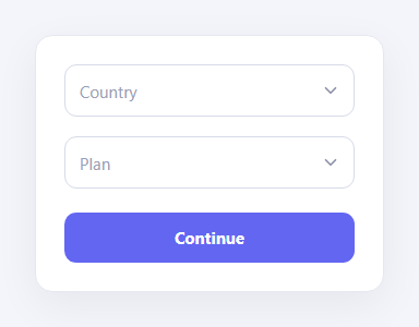
The floating label select brings the popular floating-label pattern — where the placeholder shrinks and rises into a label once the field is in use — to native <select> dropdowns. This snippet styles a real, accessible select element with plain CSS and a tiny vanilla JavaScript state sync, keeping forms compact while always showing what each field is for.
Taming the native select
A real <select> is kept for accessibility and free keyboard and mobile behaviour, but its default chrome is removed with appearance: none (and the -webkit- prefix) so it can be restyled. The browser's arrow is replaced by a custom inline SVG caret, positioned absolutely on the right and made pointer-events: none so clicks fall through to the select beneath it. Generous top padding leaves room for the label to sit above the chosen value.
The floating label logic
The label floats up in two situations: when the field is focused, and when it holds a value. Focus is handled purely in CSS with :focus + .fs-label. Value presence can't be detected by CSS on a select, so a wrapper carries a data-empty attribute that JavaScript keeps in sync on every change; the selector .fs-field:not([data-empty="true"]) .fs-label then floats the label whenever a real option is chosen. A hidden, disabled, empty first option acts as the placeholder so the field starts genuinely empty.
The animated caret
The custom caret rotates 180° on focus via :focus ~ .fs-caret, mirroring the open/closed affordance of a dropdown, and shifts to the accent colour to reinforce the focus state. Because it's a sibling of the select in the same relative wrapper, no JavaScript is needed for the flip.
Focus ring and motion
On focus the border switches to the accent colour and a soft box-shadow ring appears — the same focus affordance as a good text input — and the label transition (transform, colour, and font-size over ~160ms) makes the rise feel smooth rather than snapping. All of it is GPU-friendly transform and colour work.
Accessible by construction
Because the control is a genuine <select> with a properly associated <label for>, it works with screen readers, keyboard navigation, and native mobile pickers out of the box — you get the custom look without sacrificing the platform behaviour that a div-based fake dropdown would throw away.
Customizing it
Swap the accent colour, adjust the padding to change the float distance, or restyle the caret. The same wrapper pattern scales to as many selects as a form needs, and the submit handler shows how to read every value. Pair it with a floating label text input and an inline validation form for a complete styled form.
Build with AI
Build, Understand, Optimize, and Extend It With AI
You don't have to reason through the CSS-versus-JS split on your own. Paste this snippet's HTML, CSS, and JS into an AI coding assistant like Claude and ask it to explain exactly why the label's floated state needs a data-empty attribute synced in JavaScript instead of a pure CSS selector like the text-input version of this pattern, and why the first option is disabled, hidden, and given an empty value rather than simply omitted. The same assistant can help optimize it — ask whether the change-event sync function should also run on programmatic value changes (like resetting the form), which the current implementation would miss. It's also useful for extending the control: have it add a searchable/filterable variant for long option lists, support multiple selection with floated chips, or add a red error state that doesn't fight with the floated label's color. Treat the code less like a finished artifact and more like a starting point for a conversation.
Prompt to recreate it
Copy this into your AI assistant of choice to build the effect from scratch, or as a jumping-off point for your own variant:
Build a floating-label select dropdown in plain HTML, CSS, and JavaScript — the underlying control must remain a real, native select element for accessibility, not a custom div-based dropdown.

Requirements:
- A wrapper div containing a native select (with appearance: none and the -webkit- prefix to remove default browser chrome), a label element positioned absolutely over it, and a custom inline SVG caret positioned on the right with pointer-events disabled so clicks pass through to the select.
- The select's first option must be disabled, hidden, and selected by default with an empty value, so it behaves as an invisible placeholder and the field is genuinely empty until the user picks a real option.
- The label must rest inside the select at normal size and color when the field is empty and unfocused, and must float upward while shrinking in size and changing to an accent color in two situations: when the select has focus (handled purely with a CSS focus selector), and when the select holds a real value (handled by a wrapper attribute that JavaScript updates on every change event, since CSS alone cannot detect a select's current value).
- On page load, run the same sync logic once so a pre-selected value (if any) starts with the label already floated.
- The custom SVG caret must rotate 180 degrees and change color purely via a CSS sibling selector keyed off the select's focus state — no JavaScript should touch the caret.
- Style a focus ring (border color change plus a soft box-shadow) on the select when focused, and make every animated property (the label's transform/color/font-size, the caret's rotation) a CSS transition, not a JavaScript-driven animation.
- Include at least two such floating-label selects in a form with a submit handler that prevents default and collects every select's current value.
Want to tighten it up first? Run this prompt through the AI Prompt Studio to score it across 8 quality dimensions, catch anti-patterns, and tune the wording for Claude, ChatGPT, or Gemini before you paste it in.
Step by step
How to Use
- 1Paste HTML, CSS, and JSTwo labelled selects render with placeholders.
- 2Focus a selectThe label floats up and the caret flips.
- 3Choose an optionThe label stays floated to show the value.
- 4Submit the formThe handler logs every selected value.
- 5Add a fieldCopy a wrapper with its own select and label.
- 6Recolor itChange the accent used for focus and label.
Real-world uses
Common Use Cases
Got questions?
Frequently Asked Questions
A native select gives keyboard navigation, screen-reader support, and the platform's mobile picker for free. This snippet removes its default chrome with appearance: none and adds a custom caret, so you get the styled look without rebuilding all the accessibility a div-based fake dropdown would lose.
CSS can detect focus on a select but not whether it has a value, so a wrapper carries a data-empty attribute that JavaScript updates on every change event. The selector .fs-field:not([data-empty="true"]) .fs-label floats the label whenever a real option is chosen, and the focus case is handled separately with :focus + .fs-label.
The first option is hidden, disabled, selected, and has an empty value, so it acts as a placeholder and the select starts with no real value. The sync function reads select.value on load, finds it empty, and leaves the label in its resting position.
The custom SVG caret is a sibling of the select inside the same relative wrapper, so the CSS rule .fs-select:focus ~ .fs-caret rotates it 180 degrees and recolours it on focus. It is also pointer-events: none so clicks pass through to the select beneath it.
Drive the empty state from your bound value rather than a data attribute — render the wrapper class from whether the value is truthy (a computed in Vue, a className expression in React, ngClass in Angular). Keep the element a real select with onChange/v-model/ngModel, and port the caret and label CSS unchanged. In Tailwind use appearance-none with peer-focus utilities for the float.