Source Code
<div class="scene">
  <h1 class="glitch" data-text="GLITCH">GLITCH</h1>
  <p class="sub">CSS-only glitch effect using pseudo-elements and clip-path animation</p>
  <div class="btns">
    <button class="btn" onclick="setWord('GLITCH')">GLITCH</button>
    <button class="btn" onclick="setWord('ERROR')">ERROR</button>
    <button class="btn" onclick="setWord('SYSTEM')">SYSTEM</button>
    <button class="btn" onclick="setWord('BREACH')">BREACH</button>
  </div>
</div>
* { box-sizing: border-box; margin: 0; padding: 0; }
body { font-family: 'Courier New', monospace; background: #050810; display: flex; align-items: center; justify-content: center; min-height: 100vh; }
.scene { text-align: center; display: flex; flex-direction: column; align-items: center; gap: 28px; padding: 20px; }
.glitch {
font-size: clamp(48px, 12vw, 96px);
font-weight: 900;
color: #0ff;
letter-spacing: 6px;
text-transform: uppercase;
position: relative;
text-shadow: 0 0 20px rgba(0,255,255,0.4);
animation: glitch-main 2s infinite;
}
.glitch::before,
.glitch::after {
content: attr(data-text);
position: absolute; top: 0; left: 0; right: 0;
letter-spacing: 6px;
}
.glitch::before {
color: #ff2d78;
text-shadow: 0 0 12px #ff2d78;
animation: glitch-1 2s infinite;
clip-path: polygon(0 15%, 100% 15%, 100% 35%, 0 35%);
}
.glitch::after {
color: #0f0;
text-shadow: 0 0 12px #0f0;
animation: glitch-2 2s infinite;
clip-path: polygon(0 60%, 100% 60%, 100% 80%, 0 80%);
}
@keyframes glitch-main {
0%,90%,100% { transform: none; }
92% { transform: skewX(-2deg); }
94% { transform: skewX(2deg); }
96% { transform: skewX(-1deg); }
}
@keyframes glitch-1 {
0%,85%,100% { transform: none; opacity: 0; }
86% { transform: translateX(-4px) skewX(-5deg); opacity: 1; }
88% { transform: translateX(4px); opacity: 1; }
90% { transform: translateX(-2px); opacity: 1; }
92% { opacity: 0; }
}
@keyframes glitch-2 {
0%,88%,100% { transform: none; opacity: 0; }
89% { transform: translateX(4px) skewX(3deg); opacity: 1; }
91% { transform: translateX(-4px); opacity: 1; }
93% { opacity: 0; }
}
.sub { font-size: 12px; color: #334155; max-width: 380px; line-height: 1.6; font-family: system-ui, sans-serif; }
.btns { display: flex; gap: 10px; flex-wrap: wrap; justify-content: center; }
.btn { padding: 7px 16px; font-size: 12px; font-weight: 700; font-family: 'Courier New', monospace; letter-spacing: 1px; background: transparent; color: #0ff5; border: 1px solid #0ff2; border-radius: 4px; cursor: pointer; transition: all 0.15s; }
.btn:hover { border-color: #0ff; color: #0ff; background: rgba(0,255,255,0.05); }function setWord(w) {
const el = document.querySelector('.glitch');
el.textContent = w;
el.dataset.text = w;
}Learn Coding Visually
Learn to code with interactive, live-preview playgrounds — HTML, CSS, JavaScript, React & more.
 HTML Playground42 lessons · Click-based · Live preview
 CSS PlaygroundLearn CSS with a live editor
 JavaScript Playground60 lessons · DOM · Async · Canvas
 React PlaygroundLearn React with a live code editor
 GSAP PlaygroundLearn GSAP animation interactively
 SVG Playground44 lessons · shapes · paths · animation
 SCSS Playground45 lessons · Sass modules · tokens
 Tailwind PlaygroundLearn Tailwind CSS with a live editor
 Bootstrap 5 Playground50 lessons · live preview
Glitch Text — Free HTML CSS Cyberpunk Snippet
Glitch Text Effect · Animations · Plain HTML, CSS & JS · Live preview
What's included
Features
About this UI Snippet
Glitch Text — ::before/::after Layered Copies, clip-path Slices & Channel Offset
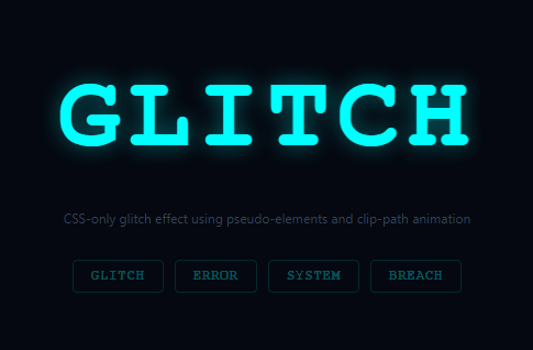
The glitch text effect simulates digital signal corruption — the text appears to tear apart into colour-separated layers that momentarily misalign. Used on cyberpunk interfaces (pair it with matrix rain and neon glow buttons), gaming titles, error screens, and dark-themed products communicating disruption.
The effect uses three layers: the original .glitch element, .glitch::before, and .glitch::after. Both pseudo-elements display the same text via content: attr(data-text) — the same value set on the element in the HTML. All three layers are absolutely positioned on top of each other.
CSS @keyframes glitch-1 and glitch-2 apply different clip-path: rect() values to each pseudo-element at different frames, slicing each into horizontal strips. translateX() and scaleX() offsets separate the cyan (::before) and red (::after) colour channels, mimicking RGB misalignment in a corrupted video signal.
The setWord(w) JS function updates both element textContent and dataset.text simultaneously to keep the pseudo-element content in sync.
The CSS animation mechanics
Two ::before and ::after pseudo-elements are stacked on top of the base text using position: absolute; inset: 0. Each has content: attr(data-text) to display the same text. They use clip-path: rect(Npx, 9999px, Mpx, 0) to show only a horizontal slice of the text at a time — this creates the "torn apart lines" look. CSS keyframes shift the slices at different random offsets: transform: translate(-2px, 3px) and transform: translate(3px, -2px). The red and cyan colour shift uses text-shadow and mix-blend-mode: screen to simulate RGB channel separation.
The animation timing
The glitch animation runs in short bursts: steps() timing with very fast keyframes (0.08s total) creates a jerky, digital corruption feel rather than a smooth animation. Using animation-iteration-count: infinite with random-length pauses (via multiple steps in the keyframe) simulates the irregular nature of actual digital glitches.
Adding glitch to any element
The snippet uses data-text attribute to clone content into pseudo-elements — this is the only technique that works for CSS-only text duplication. Add data-text="Your text" to any element and apply the glitch CSS class. Dynamic text changes need the data-text attribute updated via JavaScript: el.dataset.text = el.textContent.
Triggering glitch on hover vs continuous
The snippet animates continuously by default. For a hover-only glitch, add animation-play-state: paused to the base state and animation-play-state: running on :hover. This triggers the glitch only when the user mouses over the text — a common pattern for interactive headings on portfolio sites.
Build with AI
Build, Understand, Optimize, and Extend It With AI
Rather than eyeballing the keyframe percentages, paste this snippet's HTML, CSS, and JS into an AI coding assistant like Claude and ask it to explain exactly why the glitch-1 and glitch-2 keyframes fire only in narrow late-percentage windows (86 to 92 percent, for instance) instead of running continuously, and how content: attr(data-text) on the ::before and ::after layers lets a single data attribute drive both color-split copies of the same word. It can also help you optimize it, for example checking whether animating clip-path and transform on three stacked layers is cheap enough to run on many headings at once, or whether it should be paused off-screen. For extending it, ask it to add a hover-only trigger using animation-play-state, wire setWord to cycle automatically through a phrase list, or layer in a text-scramble decode before the glitch settles. Treat the code less like a finished artifact and more like a starting point for a conversation.
Prompt to recreate it
Copy this into your AI assistant of choice to build the effect from scratch, or as a jumping-off point for your own variant:
Build a CSS-only RGB-split glitch text effect in plain HTML and CSS, driven by a small JavaScript helper for swapping the displayed word, using only pseudo-elements and clip-path — no canvas, no images, no external libraries.

Requirements:
- A single heading element carrying its visible text as both its text content and a data-text HTML attribute, since pseudo-elements cannot read a parent's textContent directly.
- Two pseudo-elements, ::before and ::after, both set to content: attr(data-text) and absolutely positioned exactly over the base element, one tinted a distinct accent color (for example cyan) and the other a contrasting color (for example red or green), each with its own colored text-shadow glow.
- CSS keyframe animations on each pseudo-element that use clip-path polygon values to reveal only a thin horizontal strip of that copy's text at specific late-percentage keyframe steps, combined with small translateX offsets, so most of the animation loop shows no distortion and the glitch reads as a brief, irregular flicker rather than a constant effect.
- A separate, subtler keyframe on the base element itself (small skewX oscillations at similarly narrow percentage windows) so the whole word shudders slightly in sync with the color-split layers.
- A JavaScript function that accepts a new word, updates both the element's textContent and its data-text attribute together (they must never go out of sync), and wire it to at least three buttons offering different words.
- The animation must run on an infinite loop by default, and note in a comment how to make it hover-triggered instead using animation-play-state.
Want to tighten it up first? Run this prompt through the AI Prompt Studio to score it across 8 quality dimensions, catch anti-patterns, and tune the wording for Claude, ChatGPT, or Gemini before you paste it in.
Step by step
How to Use
- 1Watch the glitch animateThe text glitches continuously via CSS keyframes. Click the phrase buttons to swap to a different word and watch the glitch animate the new text.
- 2Update the wordsIn the HTML panel, change the button labels and the onclick setWord() arguments to your own phrases.
- 3Change the glitch coloursUpdate color on .glitch::before (cyan) and .glitch::after (red) in the CSS panel to any colour pair.
- 4Adjust glitch intensityIn the CSS keyframes, increase the translateX values and clip-path rect offsets for more aggressive glitching.
- 5Pause the animation on hoverAdd .glitch:hover { animation-play-state: paused } to freeze the glitch on hover.
- 6Export in your formatClick "HTML" for a standalone file, "JSX" for a React component, or "Tailwind" for a React + Tailwind version.
Real-world uses
Common Use Cases
Got questions?
Frequently Asked Questions
.glitch::before and .glitch::after are absolutely positioned on top of the original element. Both use content: attr(data-text) which reads the data-text HTML attribute — the same value as the element's textContent. All three layers overlap perfectly until the keyframe animations offset them.
CSS pseudo-elements cannot read their parent's textContent directly. data-text is an HTML attribute that mirrors the text, and content: attr(data-text) reads it. setWord(w) updates both el.textContent and el.dataset.text simultaneously to keep them in sync.
clip-path: rect(top, right, bottom, left) clips the element to a rectangle. Different rect() values in the keyframes create the horizontal slice effect — each pseudo-element shows only a specific band of the text at any given keyframe, creating the torn-apart appearance.
Remove the animation property from .glitch, .glitch::before, and .glitch::after. Add .glitch:hover, .glitch:hover::before, .glitch:hover::after { animation: ... }. The glitch fires only when hovered and stops when the cursor leaves.
In the keyframe percentages, make most of the animation frames have no transform applied: 0%,2%,4%,100% { ... } with only 1% and 3% having the glitch transforms. This makes the glitch occur only briefly at those percentages — 98% of the time the text is stable.
Yes. Manage the displayed word in useState. Set both the element text and data-text via React: <h1 className="glitch" data-text={word}>{word}</h1>. The CSS animations work without any React changes. To cycle words, use a setInterval that updates the word state.