Source Code
<div class="gt-stage">
  <svg width="0" height="0"><filter id="gtGoo"><feGaussianBlur in="SourceGraphic" stdDeviation="7" result="b"/><feColorMatrix in="b" mode="matrix" values="1 0 0 0 0  0 1 0 0 0  0 0 1 0 0  0 0 0 19 -8"/></filter></svg>

  <div class="gt-morph" id="gtMorph">
    <span class="gt-word gt-a" id="gtA">CREATE</span>
    <span class="gt-word gt-b" id="gtB">SHIP</span>
  </div>
  <p class="gt-sub">Two words melt and reform on a goo filter</p>
</div>*{box-sizing:border-box;margin:0;padding:0}
body{font-family:system-ui,-apple-system,sans-serif;background:#06060e;color:#fff;display:flex;justify-content:center;align-items:center;min-height:100vh;flex-direction:column;gap:18px}
.gt-stage{text-align:center}
.gt-morph{position:relative;height:120px;width:min(90vw,520px);filter:url(#gtGoo)}
.gt-word{position:absolute;inset:0;display:flex;align-items:center;justify-content:center;font-size:clamp(44px,11vw,96px);font-weight:900;letter-spacing:-.03em;color:#818cf8}
.gt-a{animation:gtA 4s infinite}
.gt-b{animation:gtB 4s infinite}
@keyframes gtA{0%,38%{opacity:1;transform:scale(1)}50%,88%{opacity:0;transform:scale(.6)}100%{opacity:1;transform:scale(1)}}
@keyframes gtB{0%,38%{opacity:0;transform:scale(.6)}50%,88%{opacity:1;transform:scale(1)}100%{opacity:0;transform:scale(.6)}}
.gt-sub{color:#6a6a86;font-size:13.5px;letter-spacing:.04em}// The morph itself is pure CSS + the SVG goo filter. JS only rotates a longer
// word list through the two layers, swapping their text once per 4s loop (while
// they are mid-transition) so you always see two words melting together.
var a = document.getElementById('gtA');
var b = document.getElementById('gtB');
var WORDS = ['CREATE', 'SHIP', 'SCALE', 'REPEAT'];
var step = 0;
setInterval(function () {
step++;
a.textContent = WORDS[(step * 2) % WORDS.length];
b.textContent = WORDS[(step * 2 + 1) % WORDS.length];
}, 4000);Learn Coding Visually
Learn to code with interactive, live-preview playgrounds — HTML, CSS, JavaScript, React & more.
 HTML Playground42 lessons · Click-based · Live preview
 CSS PlaygroundLearn CSS with a live editor
 JavaScript Playground60 lessons · DOM · Async · Canvas
 React PlaygroundLearn React with a live code editor
 GSAP PlaygroundLearn GSAP animation interactively
 SVG Playground44 lessons · shapes · paths · animation
 SCSS Playground45 lessons · Sass modules · tokens
 Tailwind PlaygroundLearn Tailwind CSS with a live editor
 Bootstrap 5 Playground50 lessons · live preview
Gooey Text Morph — Free HTML CSS JS Goo Filter Snippet
Gooey Text Morph · Animations · Plain HTML, CSS & JS · Live preview
What's included
Features
About this UI Snippet
Gooey Text Morph — Words Melting Through an SVG Goo Filter
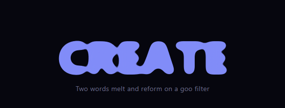
Gooey text morph is the liquid typography effect where one word appears to melt and reform into the next, the letters blobbing together as they cross-fade — the same metaball look used for gooey menus, applied to type. This snippet builds it with plain HTML, an SVG filter, CSS animation, and a little vanilla JavaScript to cycle through your own list of words.
The SVG goo filter
The morph relies on the classic goo filter, #gtGoo. It blurs the source with feGaussianBlur, then passes the result through a feColorMatrix that sharply boosts the alpha channel (0 0 0 19 -8), thresholding the soft blur back into hard shapes. Applied to a container, this makes any blurred forms inside merge: where two semi-transparent, blurred letters overlap, they fuse into one continuous blob. As one word fades out and another fades in over the same area, their blurred glyphs momentarily melt together — the gooey transition.
Two stacked word layers
Inside the filtered container sit two absolutely-positioned word layers, A and B, occupying the same space. CSS keyframes (gtA and gtB) cross-fade them on a 4-second loop: while A holds at full opacity and scale, B is hidden and shrunk, then they swap, each scaling between 0.6 and 1 as it fades. Because both layers are blurred and overlapping during the handoff, the goo filter fuses their letters mid-transition so the change reads as a liquid morph rather than a simple dissolve. The scale change adds a gravitational "pull" to the melt.
Cycling arbitrary words
The two layers only ever show two words at a time, but JavaScript rotates through a longer WORDS list so the morph keeps presenting new pairs. On each cycle it advances and assigns the next words to the layers while they're transitioning, so words are swapped during their hidden phase — you only ever see two words melting into each other, never a word changing in plain view. Supply any list (a tagline, a set of verbs, feature names) and the loop handles the rest.
Why this approach is cheap
The entire morph is GPU-friendly: the goo filter is applied once to a small container, and only opacity and transform animate — no per-frame JavaScript drawing, no canvas. That keeps it smooth even on modest devices, and the filter is reusable across multiple morphs on a page.
Type and layout
The words are heavy, tightly-tracked, and large (clamp scales them responsively), which gives the blur enough mass to blob convincingly — thin text doesn't goo well because there isn't enough ink to merge. The container has a fixed height so the absolute layers have a stable box to morph within.
Customizing it
Edit the WORDS array, tune the filter's stdDeviation and alpha matrix for more or less gooeyness, change the loop timing, recolor the text, or adjust the scale range in the keyframes for a stronger melt. Pair it with a text generate reveal or a liquid button to extend the gooey theme across a page.
Build with AI
Build, Understand, Optimize, and Extend It With AI
Instead of tracing the timing yourself, paste this snippet's HTML, CSS, and JS into an AI coding assistant like Claude and ask it to explain exactly why the gtA and gtB keyframes must fade and scale in mirrored, overlapping phases for the SVG goo filter to fuse the two words rather than just cross-dissolve them, and why the JavaScript only swaps each layer's textContent during its hidden phase in the four-second loop. It's also a good prompt for optimization, for instance whether the feGaussianBlur stdDeviation and feColorMatrix values could be tuned lower for smaller heading sizes without losing the melt. For extending it, ask it to cycle through a longer word list supplied from a CMS field, add a click-to-advance mode instead of the automatic interval, or apply the same goo filter to a logo mark morphing between two icons. Treat the code less like a finished artifact and more like a starting point for a conversation.
Prompt to recreate it
Copy this into your AI assistant of choice to build the effect from scratch, or as a jumping-off point for your own variant:
Build a gooey text morph effect in plain HTML, CSS, SVG, and JavaScript, where one word visibly melts into the next through an SVG goo filter — no canvas, no images, no animation libraries.

Requirements:
- Define one inline SVG filter using an feGaussianBlur (stdDeviation around 7) followed by an feColorMatrix that sharply boosts the alpha channel to threshold the blur back into solid shapes, and apply it via CSS filter: url(#id) to a fixed-height container that will hold the text.
- Inside that filtered container, place exactly two absolutely-positioned word layers occupying the same space, each large, bold, and tightly tracked (thin or small text will not fuse convincingly under the filter).
- Write two mirrored CSS keyframe animations, one per layer, on a shared duration loop (for example 4 seconds), where each layer alternates between full opacity and scale 1 when "active" and near-zero opacity and a smaller scale (for example 0.6) when "hidden," timed so the two layers' active and hidden phases overlap during the transition rather than snapping instantly.
- Because both layers are blurred by the shared filter and overlap in space during the transition, their letters must visually fuse into a single blob at the crossover point — the CSS timing must create this overlap window intentionally, not by accident.
- Write a JavaScript loop (setInterval matching the keyframe duration) that maintains a rotating array of at least four words and reassigns new words to whichever layer is currently in its hidden phase, so a viewer only ever sees two words melting into each other and never sees a word change while fully visible.
- The whole effect should require no per-frame JavaScript — only opacity and transform should be animated, driven entirely by the CSS keyframes.
Want to tighten it up first? Run this prompt through the AI Prompt Studio to score it across 8 quality dimensions, catch anti-patterns, and tune the wording for Claude, ChatGPT, or Gemini before you paste it in.
Step by step
How to Use
- 1Paste HTML, CSS, and JSA large word morphs into another on a loop.
- 2Watch the meltLetters blob together as one word becomes the next.
- 3See it cycleNew word pairs keep coming from the word list.
- 4Edit the wordsChange the WORDS array to your own list.
- 5Tune the gooAdjust the filter blur and alpha matrix.
- 6Retime the loopChange the keyframe and interval durations.
Real-world uses
Common Use Cases
Got questions?
Frequently Asked Questions
The container has an SVG goo filter: a Gaussian blur followed by a feColorMatrix that boosts the alpha channel to threshold the blur back into hard shapes. Inside, two blurred word layers cross-fade over the same space. During the handoff their blurred letters overlap and the filter fuses them into continuous blobs, so the change reads as a liquid morph rather than a plain dissolve.
Each layer scales between 0.6 and 1 as it fades. That scale change adds a gravitational pull to the transition — the outgoing word seems to shrink and melt away while the incoming one grows into place — which makes the goo feel like it has mass rather than just fading.
The two layers only ever display two words at once, but JavaScript rotates through a longer WORDS list, assigning the next words to the layers while they're in their hidden phase. So words are swapped out of view, and you only ever see two words melting into each other, never a word changing in plain sight.
The goo filter merges shapes by blurring and thresholding, so it needs enough ink to blob convincingly. Large, bold, tightly-tracked letters have the mass to fuse during the transition; thin or small text doesn't have enough area for the blur to merge, and the melt looks weak.
Include the SVG filter once in a shared layout. Render the two word layers and keep the rotating word index in state or a ref, updating the layers' text on an interval set up in a mount effect with cleanup. The CSS keyframes and filter port directly. In Tailwind, apply the filter via an arbitrary filter:url(#gtGoo) value and animate opacity/scale with keyframes defined in the config.