Source Code
<div class="page">
  <div class="trigger-area">
    <p class="hint">Press <kbd>?</kbd> or click the button to open shortcuts</p>
    <button class="open-btn" onclick="openModal()">
      <svg width="14" height="14" viewBox="0 0 24 24" fill="none" stroke="currentColor" stroke-width="2.2" stroke-linecap="round"><rect x="2" y="4" width="20" height="16" rx="2"/><path d="M7 8h.01M12 8h.01M17 8h.01M7 12h.01M12 12h.01M17 12h.01M7 16h5"/></svg>
      Keyboard shortcuts
    </button>
  </div>

  <div class="modal-overlay" id="modal-overlay" onclick="closeIfBackdrop(event)">
    <div class="modal" id="modal" role="dialog" aria-modal="true" aria-label="Keyboard shortcuts">
      <div class="modal-header">
        <h2 class="modal-title">Keyboard Shortcuts</h2>
        <button class="modal-close" onclick="closeModal()" aria-label="Close">×</button>
      </div>

      <div class="shortcuts-body">
        <div class="shortcut-section">
          <div class="section-label">General</div>
          <div class="shortcut-row"><span class="shortcut-label">Open shortcuts</span><div class="keys"><kbd>?</kbd></div></div>
          <div class="shortcut-row"><span class="shortcut-label">Command palette</span><div class="keys"><kbd>⌘</kbd><kbd>K</kbd></div></div>
          <div class="shortcut-row"><span class="shortcut-label">Save</span><div class="keys"><kbd>⌘</kbd><kbd>S</kbd></div></div>
          <div class="shortcut-row"><span class="shortcut-label">Undo</span><div class="keys"><kbd>⌘</kbd><kbd>Z</kbd></div></div>
          <div class="shortcut-row"><span class="shortcut-label">Redo</span><div class="keys"><kbd>⌘</kbd><kbd>⇧</kbd><kbd>Z</kbd></div></div>
        </div>

        <div class="shortcut-section">
          <div class="section-label">Navigation</div>
          <div class="shortcut-row"><span class="shortcut-label">Go to home</span><div class="keys"><kbd>G</kbd><kbd>H</kbd></div></div>
          <div class="shortcut-row"><span class="shortcut-label">Go to settings</span><div class="keys"><kbd>G</kbd><kbd>S</kbd></div></div>
          <div class="shortcut-row"><span class="shortcut-label">Search</span><div class="keys"><kbd>/</kbd></div></div>
          <div class="shortcut-row"><span class="shortcut-label">Close / Cancel</span><div class="keys"><kbd>Esc</kbd></div></div>
        </div>

        <div class="shortcut-section">
          <div class="section-label">Editing</div>
          <div class="shortcut-row"><span class="shortcut-label">Bold</span><div class="keys"><kbd>⌘</kbd><kbd>B</kbd></div></div>
          <div class="shortcut-row"><span class="shortcut-label">Italic</span><div class="keys"><kbd>⌘</kbd><kbd>I</kbd></div></div>
          <div class="shortcut-row"><span class="shortcut-label">Select all</span><div class="keys"><kbd>⌘</kbd><kbd>A</kbd></div></div>
          <div class="shortcut-row"><span class="shortcut-label">Copy</span><div class="keys"><kbd>⌘</kbd><kbd>C</kbd></div></div>
          <div class="shortcut-row"><span class="shortcut-label">Paste</span><div class="keys"><kbd>⌘</kbd><kbd>V</kbd></div></div>
        </div>
      </div>

      <div class="modal-footer">
        <span class="footer-hint"><kbd>?</kbd> to toggle · <kbd>Esc</kbd> to close</span>
      </div>
    </div>
  </div>
</div>
* { box-sizing: border-box; margin: 0; padding: 0; }
body { font-family: system-ui, sans-serif; background: #f8fafc; min-height: 100vh; display: flex; align-items: center; justify-content: center; padding: 32px 24px; }
.page { width: 100%; max-width: 480px; }
.trigger-area { display: flex; flex-direction: column; align-items: center; gap: 12px; }
.hint { font-size: 13px; color: #94a3b8; }
.hint kbd { background: #f1f5f9; border: 1px solid #e2e8f0; border-radius: 5px; padding: 1px 6px; font-size: 12px; color: #374151; font-family: monospace; }
.open-btn { display: flex; align-items: center; gap: 7px; background: #fff; border: 1.5px solid #e2e8f0; border-radius: 10px; padding: 10px 18px; font-size: 13px; font-weight: 600; color: #374151; cursor: pointer; transition: all 0.12s; font-family: inherit; }
.open-btn:hover { border-color: #6366f1; color: #6366f1; }
/* Modal */
.modal-overlay { position: fixed; inset: 0; background: rgba(0,0,0,0.5); backdrop-filter: blur(4px); display: flex; align-items: center; justify-content: center; z-index: 100; opacity: 0; pointer-events: none; transition: opacity 0.2s; padding: 20px; }
.modal-overlay.open { opacity: 1; pointer-events: all; }
.modal { background: #fff; border-radius: 18px; width: 100%; max-width: 480px; max-height: 80vh; overflow-y: auto; box-shadow: 0 24px 80px rgba(0,0,0,0.2); transform: scale(0.96); transition: transform 0.2s; }
.modal-overlay.open .modal { transform: scale(1); }
.modal-header { display: flex; align-items: center; justify-content: space-between; padding: 18px 20px 14px; border-bottom: 1px solid #f1f5f9; position: sticky; top: 0; background: #fff; border-radius: 18px 18px 0 0; }
.modal-title { font-size: 16px; font-weight: 800; color: #0f172a; }
.modal-close { background: none; border: none; font-size: 22px; color: #94a3b8; cursor: pointer; line-height: 1; transition: color 0.12s; }
.modal-close:hover { color: #0f172a; }
.shortcuts-body { padding: 8px 20px; display: flex; flex-direction: column; gap: 0; }
.shortcut-section { padding: 12px 0; border-bottom: 1px solid #f8fafc; }
.shortcut-section:last-child { border-bottom: none; }
.section-label { font-size: 11px; font-weight: 700; letter-spacing: 1px; text-transform: uppercase; color: #94a3b8; margin-bottom: 8px; }
.shortcut-row { display: flex; align-items: center; justify-content: space-between; padding: 6px 0; }
.shortcut-label { font-size: 13px; color: #374151; }
.keys { display: flex; gap: 3px; align-items: center; }
kbd { background: #f8fafc; border: 1px solid #e2e8f0; border-bottom-width: 2px; border-radius: 6px; padding: 3px 7px; font-size: 11px; font-weight: 700; color: #374151; font-family: monospace; box-shadow: 0 1px 0 #e2e8f0; }
.modal-footer { padding: 10px 20px; border-top: 1px solid #f1f5f9; text-align: center; }
.footer-hint { font-size: 12px; color: #94a3b8; }
.footer-hint kbd { font-size: 11px; }function openModal() {
document.getElementById('modal-overlay').classList.add('open');
document.addEventListener('keydown', onKey);
}
function closeModal() {
document.getElementById('modal-overlay').classList.remove('open');
document.removeEventListener('keydown', onKey);
}
function closeIfBackdrop(e) {
if (e.target === e.currentTarget) closeModal();
}
function onKey(e) {
if (e.key === 'Escape') closeModal();
if (e.key === '?' && !document.getElementById('modal-overlay').classList.contains('open')) {
openModal();
}
}
// Global ? shortcut
document.addEventListener('keydown', e => {
if (e.key === '?' && e.target.tagName !== 'INPUT' && e.target.tagName !== 'TEXTAREA') {
e.preventDefault();
if (document.getElementById('modal-overlay').classList.contains('open')) closeModal();
else openModal();
}
});Learn Coding Visually
Learn to code with interactive, live-preview playgrounds — HTML, CSS, JavaScript, React & more.
 HTML Playground42 lessons · Click-based · Live preview
 CSS PlaygroundLearn CSS with a live editor
 JavaScript Playground60 lessons · DOM · Async · Canvas
 React PlaygroundLearn React with a live code editor
 GSAP PlaygroundLearn GSAP animation interactively
 SVG Playground44 lessons · shapes · paths · animation
 SCSS Playground45 lessons · Sass modules · tokens
 Tailwind PlaygroundLearn Tailwind CSS with a live editor
 Bootstrap 5 Playground50 lessons · live preview
Keyboard Shortcuts Modal — Free HTML CSS JS Snippet
Keyboard Shortcuts · Modals · Plain HTML, CSS & JS · Live preview
What's included
Features
About this UI Snippet
Keyboard Shortcuts Modal — ? Toggle, Sectioned kbd Reference, Backdrop Blur & Scale Animation
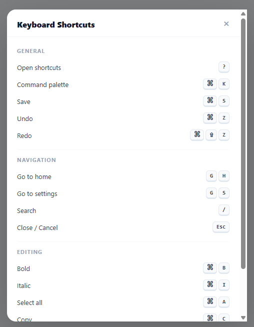
Press ? in GitHub, Linear, or Notion and a panel of every keyboard shortcut the app knows slides into view — a tiny feature that quietly tells power users "we built this for people like you." It costs almost nothing to add and pays for itself the first time someone discovers ⌘K instead of hunting through menus for the tenth time. This snippet builds that exact panel: a global ? toggle, three categorised sections (General, Navigation, Editing), kbd elements styled to look like physical keycaps, a frosted backdrop, a scale-in entrance animation, and the usual trio of close gestures — Escape, backdrop click, and the × button.
A global key listener that knows when to get out of the way
The trigger is a single document-level keydown listener watching for e.key === '?'. The detail that makes it usable rather than maddening is the guard clause: e.target.tagName !== 'INPUT' && e.target.tagName !== 'TEXTAREA'. Without it, anyone trying to type a literal question mark into a search box or comment field would find the shortcuts modal popping open mid-sentence — exactly the kind of "technically working, practically broken" bug that only surfaces once real users start typing. The same listener also closes the modal on a second ? press, making it a true toggle rather than a one-way door.
Turning a `<kbd>` tag into a keycap
Browsers render <kbd> as plain monospace text by default — recognisable as "code-ish" but nothing like a key. Four small CSS rules transform it: a light grey background, a 1px border on every edge, then a *thicker* border-bottom-width: 2px, and a matching box-shadow: 0 1px 0 beneath. That asymmetric bottom weight is the entire trick — it reads as a subtle ledge or lip, the same visual cue a real keycap gives under studio lighting, and it's the detail most homemade shortcut panels skip, leaving their keys looking like flat grey pills.
Sections instead of one long list
Dumping thirty shortcuts into a single column forces users to scan linearly for the one they want. Splitting them into General, Navigation, and Editing — each with an uppercase .section-label and a hairline separator — turns the panel into something closer to a table of contents: a user looking for "how do I search" skips straight to Navigation without reading what Bold or Redo do. It's the same chunking principle behind the Accordion / FAQ snippet's grouped questions, applied to a denser, glance-and-go layout.
A scale-and-blur entrance that feels like focus, not just a popup
The .modal starts at transform: scale(0.96) and opacity: 0; adding .open to the overlay animates both to their resting values together, producing the familiar "zoom in from just slightly smaller" entrance used by the Command Palette and the Modal / Dialog snippet. Layered behind it, backdrop-filter: blur(4px) softly defocuses the page content — a cue that tells the user's eyes "the thing in front is what matters now" before they've consciously registered why.
Making it yours
Swap the placeholder rows for your application's real bindings, duplicate .shortcut-section for new categories, and reach for the standard modifier glyphs — ⌘ ⌃ ⌥ ⇧ — rather than spelling out "Cmd" or "Ctrl", which is how every shortcuts panel from a native macOS app to a web IDE communicates key combinations at a glance.
Build with AI
Build, Understand, Optimize, and Extend It With AI
You do not have to reverse-engineer the toggle logic by clicking around. Paste this snippet's HTML, CSS, and JS into an AI coding assistant like Claude and ask it to explain exactly why the global keydown listener checks e.target.tagName against INPUT and TEXTAREA before acting on a question mark press, and what would happen to a search box on the page without that guard. The same assistant can help optimize it, for example checking whether attaching a second, near-duplicate keydown listener (onKey plus the global handler) is redundant and could be consolidated into one, or whether the backdrop-filter blur is expensive enough on lower-end devices to warrant a fallback. It is just as useful for extending the panel, such as adding a live search box that filters shortcut-rows by label text and hides empty sections, detecting the user's platform to swap the Cmd glyph for Ctrl automatically, or wiring the listed shortcuts up to real actions instead of just displaying them. Treat the code less like a finished artifact and more like a starting point for a conversation.
Prompt to recreate it
Copy this into your AI assistant of choice to build the effect from scratch, or as a jumping-off point for your own variant:
Build a "keyboard shortcuts" reference modal in plain HTML, CSS, and JavaScript using only a global keydown listener and CSS transitions — no modal library.

Requirements:
- A trigger button plus a global document keydown listener that opens the modal when the user presses the question mark key, and closes it on a second question mark press, making it a true toggle rather than open-only.
- The question mark listener must ignore the keypress (and not call preventDefault) whenever the current event target's tag name is INPUT or TEXTAREA, so users typing a literal question mark into a form field never trigger the modal.
- The modal itself must also close on the Escape key, on a click directly on the backdrop element (not on clicks inside the modal card — check that the click target equals the element the listener is bound to), and on an explicit close button.
- Style the modal's entrance as a combined opacity fade and a scale transform from slightly smaller than 100% up to 100%, triggered by adding a single class to the overlay, plus a backdrop-filter blur behind it so the page content behind visually defocuses.
- Every displayed keyboard shortcut must use the real semantic kbd element, not a styled span or div, and give each kbd a border, a background, and a bottom edge that is visually thicker or has an offset box-shadow beneath it so it reads as a physical, slightly raised key rather than a flat label.
- Group the shortcuts into at least three labeled sections (for example General, Navigation, Editing) with a section heading above each group, rather than one long undifferentiated list.
Want to tighten it up first? Run this prompt through the AI Prompt Studio to score it across 8 quality dimensions, catch anti-patterns, and tune the wording for Claude, ChatGPT, or Gemini before you paste it in.
Step by step
How to Use
- 1Press ? or click the button to open the shortcuts modalThe modal slides open with a scale+backdrop animation. Press ? again or ESC to close. Click anywhere on the dark backdrop to close.
- 2Replace shortcuts with your application's keyboard bindingsEdit each .shortcut-row with your actual shortcuts. Update .shortcut-label for the action name and the kbd elements for the key combination.
- 3Add or remove sectionsDuplicate a .shortcut-section div for each category. Update .section-label for the category name. Remove shortcut-rows or add new ones inside each section.
- 4Use the correct key symbolsUse ⌘ for Cmd, ⌃ for Ctrl, ⌥ for Option/Alt, ⇧ for Shift, ↩ for Enter. For Windows/Linux, replace ⌘ with Ctrl in a separate row or show both platforms.
- 5Change the ? trigger keyUpdate e.key === "?" in both the onKey function and the global listener to any key combination. For Cmd+/ style triggers: if (e.key === "/" && (e.metaKey || e.ctrlKey)) { ... }.
- 6Export in your formatClick "HTML" for a standalone file, "JSX" for a React component with useState for isOpen, or "Tailwind" for a React + Tailwind CSS version.
Real-world uses
Common Use Cases
Got questions?
Frequently Asked Questions
The global keydown listener checks e.target.tagName !== "INPUT" && e.target.tagName !== "TEXTAREA" before acting on the ? key. This prevents the shortcut from triggering when the user is typing in a form field. For contentEditable elements, also add e.target.isContentEditable check. The check runs on every keydown, so it handles dynamically added inputs as well.
Detect the platform: const isMac = navigator.platform.toUpperCase().indexOf("MAC") >= 0. Show different key symbols: const cmd = isMac ? "⌘" : "Ctrl". Replace all ⌘ references: <kbd>{cmd}</kbd>. For platform-specific shortcuts that differ beyond just the modifier key, conditionally render different rows. Some apps show both platforms simultaneously: "⌘K / Ctrl+K".
Add a search input in .modal-header. On each keyup: const q = searchInput.value.toLowerCase(); document.querySelectorAll(".shortcut-row").forEach(row => { const label = row.querySelector(".shortcut-label").textContent.toLowerCase(); row.style.display = label.includes(q) ? "" : "none"; }). Hide empty sections: document.querySelectorAll(".shortcut-section").forEach(s => { s.style.display = s.querySelectorAll(".shortcut-row[style=\"\"]").length ? "" : "none"; }).
Click "JSX" to download. Manage isOpen with useState(false). Add the ? keydown listener in useEffect: const handler = e => { if (e.key === "?" && e.target.tagName !== "INPUT") { e.preventDefault(); setIsOpen(o => !o); } }; document.addEventListener("keydown", handler); return () => document.removeEventListener("keydown", handler). Apply open class conditionally: className={"modal-overlay" + (isOpen ? " open" : "")}.