Source Code
<div class="wrap">
  <div class="toolbar">
    <span class="label">Aurora Wireless Headphones</span>
    <div class="switch" id="switchGroup">
      <button class="switch-btn active" data-mode="list">List</button>
      <button class="switch-btn" data-mode="feature">Featured</button>
    </div>
  </div>

  <div class="panel" id="panel">
    <div class="thumb" id="thumb"></div>
    <div class="info" id="info">
      <h3>Aurora Wireless Headphones</h3>
      <p class="price">$249</p>
      <p class="desc" id="desc">Active noise cancellation, 40-hour battery, adaptive sound.</p>
    </div>
  </div>
</div>
* { box-sizing: border-box; }
body { font-family: system-ui, sans-serif; background: #f8fafc; display: flex; justify-content: center; padding: 60px 20px; }
.wrap { width: 100%; max-width: 420px; }
.toolbar { display: flex; align-items: center; justify-content: space-between; margin-bottom: 16px; gap: 12px; }
.label { font-size: 13.5px; font-weight: 700; color: #0f172a; }
.switch { display: flex; padding: 3px; background: #e2e8f0; border-radius: 9px; gap: 2px; }
.switch-btn {
padding: 7px 12px; border-radius: 7px; border: none; background: transparent;
color: #64748b; font-size: 12px; font-weight: 700; font-family: inherit; cursor: pointer;
transition: color 0.2s;
}
.switch-btn.active { background: #fff; color: #6366f1; box-shadow: 0 1px 4px rgba(15,23,42,0.12); }
/* One panel, two very different shapes. The layout mode class changes
flex-direction, dimensions, and border-radius all at once, and every
one of those properties has its own transition, so the container
genuinely morphs from a short wide row into a tall rounded card. */
.panel {
display: flex; flex-direction: row; align-items: center; gap: 16px;
background: #fff; border: 1px solid #e2e8f0; border-radius: 12px;
padding: 14px; height: 88px; overflow: hidden;
transition: height 0.45s cubic-bezier(0.4,0,0.2,1), border-radius 0.45s cubic-bezier(0.4,0,0.2,1),
flex-direction 0s, padding 0.45s cubic-bezier(0.4,0,0.2,1);
}
.panel.feature { flex-direction: column; align-items: stretch; height: 380px; border-radius: 24px; padding: 0; gap: 0; }
.thumb {
flex-shrink: 0; width: 60px; height: 60px; border-radius: 10px;
background: linear-gradient(140deg,#6366f1,#a78bfa);
transition: width 0.45s cubic-bezier(0.4,0,0.2,1), height 0.45s cubic-bezier(0.4,0,0.2,1),
border-radius 0.45s cubic-bezier(0.4,0,0.2,1);
}
.panel.feature .thumb { width: 100%; height: 220px; border-radius: 24px 24px 0 0; }
.info { flex: 1; min-width: 0; transition: padding 0.45s cubic-bezier(0.4,0,0.2,1); }
.panel.feature .info { padding: 20px 22px 24px; }
.info h3 { font-size: 14px; font-weight: 800; color: #0f172a; margin: 0 0 4px; white-space: nowrap; overflow: hidden; text-overflow: ellipsis; transition: font-size 0.3s; }
.panel.feature .info h3 { font-size: 18px; white-space: normal; }
.price { font-size: 13px; font-weight: 700; color: #6366f1; margin: 0 0 4px; }
.desc { font-size: 12px; color: #94a3b8; margin: 0; max-height: 0; opacity: 0; overflow: hidden; transition: max-height 0.35s ease 0.1s, opacity 0.3s ease 0.1s; }
.panel.feature .desc { max-height: 80px; opacity: 1; }const buttons = document.querySelectorAll('.switch-btn');
const panel = document.getElementById('panel');
buttons.forEach(btn => {
btn.addEventListener('click', () => {
buttons.forEach(b => b.classList.remove('active'));
btn.classList.add('active');
const featured = btn.dataset.mode === 'feature';
panel.classList.toggle('feature', featured);
});
});Learn Coding Visually
Learn to code with interactive, live-preview playgrounds — HTML, CSS, JavaScript, React & more.
 HTML Playground42 lessons · Click-based · Live preview
 CSS PlaygroundLearn CSS with a live editor
 JavaScript Playground60 lessons · DOM · Async · Canvas
 React PlaygroundLearn React with a live code editor
 GSAP PlaygroundLearn GSAP animation interactively
 SVG Playground44 lessons · shapes · paths · animation
 SCSS Playground45 lessons · Sass modules · tokens
 Tailwind PlaygroundLearn Tailwind CSS with a live editor
 Bootstrap 5 Playground50 lessons · live preview
Layout Switcher Container Morph — CSS JS Toggle
Layout Switcher Container Morph · Animations · Plain HTML, CSS & JS · Live preview
What's included
Features
About this UI Snippet
Layout Switcher Container Morph — Morphing One Panel Between Two Very Different Layouts
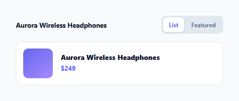
A common but under-served interaction: letting a user switch a single item between a compact "list row" presentation and a large "featured card" presentation, with the container itself smoothly reshaping between the two rather than one layout instantly replacing the other. This snippet builds exactly that — one .panel element that morphs its height, border-radius, internal flex direction, and every child element's size, all driven by a single toggled class.
One element, two layouts, one class
.panel starts as a short horizontal row: flex-direction: row; height: 88px; border-radius: 12px; padding: 14px. Adding .feature flips it into a tall vertical card: flex-direction: column; height: 380px; border-radius: 24px; padding: 0. Every one of those properties — height, border-radius, padding — has its own transition entry sharing a cubic-bezier(0.4, 0, 0.2, 1) curve, so toggling .feature animates the whole container reshaping at once rather than snapping between two fixed layouts.
Why flex-direction gets transition: 0s
CSS cannot meaningfully animate between row and column — it is a discrete keyword, not an interpolatable value — so the panel gives flex-direction an explicit 0s transition duration, meaning it switches instantly while the *animatable* properties around it (height, border-radius, padding) continue their smooth 0.45s transition. Flipping the axis immediately, while the box itself is still mid-morph in every other dimension, is what keeps the layout change from ever looking broken during the transition — children reflow into their new axis right away, inside a container that is still visibly growing to accommodate them.
The thumbnail follows the same recipe
.thumb independently transitions its own width, height, and border-radius — from a small 60×60px rounded square sitting beside the text, to a full-width 220px-tall banner with only its top corners rounded to match the card. Because both the panel and the thumbnail are animating their own dimensions on the same easing curve and duration, they move in visual lockstep rather than one snapping ahead of the other.
Revealing the description without a layout jump
.desc sits at max-height: 0; opacity: 0 in the compact mode and gets max-height: 80px; opacity: 1 in .feature mode, each with a small 0.1s transition-delay so the description only starts fading in once the panel has already grown enough to have room for it — the same content-reveal stagger technique used in modal and accordion morphs, applied here to a full layout switch instead.
Why this differs from a plain crossfade
A naive implementation would render two separate DOM structures — a list-row markup and a card markup — and crossfade their opacity. That approach loses all sense of spatial continuity: the thumbnail appears to teleport rather than grow, and the text reflows instantly rather than settling into its new position. Keeping one single .panel element and animating its actual CSS properties means every pixel the user sees is the *same* element continuously reshaping, which is what makes the transition read as a genuine morph rather than a switch.
Extending to more than two layouts
The same recipe — one shared element, a class per layout state, matching transitions on every dimension that changes, and instant transitions only on genuinely non-interpolatable properties like flex-direction or display — scales to a three-way or N-way layout switcher (grid/list/compact, for example) by adding one class and one set of overrides per additional layout.
Build with AI
Build, Understand, Optimize, and Extend It With AI
Paste this snippet into an AI coding assistant like Claude and ask it to explain why flex-direction is given a 0s transition while everything else around it animates smoothly — that detail is the key to switching a layout's internal axis without ever hitting a broken in-between frame. It is also a solid base to extend: ask the assistant to help you add a third layout mode, or to convert the switch buttons into a proper ARIA radiogroup so the active layout state is announced correctly to screen readers.
Prompt to recreate it
Copy this into your AI assistant of choice to build the effect from scratch, or as a jumping-off point for your own variant:
Build a layout switcher in plain HTML, CSS, and JavaScript where a single panel element morphs between a compact horizontal list-row layout and a tall vertical featured-card layout, driven by one toggled CSS class — no crossfade between two separate markup structures, no animation library.

Requirements:
- One panel element containing a thumbnail box and a text info block, using flexbox.
- A compact "list" CSS state with a small fixed height, small border-radius, row flex-direction, and a small square thumbnail beside the text.
- A "featured" CSS state (toggled by adding a class) with a much taller height, larger border-radius, column flex-direction, and a full-width thumbnail banner above the text.
- Every dimension that changes between the two states (panel height, panel border-radius, panel padding, thumbnail width, thumbnail height, thumbnail border-radius) must have its own CSS transition on a shared easing curve and duration, so the whole panel visibly morphs rather than snapping between states.
- Since flex-direction itself cannot be smoothly animated, give it an explicit zero-duration transition so it switches instantly while the surrounding animatable properties continue transitioning.
- A description paragraph that is hidden (zero max-height, zero opacity) in the compact state and reveals with a short transition-delay in the featured state, so it never clips against a still-growing container.
- Two toggle buttons (List / Featured) that add or remove the featured class and update which button appears active.
Want to tighten it up first? Run this prompt through the AI Prompt Studio to score it across 8 quality dimensions, catch anti-patterns, and tune the wording for Claude, ChatGPT, or Gemini before you paste it in.
Step by step
How to Use
- 1Click FeaturedThe compact list row morphs into a tall featured card — height, border-radius, thumbnail size, and padding all animate together.
- 2Click ListThe card morphs back into the compact row using the exact same transitions in reverse.
- 3Change the two layout sizesEdit the height, border-radius, and thumb dimensions on .panel and .panel.feature .thumb in the CSS panel.
- 4Retime the morphChange the 0.45s duration shared by the height/border-radius/padding transitions.
- 5Add a third layout modeAdd a new switch button, a new CSS class (e.g. .compact), and its own set of dimension/radius overrides.
- 6Export in your formatClick "HTML" for a standalone file, "JSX" for a React component, or "Tailwind" for a React + Tailwind version.
Real-world uses
Common Use Cases
Got questions?
Frequently Asked Questions
A crossfade of two separate DOM structures loses spatial continuity — the thumbnail would appear to jump position instead of growing, and text would reflow instantly rather than settling smoothly. Animating the properties of one shared element keeps every pixel the user sees as the same continuously-reshaping element.
flex-direction is given an explicit transition: 0s, so it switches instantly the moment the class toggles, while the surrounding animatable properties (height, border-radius, padding) continue transitioning smoothly around it. Children reflow into the new axis right away, inside a box that is still visibly growing.
No. Because both layout states live on the same element with explicit CSS dimensions for each state, ordinary CSS transitions can interpolate directly between them. FLIP is needed when elements move between different parents or when target sizes are not known upfront (like height: auto); here they are known in both states.
Yes — add another switch button and a new CSS class (for example .compact) with its own height/border-radius/thumb overrides, following the same pattern used for .feature.
Without the delay, the description text would start fading in at the same instant the panel begins growing, and would visibly clip against the still-small container for the first several frames. The short delay lets the box grow first, then reveals the text once there is room for it.
The switch buttons are plain focusable <button> elements, so keyboard activation already works. For full accessibility, add aria-pressed to reflect the active mode and consider wrapping the switch group in a radiogroup role.