Source Code
<div class="lu-stage">
  <p class="lu-hint">Move your cursor across a link — the underline draws in from wherever you entered</p>
  <nav class="lu-nav">
    <a href="#" class="lu-link">Home</a>
    <a href="#" class="lu-link">Products</a>
    <a href="#" class="lu-link">Documentation</a>
    <a href="#" class="lu-link">Pricing</a>
    <a href="#" class="lu-link">Contact</a>
  </nav>
</div>
* { box-sizing: border-box; margin: 0; padding: 0; }
body { font-family: system-ui, sans-serif; background: #0b1120; display: flex; align-items: center; justify-content: center; min-height: 100vh; }
.lu-stage { display: flex; flex-direction: column; align-items: center; gap: 40px; padding: 24px; }
.lu-hint { font-size: 13px; color: #64748b; text-align: center; max-width: 340px; }
.lu-nav { display: flex; gap: 32px; flex-wrap: wrap; justify-content: center; }
.lu-link {
position: relative;
color: #e2e8f0;
text-decoration: none;
font-size: 17px;
font-weight: 600;
padding-bottom: 4px;
display: inline-block;
}
/* Two pseudo-elements act as a left-growing and right-growing underline half,
each anchored at the cursor's entry x-position via a CSS custom property. */
.lu-link::before,
.lu-link::after {
content: '';
position: absolute;
bottom: 0;
height: 2px;
background: #38bdf8;
width: 0;
transition: width 0.3s cubic-bezier(0.22, 1, 0.36, 1);
}
.lu-link::before { right: calc(100% - var(--lu-x, 50%)); }
.lu-link::after { left: var(--lu-x, 50%); }
.lu-link:hover::before,
.lu-link:hover::after { width: 50%; }
/* width 50% of the link box on each side of --lu-x draws the line outward
from the entry point to both edges simultaneously. */
.lu-link::before { width: 0; }
.lu-link::after { width: 0; }
.lu-link:hover::before { width: var(--lu-left-w, 0); }
.lu-link:hover::after { width: var(--lu-right-w, 0); }// The underline is split into a left half and a right half, both anchored at
// the x-position where the cursor entered the link. On mouseenter we compute
// that position as a percentage and set the exact pixel widths each half needs
// to travel to reach its own edge, so the line visibly "draws itself" outward
// from under the cursor rather than sliding in from a fixed side.
document.querySelectorAll('.lu-link').forEach(function (link) {
link.addEventListener('mouseenter', function (e) {
var rect = link.getBoundingClientRect();
var entryX = e.clientX - rect.left;
var pct = Math.max(0, Math.min(100, (entryX / rect.width) * 100));
link.style.setProperty('--lu-x', pct + '%');
link.style.setProperty('--lu-left-w', entryX + 'px');
link.style.setProperty('--lu-right-w', (rect.width - entryX) + 'px');
});
link.addEventListener('mouseleave', function () {
link.style.setProperty('--lu-left-w', '0px');
link.style.setProperty('--lu-right-w', '0px');
});
});Learn Coding Visually
Learn to code with interactive, live-preview playgrounds — HTML, CSS, JavaScript, React & more.
 HTML Playground42 lessons · Click-based · Live preview
 CSS PlaygroundLearn CSS with a live editor
 JavaScript Playground60 lessons · DOM · Async · Canvas
 React PlaygroundLearn React with a live code editor
 GSAP PlaygroundLearn GSAP animation interactively
 SVG Playground44 lessons · shapes · paths · animation
 SCSS Playground45 lessons · Sass modules · tokens
 Tailwind PlaygroundLearn Tailwind CSS with a live editor
 Bootstrap 5 Playground50 lessons · live preview
Cursor-Follow Underline Draw — Link Hover Snippet
Cursor-Follow Underline Draw · Animations · Plain HTML, CSS & JS · Live preview
What's included
Features
About this UI Snippet
Cursor-Follow Underline Draw — Split Pseudo-Element Underline Anchored to mouseenter X
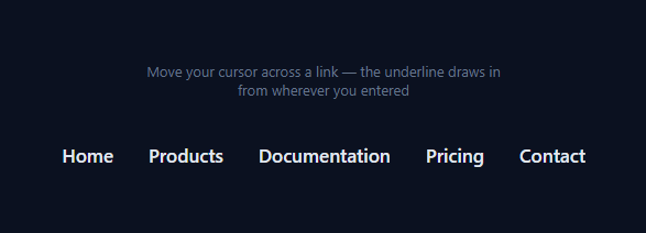
Most animated link underlines grow from a fixed edge — always left-to-right, regardless of where the cursor entered. This effect instead draws the underline outward from the exact horizontal point where the pointer crossed into the link, so a link entered from the right visibly grows rightward-to-leftward and one entered dead-center draws in both directions symmetrically. It reads as far more "aware" of the cursor than a standard animated underline.
Splitting the underline into two independent halves
Instead of one pseudo-element, the link gets two: ::before anchored to grow toward the left edge, and ::after anchored to grow toward the right edge. Both halves share a single anchor point — a CSS custom property --lu-x — using right: calc(100% - var(--lu-x)) on ::before and left: var(--lu-x) on ::after. Whatever --lu-x is set to, both halves start from that exact pixel and grow away from it in opposite directions.
Reading the entry point from `mouseenter`
The mouseenter listener receives the native MouseEvent, from which e.clientX - rect.left gives the cursor's x-offset within the link's own getBoundingClientRect() box — not the viewport, the link itself. That offset becomes entryX, converted to a percentage (--lu-x) for positioning the anchor, and also used directly in pixels to compute exactly how far each half must travel: --lu-left-w is the distance to the left edge, --lu-right-w is the distance to the right edge.
Why explicit widths instead of a flat `50%` on each half
An early, simpler version of this effect just set both halves to width: 50% on hover, which only looks correct when the entry point happens to be the exact center of the link — asymmetric entry points would produce two unequal-looking bars. Setting --lu-left-w and --lu-right-w to the actual pixel distances measured from the real entry point makes both halves finish growing at exactly the same instant, at exactly the link's true edges, no matter where the cursor came in.
The easing
Both halves transition their width with cubic-bezier(0.22, 1, 0.36, 1) — a snappy ease-out that front-loads the motion, so the line appears to shoot outward from the cursor rather than crawl. mouseleave resets both custom properties to 0px, and the same transition eases the retreat back to nothing (from whichever edges they'd reached).
Applying it to your own nav
Any <a> with position: relative and padding-bottom for the underline's vertical offset can use this — the JS attaches to any element matching .lu-link and requires no other markup. This pairs well as a drop-in replacement anywhere a static text-decoration: underline currently sits, for a nav bar, a footer link list, or inline links inside body copy.
Build with AI
Build, Understand, Optimize, and Extend It With AI
You don't have to work out the geometry by hand. Paste this snippet's HTML, CSS, and JS into an AI coding assistant like Claude and ask it to explain exactly why the underline is split into two pseudo-elements sharing one CSS custom property instead of using a single element with a transform-based approach, and why the explicit --lu-left-w / --lu-right-w pixel widths are necessary rather than a flat 50%. The same assistant can help optimize it — for instance asking whether reading getBoundingClientRect on every mouseenter is fine performance-wise for a long list of links, or whether it should be cached and only recomputed on resize. It's also useful for extending the effect: ask it to make the underline retract toward the cursor's exit position instead of just collapsing to zero, add a second color that appears once the underline is fully drawn, or apply the same anchor-point technique to a background-fill hover instead of an underline. Treat the code less like a finished artifact and more like a starting point for a conversation.
Prompt to recreate it
Copy this into your AI assistant of choice to build the effect from scratch, or as a jumping-off point for your own variant:
Build a "cursor-follow underline draw" hover effect for text links in plain HTML, CSS, and JavaScript, with no animation libraries.

Requirements:
- A row of anchor links, each of which shows an animated underline on hover that starts drawing from the exact horizontal position where the cursor entered the link — not always from the left edge and not always from the right edge.
- Implement the underline as two separate elements (or pseudo-elements) anchored at a shared position: one that grows from the entry point toward the link's left edge, and one that grows from the entry point toward the link's right edge, so both grow outward simultaneously in opposite directions.
- On the link's mouseenter event, compute the cursor's x-offset relative to the link's own bounding box (not the page) using getBoundingClientRect, then use that offset to set: the anchor position as a percentage, and the exact pixel distance from that anchor to each edge of the link.
- Both underline halves must finish growing at exactly the link's true left and right edges at the same time, regardless of where within the link the cursor entered — a naive fixed 50%/50% split is not acceptable since it only looks correct for a centered entry point.
- Use a CSS transition with a fast ease-out curve (like cubic-bezier(0.22, 1, 0.36, 1)) to animate the width changes, not a JavaScript animation loop.
- On mouseleave, both underline halves must retract back to zero width using the same transition.
- Keep the implementation reusable: any link with a shared class name should get this behavior automatically via a single querySelectorAll + event listener setup, no per-link inline code.
Want to tighten it up first? Run this prompt through the AI Prompt Studio to score it across 8 quality dimensions, catch anti-patterns, and tune the wording for Claude, ChatGPT, or Gemini before you paste it in.
Step by step
How to Use
- 1Hover a link from different sidesMove your cursor into each nav link from the left, right, or middle — notice the underline always draws outward from your actual entry point.
- 2Move the cursor outLeave the link and the underline retracts back to nothing using the same easing curve.
- 3Change the underline color or thicknessEdit the background and height on the .lu-link::before / ::after rules in the CSS panel.
- 4Adjust the draw speedChange the 0.3s duration or the cubic-bezier easing on the transition: width rule.
- 5Apply to your own nav linksAdd class lu-link to any anchor with position: relative — the JS listener attaches automatically via querySelectorAll.
- 6Export in your formatClick "HTML" for a standalone file, "JSX" for a React component, or "Tailwind" for a React + Tailwind version.
Real-world uses
Common Use Cases
Got questions?
Frequently Asked Questions
The mouseenter event carries e.clientX, the cursor position in viewport coordinates. Subtracting rect.left (from the link's getBoundingClientRect) converts that to a position relative to the link itself, which becomes the anchor point for both underline halves.
A single underline can only grow from one fixed edge. Splitting it into a left-growing ::before and a right-growing ::after, both anchored at the same entry point, lets the line expand in both directions at once from wherever the cursor actually entered.
A flat 50% only looks symmetric when the entry point happens to be dead-center. Computing the real distance from the entry point to each edge (--lu-left-w and --lu-right-w) makes both halves finish exactly at the link's true edges regardless of where the cursor came in.
It is designed for single-line inline-block links. For links that wrap across multiple lines, getBoundingClientRect returns the bounding box of the whole wrapped element, which can make the underline position look off on the second line — keep wrapped links to a plain hover state instead.
Edit the height and background properties on the .lu-link::before and ::after rules in the CSS panel — both halves should stay in sync since they share the same visual style.
Yes. Click "JSX" for a React component. Attach an onMouseEnter handler that reads e.clientX against the target's getBoundingClientRect and calls element.style.setProperty for the three custom properties, plus onMouseLeave to reset them.