Source Code
<div class="bps-phone">
<div class="bps-screen">
<div class="bps-status"><span>9:41</span><span class="bps-batt"><i></i></span></div>
<header class="bps-head">
<button class="bps-back" aria-label="Back">‹</button>
<h1>Boarding Pass</h1>
<button class="bps-share" aria-label="Share">↷</button>
</header>
<div class="bps-scroll">
<div class="bps-card" id="bpsCard">
<div class="bps-face bps-front">
<div class="bps-airline">
<span class="bps-logo">✈</span>
<div><b>Aerolinx</b><small id="bpsClass">Boarding Group B</small></div>
</div>
<div class="bps-route">
<div class="bps-pt"><b>JFK</b><small>New York</small></div>
<div class="bps-plane">
<div class="bps-dots"></div>
<span>✈</span>
</div>
<div class="bps-pt right"><b>LHR</b><small>London</small></div>
</div>
<div class="bps-grid">
<div><small>PASSENGER</small><b>A. Whitfield</b></div>
<div><small>FLIGHT</small><b>AX 204</b></div>
<div><small>DATE</small><b>Sep 14</b></div>
<div><small>GATE</small><b id="bpsGate">C12</b></div>
<div><small>SEAT</small><b>14A</b></div>
<div><small>BOARDING</small><b>10:35</b></div>
</div>
<div class="bps-perf"></div>
<div class="bps-stub">
<div class="bps-stub-row"><span>Departs</span><b>11:05 AM</b></div>
<div class="bps-stub-row"><span>Terminal</span><b>4</b></div>
<button class="bps-flip-btn" id="bpsFlipBtn">Tap to view barcode ↻</button>
</div>
</div>
<div class="bps-face bps-back">
<p class="bps-back-label">Scan at gate</p>
<div class="bps-barcode" aria-hidden="true"></div>
<p class="bps-pnr">PNR <b>Q7X4M2</b></p>
<button class="bps-flip-btn light" id="bpsFlipBack">↻ Back to pass</button>
</div>
</div>
<button class="bps-wallet" id="bpsWallet">
<span></span> Add to Apple Wallet
</button>
<p class="bps-added" id="bpsAdded" hidden>✓ Added to Wallet</p>
</div>
</div>
</div>*{box-sizing:border-box;margin:0;padding:0}
html{scrollbar-width:none;-ms-overflow-style:none}
html::-webkit-scrollbar{display:none}
body{font-family:system-ui,-apple-system,sans-serif;background:#1e293b;display:flex;justify-content:center;align-items:center;min-height:100vh;padding:24px;scrollbar-width:none;-ms-overflow-style:none}
body::-webkit-scrollbar{display:none}
.bps-phone{width:288px;height:600px;background:#0b1220;border-radius:46px;padding:12px;box-shadow:0 30px 60px -20px rgba(0,0,0,.6),inset 0 0 0 2px #1e293b}
.bps-screen{width:100%;height:100%;border-radius:34px;overflow:hidden;background:#f1f5f9;color:#0f172a;display:flex;flex-direction:column}
.bps-status{display:flex;justify-content:space-between;align-items:center;padding:13px 24px 0;font-size:13px;font-weight:700}
.bps-batt{width:22px;height:11px;border:1.4px solid currentColor;border-radius:3px;position:relative;display:inline-block}
.bps-batt::after{content:'';position:absolute;right:-3px;top:3px;width:2px;height:5px;background:currentColor;border-radius:0 1px 1px 0}
.bps-batt i{position:absolute;left:1.4px;top:1.4px;bottom:1.4px;width:82%;background:currentColor;border-radius:1px}
.bps-head{display:flex;align-items:center;justify-content:space-between;padding:8px 14px 12px}
.bps-back,.bps-share{background:rgba(15,23,42,.06);border:none;width:30px;height:30px;border-radius:50%;font-size:16px;color:#0f172a;cursor:pointer}
.bps-back{font-size:20px}
.bps-head h1{font-size:15px;font-weight:800}
.bps-scroll{flex:1;overflow-y:auto;padding:4px 18px 22px;scrollbar-width:none;-ms-overflow-style:none}
.bps-scroll::-webkit-scrollbar{display:none}
.bps-card{position:relative;perspective:1200px;height:378px;margin-bottom:18px}
.bps-face{position:absolute;inset:0;backface-visibility:hidden;transition:transform .5s cubic-bezier(.4,0,.2,1);border-radius:20px;background:#fff;box-shadow:0 14px 30px -14px rgba(0,0,0,.25);overflow:hidden}
.bps-front{transform:rotateY(0)}
.bps-back{transform:rotateY(180deg);display:flex;flex-direction:column;align-items:center;justify-content:center;gap:14px;background:#0f172a;color:#fff;padding:20px}
.bps-card.flipped .bps-front{transform:rotateY(-180deg)}
.bps-card.flipped .bps-back{transform:rotateY(0)}
.bps-airline{display:flex;align-items:center;gap:10px;background:linear-gradient(135deg,#4f46e5,#7c3aed);color:#fff;padding:16px 18px}
.bps-logo{font-size:20px}
.bps-airline b{display:block;font-size:14.5px}
.bps-airline small{font-size:11px;opacity:.85}
.bps-route{display:flex;align-items:center;justify-content:space-between;padding:18px 20px 6px}
.bps-pt b{font-size:22px;letter-spacing:.5px}
.bps-pt small{display:block;font-size:10.5px;color:#94a3b8;margin-top:2px}
.bps-pt.right{text-align:right}
.bps-plane{flex:1;display:flex;align-items:center;justify-content:center;gap:6px;position:relative;color:#6366f1;font-size:15px;padding:0 10px}
.bps-dots{flex:1;border-top:1.6px dashed #cbd5e1}
.bps-grid{display:grid;grid-template-columns:1fr 1fr 1fr;gap:14px 8px;padding:14px 20px}
.bps-grid small{display:block;font-size:9px;color:#94a3b8;letter-spacing:.4px;margin-bottom:3px}
.bps-grid b{font-size:13px}
.bps-perf{height:0;border-top:2px dashed #e2e8f0;margin:2px 0;position:relative}
.bps-perf::before,.bps-perf::after{content:'';position:absolute;top:-9px;width:18px;height:18px;background:#f1f5f9;border-radius:50%}
.bps-perf::before{left:-9px}
.bps-perf::after{right:-9px}
.bps-stub{padding:14px 20px 18px}
.bps-stub-row{display:flex;justify-content:space-between;font-size:12.5px;color:#475569;margin-bottom:8px}
.bps-stub-row b{color:#0f172a}
.bps-flip-btn{width:100%;background:#eef2ff;color:#4f46e5;border:none;border-radius:10px;padding:10px;font-size:12.5px;font-weight:700;cursor:pointer;font-family:inherit;margin-top:6px}
.bps-flip-btn.light{background:rgba(255,255,255,.12);color:#fff}
.bps-back-label{font-size:11px;letter-spacing:.6px;text-transform:uppercase;color:#94a3b8}
.bps-barcode{width:100%;height:64px;background:repeating-linear-gradient(90deg,#fff 0 2px,transparent 2px 4px,#fff 4px 7px,transparent 7px 8px,#fff 8px 11px,transparent 11px 13px)}
.bps-pnr{font-size:13px;color:#cbd5e1}
.bps-pnr b{color:#fff;letter-spacing:2px;margin-left:4px}
.bps-wallet{width:100%;background:#000;color:#fff;border:none;border-radius:12px;padding:13px;font-size:13.5px;font-weight:700;cursor:pointer;font-family:inherit;display:flex;align-items:center;justify-content:center;gap:8px;transition:opacity .15s}
.bps-wallet:hover{opacity:.85}
.bps-added{text-align:center;font-size:12.5px;color:#16a34a;font-weight:700;margin-top:10px}var card = document.getElementById('bpsCard');
document.getElementById('bpsFlipBtn').addEventListener('click', function () {
card.classList.add('flipped');
});
document.getElementById('bpsFlipBack').addEventListener('click', function () {
card.classList.remove('flipped');
});
var walletBtn = document.getElementById('bpsWallet');
var addedMsg = document.getElementById('bpsAdded');
walletBtn.addEventListener('click', function () {
walletBtn.disabled = true;
walletBtn.textContent = 'Adding…';
setTimeout(function () {
walletBtn.style.display = 'none';
addedMsg.hidden = false;
}, 700);
});
// Simulated live gate update, the way a real airline app pushes gate changes.
setTimeout(function () {
var gate = document.getElementById('bpsGate');
gate.textContent = 'C18';
gate.style.color = '#dc2626';
setTimeout(function () { gate.style.color = ''; }, 1500);
}, 4000);Learn Coding Visually
Learn to code with interactive, live-preview playgrounds — HTML, CSS, JavaScript, React & more.
 HTML Playground42 lessons · Click-based · Live preview
 CSS PlaygroundLearn CSS with a live editor
 JavaScript Playground60 lessons · DOM · Async · Canvas
 React PlaygroundLearn React with a live code editor
 GSAP PlaygroundLearn GSAP animation interactively
 SVG Playground44 lessons · shapes · paths · animation
 SCSS Playground45 lessons · Sass modules · tokens
 Tailwind PlaygroundLearn Tailwind CSS with a live editor
 Bootstrap 5 Playground50 lessons · live preview
Mobile Boarding Pass Screen — Free HTML CSS JS Snippet
Mobile Boarding Pass Screen · Mobile · Plain HTML, CSS & JS · Live preview
What's included
Features
About this UI Snippet
Mobile Boarding Pass Screen — Flip-to-Barcode Ticket with Live Gate Update
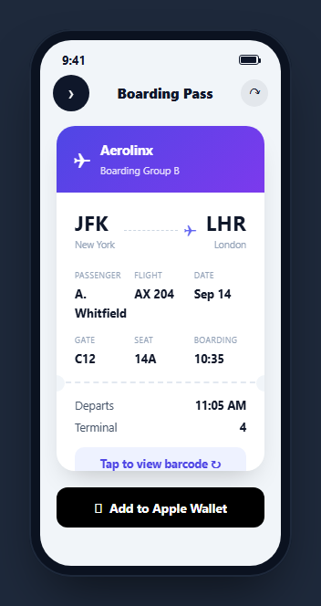
A boarding pass is a ticket UI with a very specific job: show route, time, seat, and gate at a glance from across a security line, then flip to a scannable barcode the instant a gate agent asks for it. This snippet builds that full interaction inside a CSS phone frame — a front face with the standard airline-ticket layout (route, perforated stub, flight details), a genuine 3D flip to a barcode back face, an Apple Wallet-style add button, and a simulated live gate-change push notification.
A real 3D CSS flip, not a fade
The card is two absolutely-positioned .bps-face elements inside a perspective: 1200px container, each with backface-visibility: hidden. The front starts at rotateY(0), the back at rotateY(180deg) — so before any interaction, the back face is already physically behind the front, just rotated out of view. Adding .flipped to the card rotates the front to -180deg and the back to 0deg simultaneously, both eased with the same transition: transform .5s, producing a genuine card-flip rather than a cross-fade. This is the correct technique whenever a UI needs to visually represent "the same object, other side" rather than "a different screen."
The perforated-stub ticket motif
Between the flight-detail grid and the departure/terminal stub, .bps-perf draws a dashed horizontal rule with two circular cutouts positioned at each end via ::before/::after, matching the screen's background color to fake a punched perforation. This single CSS trick is what makes the card read instantly as "ticket" rather than "generic card" — a visual convention borrowed directly from paper boarding passes and still expected in their digital equivalents.
Barcode as pure CSS, not an image
The back face's .bps-barcode element is a single div with a repeating-linear-gradient background alternating white bars of different widths against the dark back-face color — no image request, no canvas, no barcode-generation library. It is a visual stand-in; a production build should render an actual scannable PDF417 or Aztec barcode (via a library like bwip-js) encoded with the real ticket data, since gate scanners need a decodable symbol, not a decorative stripe pattern.
Add to Wallet with a realistic delay
Clicking "Add to Apple Wallet" disables the button, shows an "Adding…" label, and after a brief simulated delay replaces the button with a green confirmation — modeling the real (usually sub-second but non-instant) round trip to generate and register a .pkpass file with the OS wallet app, rather than snapping to success instantly in a way that would feel unconvincing.
A gate change that pushes itself
Four seconds after the screen loads, the gate value updates from C12 to C18 and briefly flashes red before settling back to normal text color — a small simulation of the real-time gate-change push notifications airline apps send, and a reminder that a boarding pass screen is not static: it needs a live-update path from day one, not bolted on later. Wire this to a real WebSocket or polling connection to your flight-ops API in production.
Build with AI
Build, Understand, Optimize, and Extend It With AI
Rather than tracing the flip transform math by hand, paste this snippet's HTML, CSS, and JS into an AI coding assistant like Claude and ask it to explain exactly how backface-visibility: hidden combined with the synchronized rotateY values on the front and back faces produces a convincing 3D flip rather than the two faces briefly overlapping mid-animation. The same assistant can help you optimize it, for instance asking whether the CSS repeating-linear-gradient barcode placeholder should be replaced with a real PDF417 barcode library and how to wire the encoded data through from the ticket details. It is also useful for extending the screen: ask it to add a countdown to boarding time that updates live, connect the simulated gate-change push to a real WebSocket source, or add haptic-feedback-style visual pulses when a gate or time value changes. Treat the code less like a finished artifact and more like a starting point for a conversation.
Prompt to recreate it
Copy this into your AI assistant of choice to build the effect from scratch, or as a jumping-off point for your own variant:
Build a mobile "boarding pass" screen in plain HTML, CSS, and JavaScript, framed inside a CSS phone mockup, with a genuine 3D flip animation between two card faces — no library.

Requirements:
- A front-face ticket card styled like an airline boarding pass: an airline header bar, an origin/destination route row with a dashed line and plane icon between the two airport codes, a details grid (passenger, flight number, date, gate, seat, boarding time), a dashed "perforated" divider line with two circular cutouts at its ends to mimic a torn paper stub, and a departure-time/terminal stub row below it.
- A back-face card, rotated 180 degrees and hidden via backface-visibility so it is invisible until flipped, showing a placeholder scannable barcode built from a pure CSS repeating-linear-gradient (not an image) plus a booking reference code.
- A button on the front that adds a "flipped" class to trigger a real 3D CSS transform flip (using perspective and synchronized rotateY transitions on both faces, not a cross-fade) revealing the barcode back face, and a corresponding button on the back that flips it back to the front.
- An "Add to Wallet" button below the card that, on click, disables itself, shows a brief "Adding…" label, and after a short delay replaces itself with a permanent success confirmation message.
- A simulated live gate-change: a few seconds after the screen loads, the gate value in the details grid must change to a different gate number and briefly flash a warning color before settling back to its normal color, demonstrating how a real-time push update would surface on this screen.
Want to tighten it up first? Run this prompt through the AI Prompt Studio to score it across 8 quality dimensions, catch anti-patterns, and tune the wording for Claude, ChatGPT, or Gemini before you paste it in.
Step by step
How to Use
- 1Paste HTML, CSS, and JSA boarding pass card renders inside a phone frame, front face showing.
- 2Tap "view barcode"The card performs a real 3D flip to reveal the scannable barcode back face.
- 3Flip backTap the back-face button to flip the card back to the ticket details.
- 4Add to WalletClick the wallet button to see the disabled/adding/added state sequence.
- 5Watch the gate updateAfter a few seconds the gate value changes and briefly flashes red, simulating a live push.
- 6Swap in real data and a real barcodeReplace the CSS-stripe placeholder with a generated PDF417/Aztec barcode encoding actual ticket data.
Real-world uses
Common Use Cases
Got questions?
Frequently Asked Questions
Both faces sit absolutely positioned inside a container with perspective set, each with backface-visibility: hidden. The front starts at rotateY(0) and the back at rotateY(180deg), so the back is already physically behind the front before any interaction. Adding a flipped class to the card rotates the front to -180deg and the back to 0deg at the same time, both eased with the same CSS transition, producing a genuine 3D flip.
No — it is a decorative CSS repeating-linear-gradient standing in for a real barcode. Production use requires generating an actual scannable symbol (commonly PDF417 or Aztec for boarding passes) encoding the real ticket data, typically with a library such as bwip-js, and rendering that as an image or canvas element in place of the CSS placeholder.
The .bps-perf element draws a dashed horizontal line with two circular divs positioned at its ends, colored to match the surrounding background so they read as punched-out holes. This single visual trick is what makes the layout instantly recognizable as a ticket rather than a generic info card.
No — it simulates the interaction sequence (disabled state, "Adding…" label, then a success message) with a setTimeout delay. A real implementation generates a signed .pkpass file server-side and either offers it as a download that iOS/Android wallet apps intercept, or uses a platform-specific wallet SDK to register the pass directly.
A setTimeout fires four seconds after the screen loads, changes the gate text content from C12 to C18, and briefly sets its color to red before reverting to the default color after 1.5 seconds. In production, replace this fixed timeout with a real WebSocket or polling subscription to your flight-operations data source.
Keep a boolean flipped state that toggles a CSS class or conditional class list on the card, and a separate walletState (idle/adding/added) that drives the wallet button\u2019s label and disabled attribute. Drive the gate value from real-time flight data (a subscription or polling hook) rather than a fixed timeout once connected to a real API.