Source Code
<div class="mst-phone">
<div class="mst-screen">
<div class="mst-status"><span>9:41</span><span class="mst-batt"><i></i></span></div>
<header class="mst-head">
<button class="mst-back" aria-label="Back">‹</button>
<h1>Settings</h1>
</header>
<div class="mst-search"><span>⚲</span><input id="mstSearch" type="text" placeholder="Search settings" autocomplete="off"></div>
<div class="mst-scroll" id="mstList">
<div class="mst-account">
<div class="mst-ava">AM</div>
<div><b>Alex Morgan</b><small>Apple ID, iCloud, Media & Purchases</small></div>
<em>›</em>
</div>
<div class="mst-group" data-label="Preferences">
<div class="mst-hd">Preferences</div>
<div class="mst-row" data-name="airplane mode"><span class="mst-ic i1">✈</span><span class="mst-lbl">Airplane Mode</span><label class="mst-sw"><input type="checkbox"><i></i></label></div>
<div class="mst-row" data-name="wi-fi"><span class="mst-ic i2">📶</span><span class="mst-lbl">Wi-Fi</span><em class="mst-val">HomeNet <b>›</b></em></div>
<div class="mst-row" data-name="bluetooth"><span class="mst-ic i3">☍</span><span class="mst-lbl">Bluetooth</span><label class="mst-sw"><input type="checkbox" checked><i></i></label></div>
</div>
<div class="mst-group" data-label="Notifications sounds">
<div class="mst-hd">General</div>
<div class="mst-row" data-name="notifications"><span class="mst-ic i4">🔔</span><span class="mst-lbl">Notifications</span><em>›</em></div>
<div class="mst-row" data-name="sounds haptics"><span class="mst-ic i5">🔊</span><span class="mst-lbl">Sounds & Haptics</span><em>›</em></div>
<div class="mst-row" data-name="dark mode appearance"><span class="mst-ic i6">🌙</span><span class="mst-lbl">Dark Appearance</span><label class="mst-sw"><input type="checkbox" id="mstDark"><i></i></label></div>
<div class="mst-row" data-name="screen time"><span class="mst-ic i7">⌛</span><span class="mst-lbl">Screen Time</span><em>›</em></div>
</div>
<div class="mst-group" data-label="Privacy security password">
<div class="mst-hd">Privacy</div>
<div class="mst-row" data-name="face id passcode"><span class="mst-ic i8">🔑</span><span class="mst-lbl">Face ID & Passcode</span><em>›</em></div>
<div class="mst-row" data-name="location services"><span class="mst-ic i9">📍</span><span class="mst-lbl">Location Services</span><em class="mst-val">On <b>›</b></em></div>
</div>
<p class="mst-empty" id="mstEmpty" hidden>No settings match your search.</p>
</div>
</div>
</div>*{box-sizing:border-box;margin:0;padding:0}
html{scrollbar-width:none;-ms-overflow-style:none}
html::-webkit-scrollbar{display:none}
body{font-family:system-ui,-apple-system,sans-serif;background:#1e293b;display:flex;justify-content:center;align-items:center;min-height:100vh;padding:24px;scrollbar-width:none;-ms-overflow-style:none}
body::-webkit-scrollbar{display:none}
.mst-phone{width:288px;height:600px;background:#0b1220;border-radius:46px;padding:12px;box-shadow:0 30px 60px -20px rgba(0,0,0,.6),inset 0 0 0 2px #1e293b}
.mst-screen{width:100%;height:100%;border-radius:34px;overflow:hidden;background:#eef1f6;color:#0f172a;display:flex;flex-direction:column;transition:background .3s,color .3s}
.mst-status{display:flex;justify-content:space-between;align-items:center;padding:13px 24px 0;font-size:13px;font-weight:700}
.mst-batt{width:22px;height:11px;border:1.4px solid currentColor;border-radius:3px;position:relative;display:inline-block}
.mst-batt::after{content:'';position:absolute;right:-3px;top:3px;width:2px;height:5px;background:currentColor;border-radius:0 1px 1px 0}
.mst-batt i{position:absolute;left:1.4px;top:1.4px;bottom:1.4px;width:70%;background:currentColor;border-radius:1px}
.mst-head{display:flex;align-items:center;gap:6px;padding:6px 14px 8px}
.mst-back{background:none;border:none;font-size:24px;color:#6366f1;cursor:pointer;line-height:1}
.mst-head h1{font-size:26px;font-weight:800}
.mst-search{display:flex;align-items:center;gap:7px;margin:0 14px 12px;background:rgba(120,130,150,.14);border-radius:11px;padding:8px 12px}
.mst-search span{color:#94a3b8;font-size:14px}
.mst-search input{flex:1;border:none;background:none;outline:none;font-size:13.5px;font-family:inherit;color:inherit}
.mst-scroll{flex:1;overflow-y:auto;padding:0 14px 18px;scrollbar-width:none;-ms-overflow-style:none}
.mst-scroll::-webkit-scrollbar{display:none}
.mst-account{display:flex;align-items:center;gap:12px;background:#fff;border-radius:14px;padding:12px 14px;margin-bottom:18px;cursor:pointer}
.mst-ava{width:48px;height:48px;border-radius:50%;background:linear-gradient(135deg,#6366f1,#ec4899);color:#fff;font-weight:800;font-size:16px;display:flex;align-items:center;justify-content:center;flex-shrink:0}
.mst-account b{font-size:15px}
.mst-account small{display:block;font-size:11px;color:#94a3b8;margin-top:2px}
.mst-account em{margin-left:auto;font-style:normal;color:#cbd5e1;font-size:20px}
.mst-group{background:#fff;border-radius:14px;overflow:hidden;margin-bottom:18px}
.mst-hd{font-size:11px;font-weight:700;text-transform:uppercase;letter-spacing:.4px;color:#94a3b8;padding:10px 15px 4px}
.mst-row{display:flex;align-items:center;gap:12px;padding:11px 15px;border-top:1px solid #f1f5f9;font-size:14px;font-weight:500}
.mst-hd + .mst-row{border-top:none}
.mst-ic{width:29px;height:29px;border-radius:8px;display:flex;align-items:center;justify-content:center;font-size:15px;color:#fff;flex-shrink:0}
.i1{background:#f59e0b}.i2{background:#3b82f6}.i3{background:#0ea5e9}.i4{background:#ef4444}.i5{background:#ec4899}.i6{background:#6366f1}.i7{background:#8b5cf6}.i8{background:#22c55e}.i9{background:#14b8a6}
.mst-lbl{flex:1}
.mst-row em{font-style:normal;color:#cbd5e1;font-size:18px}
.mst-val{color:#94a3b8;font-size:13px;display:flex;align-items:center;gap:4px}
.mst-val b{color:#cbd5e1;font-size:18px}
.mst-sw{position:relative;width:42px;height:25px;flex-shrink:0;cursor:pointer}
.mst-sw input{opacity:0;width:0;height:0;position:absolute}
.mst-sw i{position:absolute;inset:0;background:#d5dbe4;border-radius:99px;transition:background .2s}
.mst-sw i::after{content:'';position:absolute;left:3px;top:3px;width:19px;height:19px;background:#fff;border-radius:50%;transition:transform .2s;box-shadow:0 1px 3px rgba(0,0,0,.3)}
.mst-sw input:checked + i{background:#22c55e}
.mst-sw input:checked + i::after{transform:translateX(17px)}
.mst-empty{text-align:center;color:#94a3b8;font-size:13px;padding:30px 10px}
.mst-row.hide,.mst-group.hide{display:none}
.mst-screen.dark{background:#000;color:#f1f5f9}
.mst-screen.dark .mst-account,.mst-screen.dark .mst-group{background:#1c1c1e}
.mst-screen.dark .mst-row{border-color:#2c2c2e}
.mst-screen.dark .mst-search{background:rgba(120,130,150,.22)}var list = document.getElementById('mstList');
var search = document.getElementById('mstSearch');
var empty = document.getElementById('mstEmpty');
var screen = document.querySelector('.mst-screen');
var dark = document.getElementById('mstDark');
dark.addEventListener('change', function(){
screen.classList.toggle('dark', this.checked);
});
search.addEventListener('input', function(){
var q = this.value.trim().toLowerCase();
var anyVisible = false;
document.querySelectorAll('.mst-group').forEach(function(group){
var groupText = (group.getAttribute('data-label') || '').toLowerCase();
var rows = group.querySelectorAll('.mst-row');
var groupHasMatch = false;
rows.forEach(function(row){
var name = row.getAttribute('data-name') || '';
var match = q === '' || name.indexOf(q) > -1 || groupText.indexOf(q) > -1;
row.classList.toggle('hide', !match);
if (match) groupHasMatch = true;
});
group.classList.toggle('hide', !groupHasMatch);
if (groupHasMatch) anyVisible = true;
});
empty.hidden = anyVisible;
});
document.querySelectorAll('.mst-row').forEach(function(row){
if (row.querySelector('em')) {
row.style.cursor = 'pointer';
row.addEventListener('click', function(e){
if (e.target.closest('.mst-sw')) return;
row.style.background = 'rgba(99,102,241,.1)';
setTimeout(function(){ row.style.background = ''; }, 160);
});
}
});Learn Coding Visually
Learn to code with interactive, live-preview playgrounds — HTML, CSS, JavaScript, React & more.
 HTML Playground42 lessons · Click-based · Live preview
 CSS PlaygroundLearn CSS with a live editor
 JavaScript Playground60 lessons · DOM · Async · Canvas
 React PlaygroundLearn React with a live code editor
 GSAP PlaygroundLearn GSAP animation interactively
 SVG Playground44 lessons · shapes · paths · animation
 SCSS Playground45 lessons · Sass modules · tokens
 Tailwind PlaygroundLearn Tailwind CSS with a live editor
 Bootstrap 5 Playground50 lessons · live preview
What's included
Features
About this UI Snippet
Mobile Settings Screen — Grouped Preferences UI
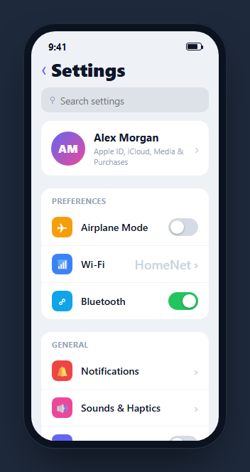
A settings screen is one of the most recognizable patterns in mobile UI — an account card at the top, then grouped cards of rows, each with a colored icon tile, a label, and either a toggle, a value, or a chevron. This snippet builds a complete iOS-style settings page inside a CSS phone frame, with real toggle switches, a live search filter that hides non-matching rows and empty groups, and a dark-appearance switch that restyles the whole screen — in HTML, CSS, and vanilla JavaScript with no dependency.
The grouped-card layout
Settings are organized into .mst-group cards, each opening with an uppercase section header and containing rows separated by hairline top borders. The first row in a group drops its border via the .mst-hd + .mst-row adjacent selector so the header sits flush. This is the exact visual grammar of native settings: rounded white cards floating on a grey background, grouped by concern.
Colored icon tiles
Each row leads with a rounded-square icon tile in a distinct accent color, assigned by numbered classes .i1 through .i9. The tiles give the list a scannable rhythm — you find "Notifications" by its red bell as much as by its label — and they cost nothing but a background color and a centered glyph.
A search filter that respects groups
Typing in the search field runs a filter over every row's data-name and its group's data-label. Non-matching rows get a .hide class, and a group with no visible rows hides entirely so you never see an empty card header. When nothing matches, a friendly empty-state line appears. Matching against both the row name and a broader group label means a search for "password" can surface the Face ID row even though the word isn't in its visible text.
Real toggle switches and dark mode
The switches are genuine checkboxes visually hidden next to an <i> track whose ::after is the knob; the :checked + i sibling selector flips the track green and slides the knob — accessible and keyboard-operable with no JavaScript for the visual state. The dark-appearance toggle is wired: flipping it adds a .dark class that repaints the background black and the cards near-black, exactly like iOS.
Accessibility and performance
The toggles are genuine checkboxes and the search field is a real text input, so the whole screen is keyboard-operable and screen readers announce each control's role and state without extra ARIA. The search filter runs on the input event over a fixed set of rows, toggling a single hide class rather than rebuilding the list, so filtering stays instant even as you type quickly — there is no re-render, only class flips. Because matching tests a lowercased data-name and data-label, the comparison is a cheap substring check with no regex compilation per keystroke. The grouped cards use CSS for their hairline separators and flush-header trick, so there is no JavaScript layout work at all. If you later load hundreds of settings, debounce the filter and consider chunking the render, but for a normal settings screen the direct class-toggle approach is both the simplest and the fastest path.
Reusing it
Swap the groups and rows for your app's real settings, point the value rows and chevrons at your detail screens, and bind each toggle to a stored preference. Lift it out of the phone frame for a responsive web settings page, or keep it framed beside a mobile profile screen to present a full account section.
Build with AI
Build, Understand, Optimize, and Extend It With AI
Instead of manually working out how a search for "password" surfaces the Face ID row, paste this snippet's HTML, CSS, and JS into an AI coding assistant like Claude and ask it to explain how the data-name and data-label attributes combine so the filter matches against synonyms that never appear in the visible label text, and why a whole group hides itself only when none of its rows match. The same assistant can help optimize it, for instance asking whether looping every group and every row on each keystroke would still be fast with a much larger settings tree, or whether the mst-hd plus mst-row adjacent-sibling CSS trick has any edge cases with dynamically reordered rows. It is also useful for extending the screen: ask it to add a settings-search keyboard shortcut, animate the row hide/show instead of an instant display toggle, or sync the dark-appearance switch with the OS-level prefers-color-scheme media query. Treat the code less like a finished artifact and more like a starting point for a conversation.
Prompt to recreate it
Copy this into your AI assistant of choice to build the effect from scratch, or as a jumping-off point for your own variant:
Build a mobile "grouped settings screen" in plain HTML, CSS, and JavaScript, framed inside a CSS phone mockup, using only real checkboxes for toggles and a plain substring search filter — no framework, no search library.

Requirements:
- An account card at the top (avatar, name, subtitle, chevron) followed by several grouped cards, each with an uppercase section header and a list of rows below it separated by hairline top borders; the first row directly under a header must not show a border, using a CSS adjacent-sibling selector rather than a JavaScript conditional.
- Every row starts with a colored square icon tile, then a label, then either a toggle switch, a static value plus chevron, or just a chevron for navigation.
- Every toggle switch must be a real checkbox input, visually hidden, next to a sibling track element whose ::after pseudo-element is the knob, with the on/off appearance driven entirely by a CSS checked plus sibling selector.
- Give every row a hidden "search name" attribute and every group a hidden "group label" attribute that includes broader synonyms not shown in the UI (e.g. a Face ID row's search data should also include the word "password").
- A search input above the list must, on every keystroke, hide any row whose search name and parent group's label attribute don't both fail to contain the (lowercased) query, and must hide an entire group if none of its rows remain visible, and must show a "no settings match" message only when literally nothing is visible anywhere.
- Wire one toggle (dark appearance) to actually restyle the whole screen: flipping it adds a class to the screen container, and CSS under that class must repaint the background, the cards, and the row borders to a dark palette.
- Tapping a navigable row (one with a chevron) must show brief tap feedback, but tapping directly on a toggle switch inside a row must not trigger that same row-tap feedback.
Want to tighten it up first? Run this prompt through the AI Prompt Studio to score it across 8 quality dimensions, catch anti-patterns, and tune the wording for Claude, ChatGPT, or Gemini before you paste it in.
Step by step
How to Use
- 1Paste HTML, CSS, and JSA grouped settings list renders with an account card and several sections inside a phone frame.
- 2Search the settingsType in the search field and non-matching rows and whole empty groups disappear instantly.
- 3See the empty stateSearch for something that does not exist and a friendly "no settings match" line appears.
- 4Flip a toggleThe green iOS-style switches animate their knob on tap.
- 5Turn on Dark AppearanceThe whole screen repaints to black cards on black, just like iOS.
- 6Bind your preferencesWire each toggle and chevron to your real settings and detail screens.
Real-world uses
Common Use Cases
Got questions?
Frequently Asked Questions
On each keystroke the code loops every group, tests each row's data-name against the query, and adds a hide class to non-matches. It also counts how many rows in the group stayed visible; if none did, the whole group gets hidden so you never see a lone section header with no rows under it.
Each row carries a data-name and each group carries a broader data-label with synonyms. The filter matches against both, so Face ID & Passcode (data-name "face id passcode") surfaces for the query "password" even though that exact word is not in the visible label.
Yes. Each switch is a genuine checkbox visually hidden beside an <i> element that acts as the track, with the knob as its ::after pseudo-element. The :checked + i sibling selector drives the on state, so the toggles are keyboard-focusable and need no JavaScript for their visual state.
Yes. Flipping it toggles a dark class on the screen element, and CSS under that class repaints the background to black and the cards to near-black with darker row borders — the same single-class theming approach real apps use for a dark mode setting.
Model the groups and rows as data and render them in a loop, keying rows by id. Drive the search hide state from a filtered derived list rather than mutating classes: compute visible rows from the query in a useMemo (React), computed (Vue), or pipe (Angular). Bind each toggle to a preference in state and the dark class to a theme value. The CSS and Tailwind utilities port directly.