Source Code
<div class="ms-page"><button type="button" class="ms-open" id="msOpen">Set up workspace</button></div>

<div class="ms-backdrop" id="msBackdrop"></div>
<div class="ms-modal" id="msModal" role="dialog" aria-modal="true" aria-label="Setup wizard">
  <div class="ms-dots" id="msDots"></div>
  <div class="ms-viewport"><div class="ms-track" id="msTrack">
    <section class="ms-step"><h3>Welcome 👋</h3><p>Let us set up your workspace in three quick steps.</p></section>
    <section class="ms-step"><h3>Name it</h3><p>Pick a workspace name.</p><input type="text" placeholder="Acme Inc." class="ms-input"></section>
    <section class="ms-step"><h3>Invite team</h3><p>Add teammate emails (optional).</p><input type="text" placeholder="email, email…" class="ms-input"></section>
    <section class="ms-step ms-final"><div class="ms-check">✓</div><h3>All set!</h3><p>Your workspace is ready to go.</p></section>
  </div></div>
  <div class="ms-nav">
    <button type="button" class="ms-btn ms-ghost" id="msBack">Back</button>
    <button type="button" class="ms-btn" id="msNext">Next</button>
  </div>
</div>*{box-sizing:border-box;margin:0;padding:0}
body{font-family:system-ui,-apple-system,sans-serif;background:#f1f5f9;min-height:100vh}
.ms-page{min-height:100vh;display:flex;align-items:center;justify-content:center}
.ms-open{background:#6366f1;color:#fff;border:none;border-radius:11px;padding:12px 24px;font-size:15px;font-weight:700;cursor:pointer;font-family:inherit}
.ms-backdrop{position:fixed;inset:0;background:rgba(15,23,42,.5);opacity:0;pointer-events:none;transition:opacity .25s;z-index:90}
.ms-backdrop.ms-show{opacity:1;pointer-events:all}
.ms-modal{position:fixed;left:50%;top:50%;transform:translate(-50%,-46%) scale(.97);opacity:0;pointer-events:none;
width:min(400px,92vw);background:#fff;border-radius:18px;padding:24px;z-index:91;box-shadow:0 30px 70px rgba(15,23,42,.3);transition:opacity .26s,transform .26s}
.ms-modal.ms-show{opacity:1;transform:translate(-50%,-50%) scale(1);pointer-events:all}
.ms-dots{display:flex;gap:6px;justify-content:center;margin-bottom:18px}
.ms-dot{width:7px;height:7px;border-radius:50%;background:#e2e8f0;transition:background .2s,width .2s}
.ms-dot.ms-active{background:#6366f1;width:20px;border-radius:4px}
.ms-dot.ms-done{background:#a5b4fc}
.ms-viewport{overflow:hidden}
.ms-track{display:flex;transition:transform .35s cubic-bezier(.4,0,.2,1)}
.ms-step{min-width:100%;text-align:center;padding:6px 4px 4px}
.ms-step h3{font-size:19px;font-weight:800;color:#0f172a;margin-bottom:8px}
.ms-step p{font-size:13.5px;color:#64748b;line-height:1.55;margin-bottom:14px}
.ms-input{width:100%;border:1.5px solid #e2e8f0;border-radius:10px;padding:11px 13px;font-size:14px;font-family:inherit;color:#0f172a}
.ms-input:focus{outline:none;border-color:#6366f1;box-shadow:0 0 0 3px rgba(99,102,241,.15)}
.ms-final{display:flex;flex-direction:column;align-items:center}
.ms-check{width:54px;height:54px;border-radius:50%;background:#22c55e;color:#fff;font-size:26px;font-weight:800;display:flex;align-items:center;justify-content:center;margin-bottom:14px}
.ms-nav{display:flex;gap:10px;margin-top:22px}
.ms-btn{flex:1;background:#6366f1;color:#fff;border:none;border-radius:10px;padding:11px;font-size:14px;font-weight:700;cursor:pointer;font-family:inherit;transition:background .15s}
.ms-btn:hover{background:#4f46e5}
.ms-ghost{background:transparent;border:1.5px solid #e2e8f0;color:#475569}
.ms-ghost:hover{background:#f1f5f9}
.ms-ghost:disabled{opacity:.4;cursor:not-allowed}var backdrop = document.getElementById('msBackdrop');
var modal = document.getElementById('msModal');
var track = document.getElementById('msTrack');
var dotsEl = document.getElementById('msDots');
var backBtn = document.getElementById('msBack');
var nextBtn = document.getElementById('msNext');
var steps = track.children.length;
var step = 0;
dotsEl.innerHTML = new Array(steps).fill('<span class="ms-dot"></span>').join('');
var dots = dotsEl.querySelectorAll('.ms-dot');
function update() {
track.style.transform = 'translateX(-' + (step * 100) + '%)';
dots.forEach(function (d, i) {
d.classList.toggle('ms-active', i === step);
d.classList.toggle('ms-done', i < step);
});
backBtn.disabled = step === 0;
nextBtn.textContent = step === steps - 1 ? 'Done' : (step === steps - 2 ? 'Finish' : 'Next');
}
function open() {
backdrop.classList.add('ms-show'); modal.classList.add('ms-show');
step = 0; update();
}
function close() { backdrop.classList.remove('ms-show'); modal.classList.remove('ms-show'); }
nextBtn.addEventListener('click', function () {
if (step < steps - 1) { step++; update(); }
else close(); // last step "Done" closes the wizard
});
backBtn.addEventListener('click', function () { if (step > 0) { step--; update(); } });
document.getElementById('msOpen').addEventListener('click', open);
backdrop.addEventListener('click', close);
document.addEventListener('keydown', function (e) { if (e.key === 'Escape' && modal.classList.contains('ms-show')) close(); });Learn Coding Visually
Learn to code with interactive, live-preview playgrounds — HTML, CSS, JavaScript, React & more.
 HTML Playground42 lessons · Click-based · Live preview
 CSS PlaygroundLearn CSS with a live editor
 JavaScript Playground60 lessons · DOM · Async · Canvas
 React PlaygroundLearn React with a live code editor
 GSAP PlaygroundLearn GSAP animation interactively
 SVG Playground44 lessons · shapes · paths · animation
 SCSS Playground45 lessons · Sass modules · tokens
 Tailwind PlaygroundLearn Tailwind CSS with a live editor
 Bootstrap 5 Playground50 lessons · live preview
Multi-Step Modal — Wizard Dialog HTML CSS JS
Multi-Step Modal · Modals · Plain HTML, CSS & JS · Live preview
What's included
Features
About this UI Snippet
Multi-Step Modal — A Sliding Wizard Dialog with Progress Dots and Step Controls
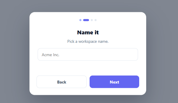
A multi-step modal walks the user through a short flow — onboarding, setup, a guided form — inside a dialog, one step at a time, with progress dots and back/next controls. It keeps the user focused on a single decision per screen rather than facing a long form. This snippet builds it in plain HTML, CSS, and vanilla JavaScript: horizontally-sliding steps, animated progress dots, smart navigation, and a success finish — no library.
Steps slide on a track
All steps live side by side on a flex track inside an overflow: hidden viewport, each step min-width: 100%. Advancing translates the track by -step × 100%, so steps slide horizontally like a carousel. Building the wizard as one sliding track (rather than toggling display per step) gives a smooth animated transition between steps and keeps all step content in the DOM, which preserves any input the user has typed as they move back and forth.
Progress dots that show position and history
A row of dots reflects progress: the current step's dot widens into a pill (active), completed steps' dots are tinted (done), and upcoming ones stay grey. Showing both where you are and how far you've come orients the user in the flow — they can see it's a short, finite process, which reduces the abandonment a long unmarked form causes. The dots are generated from the step count, so they always match.
Navigation that adapts
One step index drives everything through update(): the track position, the dot states, the disabled state of Back (off on the first step), and the Next button's label — which becomes "Finish" on the penultimate step and "Done" on the last, where it closes the wizard. Deriving the whole UI from a single index keeps the navigation consistent and makes the button semantics (you can't go back from step one; the last action closes) clear.
A polished modal shell
The dialog is role="dialog" with aria-modal, dims the page behind a backdrop, and opens with a subtle scale-and-fade. It resets to step one each time it opens, and closes via the backdrop, Escape, or finishing — all standard modal conventions. The final step is a success state with a check, the satisfying "you're done" confirmation a wizard should end on.
Drop-in and adaptable
Add or remove <section class="ms-step"> elements and the dots, navigation, and sliding all adapt to the new count automatically. Put your real form fields in the steps and validate before advancing (gate the Next handler), and it becomes the wizard for any multi-step flow. It's a clear reference for sliding step navigation and single-index wizard state. Since the modal resets to step one on every open, a returning user who closes mid-flow loses their place by design here — for a setup wizard people might abandon and come back to, persist the current step (and entered values) to localStorage or your app state, and have open() restore from that instead of always resetting to zero.
Build with AI
Build, Understand, Optimize, and Extend It With AI
Rather than tracing the carousel math yourself, paste this snippet's HTML, CSS, and JS into an AI coding assistant like Claude and ask it to explain exactly why the track's transform is computed as negative step times 100 percent, and why keeping every step section mounted on the flex track (instead of toggling display per step) is what lets typed input survive moving back and forth. The same assistant can help optimize it, for instance checking whether the wizard resetting to step zero on every open is the right default versus remembering where a user left off, or whether the translateX transition duration should adapt based on how many steps are being crossed at once. It's also good for extending the modal: ask it to gate the Next button on real field validation for the "name it" and "invite team" steps, animate the progress dots with a spring easing, or persist in-progress answers to localStorage across page reloads. Treat the code less like a finished artifact and more like a starting point for a conversation.
Prompt to recreate it
Copy this into your AI assistant of choice to build the effect from scratch, or as a jumping-off point for your own variant:
Build a "multi-step modal wizard" in plain HTML, CSS, and JavaScript using a horizontally sliding track — no carousel library, no framework.

Requirements:
- A modal dialog (role="dialog", aria-modal) that dims the page behind a backdrop and opens with a scale-and-fade transition, opened by a trigger button and closable via clicking the backdrop, pressing Escape, or completing the flow.
- All wizard steps live side by side as full-width sections inside a flex container placed in an overflow-hidden viewport; advancing or going back must animate by transforming the flex container horizontally by exactly negative (current step index times 100 percent), not by toggling each step's display property.
- A row of progress dots, generated to match however many steps exist, where the current step's dot is visually distinct (e.g. widened into a pill), completed steps are tinted differently from upcoming ones, and this must be recomputed from a single step-index variable.
- The Back button must be disabled on the very first step. The Next/primary button's label must change based on position: a normal label mid-flow, a distinct label on the second-to-last step, and on the very last step clicking it must close the entire wizard instead of advancing further.
- Every time the modal is opened (including reopening after a previous close), it must reset back to the first step.
- The final step must be visually distinct from the rest — a centered success icon and confirmation copy rather than another input step.
- Adding or removing a step section must require zero changes to the JavaScript — the step count, dot generation, and slide math must all derive from reading the DOM at runtime.
Want to tighten it up first? Run this prompt through the AI Prompt Studio to score it across 8 quality dimensions, catch anti-patterns, and tune the wording for Claude, ChatGPT, or Gemini before you paste it in.
Step by step
How to Use
- 1Paste HTML, CSS, and JSA button opens a wizard modal with four sliding steps and progress dots.
- 2Open the wizardClick "Set up workspace" — the modal fades in at step one.
- 3Move between stepsUse Next/Back to slide between steps; the dots and button labels update.
- 4FinishOn the last step the button reads Done and closes the wizard.
- 5Add or remove stepsAdd or delete a <section class="ms-step"> — the dots and navigation adapt automatically.
- 6Gate on validationValidate the current step's fields in the Next handler before advancing.
Real-world uses
Common Use Cases
Got questions?
Frequently Asked Questions
Putting all steps on a flex track and translating it gives a smooth animated slide between steps and keeps every step in the DOM. That means any text a user typed on step two is still there if they go back from step three — toggling display:none per step also works but loses the slide animation, and recreating step DOM would risk discarding input. The carousel approach is smoother and state-preserving.
Everything derives from a single step index via update(): the track translates by -step × 100%, each dot is marked active (current), done (before current), or upcoming, Back is disabled on step zero, and Next's label changes to Finish on the second-to-last step and Done on the last (where it closes). One source of truth keeps the dots, slide, and buttons perfectly in sync.
Gate the Next handler: before incrementing step, check the current step's fields and only advance if they're valid (otherwise show an error and return). Because the steps are real DOM, you can read their inputs directly. This keeps validation per-step while the slide, dots, and controls continue to work off the step index.
Add or delete a <section class="ms-step"> in the track. The code reads the step count from the track's children, generates that many dots, and the slide math uses 100% per step — so the dots, navigation labels, and transitions all adapt to the new count with no other changes. Keep the final step as your success/confirmation screen.
Hold the step index and open state in state; render steps from an array and translate the track from the index. In React use useState plus a useEffect for the Escape listener; in Vue, refs with onMounted; in Angular, properties with HostListener. The slide math and dot logic are framework-agnostic — only the step state and listeners move into the framework.