Source Code
<div class="neu-wrap">
  <button class="neu-btn">Play</button>
  <button class="neu-btn neu-icon" aria-label="Like">
    <svg width="20" height="20" viewBox="0 0 24 24" fill="none" stroke="#6b7280" stroke-width="2"><path d="M20.84 4.61a5.5 5.5 0 0 0-7.78 0L12 5.67l-1.06-1.06a5.5 5.5 0 0 0-7.78 7.78l1.06 1.06L12 21.23l7.78-7.78 1.06-1.06a5.5 5.5 0 0 0 0-7.78z"/></svg>
  </button>
  <button class="neu-btn neu-pressed">Selected</button>
</div>
* { box-sizing: border-box; margin: 0; padding: 0; }
body { font-family: system-ui, sans-serif; background: #e0e5ec; padding: 48px; display: flex; align-items: center; flex-direction: column; gap: 20px; justify-content: center; min-height: 100vh; }
.neu-wrap { display: flex; align-items: center; gap: 24px; flex-wrap: wrap; }
.neu-btn {
padding: 14px 28px;
font-size: 14px;
font-weight: 600;
color: #4b5563;
background: #e0e5ec;
border: none;
border-radius: 14px;
cursor: pointer;
box-shadow: 6px 6px 12px #b8bec7, -6px -6px 12px #ffffff;
transition: box-shadow 0.15s ease, transform 0.1s ease;
}
.neu-btn:hover { color: #374151; }
.neu-btn:active {
box-shadow: inset 4px 4px 8px #b8bec7, inset -4px -4px 8px #ffffff;
transform: scale(0.99);
}
.neu-btn:focus-visible { outline: 2px solid #6366f1; outline-offset: 3px; }
.neu-icon {
padding: 14px;
border-radius: 50%;
display: flex;
align-items: center;
justify-content: center;
}
.neu-pressed {
box-shadow: inset 4px 4px 8px #b8bec7, inset -4px -4px 8px #ffffff;
color: #6366f1;
}document.querySelectorAll('.neu-btn:not(.neu-pressed)').forEach(btn => {
btn.addEventListener('click', () => {
btn.classList.add('neu-clicked');
setTimeout(() => btn.classList.remove('neu-clicked'), 150);
});
});Learn Coding Visually
Learn to code with interactive, live-preview playgrounds — HTML, CSS, JavaScript, React & more.
 HTML Playground42 lessons · Click-based · Live preview
 CSS PlaygroundLearn CSS with a live editor
 JavaScript Playground60 lessons · DOM · Async · Canvas
 React PlaygroundLearn React with a live code editor
 GSAP PlaygroundLearn GSAP animation interactively
 SVG Playground44 lessons · shapes · paths · animation
 SCSS Playground45 lessons · Sass modules · tokens
 Tailwind PlaygroundLearn Tailwind CSS with a live editor
 Bootstrap 5 Playground50 lessons · live preview
Neumorphic Button — Free HTML CSS JS Soft UI Button Snippet
Neumorphic Button · Buttons · Plain HTML, CSS & JS · Live preview
What's included
Features
About this UI Snippet
Neumorphic Button — HTML & CSS Soft-UI Embossed Button
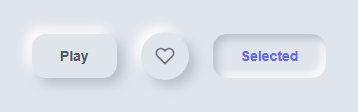
Neumorphism (a portmanteau of "new" and "skeuomorphism") is a style where UI elements appear to be extruded from or pressed into a single-colored background, using only shadows — no gradients, borders, or images. This snippet demonstrates the technique with three button states: a resting embossed button, an icon-only circular variant, and a permanently "pressed" selected state.
How the embossed effect works
The trick relies on two shadows going in opposite directions, both cast onto a background that matches the button's own color (#e0e5ec for both). One shadow is dark and offset down-right (6px 6px 12px #b8bec7), simulating a light source from the top-left casting a shadow away from it. The second shadow is light and offset up-left (-6px -6px 12px #ffffff), simulating the same light source catching the top-left edge of the raised surface. Because the button and background share the exact same base color, there's no visible edge or border — the only way you perceive the button's shape is through where the two shadows fall, which is exactly what makes it read as "raised" rather than flat.
How the pressed state works
On :active (and on the permanently-selected .neu-pressed class), both shadows switch to inset. Inset shadows are cast *inward* from the button's edges rather than outward onto the background, which flips the visual read from "raised bump" to "pressed dent." The dark inset shadow still sits down-right and the light one up-left, preserving the same simulated light direction — only the direction of the shadow (outward vs. inward) changes.
Why the background color must match
If the button's background color differs from the page background even slightly, the shadow trick breaks down into an ordinary drop shadow with a visible box outline. Neumorphism only works when the element is the *same* color as its container, relying entirely on the dual-shadow illusion for depth. This is also why neumorphic UI needs generous padding and spacing between elements — the shadows are the entire visual language, and elements need visual room to "breathe" for the illusion to register clearly.
Accessibility tradeoff
Because neumorphic buttons deliberately minimize contrast and hard edges, they can be harder to distinguish for low-vision users. This snippet adds a visible :focus-visible outline in a contrasting brand color so keyboard users always get a clear focus indicator regardless of the shadow-only styling.
Build with AI
Build, Understand, Optimize, and Extend It With AI
Ask an AI assistant to explain precisely why matching the button's background color to the page background is non-negotiable for the neumorphic effect, and what happens visually if you nudge just one of the two colors slightly. It's also useful to ask the assistant to generate a dark-mode neumorphic palette, or to add a subtle scale/shadow-blur transition so the raised-to-pressed transformation feels more physical, since getting the timing and easing right is mostly a matter of taste and iteration.
Prompt to recreate it
Copy this into your AI assistant of choice to build the effect from scratch, or as a jumping-off point for your own variant:
Build a "neumorphic button" (soft-UI embossed style) using only HTML and CSS, with optional minimal JavaScript for a click feedback flag.

Requirements:
- The button's background color must be identical to its page/container background color — the shape must be defined entirely by shadows, not by any visible border or color contrast.
- Apply two box-shadows to the resting button: one dark, offset down and to the right, and one light, offset up and to the left, both using the same blur radius, to simulate a raised surface lit from the top-left.
- On :active (and via a separate .pressed utility class for a permanently-selected state), flip both shadows to inset so the button reads as pressed into the surface rather than raised out of it, while keeping the same simulated light direction.
- Include a circular icon-only variant using the identical shadow technique.
- Add a visible, high-contrast :focus-visible outline so keyboard users get a clear focus indicator despite the intentionally low-contrast neumorphic aesthetic.
- No external images, gradients, or icon fonts — inline SVG only for any icon.
Want to tighten it up first? Run this prompt through the AI Prompt Studio to score it across 8 quality dimensions, catch anti-patterns, and tune the wording for Claude, ChatGPT, or Gemini before you paste it in.
Step by step
How to Use
- 1Load the snippetClick "Neumorphic Button" in the sidebar Library tab to see the resting, icon, and pressed variants.
- 2Click and hold a buttonNotice the shadows flip from outward to inset, and the button appears to press into the surface.
- 3Match your backgroundChange both the body background-color and the .neu-btn background to the same new hex value — they must always match.
- 4Tune the shadow intensityAdjust the blur/offset values and the two shadow colors in .neu-btn to make the emboss subtler or more dramatic.
- 5Add the permanent pressed stateApply the .neu-pressed class to any button you want to show as currently selected, like a toggled filter.
- 6Export and saveUse the export buttons for HTML/JSX/Tailwind, or click "Save as" to keep a customized palette.
Real-world uses
Common Use Cases
Got questions?
Frequently Asked Questions
Neumorphism is a UI style where elements appear extruded from or pressed into a single-colored background using only paired light and dark shadows — no visible borders, gradients, or images define the shape.
The illusion depends on the button blending seamlessly into its background so only the shadow pair defines its edges. Any visible color difference between the button and its container breaks the effect into an ordinary flat button with a drop shadow.
The :active state switches both box-shadows from their normal outward direction to inset, which is cast from the inside edges of the element rather than onto the page behind it — visually flipping the button from raised to recessed.
The style intentionally minimizes contrast between elements and their background, which can make boundaries and states hard to perceive for users with low vision. Always pair it with a strong, high-contrast focus indicator and consider offering a higher-contrast theme alternative.
Yes — pick a dark base color and use a lighter shade of that same hue for the "highlight" shadow and a darker shade for the "shadow" shadow, keeping the button background identical to the page background.
No — the emboss and pressed effects are pure CSS via :active. The included JS only adds an optional temporary class for a subtle click ripple/feedback effect and is not required for the core look.
Add the .neu-pressed class, which applies the same inset shadow pair used for :active, so the button stays visually "pressed in" until the class is removed.