Source Code
<div class="sc-root">
  <div class="sc-stack-wrap">
    <div class="sc-stack" id="sc-stack"></div>
    <div class="sc-done" id="sc-done" hidden>
      <div class="sc-done-emoji">🎉</div>
      <p class="sc-done-title">All done!</p>
      <p class="sc-done-sub">You've seen everyone.</p>
      <button class="sc-restart-btn" id="sc-restart">Restart</button>
    </div>
  </div>
  <div class="sc-actions">
    <button class="sc-action-btn sc-nope" id="sc-nope-btn" aria-label="Reject">
      <svg width="26" height="26" viewBox="0 0 24 24" fill="none" stroke="currentColor" stroke-width="2.5" stroke-linecap="round" stroke-linejoin="round"><line x1="18" y1="6" x2="6" y2="18"/><line x1="6" y1="6" x2="18" y2="18"/></svg>
    </button>
    <button class="sc-action-btn sc-like" id="sc-like-btn" aria-label="Accept">
      <svg width="26" height="26" viewBox="0 0 24 24" fill="none" stroke="currentColor" stroke-width="2.5" stroke-linecap="round" stroke-linejoin="round"><path d="M20.84 4.61a5.5 5.5 0 0 0-7.78 0L12 5.67l-1.06-1.06a5.5 5.5 0 0 0-7.78 7.78l1.06 1.06L12 21.23l7.78-7.78 1.06-1.06a5.5 5.5 0 0 0 0-7.78z"/></svg>
    </button>
  </div>
  <p class="sc-hint">Drag · Arrow keys · Buttons</p>
</div>
* { box-sizing: border-box; margin: 0; padding: 0; }
body {
font-family: system-ui, -apple-system, sans-serif;
background: #f1f5f9;
min-height: 100vh;
display: flex;
align-items: center;
justify-content: center;
padding: 24px 16px;
}
/* ── Root layout ── */
.sc-root {
display: flex;
flex-direction: column;
align-items: center;
gap: 28px;
width: 100%;
}
/* ── Stack wrapper ── */
.sc-stack-wrap {
position: relative;
width: 300px;
height: 400px;
}
.sc-stack {
position: relative;
width: 100%;
height: 100%;
}
/* ── Individual card ── */
.sc-card {
position: absolute;
inset: 0;
border-radius: 20px;
overflow: hidden;
cursor: grab;
user-select: none;
touch-action: none;
will-change: transform;
box-shadow: 0 8px 32px rgba(0,0,0,0.14), 0 2px 8px rgba(0,0,0,0.08);
transition: transform 0.35s cubic-bezier(0.34, 1.56, 0.64, 1);
}
.sc-card.is-dragging {
cursor: grabbing;
transition: none;
}
.sc-card.is-flying {
transition: transform 0.45s cubic-bezier(0.4, 0, 0.2, 1), opacity 0.45s ease;
}
/* Card gradient background */
.sc-card-bg {
position: absolute;
inset: 0;
}
/* Card content */
.sc-card-content {
position: absolute;
inset: 0;
display: flex;
flex-direction: column;
justify-content: flex-end;
padding: 24px 22px;
background: linear-gradient(to top, rgba(0,0,0,0.55) 0%, rgba(0,0,0,0.1) 55%, transparent 100%);
}
.sc-card-name {
font-size: 22px;
font-weight: 800;
color: #fff;
line-height: 1.2;
text-shadow: 0 1px 4px rgba(0,0,0,0.3);
}
.sc-card-role {
font-size: 13px;
font-weight: 500;
color: rgba(255,255,255,0.88);
margin-top: 4px;
text-shadow: 0 1px 3px rgba(0,0,0,0.3);
}
.sc-card-location {
display: flex;
align-items: center;
gap: 4px;
font-size: 12px;
color: rgba(255,255,255,0.72);
margin-top: 6px;
}
.sc-card-location svg {
flex-shrink: 0;
}
/* ── Stamps ── */
.sc-stamp {
position: absolute;
top: 28px;
font-size: 28px;
font-weight: 900;
letter-spacing: 0.08em;
padding: 6px 14px;
border-radius: 8px;
border-width: 3px;
border-style: solid;
opacity: 0;
pointer-events: none;
transform: rotate(-12deg);
transition: opacity 0.06s linear;
}
.sc-stamp-like {
right: 18px;
color: #22c55e;
border-color: #22c55e;
transform: rotate(12deg);
}
.sc-stamp-nope {
left: 18px;
color: #ef4444;
border-color: #ef4444;
transform: rotate(-12deg);
}
/* ── Done state ── */
.sc-done {
position: absolute;
inset: 0;
display: flex;
flex-direction: column;
align-items: center;
justify-content: center;
background: #fff;
border-radius: 20px;
box-shadow: 0 8px 32px rgba(0,0,0,0.10);
gap: 8px;
animation: sc-fade-in 0.4s ease;
}
.sc-done-emoji { font-size: 52px; }
.sc-done-title { font-size: 22px; font-weight: 800; color: #0f172a; }
.sc-done-sub { font-size: 14px; color: #64748b; }
.sc-restart-btn {
margin-top: 12px;
padding: 10px 28px;
background: #6366f1;
color: #fff;
font-size: 14px;
font-weight: 700;
border: none;
border-radius: 50px;
cursor: pointer;
transition: opacity 0.15s, transform 0.15s;
}
.sc-restart-btn:hover { opacity: 0.88; transform: scale(1.04); }
/* ── Action buttons ── */
.sc-actions {
display: flex;
gap: 28px;
}
.sc-action-btn {
width: 60px;
height: 60px;
border-radius: 50%;
border: none;
cursor: pointer;
display: flex;
align-items: center;
justify-content: center;
transition: transform 0.15s, box-shadow 0.15s;
}
.sc-action-btn:hover { transform: scale(1.12); }
.sc-action-btn:active { transform: scale(0.95); }
.sc-nope {
background: #fff;
color: #ef4444;
box-shadow: 0 4px 16px rgba(239,68,68,0.22);
}
.sc-like {
background: #fff;
color: #22c55e;
box-shadow: 0 4px 16px rgba(34,197,94,0.22);
}
/* ── Hint ── */
.sc-hint {
font-size: 12px;
color: #94a3b8;
text-align: center;
}
@keyframes sc-fade-in {
from { opacity: 0; transform: scale(0.92); }
to { opacity: 1; transform: scale(1); }
}const CARDS = [
{
name: 'Aria Chen',
role: 'Product Designer',
location: 'San Francisco, CA',
gradient: 'linear-gradient(135deg, #667eea 0%, #764ba2 100%)',
},
{
name: 'Marcus Reid',
role: 'Full-Stack Engineer',
location: 'Austin, TX',
gradient: 'linear-gradient(135deg, #f093fb 0%, #f5576c 100%)',
},
{
name: 'Sofia Torres',
role: 'UX Researcher',
location: 'New York, NY',
gradient: 'linear-gradient(135deg, #4facfe 0%, #00f2fe 100%)',
},
{
name: 'Kai Nakamura',
role: 'iOS Developer',
location: 'Seattle, WA',
gradient: 'linear-gradient(135deg, #43e97b 0%, #38f9d7 100%)',
},
{
name: 'Leila Osman',
role: 'Data Scientist',
location: 'Chicago, IL',
gradient: 'linear-gradient(135deg, #fa709a 0%, #fee140 100%)',
},
{
name: 'Devon Blake',
role: 'Brand Strategist',
location: 'Los Angeles, CA',
gradient: 'linear-gradient(135deg, #a18cd1 0%, #fbc2eb 100%)',
},
];
const THROW_THRESHOLD = 80; // px — minimum drag to trigger a swipe
const MAX_ROTATION = 18; // degrees — cap on tilt
const VISIBLE_COUNT = 4; // how many stacked cards to render
const stack = document.getElementById('sc-stack');
const doneEl = document.getElementById('sc-done');
const nopeBtn = document.getElementById('sc-nope-btn');
const likeBtn = document.getElementById('sc-like-btn');
const restart = document.getElementById('sc-restart');
let deck = [...CARDS]; // remaining cards (top of array = top of visual stack)
let topCard = null; // the DOM element currently being dragged
let isDragging = false;
let startX = 0, startY = 0, currentX = 0, currentY = 0;
/* ────────────────────────────────────────────
Build / re-render the visible card stack
──────────────────────────────────────────── */
function renderStack() {
stack.innerHTML = '';
topCard = null;
if (deck.length === 0) {
doneEl.hidden = false;
return;
}
doneEl.hidden = true;
// Render up to VISIBLE_COUNT cards, bottom-first so top card is last in DOM (highest z-index naturally)
const visible = deck.slice(0, VISIBLE_COUNT);
visible.reverse().forEach((data, revIdx) => {
const idx = (visible.length - 1) - revIdx; // 0 = top card
const card = createCard(data, idx, visible.length);
stack.appendChild(card);
if (idx === 0) topCard = card;
});
if (topCard) attachDragListeners(topCard);
}
/* ────────────────────────────────────────────
Create a single card element
──────────────────────────────────────────── */
function createCard(data, stackIdx, totalVisible) {
const card = document.createElement('div');
card.className = 'sc-card';
// Stack offset: top card is biggest / frontmost
const scale = 1 - stackIdx * 0.04;
const translateY = stackIdx * 12;
card.style.transform = `translateY(${translateY}px) scale(${scale})`;
card.style.zIndex = totalVisible - stackIdx;
// Background gradient
const bg = document.createElement('div');
bg.className = 'sc-card-bg';
bg.style.background = data.gradient;
// Stamps
const stampLike = document.createElement('span');
stampLike.className = 'sc-stamp sc-stamp-like';
stampLike.textContent = 'LIKE';
const stampNope = document.createElement('span');
stampNope.className = 'sc-stamp sc-stamp-nope';
stampNope.textContent = 'NOPE';
// Content
const content = document.createElement('div');
content.className = 'sc-card-content';
const name = document.createElement('div');
name.className = 'sc-card-name';
name.textContent = data.name;
const role = document.createElement('div');
role.className = 'sc-card-role';
role.textContent = data.role;
const loc = document.createElement('div');
loc.className = 'sc-card-location';
loc.innerHTML = `<svg width="12" height="12" viewBox="0 0 24 24" fill="none" stroke="currentColor" stroke-width="2.5" stroke-linecap="round" stroke-linejoin="round"><path d="M21 10c0 7-9 13-9 13S3 17 3 10a9 9 0 0 1 18 0z"/><circle cx="12" cy="10" r="3"/></svg>` + data.location;
content.append(name, role, loc);
card.append(bg, stampLike, stampNope, content);
return card;
}
/* ────────────────────────────────────────────
Apply drag transform to the top card
──────────────────────────────────────────── */
function applyDragTransform(card, dx, dy) {
const rotate = Math.min(Math.max(dx / 12, -MAX_ROTATION), MAX_ROTATION);
card.style.transform = `translate(${dx}px, ${dy}px) rotate(${rotate}deg)`;
// Stamp opacity based on horizontal drag distance
const ratio = Math.min(Math.abs(dx) / THROW_THRESHOLD, 1);
const stampLike = card.querySelector('.sc-stamp-like');
const stampNope = card.querySelector('.sc-stamp-nope');
stampLike.style.opacity = dx > 0 ? ratio : 0;
stampNope.style.opacity = dx < 0 ? ratio : 0;
}
/* ────────────────────────────────────────────
Fly card off-screen then remove from deck
──────────────────────────────────────────── */
function flyOut(card, direction) {
const flyX = direction === 'right' ? 600 : -600;
card.classList.add('is-flying');
card.style.transform = `translate(${flyX}px, ${currentY * 0.5}px) rotate(${direction === 'right' ? MAX_ROTATION : -MAX_ROTATION}deg)`;
card.style.opacity = '0';
// Remove from deck and re-render after animation
deck.shift();
card.addEventListener('transitionend', () => {
renderStack();
}, { once: true });
}
/* ────────────────────────────────────────────
Snap card back to stack position
──────────────────────────────────────────── */
function snapBack(card) {
card.classList.remove('is-dragging');
card.style.transform = 'translateY(0px) scale(1)';
const stampLike = card.querySelector('.sc-stamp-like');
const stampNope = card.querySelector('.sc-stamp-nope');
stampLike.style.opacity = '0';
stampNope.style.opacity = '0';
}
/* ────────────────────────────────────────────
Drag event handlers (mouse + touch)
──────────────────────────────────────────── */
function getEventCoords(e) {
if (e.touches && e.touches.length) {
return { x: e.touches[0].clientX, y: e.touches[0].clientY };
}
return { x: e.clientX, y: e.clientY };
}
function onPointerDown(e) {
if (e.button !== undefined && e.button !== 0) return; // left-click only for mouse
isDragging = true;
const coords = getEventCoords(e);
startX = coords.x;
startY = coords.y;
currentX = 0;
currentY = 0;
topCard.classList.add('is-dragging');
}
function onPointerMove(e) {
if (!isDragging || !topCard) return;
const coords = getEventCoords(e);
currentX = coords.x - startX;
currentY = coords.y - startY;
applyDragTransform(topCard, currentX, currentY);
}
function onPointerUp() {
if (!isDragging || !topCard) return;
isDragging = false;
topCard.classList.remove('is-dragging');
if (Math.abs(currentX) >= THROW_THRESHOLD) {
flyOut(topCard, currentX > 0 ? 'right' : 'left');
} else {
snapBack(topCard);
}
}
function attachDragListeners(card) {
// Mouse
card.addEventListener('mousedown', onPointerDown);
document.addEventListener('mousemove', onPointerMove);
document.addEventListener('mouseup', onPointerUp);
// Touch
card.addEventListener('touchstart', onPointerDown, { passive: true });
document.addEventListener('touchmove', onPointerMove, { passive: true });
document.addEventListener('touchend', onPointerUp);
}
/* ────────────────────────────────────────────
Programmatic swipe (buttons / keyboard)
──────────────────────────────────────────── */
function triggerSwipe(direction) {
if (!topCard || deck.length === 0) return;
// Show the appropriate stamp fully
const stampLike = topCard.querySelector('.sc-stamp-like');
const stampNope = topCard.querySelector('.sc-stamp-nope');
if (direction === 'right') { stampLike.style.opacity = '1'; }
else { stampNope.style.opacity = '1'; }
// Brief pause so user sees the stamp, then fly out
currentY = 0;
setTimeout(() => flyOut(topCard, direction), 120);
}
/* ────────────────────────────────────────────
Button listeners
──────────────────────────────────────────── */
nopeBtn.addEventListener('click', () => triggerSwipe('left'));
likeBtn.addEventListener('click', () => triggerSwipe('right'));
/* ────────────────────────────────────────────
Keyboard listeners
──────────────────────────────────────────── */
document.addEventListener('keydown', e => {
if (e.key === 'ArrowLeft') triggerSwipe('left');
if (e.key === 'ArrowRight') triggerSwipe('right');
});
/* ────────────────────────────────────────────
Restart
──────────────────────────────────────────── */
restart.addEventListener('click', () => {
deck = [...CARDS];
renderStack();
});
/* ────────────────────────────────────────────
Init
──────────────────────────────────────────── */
renderStack();Learn Coding Visually
Learn to code with interactive, live-preview playgrounds — HTML, CSS, JavaScript, React & more.
 HTML Playground42 lessons · Click-based · Live preview
 CSS PlaygroundLearn CSS with a live editor
 JavaScript Playground60 lessons · DOM · Async · Canvas
 React PlaygroundLearn React with a live code editor
 GSAP PlaygroundLearn GSAP animation interactively
 SVG Playground44 lessons · shapes · paths · animation
 SCSS Playground45 lessons · Sass modules · tokens
 Tailwind PlaygroundLearn Tailwind CSS with a live editor
 Bootstrap 5 Playground50 lessons · live preview
Swipe Cards HTML CSS JS — Tinder-Style Card Stack
Swipe Cards · Cards · Plain HTML, CSS & JS · Live preview
What's included
Features
translate(${dx}px, ${dy}px) rotate(${rotation}deg) per frameAbout this UI Snippet
Swipe Cards — How to Build a Tinder-Style Swipe Card Stack with Pointer Events and CSS Transform in JavaScript
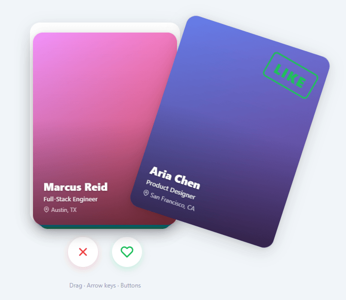
Swipe cards — the gesture-driven interaction made famous by Tinder — have become a standard UX pattern for binary decision interfaces: left to reject, right to accept. The pattern works because it maps physical gesture to decision direction intuitively, and the card's visual rotation feedback confirms the direction before the user releases.
Building swipe cards correctly requires implementing: pointer event tracking across mouse and touch, rotation math that makes the card feel physically connected to the gesture, velocity detection for snap-to-reject/accept, and a card stack depth illusion using CSS transform and z-index.
This snippet builds a complete swipe card stack entirely in HTML, CSS, and vanilla JavaScript — no Hammer.js, no gesture library, no framework.
Pointer Events for Cross-Device Dragging
The snippet uses the Pointer Events API (pointerdown, pointermove, pointerup, pointercancel) rather than separate mousedown/touchstart handlers. Pointer Events unify mouse, touch, and stylus input in a single event model with identical APIs — e.clientX, e.clientY, e.pointerId. setPointerCapture(e.pointerId) on the card element on pointerdown ensures pointermove events continue firing on the card even if the pointer moves outside the element, preventing the drag from "sticking" when the mouse moves fast.
Drag State and Rotation Math
On pointerdown: capture the start position (startX = e.clientX, startY = e.clientY), the card center position, and mark isDragging = true.
On each pointermove: compute the offset from start: dx = e.clientX - startX, dy = e.clientY - startY. The rotation is proportional to horizontal drag but amplified by vertical position relative to card center. A common formula: rotation = (dx / cardWidth) * MAX_ROTATION where MAX_ROTATION is 20–25 degrees. This creates the natural "flicking" feel where dragging from the bottom rotates more than dragging from the top.
Apply via CSS transform: card.style.transform = \translate(${dx}px, ${dy}px) rotate(${rotation}deg)\``. The translation moves the card with the pointer. The rotation makes it feel like a physical card being dragged.
Accept/Reject Thresholds and Visual Feedback
While dragging, the snippet computes whether the card has crossed the acceptance threshold: Math.abs(dx) > cardWidth * 0.35 (35% of card width). If exceeded, the card shows visual feedback — a semi-transparent accept badge (green ✓) or reject badge (red ×) that increases in opacity proportional to how far beyond the threshold the drag has gone: badgeOpacity = Math.min(1, (Math.abs(dx) - threshold) / (threshold * 0.5)).
This matches Tinder's exact interaction pattern: the label appears gradually as you drag further, giving users confirmation of their decision direction before release.
Snap and Dismiss on Release
On pointerup: if |dx| > threshold or if the pointer velocity |vx| exceeds a snap velocity threshold, the card is dismissed in the direction of the drag. Otherwise it snaps back to center with a CSS transition.
Velocity is computed from the last few pointermove events: store the last timestamp and position, compute vx = (currentX - prevX) / (currentTime - prevTime). A high velocity snap means a fast flick dismisses the card even if it hasn't crossed the distance threshold — matching the feel of real card flicking.
Dismiss: set card.style.transition = 'transform 0.3s ease-out', then card.style.transform = \translate(${exitX}px, ${exitY}px) rotate(${exitRotation}deg)\`. The exitX is window.innerWidth + cardWidth (off right edge) or -window.innerWidth - cardWidth (off left edge). After the transition ends (transitionend` event), the card element is removed from the DOM.
Snap back: set card.style.transition = 'transform 0.4s cubic-bezier(0.175, 0.885, 0.32, 1.275)' (a spring bounce cubic-bezier) and card.style.transform = 'translate(0, 0) rotate(0deg)'. The spring easing makes the snap-back feel elastic and satisfying.
Card Stack Depth Illusion
The stack of cards behind the active front card is achieved with CSS transforms and z-index. Each card at depth i from the top gets: transform: scale(${1 - i * 0.05}) translateY(${i * 8}px) and z-index: ${CARDS.length - i}. The front card (i=0) is full-size at z-index N. The card behind (i=1) is 5% smaller and 8px lower. The third card (i=2) is 10% smaller and 16px lower.
When the front card is dismissed, the remaining cards animate forward: each card transitions from its depth-i transform to its depth-(i-1) transform. This is implemented by updating the data-index attribute on each remaining card and recomputing the CSS transform, triggering the CSS transition.
Done State and Restart
When all cards are swiped, the stack container hides and a "done" panel appears with a Restart button. The Restart button re-clones the CARDS array, re-renders the full stack, and hides the done panel. This creates an infinitely replayable stack without page reload.
Build with AI
Build, Understand, Optimize, and Extend It With AI
You don't have to reverse-engineer the drag math by hand. Paste this snippet's HTML, CSS, and JS into an AI coding assistant like Claude and ask it to explain exactly how applyDragTransform derives the rotation from horizontal drag distance capped at MAX_ROTATION, and why flyOut removes the card from the deck array before its transitionend fires rather than after. The same assistant can help optimize it — for instance whether renderStack rebuilding the entire visible stack with innerHTML on every card removal is wasteful compared to just animating the remaining cards to their new depth, or whether attaching mousemove and mouseup listeners to document on every drag start (and never removing the touch ones) could leak. It's also useful for extending the deck: ask it to add velocity-based flicking so a fast short swipe dismisses a card even under the distance threshold, track accepted versus rejected cards into separate arrays, or load real profile photos instead of gradients. Treat the code less like a finished artifact and more like a starting point for a conversation.
Prompt to recreate it
Copy this into your AI assistant of choice to build the effect from scratch, or as a jumping-off point for your own variant:
Build a Tinder-style "swipe card stack" in plain HTML, CSS, and JavaScript using mouse and touch drag events and CSS transforms — no gesture library, no framework.

Requirements:
- A deck array of card data objects, rendered as a stack of absolutely positioned cards where only a fixed number (e.g. four) are visible at once, each successive card behind the top one scaled slightly smaller and offset downward via a translateY plus scale transform, with z-index decreasing with depth.
- The frontmost card must be draggable by both mouse and touch, using a single set of coordinate-reading logic that works for both input types (reading touches[0].clientX/clientY for touch events, clientX/clientY for mouse events).
- While dragging, the card's transform must combine a translate matching the pointer's horizontal and vertical offset with a rotation proportional to the horizontal offset, clamped to a maximum rotation angle in either direction.
- Two overlay "LIKE" and "NOPE" stamp elements on the card must fade in during the drag, with opacity proportional to how far the horizontal drag has progressed toward a throw-distance threshold, showing only the stamp matching the current drag direction.
- On release, if the horizontal drag distance meets or exceeds the threshold, animate the card flying off-screen in that direction with a rotation and a fade to opacity zero, remove it from the deck data, and re-render the stack once the fly-out transition completes; if the drag falls short of the threshold, animate the card snapping back to its resting position and fade the stamps back out.
- Provide two buttons (reject and accept) and Left/Right arrow key bindings that trigger the same stamp-then-fly-out sequence programmatically without requiring an actual drag.
- When the deck is empty, show a completion state with a restart control that resets the deck to its original full list and re-renders the stack from scratch.
Want to tighten it up first? Run this prompt through the AI Prompt Studio to score it across 8 quality dimensions, catch anti-patterns, and tune the wording for Claude, ChatGPT, or Gemini before you paste it in.
Step by step
How to Use
- 1Drag a cardClick and drag the front card left or right. The card moves with your pointer and rotates naturally. A green ✓ or red × badge appears as you drag further.
- 2See the threshold indicatorDrag past 35% of the card width. The accept or reject badge reaches full opacity, indicating the card will be dismissed if released.
- 3Release to dismiss or snap backRelease past the threshold (or flick quickly) to dismiss the card off-screen. Release before the threshold to snap the card back to center with a spring animation.
- 4Use the action buttonsClick the × (reject) or ♥ (accept) buttons below the stack to trigger programmatic swipe animations without dragging.
- 5See the done stateAfter swiping all cards, a "You've seen everyone" message appears with a Restart button. Click Restart to reset the full stack.
- 6Customize the cardsEdit the CARDS array at the top of the JS. Each card has name, role, location, and gradient (CSS gradient string). The render function creates card elements from this data.
Real-world uses
Common Use Cases
Got questions?
Frequently Asked Questions
The Pointer Events API unifies mouse (pointerdown/move/up), touch (single-touch maps directly), and stylus input in one event model with identical properties (clientX, clientY, pointerId). Without Pointer Events, you need separate mousedown/mousemove/mouseup and touchstart/touchmove/touchend handlers with duplicate logic. setPointerCapture(e.pointerId) is a key advantage: it routes all subsequent pointer events to the capturing element even when the pointer moves outside it — essential for fast drags that move off the card.
The rotation formula rotation = (dx / cardWidth) * MAX_ROTATION scales the rotation by how far across the card the pointer has moved. At dx=0 (no drag), rotation=0 (flat). At dx=cardWidth (dragged one full card width), rotation=MAX_ROTATION (e.g., 20°). This linear scaling makes the card feel like its top edge is fixed and you're pushing the bottom — the same physics as a real card lying on a table. The combined transform: translate(dx, dy) rotate(rotation) applies movement and rotation simultaneously.
On each pointermove, store the current timestamp and position. Compute vx = (currentX - prevX) / (currentTime - prevTime) in pixels per millisecond. On pointerup, if |vx| > SNAP_VELOCITY (e.g., 0.5 px/ms), dismiss the card in the direction of vx even if dx hasn't crossed the distance threshold. This implements the "flick" gesture: a fast short swipe should dismiss the card, while a slow long swipe that stops mid-way should snap back. Users expect the velocity response from real-world card flicking.
Each card has a data-depth attribute (0=front, 1=second, 2=third). CSS transitions are set on all cards: transition: transform 0.3s ease. When the front card is dismissed, the remaining cards have their data-depth decremented: depth 1 becomes 0, depth 2 becomes 1. A function reads the new depth and applies the updated transform: scale(1 - depth * 0.05) translateY(depth * 8px). The CSS transition animates each card from its old depth transform to its new one simultaneously, creating the "stack advancing forward" feel.
Add accepted and rejected arrays. In the dismiss handler: if (dx > 0) { accepted.push(CARDS[currentIndex]); } else { rejected.push(CARDS[currentIndex]); }. In the done state handler, display the counts: acceptedCount.textContent = accepted.length. To send the results to an API: fetch("/api/swipe-results", { method: "POST", body: JSON.stringify({ accepted: accepted.map(c => c.id), rejected: rejected.map(c => c.id) }) }) in the done handler or when the last card is dismissed.
Yes. The JSX, Vue, Angular, and Tailwind export buttons on this page convert the snippet automatically. In React, attach the pointerdown/pointermove handlers in a useEffect with cleanup, and track the card stack as state so removed cards trigger a re-render rather than manual DOM removal.