Source Code
<div class="demo">
  <div class="phone-frame">
    <div class="chat-screen" id="chatScreen">
      <div class="chat-header">Support chat</div>
      <div class="chat-messages" id="chatMessages">
        <div class="msg them">Hi! How can we help today?</div>
        <div class="msg me">My export keeps failing at 90%.</div>
        <div class="msg them">Got it — checking that now. On a phone, try focusing the input below: it stays pinned above the (simulated) keyboard instead of sliding underneath it.</div>
      </div>
      <form class="chat-input-bar" id="chatInputBar">
        <input type="text" id="chatInput" placeholder="Type a message…" autocomplete="off" />
        <button type="submit" class="chat-send" aria-label="Send message">
          <svg viewBox="0 0 24 24" width="16" height="16" fill="none" stroke="currentColor" stroke-width="2.2" stroke-linecap="round" stroke-linejoin="round"><line x1="22" y1="2" x2="11" y2="13"/><polygon points="22 2 15 22 11 13 2 9 22 2"/></svg>
        </button>
      </form>
    </div>
  </div>
  <p class="vv-hint">On a real mobile browser, VisualViewport tracks the software keyboard's height directly, so the input bar sits exactly above it — never hidden underneath.</p>
</div>
* { box-sizing: border-box; margin: 0; padding: 0; }
body { font-family: system-ui, sans-serif; background: #f8fafc; display: flex; align-items: center; justify-content: center; min-height: 100vh; padding: 24px; }
.demo { display: flex; flex-direction: column; align-items: center; gap: 12px; }
.phone-frame { width: 300px; height: 500px; border-radius: 32px; border: 8px solid #0f172a; background: #0f172a; overflow: hidden; box-shadow: 0 30px 60px rgba(15,23,42,0.25); }
.chat-screen { height: 100%; display: flex; flex-direction: column; background: #fff; position: relative; }
.chat-header { padding: 14px 16px; font-size: 13px; font-weight: 800; color: #111827; border-bottom: 1px solid #f1f5f9; flex-shrink: 0; }
.chat-messages { flex: 1; overflow-y: auto; padding: 14px; display: flex; flex-direction: column; gap: 8px; }
.msg { max-width: 78%; padding: 9px 12px; border-radius: 14px; font-size: 12.5px; line-height: 1.5; }
.msg.them { align-self: flex-start; background: #f1f5f9; color: #334155; border-bottom-left-radius: 4px; }
.msg.me { align-self: flex-end; background: #4f46e5; color: #fff; border-bottom-right-radius: 4px; }
.chat-input-bar {
display: flex; align-items: center; gap: 8px;
padding: 10px 12px;
padding-bottom: max(10px, env(safe-area-inset-bottom));
border-top: 1px solid #f1f5f9;
background: #fff;
flex-shrink: 0;
/* transform, not top/bottom, is what actually moves the bar when the
keyboard resizes the visual viewport — see the JS for why. */
transition: transform 0.15s ease;
}
.chat-input-bar input { flex: 1; padding: 10px 13px; border: 1.5px solid #e2e8f0; border-radius: 999px; font-size: 13px; font-family: inherit; }
.chat-input-bar input:focus-visible { outline: none; border-color: #6366f1; box-shadow: 0 0 0 3px rgba(99,102,241,0.15); }
.chat-send { flex-shrink: 0; width: 34px; height: 34px; border-radius: 50%; border: none; background: #4f46e5; color: #fff; display: flex; align-items: center; justify-content: center; cursor: pointer; }
.chat-send:hover { background: #4338ca; }
.vv-hint { font-size: 11px; color: #94a3b8; text-align: center; max-width: 280px; line-height: 1.6; }const inputBar = document.getElementById('chatInputBar');
const chatInput = document.getElementById('chatInput');
const chatMessages = document.getElementById('chatMessages');
const chatForm = document.getElementById('chatInputBar');
// The core problem this solves: on mobile, opening the software keyboard
// shrinks the VISUAL viewport (what's actually visible on screen) while the
// LAYOUT viewport (what CSS position:fixed measures against) often stays the
// same size — so a naively fixed-position input bar can end up rendered
// UNDERNEATH the keyboard, invisible, even though CSS thinks it's still
// pinned to the bottom of the screen.
//
// window.visualViewport reports the REAL visible area, and fires 'resize'
// whenever the keyboard opens, closes, or changes height — giving exactly
// the signal needed to reposition the bar correctly.
function repositionInputBar() {
if (!window.visualViewport) return; // graceful no-op on unsupported browsers
const viewport = window.visualViewport;
// The gap between the layout viewport's bottom and the visual viewport's
// bottom is exactly the space currently occupied by the keyboard (or any
// other viewport-shrinking browser UI).
const keyboardHeight = window.innerHeight - viewport.height - viewport.offsetTop;
const offset = Math.max(0, keyboardHeight);
// translateY, not changing 'bottom', is deliberate: a fixed-position
// element's own positioning is already relative to the layout viewport,
// so nudging it up by exactly the keyboard's height with a transform
// avoids fighting that base positioning with a second, conflicting
// positioning system.
inputBar.style.transform = offset > 0 ? `translateY(-${offset}px)` : 'none';
}
if (window.visualViewport) {
window.visualViewport.addEventListener('resize', repositionInputBar);
window.visualViewport.addEventListener('scroll', repositionInputBar);
}
chatInput.addEventListener('focus', () => {
// Give the keyboard's opening animation a moment to actually resize the
// visual viewport before recalculating — checking immediately on focus
// can read a stale, pre-resize viewport height on some browsers.
setTimeout(repositionInputBar, 50);
});
chatInput.addEventListener('blur', () => {
inputBar.style.transform = 'none';
});
chatForm.addEventListener('submit', (e) => {
e.preventDefault();
const text = chatInput.value.trim();
if (!text) return;
const msg = document.createElement('div');
msg.className = 'msg me';
msg.textContent = text;
chatMessages.appendChild(msg);
chatMessages.scrollTop = chatMessages.scrollHeight;
chatInput.value = '';
});Learn Coding Visually
Learn to code with interactive, live-preview playgrounds — HTML, CSS, JavaScript, React & more.
 HTML Playground42 lessons · Click-based · Live preview
 CSS PlaygroundLearn CSS with a live editor
 JavaScript Playground60 lessons · DOM · Async · Canvas
 React PlaygroundLearn React with a live code editor
 GSAP PlaygroundLearn GSAP animation interactively
 SVG Playground44 lessons · shapes · paths · animation
 SCSS Playground45 lessons · Sass modules · tokens
 Tailwind PlaygroundLearn Tailwind CSS with a live editor
 Bootstrap 5 Playground50 lessons · live preview
Keyboard-Safe Fixed Input Bar — Correct Mobile Keyboard Handling with VisualViewport
Keyboard-Safe Fixed Input Bar with the VisualViewport API · Mobile · Plain HTML, CSS & JS · Live preview
What's included
Features
About this UI Snippet
Keyboard-Safe Input Bar — Solving the Fixed-Position-Underneath-the-Keyboard Bug
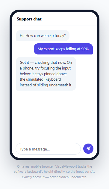
Every mobile chat, messaging, or comment UI eventually hits the same frustrating bug: a position: fixed input bar pinned to the bottom of the screen, which — the moment the on-screen keyboard opens — ends up rendered *underneath* that keyboard, invisible, even though CSS still believes it's correctly anchored to the bottom of the viewport. This snippet fixes it properly using the VisualViewport API, the browser API specifically designed to report what's actually visible on screen.
Why `position: fixed` alone isn't enough
There are two different "viewports" a mobile browser tracks: the layout viewport (what CSS position: fixed, vh units, and window.innerHeight generally measure against) and the visual viewport (the actual currently-visible region of the screen, which shrinks when the keyboard opens). On many mobile browsers, opening the keyboard shrinks the *visual* viewport while leaving the *layout* viewport's dimensions unchanged — so a bar fixed to the bottom of the layout viewport stays exactly where it was, now sitting behind the keyboard rather than above it.
`window.visualViewport` reports the truth, and fires `resize` when it changes
repositionInputBar() computes keyboardHeight as the difference between window.innerHeight (the layout viewport) and visualViewport.height plus its offsetTop — this gap is exactly the space currently consumed by the keyboard (or any other viewport-shrinking browser chrome). The visualViewport's own resize event fires precisely when the keyboard opens, closes, or changes height, giving the exact signal needed to know when to recalculate, rather than guessing based on focus/blur timing alone.
Why `transform: translateY()`, not changing `bottom`
The fix nudges the bar up using transform: translateY(-Npx) rather than adjusting its bottom CSS property. This is deliberate: the bar's base position is already established through normal fixed/flex positioning; layering a transform-based offset on top is an *additive* adjustment that doesn't need to fight or duplicate that base positioning logic — it simply shifts the already-correctly-positioned element up by exactly the keyboard's height, then removes the transform entirely (returning to the base position) the instant the keyboard closes.
A short delay on focus, to avoid reading a stale viewport size
The focus handler doesn't call repositionInputBar() synchronously — it wraps it in a small setTimeout. On some mobile browsers, the visual viewport's dimensions haven't finished updating at the exact instant a focus event fires (the keyboard's opening animation is still in progress), so checking immediately can read a stale, pre-resize height. The short delay gives the keyboard animation a moment to actually complete its resize before the code measures it.
Build with AI
Build, Understand, Optimize, and Extend It With AI
Ask an AI assistant to explain in detail the difference between the layout viewport and the visual viewport on mobile browsers, and why this distinction is specifically what causes fixed-position elements to end up hidden behind an open keyboard. It's also worth asking for a version that additionally auto-scrolls the currently-focused input into view above the repositioned bar, or one that smoothly animates the keyboard-avoidance transform using the same duration as the platform's native keyboard animation for a more seamless feel.
Prompt to recreate it
Copy this into your AI assistant of choice to build the effect from scratch, or as a jumping-off point for your own variant:
Build a keyboard-safe, fixed-position chat input bar in HTML, CSS, and vanilla JavaScript using the VisualViewport API — no external library.

Requirements:
- A chat-style mobile UI with a scrollable message list and a fixed input bar (text input plus send button) pinned to the bottom of the screen.
- Use window.visualViewport to detect the real height currently occupied by the on-screen keyboard, computed as the difference between the layout viewport (window.innerHeight) and the visual viewport's actual height and offset — do not rely solely on guessing based on input focus/blur timing.
- Listen to the visualViewport's resize event (and its scroll event, to handle viewport panning) to recalculate and reposition the input bar whenever the visible keyboard area changes.
- Reposition the bar using an additive CSS transform: translateY() based on the detected keyboard height, rather than modifying its base bottom/top positioning — the transform should shift the bar up by exactly the keyboard's height and reset to none when the keyboard is closed.
- On input focus, add a brief delay before the first repositioning check, to avoid reading a stale visual viewport height before the keyboard's opening animation has finished resizing it.
- Gracefully handle browsers that don't support VisualViewport by skipping the repositioning logic entirely rather than throwing an error, so the bar still falls back to normal fixed-position behavior.
- Respect env(safe-area-inset-bottom) padding on the bar for devices with a home-indicator safe area.
Want to tighten it up first? Run this prompt through the AI Prompt Studio to score it across 8 quality dimensions, catch anti-patterns, and tune the wording for Claude, ChatGPT, or Gemini before you paste it in.
Step by step
How to Use
- 1Open this snippet on an actual mobile deviceThe effect is only visible on real mobile browsers with a software keyboard — desktop browsers have no keyboard to resize the viewport.
- 2Tap the message inputThe keyboard opens, and the input bar smoothly translates upward to sit exactly above it, remaining fully visible rather than sliding underneath.
- 3Dismiss the keyboardThe bar's transform resets to none, and it returns to its normal fixed position at the bottom of the screen.
- 4Send a messageThe message list scrolls to the newest message, demonstrating the pattern working inside a realistic chat UI context.
- 5Adapt repositionInputBar() to your own fixed barPoint the function at your own bottom-fixed element and wire the same visualViewport resize/scroll listeners to it.
Real-world uses
Common Use Cases
Got questions?
Frequently Asked Questions
Mobile browsers track two different viewports — a layout viewport that position: fixed measures against, and a visual viewport representing what's actually currently visible. Opening the keyboard shrinks the visual viewport while often leaving the layout viewport's size unchanged, so a naively fixed bar stays where the layout viewport says the bottom is, which is now hidden underneath the keyboard.
It reports the real, currently-visible viewport dimensions and position, and fires a resize event whenever that visible area changes — including specifically when the on-screen keyboard opens, closes, or changes height, which is exactly the signal this pattern needs.
The bar already has a correct base position from normal fixed/flex layout. Using transform: translateY() as an additive adjustment on top of that base position avoids needing to duplicate or override the existing positioning logic — it simply shifts the already-correct position up by exactly the keyboard's height.
On some mobile browsers, the visual viewport hasn't finished resizing at the exact moment a focus event fires — the keyboard's opening animation may still be in progress. A short setTimeout gives that resize a moment to actually complete before the height is measured, avoiding a stale reading.
The code checks for window.visualViewport before using it and simply no-ops (skips the repositioning logic entirely) if it's unavailable, falling back to the bar's normal fixed-position behavior rather than throwing an error.
Yes — the input bar's padding-bottom uses max(10px, env(safe-area-inset-bottom)), ensuring it clears the home-indicator gesture area on notched devices when the keyboard is closed, independent of the keyboard-avoidance transform logic.