Source Code
<section class="spl-hero">
  <div class="spl-glow"></div>
  <div class="spl-content">
    <span class="spl-badge">Rated 4.9/5 by 2,300+ teams</span>
    <h1 class="spl-h1">The workspace<br><span class="spl-accent">operations teams trust</span></h1>
    <p class="spl-sub">One place to plan, ship, and review work — built for teams who can't afford to slow down. Onboard in minutes, not weeks.</p>
    <div class="spl-cta-row">
      <a href="#" class="spl-btn-primary">Start free trial</a>
      <a href="#" class="spl-btn-secondary">Book a demo</a>
    </div>

    <blockquote class="spl-quote">
      <p>"We replaced four tools with this in a single afternoon. Our team has never shipped faster."</p>
      <footer>
        <span class="spl-quote-avatar">JM</span>
        <div class="spl-quote-who">
          <strong>Jordan Marsh</strong>
          <span>VP Engineering, Northwind</span>
        </div>
      </footer>
    </blockquote>
  </div>

  <div class="spl-logos" aria-label="Trusted by companies including">
    <p class="spl-logos-label">Trusted by teams at</p>
    <div class="spl-logos-track">
      <span class="spl-logo"><i class="spl-mark spl-mark-1"></i>Northwind</span>
      <span class="spl-logo"><i class="spl-mark spl-mark-2"></i>Orbital</span>
      <span class="spl-logo"><i class="spl-mark spl-mark-3"></i>Fernbank</span>
      <span class="spl-logo"><i class="spl-mark spl-mark-4"></i>Cascade Labs</span>
      <span class="spl-logo"><i class="spl-mark spl-mark-5"></i>Halyard</span>
      <span class="spl-logo"><i class="spl-mark spl-mark-6"></i>Verity</span>
    </div>
  </div>
</section>*{box-sizing:border-box;margin:0;padding:0}
body{font-family:system-ui,-apple-system,sans-serif;background:#0a0d16;color:#f1f5f9}
.spl-hero{position:relative;min-height:100vh;display:flex;flex-direction:column;align-items:center;justify-content:center;padding:80px 24px 40px;overflow:hidden;gap:56px}
.spl-glow{position:absolute;top:-20%;left:50%;transform:translateX(-50%);width:900px;height:600px;background:radial-gradient(ellipse,rgba(56,189,248,.16),transparent 65%);pointer-events:none}
.spl-content{position:relative;z-index:1;display:flex;flex-direction:column;align-items:center;text-align:center;gap:22px;max-width:720px}
.spl-badge{display:inline-flex;align-items:center;gap:6px;background:rgba(56,189,248,.1);border:1px solid rgba(56,189,248,.28);color:#7dd3fc;font-size:12px;font-weight:700;padding:7px 16px;border-radius:20px;letter-spacing:.02em}
.spl-h1{font-size:clamp(32px,6vw,60px);font-weight:800;line-height:1.12;letter-spacing:-.02em}
.spl-accent{color:#38bdf8}
.spl-sub{font-size:16px;color:#94a3b8;line-height:1.7;max-width:520px}
.spl-cta-row{display:flex;gap:12px;flex-wrap:wrap;justify-content:center;margin-top:6px}
.spl-btn-primary{background:#38bdf8;color:#04101a;font-weight:700;font-size:15px;padding:13px 26px;border-radius:9px;text-decoration:none;box-shadow:0 6px 24px rgba(56,189,248,.35);transition:transform .15s,box-shadow .15s}
.spl-btn-primary:hover{transform:translateY(-2px);box-shadow:0 10px 30px rgba(56,189,248,.45)}
.spl-btn-secondary{background:rgba(255,255,255,.06);color:#e2e8f0;font-weight:600;font-size:15px;padding:13px 24px;border-radius:9px;text-decoration:none;border:1px solid rgba(255,255,255,.12);transition:background .15s}
.spl-btn-secondary:hover{background:rgba(255,255,255,.1)}
.spl-quote{margin-top:18px;max-width:480px;padding:18px 22px;border-radius:14px;background:rgba(255,255,255,.04);border:1px solid rgba(255,255,255,.08);text-align:left}
.spl-quote p{font-size:14.5px;color:#cbd5e1;line-height:1.6;font-style:italic}
.spl-quote footer{display:flex;align-items:center;gap:10px;margin-top:14px}
.spl-quote-avatar{width:32px;height:32px;border-radius:50%;background:linear-gradient(135deg,#38bdf8,#818cf8);display:flex;align-items:center;justify-content:center;font-size:12px;font-weight:700;color:#04101a;flex-shrink:0}
.spl-quote-who{display:flex;flex-direction:column;line-height:1.3}
.spl-quote-who strong{font-size:13px;color:#f1f5f9}
.spl-quote-who span{font-size:12px;color:#64748b}
.spl-logos{position:relative;z-index:1;width:100%;max-width:960px;display:flex;flex-direction:column;align-items:center;gap:18px}
.spl-logos-label{font-size:11px;text-transform:uppercase;letter-spacing:.14em;color:#475569;font-weight:700}
.spl-logos-track{display:flex;flex-wrap:wrap;justify-content:center;gap:32px 40px;padding-top:8px;border-top:1px solid rgba(255,255,255,.07);width:100%}
.spl-logo{display:flex;align-items:center;gap:9px;font-size:15px;font-weight:700;color:#64748b;letter-spacing:-.01em;opacity:.85;transition:opacity .15s,color .15s}
.spl-logo:hover{opacity:1;color:#cbd5e1}
.spl-mark{width:18px;height:18px;border-radius:5px;display:inline-block;flex-shrink:0}
.spl-mark-1{background:linear-gradient(135deg,#38bdf8,#0ea5e9);clip-path:circle(50%)}
.spl-mark-2{background:linear-gradient(135deg,#a78bfa,#818cf8);border-radius:4px}
.spl-mark-3{background:linear-gradient(135deg,#f97316,#f59e0b);clip-path:polygon(50% 0,100% 100%,0 100%)}
.spl-mark-4{background:linear-gradient(135deg,#34d399,#10b981);border-radius:50% 5px 50% 5px}
.spl-mark-5{background:linear-gradient(135deg,#f472b6,#ec4899);clip-path:circle(50%)}
.spl-mark-6{background:linear-gradient(135deg,#facc15,#eab308);border-radius:4px}
@media (max-width:560px){.spl-logos-track{gap:22px 26px}}Learn Coding Visually
Learn to code with interactive, live-preview playgrounds — HTML, CSS, JavaScript, React & more.
 HTML Playground42 lessons · Click-based · Live preview
 CSS PlaygroundLearn CSS with a live editor
 JavaScript Playground60 lessons · DOM · Async · Canvas
 React PlaygroundLearn React with a live code editor
 GSAP PlaygroundLearn GSAP animation interactively
 SVG Playground44 lessons · shapes · paths · animation
 SCSS Playground45 lessons · Sass modules · tokens
 Tailwind PlaygroundLearn Tailwind CSS with a live editor
 Bootstrap 5 Playground50 lessons · live preview
Hero with Social Proof Logo Strip — Free HTML CSS Hero Snippet
Hero with Social Proof Logo Strip · Heroes · Plain HTML & CSS · Live preview
What's included
Features
About this UI Snippet
Hero with Social Proof Logo Strip — Testimonial and Trusted-By Row
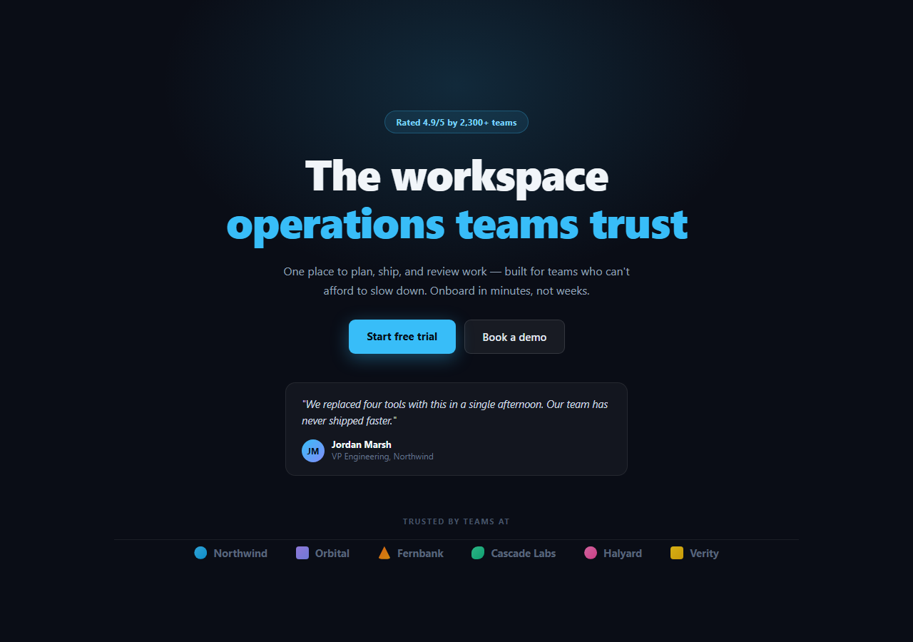
The social-proof hero pairs the standard headline-and-CTA pattern with two forms of trust signal at once: an embedded testimonial quote with named attribution, and a row of company "logos" beneath the fold line. It's the layout most B2B SaaS marketing teams reach for because it answers the visitor's first objection — "does this actually work for teams like mine?" — before they've even scrolled.
Two trust signals, two jobs
The rating badge above the headline does the fast, glanceable job: a number a visitor registers in under a second. The testimonial block does the slower, persuasive job — a real voice, a name, a role, a company — which is why it sits inside the content column rather than being crammed into the badge. Splitting these two signals apart, rather than stacking them into one crowded element, keeps each one legible.
CSS-drawn logo placeholders
Rather than shipping broken <img> tags or a CDN dependency, the logo strip uses small CSS shapes (.spl-mark-1 through .spl-mark-6) — a circle, a rounded square, a triangle, a blob, built purely from background, border-radius and clip-path — paired with a company name. They're explicitly placeholders: swap each <i class="spl-mark-*"> for a real <img> or inline SVG wordmark once you have brand assets, and drop the accompanying text label if the logo is self-explanatory.
The testimonial card
The quote sits in its own bordered card with a small gradient avatar bearing initials, a name, and a role/company line — the structure a reader scans in order (claim, then who's making it) to judge credibility. Keeping the card left-aligned rather than centered like the rest of the hero gives it a distinct "inserted evidence" feel rather than reading as more marketing copy.
Layout and rhythm
A top divider line separates the headline block from the logo row, giving the page a clear "here's the pitch, here's the proof" rhythm as you scroll down through the hero. The logos wrap with flex-wrap and a generous gap so the strip degrades gracefully from a wide desktop row to a stacked mobile block without a media query doing the heavy lifting.
Customizing it
Swap in your own rating, testimonial copy, and CSS marks or real logo images; adjust .spl-glow's color to match your brand. Pair it with a startup hero if you want a bolder gradient headline, or a count-up stats row directly beneath the logos for a second layer of proof.
Build with AI
Build, Understand, Optimize, and Extend It With AI
You don't have to manually work out the layering of proof signals here. Paste this snippet's HTML, CSS, and JS into an AI coding assistant like Claude and ask it to explain why the testimonial card is left-aligned inside an otherwise centered layout, or how the CSS-only logo marks are built from background, border-radius, and clip-path without any image assets. The same assistant can help you extend it responsibly — for example asking it to wire the logo strip up to a CMS array of real customer names and logo URLs with a graceful placeholder fallback, or to turn the static logo row into a slow auto-scrolling marquee that pauses on hover. It's also useful for a sanity check: ask it whether the fictional company names and placeholder marks read clearly enough as illustrative rather than implying a real endorsement. Treat the code less like a finished artifact and more like a starting point for a conversation.
Prompt to recreate it
Copy this into your AI assistant of choice to build the effect from scratch, or as a jumping-off point for your own variant:
Build a SaaS marketing hero section in plain HTML and CSS (no JavaScript needed) that combines a headline-and-CTA layout with two trust signals: an embedded testimonial and a trusted-by logo strip.

Requirements:
- A centered hero with a small rating/social-proof badge above a large headline, a supporting subheading, and two call-to-action buttons (a solid primary and an outlined secondary) that wrap on narrow viewports.
- A testimonial card, left-aligned within the otherwise centered content column, containing a quoted sentence, a small circular avatar built from initials on a gradient background, and a name plus role/company line below it.
- A "trusted by" section below a horizontal divider line containing a row of six placeholder company entries, each pairing a small CSS-only shape (built using only background, border-radius, and clip-path — no image files or icon fonts) with a company name text label, clearly meant as illustrative placeholders rather than real logos.
- The logo row should use flex-wrap so it reflows from one row on desktop to a wrapped multi-row block on mobile without any media queries controlling the wrapping itself.
- A soft ambient radial-gradient glow behind the content for visual depth, using pointer-events: none so it never intercepts clicks.
- Everything should degrade gracefully with no JavaScript at all, so the hero works as a static server-rendered component in any framework.
Want to tighten it up first? Run this prompt through the AI Prompt Studio to score it across 8 quality dimensions, catch anti-patterns, and tune the wording for Claude, ChatGPT, or Gemini before you paste it in.
Step by step
How to Use
- 1Paste the HTML, CSS, and JSThe hero, testimonial card, and logo strip render immediately — no JS is required for this snippet.
- 2Edit the headline and rating badgeUpdate the h1 copy and the "Rated 4.9/5" badge text to your own numbers.
- 3Replace the testimonialSwap the quote text, avatar initials, name, and role/company in .spl-quote.
- 4Swap the logo marksReplace each .spl-mark span with a real <img> or inline SVG once you have logo assets.
- 5Wire the CTAsPoint .spl-btn-primary and .spl-btn-secondary at your signup and demo-booking URLs.
- 6Tune the accent colorChange #38bdf8 across the CSS to match your brand palette.
Real-world uses
Common Use Cases
Got questions?
Frequently Asked Questions
No — they're intentionally placeholder marks drawn with plain CSS (background, border-radius, and clip-path shapes) paired with fictional company names, so nothing implies a real endorsement. Replace each .spl-mark span with a real <img> or inline SVG once you have permission to display a customer's actual logo.
They do different jobs. The rating badge and logo row are fast, glanceable signals a visitor registers in under a second; the testimonial is a slower, more persuasive signal that requires reading a sentence and a name. Using both covers visitors who skim and visitors who read, without making either element carry the whole weight of trust-building alone.
Only ship this with real logos once you have explicit permission or an existing case-study relationship with each company. Until then, keep the CSS-drawn placeholder marks and fictional names exactly as shipped, or swap in generic industry-category labels ("Fintech", "Healthcare") instead of specific company names.
Yes — wrap .spl-logos-track's children in a second inner div, duplicate the logo list once, and animate the wrapper's transform: translateX() in a CSS @keyframes loop for an infinite marquee. Pause the animation on :hover with animation-play-state: paused so users can read a logo they're pointing at.
Since the snippet has no JavaScript, it ports as a pure presentational component in any framework — a React Server Component needs no "use client" directive. Just map the testimonial and logo data from props or a CMS array instead of hardcoding it in JSX, so the same component can render different proof points per page.