Source Code
<section class="hero">
  <div class="pill">✦ Loved by 12,000+ product teams</div>

  <h1 class="headline">
    The <em>smarter</em> way to<br>manage your workflow
  </h1>

  <p class="sub">Streamline your entire product pipeline in one place. No more scattered tools, missed deadlines, or lost context — just clean, fast, focused work.</p>

  <form class="capture" onsubmit="handleSubmit(event)">
    <input class="email-inp" type="email" placeholder="Enter your work email…" required />
    <button type="submit" class="btn-cta">Get early access</button>
  </form>

  <p class="disclaimer">Free 14-day trial · No credit card · Cancel anytime</p>

  <div class="browser-wrap">
    <div class="browser-bar">
      <span class="dot red"></span>
      <span class="dot yellow"></span>
      <span class="dot green"></span>
      <div class="url-bar">app.yourproduct.com</div>
    </div>
    <div class="screen">
      <div class="app-top">
        <div class="app-nav">
          <div class="nav-logo"></div>
          <div class="nav-links">
            <div class="nav-item active"></div>
            <div class="nav-item"></div>
            <div class="nav-item"></div>
          </div>
          <div class="nav-btn"></div>
        </div>
      </div>
      <div class="app-body">
        <div class="sidebar-col">
          <div class="sb-item active"></div>
          <div class="sb-item"></div>
          <div class="sb-item"></div>
          <div class="sb-item"></div>
        </div>
        <div class="main-col">
          <div class="card-row">
            <div class="card-block blue"></div>
            <div class="card-block purple"></div>
            <div class="card-block green"></div>
          </div>
          <div class="table-mock">
            <div class="row-mock head"></div>
            <div class="row-mock"></div>
            <div class="row-mock"></div>
            <div class="row-mock"></div>
          </div>
        </div>
      </div>
    </div>
  </div>
</section>
* { box-sizing: border-box; margin: 0; padding: 0; }
body { font-family: system-ui, sans-serif; background: #fafafa; min-height: 100vh; }
.hero { display: flex; flex-direction: column; align-items: center; text-align: center; padding: 64px 24px 0; gap: 20px; }
.pill { display: inline-flex; align-items: center; gap: 6px; background: #f0f9ff; border: 1px solid #bae6fd; color: #0369a1; font-size: 12px; font-weight: 600; padding: 5px 14px; border-radius: 20px; }
.headline { font-size: clamp(32px, 6vw, 60px); font-weight: 900; color: #0f172a; line-height: 1.15; letter-spacing: -1.2px; max-width: 700px; }
.headline em { font-style: italic; background: linear-gradient(135deg, #6366f1, #0ea5e9); -webkit-background-clip: text; -webkit-text-fill-color: transparent; background-clip: text; }
.sub { font-size: 15px; color: #64748b; max-width: 480px; line-height: 1.75; }
.capture { display: flex; gap: 8px; width: 100%; max-width: 460px; }
.email-inp { flex: 1; padding: 13px 16px; border: 1.5px solid #e2e8f0; border-radius: 10px; font-size: 14px; color: #1e293b; background: #fff; outline: none; transition: border-color 0.15s, box-shadow 0.15s; }
.email-inp:focus { border-color: #6366f1; box-shadow: 0 0 0 3px rgba(99,102,241,0.12); }
.email-inp::placeholder { color: #94a3b8; }
.btn-cta { background: #6366f1; color: #fff; font-size: 14px; font-weight: 700; padding: 13px 22px; border-radius: 10px; border: none; cursor: pointer; white-space: nowrap; transition: background 0.15s; }
.btn-cta:hover { background: #4f46e5; }
.disclaimer { font-size: 12px; color: #94a3b8; margin-top: -4px; }
/* Browser mockup */
.browser-wrap { width: 100%; max-width: 860px; border-radius: 16px 16px 0 0; overflow: hidden; box-shadow: 0 -4px 60px rgba(0,0,0,0.1), 0 0 0 1px rgba(0,0,0,0.06); margin-top: 8px; }
.browser-bar { background: #f1f5f9; padding: 10px 16px; display: flex; align-items: center; gap: 8px; border-bottom: 1px solid #e2e8f0; }
.dot { width: 10px; height: 10px; border-radius: 50%; flex-shrink: 0; }
.dot.red { background: #ef4444; }
.dot.yellow { background: #f59e0b; }
.dot.green { background: #22c55e; }
.url-bar { flex: 1; background: #fff; border-radius: 6px; padding: 4px 12px; font-size: 11px; color: #94a3b8; text-align: center; border: 1px solid #e2e8f0; }
.screen { background: #fff; }
.app-top { padding: 12px 16px; border-bottom: 1px solid #f1f5f9; }
.app-nav { display: flex; align-items: center; gap: 16px; }
.nav-logo { width: 24px; height: 24px; background: #6366f1; border-radius: 6px; }
.nav-links { display: flex; gap: 8px; flex: 1; }
.nav-item { height: 8px; background: #e2e8f0; border-radius: 4px; width: 48px; }
.nav-item.active { background: #6366f1; }
.nav-btn { width: 60px; height: 24px; background: #6366f1; border-radius: 6px; }
.app-body { display: flex; height: 200px; }
.sidebar-col { width: 140px; border-right: 1px solid #f1f5f9; padding: 12px; display: flex; flex-direction: column; gap: 6px; flex-shrink: 0; }
.sb-item { height: 10px; background: #e2e8f0; border-radius: 5px; }
.sb-item.active { background: rgba(99,102,241,0.2); }
.main-col { flex: 1; padding: 12px; display: flex; flex-direction: column; gap: 10px; overflow: hidden; }
.card-row { display: flex; gap: 8px; }
.card-block { flex: 1; height: 56px; border-radius: 8px; }
.card-block.blue { background: rgba(14,165,233,0.12); }
.card-block.purple { background: rgba(99,102,241,0.12); }
.card-block.green { background: rgba(34,197,94,0.12); }
.table-mock { display: flex; flex-direction: column; gap: 4px; }
.row-mock { height: 10px; background: #f1f5f9; border-radius: 4px; }
.row-mock.head { background: #e2e8f0; }function handleSubmit(e) {
e.preventDefault();
const btn = e.target.querySelector('.btn-cta');
const original = btn.textContent;
btn.textContent = "✓ You're on the list!";
btn.style.background = '#22c55e';
setTimeout(() => { btn.textContent = original; btn.style.background = ''; }, 3000);
}Learn Coding Visually
Learn to code with interactive, live-preview playgrounds — HTML, CSS, JavaScript, React & more.
 HTML Playground42 lessons · Click-based · Live preview
 CSS PlaygroundLearn CSS with a live editor
 JavaScript Playground60 lessons · DOM · Async · Canvas
 React PlaygroundLearn React with a live code editor
 GSAP PlaygroundLearn GSAP animation interactively
 SVG Playground44 lessons · shapes · paths · animation
 SCSS Playground45 lessons · Sass modules · tokens
 Tailwind PlaygroundLearn Tailwind CSS with a live editor
 Bootstrap 5 Playground50 lessons · live preview
Product Hero — Free HTML CSS JS Email Capture Snippet
Product Hero · Heroes · Plain HTML, CSS & JS · Live preview
What's included
Features
About this UI Snippet
Product Hero Section — Email Capture Form, Browser Mockup & Light Design
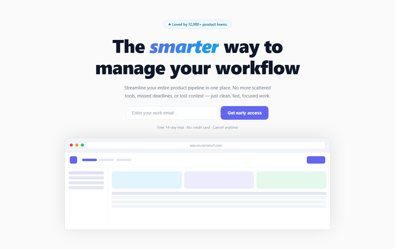
If you are building a product landing page and need to collect email sign-ups before launch, this snippet gives you a complete above-the-fold section: a trust pill badge, a large headline with italic gradient accent, a subtitle, an email capture form with success feedback, a disclaimer line, and a browser chrome mockup frame showing a placeholder app UI.
This is the standard pattern used by high-converting SaaS waitlist pages and product launches.
The email capture form
The .capture form uses display: flex so the email input and CTA button sit side by side on desktop. On submit, handleSubmit() prevents the default form action, shows a "✓ You're on the list!" success state on the button with a green background, and resets after 3 seconds. In production, replace the timeout with your actual API call to a mailing list service (Mailchimp, ConvertKit, Resend) or your own backend.
The italic gradient headline
The em element inside the headline uses the same background-clip: text technique as other gradient text snippets — but wrapped in an italic element for added visual differentiation. italic + gradient is a high-impact typographic combination that draws attention to the key differentiating word without using a separate colour or size.
The browser chrome mockup
The .browser-wrap creates a realistic browser window frame: three coloured dots (red, yellow, green), a fake URL bar, and a simulated app interface below. The app UI uses placeholder blocks (sidebar items, stat cards, table rows) to suggest a real product without requiring screenshots. This communicates "this is a real application" without needing finished designs.
The mockup sits below the fold with no bottom border-radius — it extends to the edge, creating a peek-below-the-fold effect that encourages scrolling.
Customising for your product
Replace the pill text with your actual user count or trust signal. Update the headline and subtitle. Wire the form to your email list API. Replace the browser mockup with a real screenshot — set background: url("your-screenshot.png") on .screen, background-size: cover.
A/B testing considerations
The email-capture-below-headline layout is one of the highest-converting hero patterns for pre-launch pages. Common A/B variants to test: (1) a single large "Get early access" CTA without the email input — fewer fields, higher click rate, but lower email quality; (2) moving the browser mockup to the right side for a split-hero layout. The disclaimer line ("Free 14-day trial · No credit card · Cancel anytime") consistently increases submit rate — do not remove it without testing.
Build with AI
Build, Understand, Optimize, and Extend It With AI
You don't have to work out the browser-chrome illusion or the gradient headline technique by hand. Paste this snippet's HTML, CSS, and JS into an AI coding assistant like Claude and ask it to explain exactly how the app UI mockup below the browser bar is built entirely from plain colored div elements rather than an actual screenshot, and how background-clip text on the em element produces the italic gradient accent word inside the headline. The same assistant can help optimize it, for example checking whether preventDefault plus a setTimeout is a reasonable stand-in for a real async fetch call, or whether the button's success-state reset timing feels right compared to how long a real API call would typically take. It's also useful for extending the effect: ask it to wire the form to a real email-capture API endpoint with proper error handling, swap the placeholder app mockup for a real product screenshot with a graceful loading state, or add basic email format validation before allowing submission. Treat the code less like a finished artifact and more like a starting point for a conversation.
Prompt to recreate it
Copy this into your AI assistant of choice to build the effect from scratch, or as a jumping-off point for your own variant:
Build a SaaS product landing page hero section in plain HTML, CSS, and vanilla JavaScript with an email capture form and a browser-chrome app mockup — no screenshots, no libraries.

Requirements:
- A centered hero containing: a small trust-signal pill badge, a large headline where one key word or phrase is wrapped in an em element styled with an italic weight and a gradient color applied via background-clip: text, a subtitle paragraph, an email capture form (an email input plus a submit button side by side using flexbox), and a small disclaimer line below the form (trial length, no credit card required, cancel anytime).
- Submitting the form must prevent the default page reload, replace the submit button's text with a success confirmation message, change its background to a success color, and after a few seconds automatically revert the button back to its original text and color.
- Below the form, build a realistic browser-window mockup using only div elements and CSS (no images): a top bar with three colored dots (red, yellow, green) and a fake URL text field, followed by a mock application interface below it consisting of a top navigation bar (a logo block, a few nav-item bars with one marked active in an accent color, and an action button block), and a body area with a narrow sidebar of item bars (one marked active) next to a main content area containing a row of colored stat-card blocks and a simple table mockup made of thin colored bars.
- The browser mockup container must sit flush against the bottom of its rounded container (no bottom border-radius) so it reads as extending below the visible fold, encouraging the visitor to scroll.
- Make sure every visual element in the app mockup (nav items, sidebar items, stat cards, table rows) is built from simple div blocks with background colors and border-radius only — no text content, no icons, no images — so the mockup reads as a placeholder UI rather than a fake screenshot trying to look too specific.
Want to tighten it up first? Run this prompt through the AI Prompt Studio to score it across 8 quality dimensions, catch anti-patterns, and tune the wording for Claude, ChatGPT, or Gemini before you paste it in.
Step by step
How to Use
- 1Update the trust pill and headlineChange the pill text to your real user count ("Loved by 12,000+ teams"). Edit the headline and wrap the key differentiating word in the em tag for the gradient italic effect.
- 2Wire the email form to your APIIn the JS panel, replace the setTimeout in handleSubmit() with a fetch call to your email service endpoint. The button shows a success state on the same click — no page reload needed.
- 3Replace the browser mockupTo show a real screenshot, set background: url("screenshot.png"); background-size: cover; on the .screen element. Remove the .app-top and .app-body placeholder content. Keep .browser-bar for the chrome effect.
- 4Change the gradient accentIn CSS, find .headline em and update the background gradient colours. Also update .btn-cta background and .email-inp focus border-color to match your brand accent.
- 5Update the disclaimer textEdit the .disclaimer paragraph to match your actual trial terms — "14-day free trial", "No credit card required", and "Cancel anytime" are the three standard trust signals for SaaS sign-ups.
- 6Export in your formatClick "HTML" for a standalone file, "JSX" for a React component with onSubmit handler and useState for the button feedback state, or "Tailwind" for a React + Tailwind CSS version.
Real-world uses
Common Use Cases
Got questions?
Frequently Asked Questions
Replace the setTimeout inside handleSubmit() with a fetch call: await fetch("/api/subscribe", { method: "POST", headers: {"Content-Type":"application/json"}, body: JSON.stringify({ email: e.target.querySelector(".email-inp").value }) }). Show the success state on resolve and an error state (red button) on reject. For Mailchimp, use their embedded form action URL directly as the form action attribute and submit natively, or use their API with a server-side proxy to hide your API key.
Remove the .app-top and .app-body div elements from the HTML. On the .screen element, add style="background: url('screenshot.png') center top / cover no-repeat; height: 320px;" — or set it in the CSS panel. Keep the .browser-bar for the chrome effect above the screenshot. For a sharper result, export your screenshot at 2× resolution and use the regular display size in CSS.
Add @media (max-width: 500px) { .capture { flex-direction: column; } .btn-cta { width: 100%; } } to the CSS. The input and button each take full width and stack naturally. The max-width: 460px on .capture keeps the layout compact on desktop while allowing full-width stack on mobile.
Yes. Click "JSX" to download a React component. Replace the inline onsubmit with a React onSubmit handler. Manage the button state with useState — const [submitted, setSubmitted] = useState(false). Conditionally show the success text: submitted ? "✓ You're on the list!" : "Get early access". In Next.js, wrap the form in a Client Component ("use client") since it uses state and event handlers.