Source Code
<div class="ws">
  <nav class="ws-rail">
    <button type="button" class="ws-rail-btn active" data-panel="files" title="Files" aria-label="Files">▤</button>
    <button type="button" class="ws-rail-btn" data-panel="search" title="Search" aria-label="Search">⌕</button>
    <button type="button" class="ws-rail-btn" data-panel="git" title="Source Control" aria-label="Source Control">⑂</button>
    <button type="button" class="ws-rail-btn" data-panel="ext" title="Extensions" aria-label="Extensions">▣</button>
    <button type="button" class="ws-rail-btn ws-rail-bottom" data-panel="settings" title="Settings" aria-label="Settings">⚙</button>
  </nav>

  <aside class="ws-list" id="wsList" style="width:230px">
    <div class="ws-list-head" id="wsListHead">Files</div>
    <div class="ws-list-body" id="wsListBody"></div>
    <div class="ws-resizer" id="wsResizer"></div>
  </aside>

  <main class="ws-main">
    <div class="ws-tabs">
      <div class="ws-tab active"><span>layout.css</span><i>×</i></div>
      <div class="ws-tab"><span>index.html</span><i>×</i></div>
    </div>
    <div class="ws-editor" id="wsEditor">
      <pre><code>.ws {
  display: grid;
  grid-template-columns: 52px var(--list-w) 1fr;
  height: 100vh;
}

.ws-rail   { /* fixed icon rail   */ }
.ws-list   { /* resizable pane    */ }
.ws-main   { /* fluid detail pane */ }</code></pre>
    </div>
    <div class="ws-statusbar">
      <span id="wsActivePanel">Files</span>
      <span class="ws-dot">·</span>
      <span id="wsListWidth">230px</span>
      <span class="ws-spacer"></span>
      <span>Ln 5, Col 12</span>
    </div>
  </main>
</div>
* { box-sizing: border-box; margin: 0; padding: 0; }
html, body { height: 100%; }
body { font-family: system-ui, sans-serif; background: #1e1e2e; overflow: hidden; }
.ws { display: grid; grid-template-columns: 52px auto 1fr; height: 100vh; }
.ws-rail {
background: #181825; border-right: 1px solid #313244;
display: flex; flex-direction: column; align-items: center; padding: 12px 0; gap: 4px;
}
.ws-rail-btn {
width: 34px; height: 34px; border-radius: 8px; border: none; background: none;
color: #6c7086; font-size: 16px; cursor: pointer; display: flex; align-items: center; justify-content: center;
transition: background .12s, color .12s;
}
.ws-rail-btn:hover { color: #cdd6f4; background: #232336; }
.ws-rail-btn.active { color: #cba6f7; background: #232336; }
.ws-rail-bottom { margin-top: auto; }
.ws-list { background: #1e1e2e; border-right: 1px solid #313244; display: flex; flex-direction: column; position: relative; min-width: 160px; max-width: 480px; }
.ws-list-head { padding: 12px 14px 8px; font-size: 10.5px; font-weight: 800; text-transform: uppercase; letter-spacing: .07em; color: #6c7086; }
.ws-list-body { flex: 1; overflow-y: auto; padding: 0 6px 12px; }
.ws-item { display: flex; align-items: center; gap: 8px; padding: 6px 8px; border-radius: 6px; font-size: 13px; color: #bac2de; cursor: pointer; white-space: nowrap; overflow: hidden; text-overflow: ellipsis; }
.ws-item:hover { background: #232336; }
.ws-item.active { background: #313244; color: #cdd6f4; }
.ws-item .ico { opacity: .7; width: 14px; text-align: center; flex-shrink: 0; }
.ws-item.indent { padding-left: 24px; }
.ws-resizer { position: absolute; top: 0; right: -4px; width: 8px; height: 100%; cursor: col-resize; z-index: 5; touch-action: none; }
.ws-resizer::after { content: ''; position: absolute; left: 3px; top: 0; width: 1px; height: 100%; background: transparent; transition: background .12s; }
.ws-resizer:hover::after, .ws-resizer.on::after { background: #cba6f7; }
.ws.sizing { cursor: col-resize; user-select: none; }
.ws-main { min-width: 0; display: flex; flex-direction: column; background: #181825; }
.ws-tabs { display: flex; background: #181825; border-bottom: 1px solid #313244; }
.ws-tab { display: flex; align-items: center; gap: 10px; padding: 9px 14px; font-size: 12.5px; color: #6c7086; background: #1e1e2e; border-right: 1px solid #313244; cursor: pointer; }
.ws-tab.active { color: #cdd6f4; background: #181825; box-shadow: inset 0 -2px 0 #cba6f7; }
.ws-tab i { font-style: normal; opacity: .5; font-size: 13px; }
.ws-editor { flex: 1; overflow: auto; padding: 18px 22px; }
.ws-editor pre { font-family: ui-monospace, Menlo, Consolas, monospace; font-size: 13px; line-height: 1.65; color: #cdd6f4; white-space: pre; }
.ws-editor code { color: inherit; }
.ws-statusbar { display: flex; align-items: center; gap: 8px; padding: 5px 14px; background: #cba6f7; color: #1e1e2e; font-size: 11.5px; font-weight: 600; }
.ws-dot { opacity: .5; }
.ws-spacer { flex: 1; }
@media (max-width: 700px) {
.ws-list { position: fixed; top: 0; bottom: 0; left: 52px; z-index: 20; box-shadow: 6px 0 24px rgba(0,0,0,.4); }
}var PANELS = {
files: {
label: 'Files',
items: [
{ icon: '▾', text: 'src', indent: false },
{ icon: '▸', text: 'components', indent: true },
{ icon: '·', text: 'layout.css', indent: true, active: true },
{ icon: '·', text: 'index.html', indent: true },
{ icon: '·', text: 'main.js', indent: true },
{ icon: '·', text: 'README.md', indent: false },
{ icon: '·', text: 'package.json', indent: false },
],
},
search: {
label: 'Search',
items: [
{ icon: '⌕', text: '"grid-template-columns"', indent: false },
{ icon: '·', text: 'layout.css:2', indent: true },
{ icon: '·', text: 'reset.css:14', indent: true },
],
},
git: {
label: 'Source Control',
items: [
{ icon: 'M', text: 'layout.css', indent: false },
{ icon: 'M', text: 'index.html', indent: false },
{ icon: 'A', text: 'workspace.js', indent: false },
],
},
ext: {
label: 'Extensions',
items: [
{ icon: '▣', text: 'ES7 Snippets', indent: false },
{ icon: '▣', text: 'Prettier', indent: false },
{ icon: '▣', text: 'GitLens', indent: false },
],
},
settings: {
label: 'Settings',
items: [
{ icon: '⚙', text: 'Editor: Font Size', indent: false },
{ icon: '⚙', text: 'Workbench: Theme', indent: false },
],
},
};
var railBtns = document.querySelectorAll('.ws-rail-btn');
var listHead = document.getElementById('wsListHead');
var listBody = document.getElementById('wsListBody');
var activeLabel = document.getElementById('wsActivePanel');
var widthLabel = document.getElementById('wsListWidth');
var list = document.getElementById('wsList');
var resizer = document.getElementById('wsResizer');
var ws = document.querySelector('.ws');
function renderPanel(key) {
var panel = PANELS[key];
listHead.textContent = panel.label;
activeLabel.textContent = panel.label;
listBody.innerHTML = '';
panel.items.forEach(function (item) {
var row = document.createElement('div');
row.className = 'ws-item' + (item.indent ? ' indent' : '') + (item.active ? ' active' : '');
row.innerHTML = '<span class="ico">' + item.icon + '</span><span>' + item.text + '</span>';
listBody.appendChild(row);
});
}
railBtns.forEach(function (btn) {
btn.addEventListener('click', function () {
railBtns.forEach(function (b) { b.classList.remove('active'); });
btn.classList.add('active');
renderPanel(btn.dataset.panel);
});
});
renderPanel('files');
// Resizable middle pane, same pointer-capture drag pattern as a resizable split view.
var drag = null;
resizer.addEventListener('pointerdown', function (e) {
drag = { startX: e.clientX, startW: list.getBoundingClientRect().width };
resizer.classList.add('on');
ws.classList.add('sizing');
resizer.setPointerCapture(e.pointerId);
});
resizer.addEventListener('pointermove', function (e) {
if (!drag) return;
var next = Math.min(480, Math.max(160, drag.startW + (e.clientX - drag.startX)));
list.style.width = next + 'px';
widthLabel.textContent = Math.round(next) + 'px';
});
function endDrag() {
if (!drag) return;
drag = null;
resizer.classList.remove('on');
ws.classList.remove('sizing');
}
resizer.addEventListener('pointerup', endDrag);
resizer.addEventListener('pointercancel', endDrag);Learn Coding Visually
Learn to code with interactive, live-preview playgrounds — HTML, CSS, JavaScript, React & more.
 HTML Playground42 lessons · Click-based · Live preview
 CSS PlaygroundLearn CSS with a live editor
 JavaScript Playground60 lessons · DOM · Async · Canvas
 React PlaygroundLearn React with a live code editor
 GSAP PlaygroundLearn GSAP animation interactively
 SVG Playground44 lessons · shapes · paths · animation
 SCSS Playground45 lessons · Sass modules · tokens
 Tailwind PlaygroundLearn Tailwind CSS with a live editor
 Bootstrap 5 Playground50 lessons · live preview
IDE Three-Pane Workspace Layout — Icon Rail + Resizable List
IDE Three-Pane Workspace Layout · Layouts · Plain HTML, CSS & JS · Live preview
What's included
Features
About this UI Snippet
IDE Three-Pane Workspace Layout — Fixed Icon Rail, Resizable List Pane & Fluid Editor
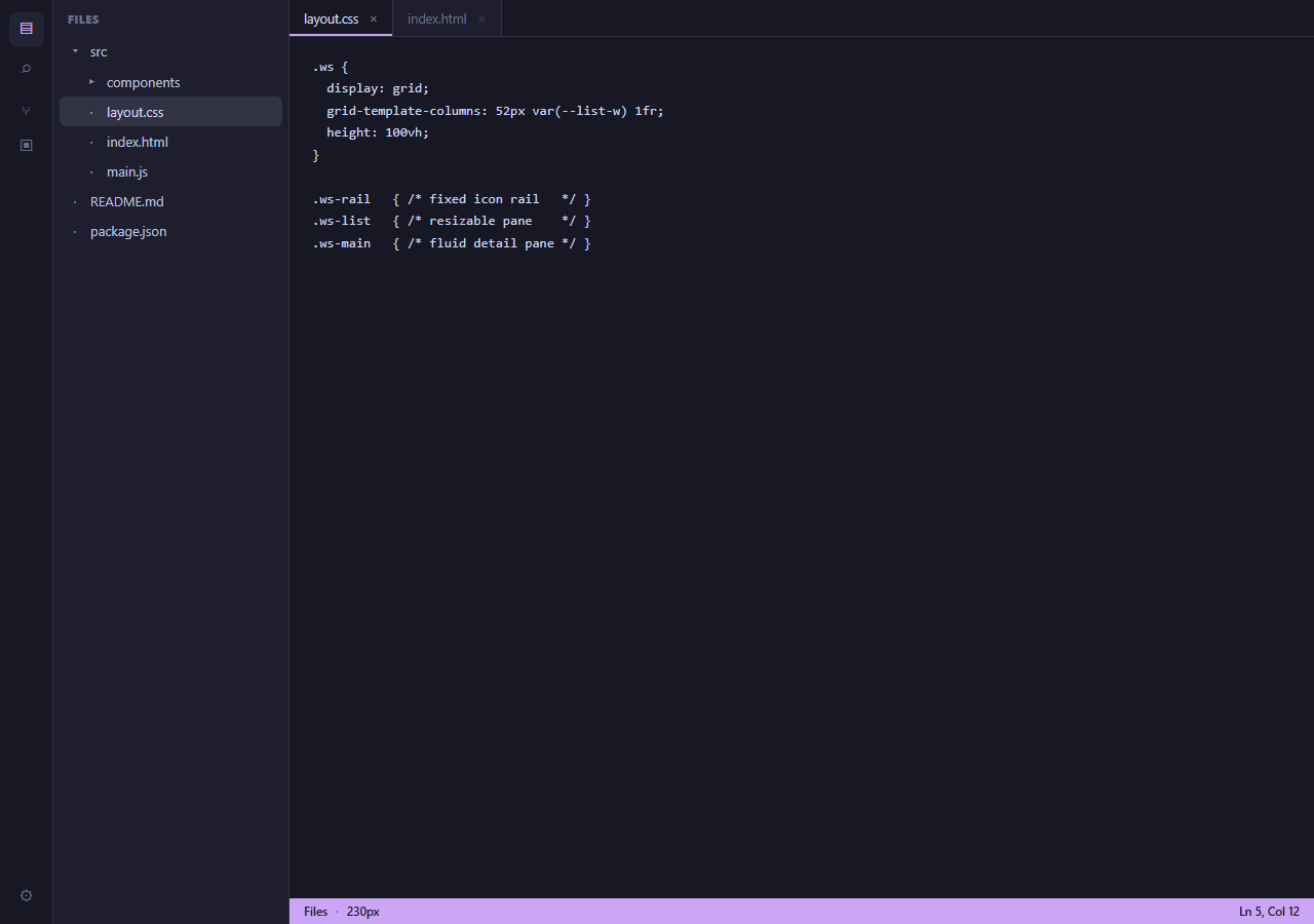
Tools like VS Code, Slack, and most modern IDEs share the same three-zone skeleton: a narrow fixed-width icon rail on the far left for switching top-level views, a resizable list pane next to it showing the content of whichever view is active, and a large fluid pane on the right doing the actual work. This snippet builds that exact shell — icon rail, resizable file/search/git list, and an editor pane with tabs and a status bar — entirely in HTML, CSS grid, and vanilla JavaScript.
Three zones, one grid declaration
The outer .ws container is a single grid-template-columns: 52px auto 1fr row filling 100vh: a fixed-width rail, an auto-sized list pane whose width is actually controlled by inline JavaScript, and a fluid 1fr main pane that absorbs whatever space is left. Because the rail's width never changes, it behaves as a stable anchor for the eye no matter how the middle pane is resized or which panel is active — exactly the property that makes an icon rail useful as permanent muscle-memory navigation.
The rail switches content, not just an active state
Clicking a rail button does two things: toggles the .active class for the pressed-icon visual state, and calls renderPanel(key), which looks up a PANELS object keyed by 'files', 'search', 'git', 'ext', or 'settings' and re-renders the list pane's heading and item rows from that panel's own data. This models the real behavior of a rail-driven workspace: the rail is not a static sidebar toggle, it is a *view switcher* — the list pane's entire content and heading change identity depending on which rail icon is active, not just its visibility.
Resizing the middle pane with pointer capture
The drag handle on the list pane's right edge uses the same pointerdown / pointermove / pointerup plus setPointerCapture() pattern used for any robust drag interaction — capturing the pointer means the resize keeps tracking correctly even if the cursor moves faster than the browser can repaint and briefly leaves the 8px hit area. The width is clamped between 160px and 480px so the pane can never be dragged small enough to make its own contents unreadable, or wide enough to swallow the entire editor pane, and a status-bar readout mirrors the live pixel width back to the user during the drag.
A realistic detail pane, not a placeholder
Rather than an empty gray box, the main pane includes tabs (with a close affordance), a monospace code preview, and a status bar — the same three sub-elements every code editor's main area has. This matters for a layout snippet specifically because a layout's true test is whether *realistic* content fits it correctly: tabs need to sit above a scrollable body, and a status bar needs to stick to the bottom of the pane regardless of how much code is above it, both of which this flex-column main pane handles.
Where this shell belongs
This is the right starting skeleton anywhere a product needs several distinct top-level "modes" (files, search, notifications, settings) that each drive a secondary list, next to one large primary work surface — internal admin tools, no-code builders, chat apps with channel/DM switching, and of course browser-based code editors.
Build with AI
Build, Understand, Optimize, and Extend It With AI
Paste this snippet's HTML, CSS, and JS into an AI coding assistant like Claude and ask it to explain exactly how the PANELS object drives both the rail's active state and the list pane's rendered content from the same click handler, and why the resize logic clamps width rather than letting the pane grow or shrink without limit. It is also a good candidate for extension — ask it to persist the chosen list-pane width and last-active rail panel to localStorage so they survive a page reload, add a collapse-to-icon-only mode for the list pane itself (distinct from the fixed rail), or wire real file-tree expand/collapse behavior into the Files panel instead of the flat mock list.
Prompt to recreate it
Copy this into your AI assistant of choice to build the effect from scratch, or as a jumping-off point for your own variant:
Build a code-editor-style three-pane workspace layout in plain HTML, CSS Grid, and JavaScript — no framework, no library.

Requirements:
- A single outer CSS grid container with three columns: a fixed-width icon rail (roughly 52px), a resizable list pane, and a fluid main pane that fills all remaining space, together filling the full viewport height.
- The icon rail must contain at least five icon buttons (e.g. files, search, source control, extensions, settings), each toggling an active visual state and, more importantly, causing the list pane to re-render its heading and item rows with content specific to that icon — model this as a lookup object keyed by a panel identifier, each holding a label and an array of list items, so the list pane's identity actually changes per rail selection rather than just being shown or hidden.
- A drag handle on the right edge of the list pane that resizes its width using pointer events (pointerdown/pointermove/pointerup) with setPointerCapture() so the drag continues correctly even if the pointer leaves the narrow handle mid-gesture.
- Clamp the resize between a sensible minimum (so list text never becomes unreadable) and maximum (so the list pane can never swallow the main pane) width, and show the current pixel width live somewhere in the UI while dragging.
- The main pane must contain realistic content demonstrating the layout actually works: a row of tabs with a close affordance, a scrollable code or content preview area, and a status bar pinned to the bottom of that pane showing the currently active rail panel's label.
- Make the layout responsive: on a narrow viewport, the list pane should become an overlay/drawer positioned next to the icon rail rather than permanently squeezing the main pane's width.
Want to tighten it up first? Run this prompt through the AI Prompt Studio to score it across 8 quality dimensions, catch anti-patterns, and tune the wording for Claude, ChatGPT, or Gemini before you paste it in.
Step by step
How to Use
- 1Click a rail iconSwitching between Files, Search, Source Control, Extensions, or Settings re-renders the list pane's heading and items for that view.
- 2Drag the divider to resize the list paneGrab the edge between the list pane and the editor and drag — the width is clamped between 160px and 480px and mirrored live in the status bar.
- 3Replace the PANELS dataEdit the PANELS object in the JS panel to swap in your own file tree, search results, or any other list content per rail icon.
- 4Add or remove rail iconsAdd a new button with a data-panel attribute matching a new key in PANELS, and it wires into the same click handler automatically.
- 5Fill in the editor paneReplace the tabs and code preview in .ws-main with your actual editor, preview, or detail content — the pane is a plain flex column.
- 6Export in your frameworkUse the HTML, JSX, Vue, or Tailwind export buttons to bring this shell into your own project as a layout component.
Real-world uses
Common Use Cases
Got questions?
Frequently Asked Questions
The rail functions as permanent muscle-memory navigation — its icons should always land under the same pixel position regardless of what else on the page is resized, the same way a taskbar or dock stays fixed. Making the rail itself resizable would undermine that stability for very little benefit, since its content (a handful of icons) never needs more room.
Each rail button carries a data-panel attribute matching a key in a PANELS JavaScript object holding a label and item list per view. The click handler looks up that key and calls renderPanel(), which rewrites the list pane's heading and rebuilds its item rows from that panel's own data — so the list is not just shown or hidden, its actual content changes identity.
Pointer events cover mouse, touch, and stylus input with one code path, and setPointerCapture() redirects all subsequent pointer events to the resizer element until release — without it, a fast drag can outrun the 8px hit area and the resize stops mid-gesture the moment the cursor leaves the handle.
Below roughly 160px, file or list names become unreadable and start truncating aggressively; above roughly 480px, the list pane starts crowding out the primary editor pane it is supposed to be secondary to. The clamp keeps the pane useful at both extremes without needing the user to manually recover from an unreasonable drag.
Read list.style.width (or the numeric value tracked during the drag) on pointerup and write it to localStorage; on page load, read it back before first paint and apply it to the pane's inline width, the same pattern used in the Resizable Sidebar with Persisted Width snippet.
Yes. Keep the PANELS data as component state or props, render the rail buttons and list items from it, and track the pane width in a ref during the drag (committing to state only on pointerup) so dragging does not re-render the whole tree on every pointermove event.