Source Code
<section class="vcr-intro"><h1>Cards That Turn Themselves</h1><p>Scroll down. Each card rotates in on its Y-axis and settles flat, then rotates back out as it leaves — driven entirely by its own native CSS <code>view-timeline</code>, no JavaScript involved.</p></section>
<div class="vcr-stage">
  <div class="vcr-card" style="--vcr-hue:262"><div class="vcr-face"><h3>Design System</h3><p>Tokens, components, and a shared language across every product surface.</p></div></div>
  <div class="vcr-card" style="--vcr-hue:200"><div class="vcr-face"><h3>Realtime Sync</h3><p>Every edit propagates to collaborators in under 80ms.</p></div></div>
  <div class="vcr-card" style="--vcr-hue:150"><div class="vcr-face"><h3>Edge Rendering</h3><p>Pages render close to the user, not just close to the database.</p></div></div>
  <div class="vcr-card" style="--vcr-hue:20"><div class="vcr-face"><h3>Type-Safe API</h3><p>Every endpoint is generated from a single schema, end to end.</p></div></div>
</div>
<section class="vcr-outro"><p>Every rotation above played on its own schedule, timed by that card's own transit through the viewport.</p></section>*{box-sizing:border-box;margin:0;padding:0}
body{font-family:system-ui,-apple-system,sans-serif;background:#0a0a12;color:#f1eefb}
.vcr-intro,.vcr-outro{min-height:60vh;display:flex;flex-direction:column;justify-content:center;align-items:center;text-align:center;gap:12px;padding:24px;max-width:560px;margin:0 auto}
.vcr-intro h1{font-size:clamp(28px,5.5vw,48px);letter-spacing:-.02em}
.vcr-intro p,.vcr-outro p{color:#a3a0c4;font-size:16px;line-height:1.7}
code{background:rgba(129,140,248,.16);color:#c7d2fe;padding:2px 6px;border-radius:5px;font-size:.9em;font-family:ui-monospace,Consolas,monospace}
.vcr-stage{display:flex;flex-direction:column;gap:26vh;max-width:480px;margin:0 auto;padding:12vh 24px;perspective:1200px}
.vcr-card{
view-timeline-name:--card-in;
view-timeline-axis:block;
animation:vcr-turn linear both;
animation-timeline:--card-in;
animation-range:entry 0% cover 45%, exit 55% exit 100%;
transform-style:preserve-3d;
}
.vcr-face{
border-radius:20px;padding:36px 30px;min-height:180px;display:flex;flex-direction:column;justify-content:center;gap:10px;
background:linear-gradient(155deg, hsl(var(--vcr-hue) 70% 22%), hsl(var(--vcr-hue) 60% 12%));
border:1px solid hsl(var(--vcr-hue) 50% 30%);
box-shadow:0 24px 48px -20px rgba(0,0,0,.6);
backface-visibility:hidden;
}
.vcr-face h3{font-size:19px;margin-bottom:4px}
.vcr-face p{color:#c8c4e0;font-size:14px;line-height:1.6}
@keyframes vcr-turn{
from{ transform:perspective(1200px) rotateY(-72deg) translateZ(-40px); opacity:0 }
30%{ opacity:1 }
45%,55%{ transform:perspective(1200px) rotateY(0deg) translateZ(0); opacity:1 }
to{ transform:perspective(1200px) rotateY(72deg) translateZ(-40px); opacity:0 }
}
@supports not (animation-timeline: view()){
.vcr-card{opacity:1;animation:none;transform:none}
}// Every card rotation above is entirely driven by CSS animation-timeline:
// view() (via a named view-timeline per card) with animation-range shaping
// the entry and exit windows. No JS observes scroll or intersection at all
// — this script only reports feature support for the demo readout.
const supportsView = typeof CSS !== 'undefined' && CSS.supports('animation-timeline: view()');
console.log('[view-timeline-card-rotate-3d] native view() timeline supported:', supportsView);
document.querySelectorAll('.vcr-face h3').forEach(h => {
if (!supportsView) h.textContent += ' (static fallback)';
});Learn Coding Visually
Learn to code with interactive, live-preview playgrounds — HTML, CSS, JavaScript, React & more.
 HTML Playground42 lessons · Click-based · Live preview
 CSS PlaygroundLearn CSS with a live editor
 JavaScript Playground60 lessons · DOM · Async · Canvas
 React PlaygroundLearn React with a live code editor
 GSAP PlaygroundLearn GSAP animation interactively
 SVG Playground44 lessons · shapes · paths · animation
 SCSS Playground45 lessons · Sass modules · tokens
 Tailwind PlaygroundLearn Tailwind CSS with a live editor
 Bootstrap 5 Playground50 lessons · live preview
3D Card Rotate on Scroll — Native CSS view-timeline
3D Card Rotate on Scroll (view-timeline) · Scroll · Plain HTML, CSS & JS · Live preview
What's included
Features
About this UI Snippet
3D Card Rotate on Scroll — animation-timeline: view() Driving rotateY()
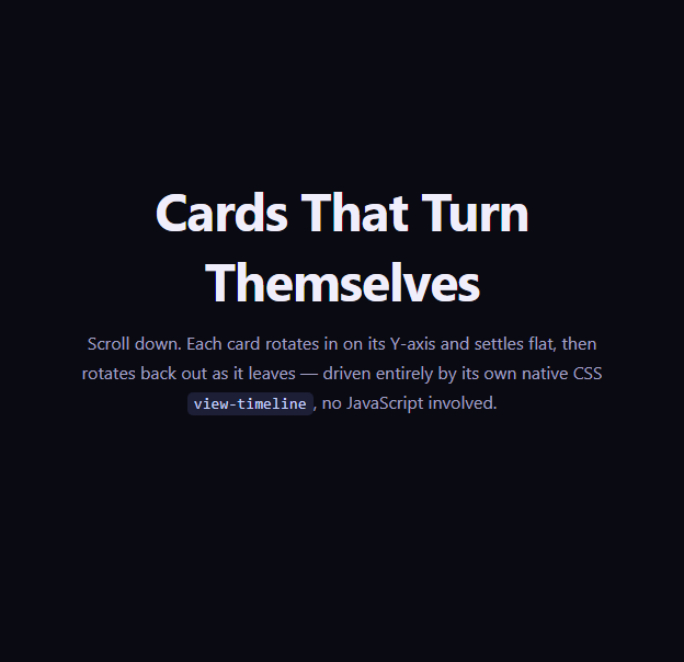
A 3D card rotation reveal — where a card turns in on its Y-axis, settles flat, then turns back out as the reader keeps scrolling — is normally built with a scroll-triggered animation library like GSAP ScrollTrigger, computing a rotation value from the card's position relative to the viewport on every scroll frame. This snippet builds the identical effect using nothing but a per-element native CSS view timeline: the browser itself supplies the "how far through the viewport is this card" value, and a single @keyframes block maps that value to a Y-axis rotation.
A view timeline per card
Each .vcr-card declares its own view-timeline-name: --card-in and view-timeline-axis: block. Because every card uses the same custom-ident name, each card still gets an entirely independent timeline instance scoped to itself — card two's own transit through the viewport has nothing to do with card one's. That per-element timeline then drives an animation-timeline: --card-in reference on the same element's @keyframes vcr-turn animation.
Shaping entry AND exit with a comma-separated animation-range
Unlike a simple fade that only needs an entry range, this rotation needs two distinct windows: the card turning in as it enters, and turning back out as it exits. animation-range: entry 0% cover 45%, exit 55% exit 100% supplies both: the first range covers the entry phase (0% of entry to 45% covered), and the second covers the exit phase (55% through exit to fully exited). The keyframes themselves are written to match — from/30%/45%,55%/to — so the card is flat and fully opaque only in the very middle of its visible window, and turned away with reduced opacity at both edges.
Why rotateY and not a simple slide
A Y-axis rotation reads as physically dimensional in a way translateY or opacity fades do not — combined with perspective on the stage container and translateZ pulling the card slightly back during rotation, the card appears to be a physical object tumbling into and out of the page's plane rather than a flat layer sliding. backface-visibility: hidden prevents a distracting mirror-flash of the card's back face during the steepest part of the rotation.
Comparing to a per-element fade-in
View Timeline Image Reveal uses the same per-element view-timeline-name + animation-range pattern for a simpler clip-path reveal that only needs an entry range. This snippet demonstrates the natural next step: layering a second animation-range for the exit phase so the effect is symmetric on the way out, not just the way in.
Browser support
Chromium-based browsers (Chrome, Edge, Opera, Brave) support animation-timeline: view() today. Firefox and Safari support is still landing, so an @supports not (animation-timeline: view()) block resets every card to a flat, fully visible, non-rotated state rather than leaving cards stuck mid-turn or invisible.
Customizing it
Tune the entry 0% cover 45% and exit 55% exit 100% percentages to make the turn faster or slower relative to the card's total transit, swap rotateY for rotateX for a top-down tumble, or change view-timeline-axis to inline for a horizontally scrolling card row instead. Pair it with a Feature Cards layout or a Bento Grid for a scroll-paced feature story.
Build with AI
Build, Understand, Optimize, and Extend It With AI
You don't have to work through the dual animation-range math by hand. Paste this snippet's HTML, CSS, and JS into an AI coding assistant like Claude and ask it to explain exactly how the comma-separated animation-range: entry 0% cover 45%, exit 55% exit 100% maps onto the from/30%/45%,55%/to keyframe percentages in @keyframes vcr-turn, and why backface-visibility: hidden matters during the steepest part of the rotation. The same assistant is useful for extending the effect: ask it to alternate the rotation direction between cards (some turning in from the left, others from the right), add a subtle drop-shadow animation that intensifies as the card reaches its flat resting position, or convert the vertical stack into a horizontal scroll-snap row using view-timeline-axis: inline. Treat the code less like a finished artifact and more like a starting point for a conversation.
Prompt to recreate it
Copy this into your AI assistant of choice to build the effect from scratch, or as a jumping-off point for your own variant:
Build a vertical stack of cards that rotate in on their Y-axis as they enter the viewport, settle flat, then rotate back out as they exit — using only native CSS scroll-driven animations with per-element view timelines (animation-timeline: view() via view-timeline-name and view-timeline-axis). No JavaScript, no scroll event listeners, no animation library.

Requirements:
- Several card elements, each containing a heading and a short description, laid out vertically with generous spacing between them.
- Every card must declare its own view-timeline-name and view-timeline-axis: block, then reference that timeline via animation-timeline on a keyframe animation applied to the same element.
- Use a comma-separated animation-range with two ranges — one covering the card's entry into the viewport, one covering its exit — so a single keyframe animation can shape both the turn-in and the turn-out symmetrically.
- The keyframes must animate transform using rotateY() combined with perspective() and a translateZ() pullback, plus opacity, so the card reads as a physically dimensional object tumbling into and out of the page rather than a flat sliding layer. Set backface-visibility: hidden on the card face to avoid a mirrored flash mid-rotation.
- Wrap the whole effect in @supports not (animation-timeline: view()) so unsupported browsers show every card flat, fully visible, and untransformed instead of stuck mid-rotation.
- Keep any JavaScript limited to a CSS.supports('animation-timeline: view()') feature check for a console message — it must not drive or trigger the rotation itself.
Want to tighten it up first? Run this prompt through the AI Prompt Studio to score it across 8 quality dimensions, catch anti-patterns, and tune the wording for Claude, ChatGPT, or Gemini before you paste it in.
Step by step
How to Use
- 1Paste the HTML, CSS, and JSAn intro, a four-card stack, and an outro render — no library needed.
- 2Scroll down slowlyEach card rotates in on its Y-axis, settles flat, then rotates back out as it exits.
- 3Scroll back upThe rotation reverses correctly because the animation is bound to a live view timeline.
- 4Adjust animation-rangeWiden or narrow the entry/exit percentages to make the turn faster or slower.
- 5Swap rotation axisChange rotateY to rotateX in @keyframes vcr-turn for a top-down tumble instead.
- 6Export in your formatClick "HTML" for a standalone file, "JSX" for a React component, or "Tailwind" for a React + Tailwind version.
Real-world uses
Common Use Cases
Got questions?
Frequently Asked Questions
Each element that declares view-timeline-name creates its own independent timeline instance scoped to itself, even if multiple elements use the identical custom-ident name. The name is only used so the element's own animation-timeline property can reference it — it is not a shared, page-wide timeline the way scroll(root) is.
A single animation-range can list multiple ranges separated by commas, and each keyframe percentage in the associated @keyframes rule is then mapped proportionally across however many ranges are supplied. Here entry 0% cover 45% covers the first half of playback (the card entering) and exit 55% exit 100% covers the second half (the card exiting), letting one animation shape two distinct windows.
A Y-axis rotation combined with a perspective on the containing stage reads as a physically dimensional tumble rather than a flat opacity change, which draws more attention and feels more crafted for a hero-level feature showcase — at the cost of being a slightly heavier visual effect than a plain fade.
Yes. Because the animation is bound to a live view timeline rather than triggered once by an observer, scrolling a card back down out of view and then back up replays the exact same keyframe range in the corresponding direction with no manual reset needed.
The @supports not (animation-timeline: view()) block removes the animation and resets transform to none, so cards render flat and fully visible immediately in Firefox and Safari rather than being stuck mid-rotation or invisible.
Yes. Switch view-timeline-axis from block to inline and lay the cards out in a horizontally scrolling row (for example with scroll-snap) — each card's timeline will then track its transit across the horizontal viewport instead of the vertical one.