Source Code
<div class="bento">
  <div class="cell a">
    <div class="icon">✦</div>
    <h3>Build faster</h3>
    <p>Ship production-ready components in minutes, not hours.</p>
  </div>
  <div class="cell b"><div class="big-number">99%</div><span>Satisfaction</span></div>
  <div class="cell c"><div class="icon">⚡</div><h3>Performance</h3></div>
  <div class="cell d"><div class="icon">🎨</div><h3>Design tokens</h3><p>Consistent colors, spacing, and typography.</p></div>
  <div class="cell e"><div class="stat">12k+</div><span>Components</span></div>
  <div class="cell f"><div class="icon">🔒</div><h3>Accessible</h3><p>WCAG 2.1 AA by default.</p></div>
</div>
* { box-sizing: border-box; margin: 0; padding: 0; }
body { font-family: system-ui, sans-serif; background: #0f172a; display: flex; align-items: center; justify-content: center; min-height: 100vh; padding: 20px; }
.bento { display: grid; grid-template-columns: repeat(3, 1fr); gap: 10px; width: 100%; max-width: 520px; }
.cell { background: #1e293b; border-radius: 16px; padding: 22px 20px; border: 1px solid rgba(255,255,255,0.06); transition: transform 0.2s, border-color 0.2s; }
.cell:hover { transform: translateY(-2px); border-color: rgba(99,102,241,0.3); }
.a { grid-column: span 2; background: linear-gradient(135deg, #1e1b4b, #312e81); }
.b { text-align: center; display: flex; flex-direction: column; align-items: center; justify-content: center; }
.d { grid-column: span 2; }
.e { text-align: center; display: flex; flex-direction: column; align-items: center; justify-content: center; background: linear-gradient(135deg, #4c1d95, #5b21b6); }
.icon { font-size: 24px; margin-bottom: 12px; }
h3 { font-size: 15px; font-weight: 700; color: #f1f5f9; margin-bottom: 6px; }
p { font-size: 12px; color: #64748b; line-height: 1.55; }
.big-number { font-size: 36px; font-weight: 800; color: #6366f1; line-height: 1; margin-bottom: 4px; }
.stat { font-size: 32px; font-weight: 800; color: #a78bfa; line-height: 1; margin-bottom: 4px; }
.b span, .e span { font-size: 11px; color: #64748b; text-transform: uppercase; letter-spacing: 0.5px; }Learn Coding Visually
Learn to code with interactive, live-preview playgrounds — HTML, CSS, JavaScript, React & more.
 HTML Playground42 lessons · Click-based · Live preview
 CSS PlaygroundLearn CSS with a live editor
 JavaScript Playground60 lessons · DOM · Async · Canvas
 React PlaygroundLearn React with a live code editor
 GSAP PlaygroundLearn GSAP animation interactively
 SVG Playground44 lessons · shapes · paths · animation
 SCSS Playground45 lessons · Sass modules · tokens
 Tailwind PlaygroundLearn Tailwind CSS with a live editor
 Bootstrap 5 Playground50 lessons · live preview
What's included
Features
About this UI Snippet
Bento Grid — grid-column span, Named Areas & Dark Feature Layout
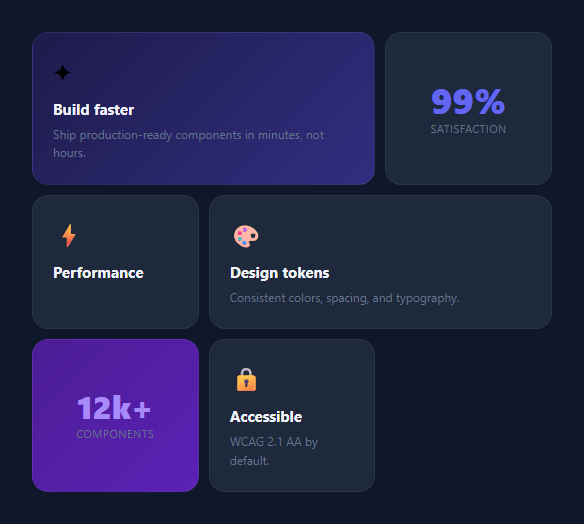
The bento grid is a modern layout pattern borrowed from Japanese bento boxes — a collection of different-sized cells arranged in a grid, each containing distinct content. Made popular by Apple and Linear, it is used on feature pages — alongside feature cards and a metric card grid — to showcase product capabilities where each feature gets a proportional amount of visual space based on its importance.
The grid structure
.bento { display: grid; grid-template-columns: repeat(3, 1fr); gap: 10px } creates a three-equal-column grid. Cells span different numbers of columns using grid-column: span N: .a { grid-column: span 2 } makes the first cell take two columns and the next cell one, creating a 2+1 row. .d { grid-column: span 2 } in the second row creates a mirrored 1+2 layout. This combination produces the visually varied bento pattern.
Named cell classes
The cells use single-letter class names (.a, .b, .c, .d, .e) as span modifiers. Most cells use the default .cell background (#1e293b). Cells .a and .e use their own gradient backgrounds to create accent points of visual interest.
The hover interaction
.cell:hover { transform: translateY(-2px); border-color: rgba(99,102,241,0.3); } lifts each cell and tints its border with the accent colour on hover. The transition: transform 0.2s, border-color 0.2s makes both smooth. The default border is rgba(255,255,255,0.06) — nearly invisible on dark background.
Content patterns
The snippet demonstrates four content patterns: emoji icon + heading + description (standard feature cell), large stat number + label (metric cell), and pure gradient accent cells. These four patterns cover most feature grid use cases.
Making it responsive
For mobile, override the grid to a single column: @media (max-width: 640px) { .bento { grid-template-columns: 1fr; } .a, .d { grid-column: span 1; } }. All cells stack vertically on narrow screens.
The grid-column: span pattern
Bento grid items use grid-column: span 2 to occupy two columns of width while using the standard row height. Some items use grid-row: span 2 for double-height cells. The container uses display: grid; grid-template-columns: repeat(4, 1fr); gap: 12px. The browser automatically positions items in the available cells following the normal document flow, wrapping to new rows as needed — for a uniform-cell variant, use the responsive card grid. No manual row/column placement is required — the span values create the varied layout automatically.
Responsive adaptation
On narrow screens, reduce the grid columns: @media (max-width: 768px) { .bento { grid-template-columns: repeat(2, 1fr); } }. Items with span 2 that were wide on desktop now span both narrow columns, becoming full-width. For mobile, single column with no spans works best. Each breakpoint may need custom span overrides for specific items.
The hover accent border
Each bento card uses border: 1px solid transparent initially. On :hover, border-color transitions to the accent colour. Combined with border-radius and the card background, this creates a lit border effect that highlights the card being hovered without moving it. Add box-shadow: 0 8px 32px rgba(accent, 0.1) on hover for additional lift.
Build with AI
Build, Understand, Optimize, and Extend It With AI
You don't have to work out every span value by trial and error here. Paste this snippet's HTML and CSS into an AI coding assistant like Claude and ask it to explain exactly how the three-column repeat(3, 1fr) track combines with grid-column: span 2 on cells a and d to produce the asymmetric 2+1 and 1+2 row pattern, and why the browser's auto-placement algorithm is enough without any explicit grid-row assignments. The same assistant can help optimize it — asking whether the hover lift and border-color transition should be consolidated into a single transition shorthand, or whether the gradient cells should use CSS custom properties so a brand recolor only touches one place. It's also useful for extending the layout: ask it to add a responsive breakpoint that collapses spans on mobile, a cell that spans two rows for a taller feature tile, or a variant with an image-backed cell using object-fit cover. Treat the code less like a finished artifact and more like a starting point for a conversation.
Prompt to recreate it
Copy this into your AI assistant of choice to build the effect from scratch, or as a jumping-off point for your own variant:
Build a "bento grid" feature layout in plain HTML and CSS only — no JavaScript, no grid template areas, using only grid-column span values and the browser's automatic item placement.

Requirements:
- A container using display: grid with exactly three equal-width columns (repeat(3, 1fr)) and a consistent gap.
- At least six cells, where two specific cells each use grid-column: span 2 so they occupy two of the three columns while sibling cells fill the remaining single column, producing a visually varied 2-then-1 and 1-then-2 row rhythm purely from the browser's auto-placement — no manual grid-row or grid-column-start values anywhere.
- At least two cells with distinct linear-gradient backgrounds to serve as visual anchor points, while the rest share a common flat dark card background.
- Every cell must have a hover state that lifts it slightly with a transform: translateY and simultaneously brightens its border-color, both animated with a CSS transition, without affecting sibling cells' layout position.
- Include at least three distinct content patterns inside cells: an icon-plus-heading-plus-paragraph cell, a large-number-plus-label stat cell, and an icon-plus-heading-only cell with no paragraph.
- Add a mobile media query that collapses the grid to a single column and resets both span-2 cells back to span 1 so the layout stacks cleanly on narrow screens.
Want to tighten it up first? Run this prompt through the AI Prompt Studio to score it across 8 quality dimensions, catch anti-patterns, and tune the wording for Claude, ChatGPT, or Gemini before you paste it in.
Step by step
How to Use
- 1Load the snippetClick "Bento Grid" in the sidebar. The preview shows the dark five-cell grid with span-2 cells and gradient accent areas.
- 2Edit cell contentIn the HTML panel, update the emoji icon, h3 heading, and p description in each .cell div. Change the stat numbers in the metric cells.
- 3Change the span layoutIn the CSS panel, update grid-column: span 2 on .a and .d to span 1 or span 3 to change the cell proportions.
- 4Change accent cell gradientsUpdate the linear-gradient on .a and .e cells to your brand colours.
- 5Make it responsiveAdd @media (max-width: 640px) { .bento { grid-template-columns: 1fr; } .a, .d { grid-column: span 1; } } in the CSS panel.
- 6Export in your formatClick "HTML" for a standalone file, "JSX" for a React component, or "Tailwind" for a React + Tailwind version.
Real-world uses
Common Use Cases
Got questions?
Frequently Asked Questions
A bento grid is a CSS Grid layout where cells have varied sizes — some span one column, others span two — creating a visually asymmetric arrangement. It is named after the Japanese bento box and popularised by Apple product pages and SaaS landing pages.
grid-column: span 2 tells a grid item to occupy two consecutive column tracks. In a three-column grid, a span-2 item takes up 2/3 of the row width. The next item (span 1) fills the remaining 1/3, creating a 2+1 layout.
Add a new <div class="cell"> inside .bento. The grid auto-places it in the next available position. To control its position, add a span modifier. For a full-width cell, add .f { grid-column: span 3 } in the CSS.
Add @media (max-width: 640px) { .bento { grid-template-columns: 1fr; } .a, .d { grid-column: span 1; } }. This collapses to a single column on mobile and resets all span overrides.
Yes. Add an img inside any cell with width: 100%; height: auto; object-fit: cover; border-radius: 8px. For cells that should show only an image, remove the text content and set a fixed height on the cell.
Yes. Click "JSX" or "Tailwind" to download the export. In Tailwind, the grid maps to grid grid-cols-3 gap-2.5. span 2 cells use col-span-2. The dark background cells use bg-slate-800 and hover styles use hover:translate-y-[-2px] hover:border-indigo-500/30.