Source Code
<div class="demo">
  <div class="phone">
    <div class="notch"></div>
    <div class="screen">
      <div class="status-bar">
        <span>9:41</span>
        <span class="status-icons">
          <svg width="14" height="14" viewBox="0 0 24 24" fill="currentColor"><path d="M2 22h2v-4H2v4Zm5 0h2v-9H7v9Zm5 0h2v-14h-2v14Zm5 0h2V6h-2v16Zm5 0h2V2h-2v20Z"/></svg>
          <svg width="15" height="15" viewBox="0 0 24 24" fill="currentColor"><path d="M1 21h2v-2H1v2Zm5 0h2V9H6v12Zm5 0h2V3h-2v18Zm5 0h2V9h-2v12Zm5 0h2V13h-2v8Z" opacity="0"/></svg>
          <svg width="20" height="12" viewBox="0 0 24 12" fill="none" stroke="currentColor" stroke-width="1"><rect x="1" y="1" width="19" height="10" rx="2.5"/><rect x="3" y="3" width="13" height="6" rx="1" fill="currentColor" stroke="none"/><rect x="21.5" y="4" width="1.5" height="4" rx="0.5" fill="currentColor" stroke="none"/></svg>
        </span>
      </div>

      <h1 class="clock-time">9:41 <span class="am">AM</span></h1>

      <div class="alarm-list">
        <div class="alarm-row">
          <div>
            <span class="alarm-time">6:30 <small>AM</small></span>
            <span class="alarm-days">Weekdays</span>
          </div>
          <button class="switch on" data-alarm="1" role="switch" aria-checked="true" aria-label="Weekday alarm"><span class="knob"></span></button>
        </div>
        <div class="alarm-row">
          <div>
            <span class="alarm-time">8:00 <small>AM</small></span>
            <span class="alarm-days">Sat, Sun</span>
          </div>
          <button class="switch" data-alarm="2" role="switch" aria-checked="false" aria-label="Weekend alarm"><span class="knob"></span></button>
        </div>
        <div class="alarm-row">
          <div>
            <span class="alarm-time">12:45 <small>PM</small></span>
            <span class="alarm-days">Once — Today</span>
          </div>
          <button class="switch on" data-alarm="3" role="switch" aria-checked="true" aria-label="Reminder alarm"><span class="knob"></span></button>
        </div>
      </div>

      <button class="add-alarm">
        <svg width="16" height="16" viewBox="0 0 24 24" fill="none" stroke="currentColor" stroke-width="2.4" stroke-linecap="round"><path d="M12 5v14M5 12h14"/></svg>
        Add alarm
      </button>
    </div>
  </div>
</div>
* { box-sizing: border-box; margin: 0; padding: 0; }
body { font-family: system-ui, sans-serif; background: #f8fafc; display: flex; align-items: center; justify-content: center; min-height: 100vh; padding: 24px; }
.phone { width: 300px; height: 620px; background: #0f172a; border-radius: 42px; padding: 12px; box-shadow: 0 24px 60px rgba(15,23,42,0.35); position: relative; }
.notch { position: absolute; top: 12px; left: 50%; transform: translateX(-50%); width: 110px; height: 24px; background: #0f172a; border-radius: 0 0 16px 16px; z-index: 2; }
.screen { background: #f8fafc; height: 100%; border-radius: 32px; overflow: hidden; display: flex; flex-direction: column; padding: 16px 18px; gap: 20px; }
.status-bar { display: flex; justify-content: space-between; align-items: center; font-size: 13px; font-weight: 700; color: #0f172a; padding: 4px 6px 0; }
.status-icons { display: flex; align-items: center; gap: 4px; color: #0f172a; }
.clock-time { text-align: center; font-size: 40px; font-weight: 200; color: #0f172a; letter-spacing: -1px; }
.clock-time .am { font-size: 16px; font-weight: 600; color: #94a3b8; }
.alarm-list { display: flex; flex-direction: column; gap: 10px; flex: 1; }
.alarm-row { display: flex; align-items: center; justify-content: space-between; background: #fff; border: 1px solid #e2e8f0; border-radius: 14px; padding: 14px 16px; }
.alarm-row > div { display: flex; flex-direction: column; gap: 3px; }
.alarm-time { font-size: 19px; font-weight: 700; color: #0f172a; }
.alarm-time small { font-size: 11px; font-weight: 700; color: #94a3b8; }
.alarm-days { font-size: 11px; color: #94a3b8; font-weight: 600; }
.switch { width: 44px; height: 26px; border-radius: 999px; background: #e2e8f0; border: none; position: relative; cursor: pointer; transition: background 0.2s; flex-shrink: 0; }
.switch .knob { position: absolute; top: 2px; left: 2px; width: 22px; height: 22px; border-radius: 50%; background: #fff; box-shadow: 0 1px 3px rgba(0,0,0,0.25); transition: transform 0.2s; }
.switch.on { background: #34d399; }
.switch.on .knob { transform: translateX(18px); }
.add-alarm { display: flex; align-items: center; justify-content: center; gap: 7px; background: #0f172a; color: #fff; border: none; padding: 13px; border-radius: 14px; font-size: 13px; font-weight: 700; cursor: pointer; font-family: inherit; }
.add-alarm:hover { background: #1e293b; }document.querySelectorAll('.switch').forEach((sw) => {
sw.addEventListener('click', () => {
const isOn = sw.classList.toggle('on');
sw.setAttribute('aria-checked', String(isOn));
});
});Learn Coding Visually
Learn to code with interactive, live-preview playgrounds — HTML, CSS, JavaScript, React & more.
 HTML Playground42 lessons · Click-based · Live preview
 CSS PlaygroundLearn CSS with a live editor
 JavaScript Playground60 lessons · DOM · Async · Canvas
 React PlaygroundLearn React with a live code editor
 GSAP PlaygroundLearn GSAP animation interactively
 SVG Playground44 lessons · shapes · paths · animation
 SCSS Playground45 lessons · Sass modules · tokens
 Tailwind PlaygroundLearn Tailwind CSS with a live editor
 Bootstrap 5 Playground50 lessons · live preview
Mobile Alarm Clock Screen — iOS-Style Alarm List UI Mockup
Mobile Alarm Clock Screen · Mobile · Plain HTML, CSS & JS · Live preview
What's included
Features
About this UI Snippet
Mobile Alarm Clock Screen — Toggleable Alarm List UI
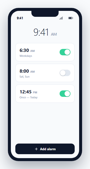
This mockup recreates the familiar mobile alarm-clock app layout: a large current-time display up top, followed by a scrollable list of configured alarms, each independently toggleable. It's built entirely from HTML and CSS inside a phone-shaped frame, with a small amount of JavaScript purely for the switch interactions.
Each alarm row is self-contained
An .alarm-row pairs a time/label block on the left with a .switch toggle on the right — the time uses a large numeral with a smaller AM/PM suffix (<small>), and the day label beneath it (Weekdays, Sat, Sun, Once — Today) communicates recurrence at a glance, matching how real alarm apps summarize a schedule without requiring the user to open each alarm's detail view.
The switch control is a real toggle, not just a colored pill
Each .switch is a <button role="switch" aria-checked="..."> — genuine toggle-switch semantics, not a styled checkbox or a plain div. Clicking it toggles both the .on class (which slides the .knob circle via transform: translateX and switches the track's background to green) and the aria-checked attribute in the same handler, so the visual state and the accessible state can never drift out of sync with each other.
Why the knob animates via transform, not left/right positioning
.knob is absolutely positioned at a fixed left: 2px, and the "sliding" effect comes entirely from transform: translateX(18px) on the .on state — using transform instead of animating left lets the browser run the toggle animation on the compositor thread, avoiding a full layout recalculation on every click and keeping the interaction snappy even on lower-powered devices.
Where this mockup is useful beyond a literal alarm app
Beyond a literal clock app, the toggleable-row-with-label pattern shown here generalizes directly to any settings list where each row needs a switch — notification preferences, feature flags in an admin panel, or scheduled-task enable/disable lists — making this a reusable reference for building an accessible, correctly-animated switch control from scratch.
Build with AI
Build, Understand, Optimize, and Extend It With AI
Ask an AI assistant to explain why using role="switch" with a synchronized aria-checked attribute is preferable to styling a checkbox or a plain div to look like a toggle, especially for screen reader users navigating a settings list. It's also worth asking for a version that supports per-alarm custom repeat-day selection (a day-of-week picker), or one that adds a snooze/dismiss overlay simulating an alarm actively going off.
Prompt to recreate it
Copy this into your AI assistant of choice to build the effect from scratch, or as a jumping-off point for your own variant:
Build a mobile alarm clock app screen mockup in HTML, CSS and vanilla JavaScript, presented inside a phone-shaped frame — no external libraries.

Requirements:
- A phone frame with a notch and a status bar showing the time and simple signal/battery icons at the top.
- A large current-time display below the status bar.
- A list of alarm rows below that, each showing a time with an AM/PM suffix, a recurrence label (e.g. "Weekdays", "Sat, Sun", "Once — Today"), and a toggle switch on the right.
- Each toggle switch must be implemented as a real button with role="switch" and an aria-checked attribute that is kept in sync with its visual on/off state by the same click handler.
- The switch's sliding knob animation must be implemented using a CSS transform (not by changing a left/right position property) for compositor-friendly performance.
- Include an "Add alarm" button styled consistently with the rest of the screen at the bottom of the alarm list.
Want to tighten it up first? Run this prompt through the AI Prompt Studio to score it across 8 quality dimensions, catch anti-patterns, and tune the wording for Claude, ChatGPT, or Gemini before you paste it in.
Step by step
How to Use
- 1Edit the current time and alarm entriesUpdate .clock-time and each .alarm-row's time/day text in the HTML panel to match your desired mockup content.
- 2Toggle switch default statesAdd or remove the .on class and set aria-checked accordingly on any .switch to control its starting state.
- 3Add or remove alarm rows freelyEach .alarm-row is independent — copy the block structure to add more entries to the list.
- 4Adjust the phone frame sizeChange the .phone width/height in the CSS panel if you need a different device aspect ratio for your mockup.
- 5Wire up real toggle behaviorReplace the click handler's simple class/attribute toggle with a call to your actual alarm-scheduling logic if this becomes a real feature.
Real-world uses
Common Use Cases
Got questions?
Frequently Asked Questions
It is a real toggle — a <button role="switch" aria-checked="true|false"> whose accessible state is updated in the exact same click handler that updates the visual .on class, so the two can never fall out of sync.
Animating transform: translateX() runs on the GPU-accelerated compositor thread without triggering layout recalculation, making the slide noticeably smoother and cheaper than animating the left property directly, especially on lower-powered mobile devices.
Yes — the .switch markup and CSS are fully generic; the same role="switch" button pattern works for any binary settings toggle, such as notification preferences or feature flags.
Copy an existing .alarm-row block, update its time, AM/PM suffix, and day label text, and add a matching .switch button with a unique data-alarm value if you need to track alarms individually in JavaScript.
No — this is a visual mockup of the alarm list screen and its toggle interactions only; it does not include actual scheduling, notifications, or sound-playing logic, which would need to be implemented separately for a real app.
The frame has a fixed pixel size intended for a mockup/showcase context; for an actual responsive mobile web app, you would remove the phone-frame chrome and let the .screen content fill the real device viewport instead.