Source Code
<div class="aps-phone" id="apsPhone">
<div class="aps-screen" id="apsScreen">
<div class="aps-status"><span>9:41</span><span class="aps-batt"><i></i></span></div>
<header class="aps-head">
<button class="aps-back" aria-label="Back">‹</button>
<h1>Appearance</h1>
<span class="aps-spacer"></span>
</header>
<div class="aps-scroll">
<p class="aps-section-label">Theme</p>
<div class="aps-seg" id="apsSeg">
<button class="aps-seg-btn" data-theme="light">
<svg width="16" height="16" viewBox="0 0 24 24" fill="none" stroke="currentColor" stroke-width="2"><circle cx="12" cy="12" r="4.5"/><path d="M12 2v2M12 20v2M4.2 4.2l1.4 1.4M18.4 18.4l1.4 1.4M2 12h2M20 12h2M4.2 19.8l1.4-1.4M18.4 5.6l1.4-1.4"/></svg>
Light
</button>
<button class="aps-seg-btn active" data-theme="system">
<svg width="16" height="16" viewBox="0 0 24 24" fill="none" stroke="currentColor" stroke-width="2"><rect x="3" y="4" width="18" height="13" rx="2"/><path d="M8 21h8M12 17v4"/></svg>
System
</button>
<button class="aps-seg-btn" data-theme="dark">
<svg width="16" height="16" viewBox="0 0 24 24" fill="none" stroke="currentColor" stroke-width="2"><path d="M20.5 14.5A8.5 8.5 0 1110 3.2a7 7 0 0010.5 11.3z"/></svg>
Dark
</button>
</div>
<p class="aps-section-label">Accent color</p>
<div class="aps-swatches" id="apsSwatches">
<button class="aps-swatch active" data-color="#6366f1" style="background:#6366f1" aria-label="Indigo"></button>
<button class="aps-swatch" data-color="#059669" style="background:#059669" aria-label="Green"></button>
<button class="aps-swatch" data-color="#dc2626" style="background:#dc2626" aria-label="Red"></button>
<button class="aps-swatch" data-color="#d97706" style="background:#d97706" aria-label="Amber"></button>
<button class="aps-swatch" data-color="#db2777" style="background:#db2777" aria-label="Pink"></button>
<button class="aps-swatch" data-color="#0891b2" style="background:#0891b2" aria-label="Cyan"></button>
</div>
<p class="aps-section-label">Text size</p>
<div class="aps-slider-row">
<span class="aps-slider-icon small">A</span>
<input type="range" min="0" max="4" step="1" value="1" class="aps-slider" id="apsSlider">
<span class="aps-slider-icon large">A</span>
</div>
<p class="aps-section-label">Preview</p>
<div class="aps-preview" id="apsPreview">
<div class="aps-preview-row">
<span class="aps-preview-avatar" id="apsPreviewAvatar">JD</span>
<div>
<b id="apsPreviewTitle">Jordan Diaz</b>
<small id="apsPreviewSub">Update available for 3 apps</small>
</div>
</div>
<button class="aps-preview-btn" id="apsPreviewBtn">Primary Action</button>
</div>
<label class="aps-toggle-row">
<span>Reduce motion</span>
<span class="aps-toggle" id="apsMotionToggle"><span class="aps-knob"></span></span>
</label>
<label class="aps-toggle-row">
<span>True black backgrounds</span>
<span class="aps-toggle" id="apsBlackToggle"><span class="aps-knob"></span></span>
</label>
</div>
</div>
</div>*{box-sizing:border-box;margin:0;padding:0}
html{scrollbar-width:none;-ms-overflow-style:none}
html::-webkit-scrollbar{display:none}
body{font-family:system-ui,-apple-system,sans-serif;background:#1e293b;display:flex;justify-content:center;align-items:center;min-height:100vh;padding:24px;scrollbar-width:none;-ms-overflow-style:none}
body::-webkit-scrollbar{display:none}
.aps-phone{width:288px;height:600px;background:#0b1220;border-radius:46px;padding:12px;box-shadow:0 30px 60px -20px rgba(0,0,0,.6),inset 0 0 0 2px #1e293b}
.aps-screen{width:100%;height:100%;border-radius:34px;overflow:hidden;background:#f8fafc;color:#0f172a;display:flex;flex-direction:column;transition:background .3s,color .3s}
.aps-screen.dark{background:#0f172a;color:#f1f5f9}
.aps-status{display:flex;justify-content:space-between;align-items:center;padding:13px 24px 0;font-size:13px;font-weight:700}
.aps-batt{width:22px;height:11px;border:1.4px solid currentColor;border-radius:3px;position:relative;display:inline-block}
.aps-batt::after{content:'';position:absolute;right:-3px;top:3px;width:2px;height:5px;background:currentColor;border-radius:0 1px 1px 0}
.aps-batt i{position:absolute;left:1.4px;top:1.4px;bottom:1.4px;width:82%;background:currentColor;border-radius:1px}
.aps-head{display:flex;align-items:center;justify-content:space-between;padding:8px 14px 10px}
.aps-back{background:rgba(15,23,42,.06);border:none;width:30px;height:30px;border-radius:50%;font-size:20px;color:inherit;cursor:pointer}
.aps-screen.dark .aps-back{background:rgba(255,255,255,.1)}
.aps-head h1{font-size:15px;font-weight:800}
.aps-spacer{width:30px}
.aps-scroll{flex:1;overflow-y:auto;padding:6px 18px 26px;scrollbar-width:none;-ms-overflow-style:none}
.aps-scroll::-webkit-scrollbar{display:none}
.aps-section-label{font-size:10.5px;font-weight:800;text-transform:uppercase;letter-spacing:.5px;color:#94a3b8;margin:16px 0 8px}
.aps-seg{display:flex;background:#e2e8f0;border-radius:12px;padding:3px;gap:2px}
.aps-screen.dark .aps-seg{background:#1e293b}
.aps-seg-btn{flex:1;display:flex;flex-direction:column;align-items:center;gap:3px;background:none;border:none;padding:9px 4px;border-radius:9px;font-size:11px;font-weight:700;color:#64748b;cursor:pointer;font-family:inherit;transition:background .15s,color .15s}
.aps-screen.dark .aps-seg-btn{color:#94a3b8}
.aps-seg-btn.active{background:#fff;color:#0f172a;box-shadow:0 1px 4px rgba(0,0,0,.12)}
.aps-screen.dark .aps-seg-btn.active{background:#334155;color:#fff}
.aps-swatches{display:flex;gap:12px}
.aps-swatch{width:32px;height:32px;border-radius:50%;border:none;cursor:pointer;position:relative;box-shadow:0 1px 3px rgba(0,0,0,.2)}
.aps-swatch.active::after{content:'';position:absolute;inset:-4px;border:2px solid currentColor;border-radius:50%}
.aps-slider-row{display:flex;align-items:center;gap:10px}
.aps-slider-icon{color:#94a3b8;font-weight:800}
.aps-slider-icon.small{font-size:11px}
.aps-slider-icon.large{font-size:19px}
.aps-slider{flex:1;accent-color:var(--aps-accent,#6366f1)}
.aps-preview{background:#fff;border-radius:16px;padding:16px;box-shadow:0 2px 10px rgba(0,0,0,.06)}
.aps-screen.dark .aps-preview{background:#1e293b}
.aps-preview-row{display:flex;align-items:center;gap:10px;margin-bottom:14px}
.aps-preview-avatar{width:38px;height:38px;border-radius:50%;background:var(--aps-accent,#6366f1);color:#fff;display:flex;align-items:center;justify-content:center;font-size:13px;font-weight:800;flex-shrink:0}
.aps-preview-row b{display:block;font-size:var(--aps-text-md,13.5px)}
.aps-preview-row small{font-size:calc(var(--aps-text-md,13.5px) - 2px);color:#94a3b8}
.aps-preview-btn{width:100%;background:var(--aps-accent,#6366f1);color:#fff;border:none;border-radius:10px;padding:11px;font-size:var(--aps-text-md,13px);font-weight:800;cursor:pointer;font-family:inherit;transition:background .2s}
.aps-toggle-row{display:flex;align-items:center;justify-content:space-between;padding:13px 2px;font-size:13px;border-bottom:1px solid #e2e8f0;cursor:pointer}
.aps-screen.dark .aps-toggle-row{border-color:#1e293b}
.aps-toggle{width:42px;height:25px;border-radius:14px;background:#cbd5e1;position:relative;transition:background .2s;flex-shrink:0}
.aps-screen.dark .aps-toggle{background:#334155}
.aps-toggle.on{background:var(--aps-accent,#6366f1)}
.aps-knob{position:absolute;top:2.5px;left:2.5px;width:20px;height:20px;border-radius:50%;background:#fff;transition:transform .2s;box-shadow:0 1px 3px rgba(0,0,0,.2)}
.aps-toggle.on .aps-knob{transform:translateX(17px)}var screen = document.getElementById('apsScreen');
var seg = document.getElementById('apsSeg');
var swatches = document.getElementById('apsSwatches');
var slider = document.getElementById('apsSlider');
var motionToggle = document.getElementById('apsMotionToggle');
var blackToggle = document.getElementById('apsBlackToggle');
var systemPrefersDark = window.matchMedia && window.matchMedia('(prefers-color-scheme: dark)').matches;
var sizes = ['11px', '12px', '13.5px', '15px', '17px'];
function applyTheme(theme) {
var isDark = theme === 'dark' || (theme === 'system' && systemPrefersDark);
screen.classList.toggle('dark', isDark);
Array.prototype.forEach.call(seg.querySelectorAll('.aps-seg-btn'), function (btn) {
btn.classList.toggle('active', btn.dataset.theme === theme);
});
}
seg.addEventListener('click', function (e) {
var btn = e.target.closest('.aps-seg-btn');
if (!btn) return;
applyTheme(btn.dataset.theme);
});
swatches.addEventListener('click', function (e) {
var btn = e.target.closest('.aps-swatch');
if (!btn) return;
Array.prototype.forEach.call(swatches.querySelectorAll('.aps-swatch'), function (s) {
s.classList.remove('active');
});
btn.classList.add('active');
screen.style.setProperty('--aps-accent', btn.dataset.color);
});
slider.addEventListener('input', function () {
var size = sizes[Number(slider.value)];
screen.style.setProperty('--aps-text-md', size);
});
function wireToggle(el) {
el.addEventListener('click', function () {
el.classList.toggle('on');
});
}
wireToggle(motionToggle);
wireToggle(blackToggle);
blackToggle.addEventListener('click', function () {
if (blackToggle.classList.contains('on') && screen.classList.contains('dark')) {
screen.style.background = '#000';
} else if (screen.classList.contains('dark')) {
screen.style.background = '';
}
});
applyTheme('system');Learn Coding Visually
Learn to code with interactive, live-preview playgrounds — HTML, CSS, JavaScript, React & more.
 HTML Playground42 lessons · Click-based · Live preview
 CSS PlaygroundLearn CSS with a live editor
 JavaScript Playground60 lessons · DOM · Async · Canvas
 React PlaygroundLearn React with a live code editor
 GSAP PlaygroundLearn GSAP animation interactively
 SVG Playground44 lessons · shapes · paths · animation
 SCSS Playground45 lessons · Sass modules · tokens
 Tailwind PlaygroundLearn Tailwind CSS with a live editor
 Bootstrap 5 Playground50 lessons · live preview
What's included
Features
About this UI Snippet
Mobile Appearance Settings Screen — Live Theme, Accent Color & Text Size Preview
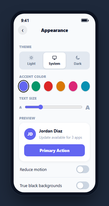
An appearance settings screen only earns its keep if every control it offers visibly changes something in real time — a theme switch that requires leaving the screen to see its effect fails the entire point of the setting. This snippet builds a fully live appearance panel inside a CSS phone frame: a Light/System/Dark segmented control that actually recolors the screen, a six-swatch accent color picker that actually restyles a preview card, and a text-size slider that actually resizes preview text, all wired to CSS custom properties so every change is instant.
Theme state driven by one function, not three
applyTheme(theme) is the single function every theme change routes through. It resolves "system" against the visitor's real OS preference via window.matchMedia('(prefers-color-scheme: dark)').matches, then toggles one .dark class on the screen container and syncs the segmented control's active button — so light, dark, and system are three states of one function rather than three different code paths that could drift out of sync with each other.
Accent color as a CSS custom property, not a class per color
Clicking a swatch calls screen.style.setProperty('--aps-accent', btn.dataset.color), which every accent-dependent element (the preview avatar background, the primary button, active toggle fills, even the range input's native accent) already reads via var(--aps-accent, #6366f1). This means adding a seventh swatch color requires no new CSS rules anywhere — every accent-aware element updates automatically because they all read from the same custom property.
Text size as a slider-driven variable, not five hardcoded classes
The text-size slider is a five-step range input (0 through 4) mapped to a sizes array of font-size strings. On input, the selected size is written into --aps-text-md, which the preview card's name and subtitle both read from — the subtitle specifically via calc(var(--aps-text-md) - 2px) so it always stays proportionally smaller than the title rather than needing its own separate slider-to-size mapping.
A preview card that is not decoration
.aps-preview is a real, functioning mini interface — an avatar, a name, a subtitle, and a primary button — that exists purely so every setting on the screen has somewhere immediate to show its effect. This is the same reason real OS appearance-settings screens (iOS, Android, most design-system theme pickers) always include a live preview: users trust a setting far more when they can see it apply before navigating away.
Independent toggles for motion and true-black
"Reduce motion" and "True black backgrounds" are modeled as separate toggle rows using one shared wireToggle() helper that just flips an .on class per toggle. The true-black toggle additionally sets the screen's background directly to pure black when both it and dark mode are active, and clears that inline override otherwise — demonstrating how a secondary appearance option should compose with the primary theme rather than fight it.
Wiring it to a real app
Persist the selected theme, accent, and text-size values to localStorage or a user-preferences API call, apply the same CSS custom properties at the document root instead of a single phone-frame screen, and drive the initial state from prefers-color-scheme on first load before falling back to any explicit stored choice — the same pattern most production dark-mode implementations follow.
Build with AI
Build, Understand, Optimize, and Extend It With AI
Rather than tracing the theming logic by hand, paste this snippet's HTML, CSS, and JS into an AI coding assistant like Claude and ask it to explain exactly how a single CSS custom property change for --aps-accent cascades to the preview avatar, button, and toggles without any per-element JavaScript, and how applyTheme() resolves the System option against the real OS preference. The same assistant can help you optimize it, for instance asking whether the theme and accent choices should persist to localStorage so they survive a reload. It is also useful for extending the screen: ask it to add a live font-family picker alongside the size slider, wire Reduce Motion to actually gate CSS transition durations, or add a system-preference change listener so the screen updates live if the OS theme flips while the app is open. Treat the code less like a finished artifact and more like a starting point for a conversation.
Prompt to recreate it
Copy this into your AI assistant of choice to build the effect from scratch, or as a jumping-off point for your own variant:
Build a mobile "appearance settings" screen in plain HTML, CSS, and JavaScript, framed inside a CSS phone mockup, with every control producing a real, live visual change, no library.

Requirements:
- A Light / System / Dark segmented control where System resolves against the real OS color-scheme preference via a matchMedia prefers-color-scheme check, and selecting any option immediately recolors the entire screen (background and text colors) with a smooth CSS transition, through one shared function rather than three separate code paths.
- A row of at least six accent color swatches where clicking one updates a single CSS custom property on a shared ancestor element, and every accent-dependent element elsewhere on the screen (an avatar background, a primary button, active toggle fills) must read that same custom property so a single click updates all of them at once with no per-element JavaScript.
- A text-size range slider (multiple discrete steps) that writes a chosen font-size value into another CSS custom property, live-resizing a preview card’s title and subtitle text as it is dragged, with the subtitle staying proportionally smaller than the title via a calc() expression rather than its own separate slider mapping.
- A non-decorative live preview card (avatar, name, subtitle, primary button) that visibly reflects the current theme, accent color, and text size at all times, so every setting has an immediate place to show its effect without navigating elsewhere.
- Two additional independent toggle rows (for example Reduce Motion and True Black Backgrounds) built from one shared toggle-wiring helper function, where the true-black toggle specifically overrides the screen background to pure black only while Dark mode is also active, and clears that override otherwise.
Want to tighten it up first? Run this prompt through the AI Prompt Studio to score it across 8 quality dimensions, catch anti-patterns, and tune the wording for Claude, ChatGPT, or Gemini before you paste it in.
Step by step
How to Use
- 1Paste HTML, CSS, and JSThe screen renders in System mode, following your OS light/dark preference automatically.
- 2Tap Light or DarkThe whole screen recolors instantly, and the preview card, toggles, and button all update with it.
- 3Tap a different accent swatchThe preview avatar, primary button, and active toggles all pick up the new color immediately.
- 4Drag the text-size sliderThe preview card name and subtitle resize live, with the subtitle staying proportionally smaller.
- 5Toggle "True black backgrounds"While in Dark mode, the screen background switches to pure black instead of the default dark slate.
- 6Export in your formatClick HTML, JSX, or Tailwind to download the version you need.
Real-world uses
Common Use Cases
Got questions?
Frequently Asked Questions
It checks window.matchMedia("(prefers-color-scheme: dark)").matches once on load and resolves "system" to dark or light accordingly inside applyTheme(). It reflects your actual OS/browser color-scheme setting, so it may render differently depending on your device.
Every accent-dependent CSS rule reads its color through var(--aps-accent, #6366f1) instead of a hardcoded hex value. Clicking a swatch calls screen.style.setProperty("--aps-accent", color) once, and every element referencing that variable repaints automatically with no per-element JavaScript needed.
The slider writes a chosen font-size string into --aps-text-md. The preview title reads that variable directly, while the subtitle reads calc(var(--aps-text-md) - 2px), so it always stays two pixels smaller than whatever size the title is currently set to.
When both Dark mode and the True Black toggle are active, the screen background is set directly to pure black (#000) via an inline style, overriding the default dark slate background. Turning off either Dark mode or the toggle clears that inline override.
In this demo it only flips a visual toggle state. In a production build, check that toggle’s state before applying any CSS transition or animation classes, or set a --reduce-motion custom property and gate your keyframe/transition durations behind it with calc() or a conditional class.
Yes. Keep theme, accent, and textSize in state, apply them as inline CSS custom properties on a root element (or via a CSS-in-JS theme object), and derive the resolved dark/light boolean from prefers-color-scheme when theme is "system" the same way applyTheme() does.