Source Code
<div class="container py-5" style="max-width:520px">
  <div id="bsalertStack">
    <div class="alert alert-warning alert-dismissible fade show" role="alert">
      Your trial ends in 3 days. <a href="javascript:void(0)" class="alert-link">Upgrade now</a>.
      <button type="button" class="btn-close" data-bs-dismiss="alert" aria-label="Close"></button>
    </div>
    <div class="alert alert-info alert-dismissible fade show" role="alert">
      New dashboard layout is available in Settings.
      <button type="button" class="btn-close" data-bs-dismiss="alert" aria-label="Close"></button>
    </div>
  </div>
  <p class="text-muted small mt-2">Open: <strong id="bsalertCount">2</strong></p>
</div>
#bsalertStack .alert:last-child { margin-bottom: 0; }const stack = document.getElementById('bsalertStack');
const countEl = document.getElementById('bsalertCount');
function recount() {
countEl.textContent = stack.querySelectorAll('.alert').length;
}
// Bootstrap's own Alert component removes the element from the DOM once its
// fade-out finishes, firing closed.bs.alert — but that event does not bubble
// up to a parent container the way native DOM events do, so the listener has
// to sit on each individual alert rather than once on the shared wrapper.
stack.querySelectorAll('.alert').forEach(alert => alert.addEventListener('closed.bs.alert', recount));
recount();Learn Coding Visually
Learn to code with interactive, live-preview playgrounds — HTML, CSS, JavaScript, React & more.
 HTML Playground42 lessons · Click-based · Live preview
 CSS PlaygroundLearn CSS with a live editor
 JavaScript Playground60 lessons · DOM · Async · Canvas
 React PlaygroundLearn React with a live code editor
 GSAP PlaygroundLearn GSAP animation interactively
 SVG Playground44 lessons · shapes · paths · animation
 SCSS Playground45 lessons · Sass modules · tokens
 Tailwind PlaygroundLearn Tailwind CSS with a live editor
 Bootstrap 5 Playground50 lessons · live preview
Bootstrap Dismissible Alert Stack — Free Snippet
Bootstrap Dismissible Alert Stack · Modals · Plain HTML, CSS & JS · Live preview
What's included
Features
About this UI Snippet
Bootstrap Dismissible Alert Stack — HTML, CSS & JavaScript
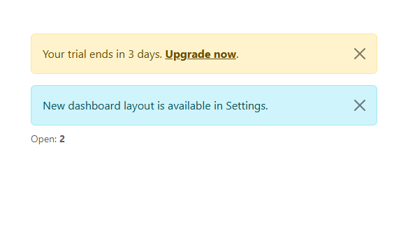
Bootstrap's dismissible alert (.alert-dismissible plus data-bs-dismiss="alert") already does the hard part on its own: clicking the × fades the alert out and removes its element from the DOM entirely once the animation finishes — no manual class toggling or element.remove() call required. This snippet shows that real, self-contained behavior with two stacked alerts, and adds one small piece of custom code: a live "Open: N" counter that stays accurate by listening for Bootstrap's own closed.bs.alert event, fired exactly when an alert has genuinely finished being removed.
The event doesn't bubble to a parent — attach it per alert
A natural first instinct is to attach one closed.bs.alert listener to the shared wrapper around all the alerts, expecting it to catch the event from whichever child dismisses, the way a native click would bubble. Bootstrap's alert event does not bubble that way — it fires only on the specific .alert element being removed. The listener has to be attached to each alert individually (stack.querySelectorAll('.alert').forEach(...)), which is also why a *newly added* alert needs its own listener attached explicitly rather than being caught automatically by a parent-level one.
Build with AI
Build, Understand, Optimize, and Extend It With AI
Hand this snippet's HTML, CSS, and JS to an AI coding assistant like Claude and ask it to add an auto-dismiss timer to the info alert (calling Bootstrap's own .close() method after a delay) while leaving the warning alert requiring a manual dismiss, or to persist dismissed alert IDs to localStorage so they stay hidden on a page reload. It's also a good exercise to ask the assistant to add a small slide-up animation as each alert leaves, layered on top of Bootstrap's own fade.
Prompt to recreate it
Copy this into your AI assistant of choice to build the effect from scratch, or as a jumping-off point for your own variant:
Build a stack of dismissible Bootstrap 5.3 alerts with a live open-count, using the real Bootstrap CDN framework (bootstrap.min.css and bootstrap.bundle.min.js), not custom CSS made to resemble Bootstrap.

Requirements:
- At least two Bootstrap alerts (using different contextual color classes) with alert-dismissible and a real close button (data-bs-dismiss="alert") — rely entirely on Bootstrap's own Alert component for the fade-out and DOM removal; do not write custom JavaScript to remove the elements.
- A counter showing how many alerts are currently open, updated by listening for Bootstrap's own closed.bs.alert event (which fires once an alert has actually finished being removed) and re-querying the remaining alert count — not by manually decrementing a variable on click.
- The counter must work correctly regardless of the order alerts are dismissed in, and must reflect any number of alerts, not just the initial two.
Want to tighten it up first? Run this prompt through the AI Prompt Studio to score it across 8 quality dimensions, catch anti-patterns, and tune the wording for Claude, ChatGPT, or Gemini before you paste it in.
Step by step
How to Use
- 1Load the snippetClick the snippet in the sidebar Library tab. The preview loads two dismissible alerts and "Open: 2".
- 2Dismiss oneClick its × — Bootstrap fades it out and removes it from the DOM, and the count updates to 1.
- 3Dismiss the otherThe count updates to 0, with no alerts left in the stack.
- 4Add a third alertCopy one .alert block in the HTML panel with a different alert-<color> class — it participates in the count automatically.
Real-world uses
Common Use Cases
Got questions?
Frequently Asked Questions
It genuinely removes the element from the DOM — that's Bootstrap's real Alert component behavior (data-bs-dismiss="alert"), not something this snippet implements manually.
It listens for Bootstrap's own closed.bs.alert event, which fires exactly when an alert has finished being removed, and re-queries how many .alert elements remain — so it's always reading the DOM's true current state, not tracking clicks separately. The listener is attached to each individual alert, not once on their shared wrapper, since this event does not bubble up to a parent element.
Yes — copy an existing alert block and change alert-warning or alert-info to any of Bootstrap's contextual classes (alert-success, alert-danger, etc.); it will be counted and dismissible automatically.
Yes — get the alert's bootstrap.Alert instance and call its .close() method inside a setTimeout; the same closed.bs.alert event fires either way, so the counter stays correct.
Yes — it's a real button with aria-label="Close", and the alert itself carries role="alert" so its content is announced by screen readers when it appears.