Source Code
<div class="container py-5">
  <div class="d-flex justify-content-between align-items-center mb-3">
    <h5 class="fw-bold mb-0">Team Members</h5>
    <button class="btn btn-outline-secondary btn-sm" id="bsskReload">Reload</button>
  </div>

  <div class="row g-3" id="bsskGrid">
    <div class="col-12 col-md-4">
      <div class="card h-100">
        <div class="card-body">
          <div class="d-flex align-items-center mb-3">
            <div class="bssk-skel bssk-avatar"></div>
            <div class="ms-3 flex-grow-1">
              <div class="bssk-skel bssk-line w-75 mb-2"></div>
              <div class="bssk-skel bssk-line w-50"></div>
            </div>
          </div>
          <div class="bssk-skel bssk-line mb-2"></div>
          <div class="bssk-skel bssk-line w-75"></div>
          <div class="bssk-real d-none">
            <div class="d-flex align-items-center mb-3">
              <img src="https://i.pravatar.cc/56?img=12" class="rounded-circle" width="56" height="56" alt="Avatar">
              <div class="ms-3">
                <h6 class="mb-0 fw-bold">Riya Kapoor</h6>
                <small class="text-muted">Product Designer</small>
              </div>
            </div>
            <p class="mb-0 small">Leads the design system and mentors two junior designers on the team.</p>
          </div>
        </div>
      </div>
    </div>
    <div class="col-12 col-md-4">
      <div class="card h-100">
        <div class="card-body">
          <div class="d-flex align-items-center mb-3">
            <div class="bssk-skel bssk-avatar"></div>
            <div class="ms-3 flex-grow-1">
              <div class="bssk-skel bssk-line w-75 mb-2"></div>
              <div class="bssk-skel bssk-line w-50"></div>
            </div>
          </div>
          <div class="bssk-skel bssk-line mb-2"></div>
          <div class="bssk-skel bssk-line w-75"></div>
          <div class="bssk-real d-none">
            <div class="d-flex align-items-center mb-3">
              <img src="https://i.pravatar.cc/56?img=32" class="rounded-circle" width="56" height="56" alt="Avatar">
              <div class="ms-3">
                <h6 class="mb-0 fw-bold">Dev Malhotra</h6>
                <small class="text-muted">Backend Engineer</small>
              </div>
            </div>
            <p class="mb-0 small">Owns the payments service and the on-call rotation for the API team.</p>
          </div>
        </div>
      </div>
    </div>
    <div class="col-12 col-md-4">
      <div class="card h-100">
        <div class="card-body">
          <div class="d-flex align-items-center mb-3">
            <div class="bssk-skel bssk-avatar"></div>
            <div class="ms-3 flex-grow-1">
              <div class="bssk-skel bssk-line w-75 mb-2"></div>
              <div class="bssk-skel bssk-line w-50"></div>
            </div>
          </div>
          <div class="bssk-skel bssk-line mb-2"></div>
          <div class="bssk-skel bssk-line w-75"></div>
          <div class="bssk-real d-none">
            <div class="d-flex align-items-center mb-3">
              <img src="https://i.pravatar.cc/56?img=48" class="rounded-circle" width="56" height="56" alt="Avatar">
              <div class="ms-3">
                <h6 class="mb-0 fw-bold">Anaya Singh</h6>
                <small class="text-muted">Marketing Lead</small>
              </div>
            </div>
            <p class="mb-0 small">Runs the quarterly campaign calendar and the growth experiments backlog.</p>
          </div>
        </div>
      </div>
    </div>
  </div>
</div>
.bssk-skel {
background: linear-gradient(90deg, #eceef1 25%, #f6f7f8 37%, #eceef1 63%);
background-size: 400% 100%;
animation: bssk-shimmer 1.4s ease infinite;
border-radius: 6px;
}
.bssk-avatar { width: 56px; height: 56px; border-radius: 50%; flex-shrink: 0; }
.bssk-line { height: 12px; width: 100%; }
@keyframes bssk-shimmer {
0% { background-position: 100% 50%; }
100% { background-position: 0 50%; }
}
.card.is-loaded .bssk-skel { display: none; }
.card:not(.is-loaded) .bssk-real { display: none; }const grid = document.getElementById('bsskGrid');
const reloadBtn = document.getElementById('bsskReload');
const cards = Array.from(grid.querySelectorAll('.card'));
function showSkeletons() {
cards.forEach(card => card.classList.remove('is-loaded'));
}
function showLoaded() {
cards.forEach(card => card.classList.add('is-loaded'));
}
function loadCards() {
showSkeletons();
reloadBtn.disabled = true;
// Simulated network latency before the real card markup is revealed;
// a real integration would call showLoaded() from a fetch().then().
setTimeout(() => {
showLoaded();
reloadBtn.disabled = false;
}, 1600);
}
reloadBtn.addEventListener('click', loadCards);
loadCards();Learn Coding Visually
Learn to code with interactive, live-preview playgrounds — HTML, CSS, JavaScript, React & more.
 HTML Playground42 lessons · Click-based · Live preview
 CSS PlaygroundLearn CSS with a live editor
 JavaScript Playground60 lessons · DOM · Async · Canvas
 React PlaygroundLearn React with a live code editor
 GSAP PlaygroundLearn GSAP animation interactively
 SVG Playground44 lessons · shapes · paths · animation
 SCSS Playground45 lessons · Sass modules · tokens
 Tailwind PlaygroundLearn Tailwind CSS with a live editor
 Bootstrap 5 Playground50 lessons · live preview
Bootstrap Skeleton Loader Cards — Free HTML CSS JS Snippet
Bootstrap Skeleton Loader Cards · Loaders · Plain HTML, CSS & JS · Live preview
What's included
Features
About this UI Snippet
Bootstrap Skeleton Loader Cards — HTML, CSS & JavaScript
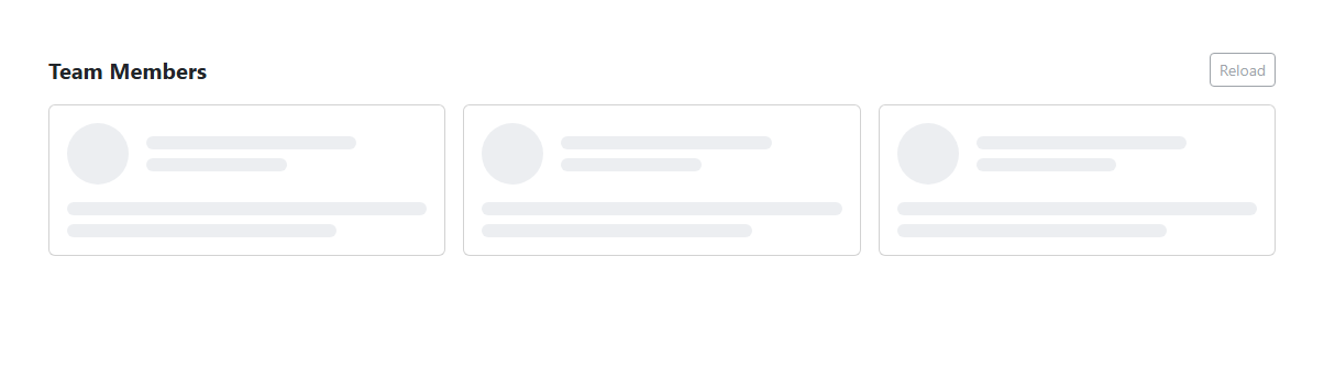
A skeleton loader is meant to be a preview of the shape content will take, not just a spinner, so this snippet builds each card in a Bootstrap card component with two complete markup blocks stacked on top of each other — a set of .bssk-skel placeholder divs and a hidden .bssk-real block containing the actual avatar, name, role, and bio text — and uses CSS to show exactly one of the two at a time. The shimmer effect comes from a single reusable class: .bssk-skel gets a wide linear-gradient background (400% 100% background-size) that sweeps across the element via the bssk-shimmer @keyframes animating background-position from 100% 50% to 0 50% on a 1.4 second loop, which is far cheaper for the browser to animate than repeatedly changing opacity or box-shadow on many elements at once.
Switching between the two states is a single class toggle at the card level rather than per-element: adding is-loaded to a .card triggers two CSS rules — .card.is-loaded .bssk-skel { display: none; } and .card:not(.is-loaded) .bssk-real { display: none; } — so the JavaScript never has to touch individual skeleton or real elements directly, it only ever adds or removes one class per card. The loadCards() function calls showSkeletons() to strip is-loaded from every card and disable the Reload button, then after a 1.6 second setTimeout (standing in for a real fetch) calls showLoaded() to add is-loaded back to all three cards at once and re-enable the button. The function runs once automatically on page load so the demo starts in the loading state rather than requiring a click first.
One edge case worth calling out: the avatar skeleton (.bssk-avatar) is a fixed 56×56 circle sized to match the real <img> it stands in for exactly, and the line skeletons (.bssk-line) are given the same line-height-adjacent 12px height as real text — mismatched skeleton dimensions are the most common bug in real skeleton loaders, since a skeleton that is a different size than its real content causes a visible layout jump the instant the content swaps in, which defeats the whole purpose of a skeleton loader. Keeping the skeleton and the real markup both present in the DOM at all times (just toggled with display: none) instead of injecting/removing markup on load also avoids any layout reflow beyond the swap itself.
The Reload button lets you replay the skeleton-to-content transition without a full page refresh, which is useful both as a demo and as a pattern for a real "refresh" action on a dashboard.
Build with AI
Build, Understand, Optimize, and Extend It With AI
Ask an AI assistant like Claude to randomize each card's simulated load time so they do not all resolve in lockstep, or to add a subtle fade-in transition on the real content instead of an instant class-toggle swap.
Prompt to recreate it
Copy this into your AI assistant of choice to build the effect from scratch, or as a jumping-off point for your own variant:
Build a Bootstrap 5.3 skeleton loader card grid using the real Bootstrap CDN (bootstrap.min.css and bootstrap.bundle.min.js), not custom CSS made to resemble Bootstrap.

Requirements:
- A responsive row of at least three Bootstrap cards, each containing both a skeleton placeholder block (avatar circle, title line, text line) and a hidden real-content block (image, name, role, bio) in the same markup.
- The skeleton placeholders must use a CSS @keyframes animation that sweeps a lighter gradient band across a gray background to create a shimmering effect, not a JS-driven opacity flicker.
- On page load, show the skeleton state, then after a simulated setTimeout delay swap every card to its real content by toggling a single class per card, letting CSS descendant selectors show/hide the correct block.
- Size the skeleton avatar and text-line placeholders to match the real image and text dimensions so nothing visibly jumps when the content swaps in.
- Include a "Reload" button that replays the skeleton-to-content sequence and disables itself while the simulated load is in progress.
Want to tighten it up first? Run this prompt through the AI Prompt Studio to score it across 8 quality dimensions, catch anti-patterns, and tune the wording for Claude, ChatGPT, or Gemini before you paste it in.
Step by step
How to Use
- 1Load the snippetThe preview immediately shows three cards filled with gray shimmering placeholder blocks instead of content.
- 2Watch the shimmer animateA lighter band sweeps left-to-right across each gray block on a continuous loop while data "loads".
- 3Wait about 1.6 secondsAll three cards swap at once to real content — an avatar photo, a name, a role, and a short bio line.
- 4Click "Reload"The cards immediately revert to the shimmering skeleton state and the Reload button disables itself.
- 5Watch it reloadAfter the same delay, the real content reappears again and the button re-enables.
- 6Compare skeleton and real sizesNotice the avatar circle and text-line placeholders are sized to match their real counterparts, so nothing jumps when they swap.
Real-world uses
Common Use Cases
Got questions?
Frequently Asked Questions
Yes. Keep a single loading boolean in useState (React), a ref (Vue), or a component property (Angular) and conditionally render either the skeleton JSX/template block or the real one — there is no direct DOM manipulation to port, since this vanilla version only toggles one class per card.
Toggling one class per card and letting CSS descendant selectors (.card.is-loaded .bssk-skel) handle the rest means the JavaScript stays constant no matter how many skeleton or real elements a card contains, which scales better as card layouts get more complex.
Replace the setTimeout in loadCards() with an async fetch call, populate the real markup with the response data before calling showLoaded(), and call showSkeletons() again at the start of any refetch.
Animating background-position on a single gradient layer is handled efficiently by the browser's compositor and avoids the visible flicker that repeatedly toggling opacity or box-shadow across several stacked elements can cause.
Yes — replace the .bssk-skel class with a tailwind utility set like bg-gradient-to-r from-gray-200 via-gray-100 to-gray-200 animate-pulse, or keep the custom @keyframes sweep and apply it via an arbitrary tailwind animation class.
Keeping both present and toggling visibility with CSS avoids injecting or removing markup at load time, which sidesteps extra reflow and makes the swap feel instantaneous instead of causing a visible re-render.