Source Code
<div class="container py-5">
  <div class="bstl-line mx-auto">
    <div class="bstl-item">
      <span class="badge rounded-circle bg-primary bstl-badge">1</span>
      <div class="card bstl-card">
        <div class="card-body">
          <div class="small text-muted mb-1">Jan 2024</div>
          <h6 class="fw-bold mb-1">Company founded</h6>
          <p class="small mb-0">Started as a two-person team working out of a shared office space.</p>
        </div>
      </div>
    </div>
    <div class="bstl-item">
      <span class="badge rounded-circle bg-success bstl-badge">2</span>
      <div class="card bstl-card">
        <div class="card-body">
          <div class="small text-muted mb-1">Jun 2024</div>
          <h6 class="fw-bold mb-1">First 1,000 users</h6>
          <p class="small mb-0">Crossed our first major growth milestone six months after launch.</p>
        </div>
      </div>
    </div>
    <div class="bstl-item">
      <span class="badge rounded-circle bg-warning bstl-badge">3</span>
      <div class="card bstl-card">
        <div class="card-body">
          <div class="small text-muted mb-1">Nov 2024</div>
          <h6 class="fw-bold mb-1">Seed funding closed</h6>
          <p class="small mb-0">Raised our seed round to expand the team and accelerate development.</p>
        </div>
      </div>
    </div>

    <div id="bstlMore">
      <div class="bstl-item">
        <span class="badge rounded-circle bg-info bstl-badge">4</span>
        <div class="card bstl-card">
          <div class="card-body">
            <div class="small text-muted mb-1">Mar 2025</div>
            <h6 class="fw-bold mb-1">Launched mobile app</h6>
            <p class="small mb-0">Released native iOS and Android apps after months of beta testing.</p>
          </div>
        </div>
      </div>
      <div class="bstl-item">
        <span class="badge rounded-circle bg-danger bstl-badge">5</span>
        <div class="card bstl-card">
          <div class="card-body">
            <div class="small text-muted mb-1">Sep 2025</div>
            <h6 class="fw-bold mb-1">Opened second office</h6>
            <p class="small mb-0">Expanded to a second city as the team grew past fifty people.</p>
          </div>
        </div>
      </div>
    </div>
  </div>

  <div class="text-center mt-3">
    <button type="button" class="btn btn-outline-primary btn-sm" id="bstlLoadMore">Load more</button>
  </div>
</div>
.bstl-line { max-width: 560px; position: relative; padding-left: 40px; }
.bstl-line::before { content: ''; position: absolute; left: 15px; top: 4px; bottom: 4px; width: 2px; background: #dee2e6; }
.bstl-item { position: relative; margin-bottom: 1.5rem; }
.bstl-badge { position: absolute; left: -40px; top: 0; width: 32px; height: 32px; display: flex; align-items: center; justify-content: center; font-size: .85rem; }
.bstl-card { border: 1px solid #eceef1; border-radius: 10px; }
#bstlMore.d-none { display: none; }const moreSection = document.getElementById('bstlMore');
const loadMoreBtn = document.getElementById('bstlLoadMore');
moreSection.classList.add('d-none');
loadMoreBtn.addEventListener('click', () => {
moreSection.classList.remove('d-none');
loadMoreBtn.remove();
});Learn Coding Visually
Learn to code with interactive, live-preview playgrounds — HTML, CSS, JavaScript, React & more.
 HTML Playground42 lessons · Click-based · Live preview
 CSS PlaygroundLearn CSS with a live editor
 JavaScript Playground60 lessons · DOM · Async · Canvas
 React PlaygroundLearn React with a live code editor
 GSAP PlaygroundLearn GSAP animation interactively
 SVG Playground44 lessons · shapes · paths · animation
 SCSS Playground45 lessons · Sass modules · tokens
 Tailwind PlaygroundLearn Tailwind CSS with a live editor
 Bootstrap 5 Playground50 lessons · live preview
Bootstrap Vertical Timeline — Free HTML CSS JS Snippet
Bootstrap Vertical Timeline · Layouts · Plain HTML, CSS & JS · Live preview
What's included
Features
About this UI Snippet
Bootstrap Vertical Timeline — HTML, CSS & JavaScript
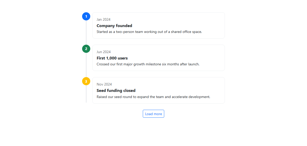
A vertical timeline's defining visual feature — the connecting line running through every marker — is not an image or an extra div per entry; it's a single CSS pseudo-element. The .bstl-line::before rule draws one absolutely positioned 2px-wide bar spanning from top: 4px to bottom: 4px of the container, sitting behind every badge, so the line automatically stretches to match however many entries are in the list without any JavaScript recalculating its height. Each entry's circular marker is a real Bootstrap badge rounded-circle — bg-primary, bg-success, bg-warning, bg-info, and bg-danger across the five entries — pulled out of normal flow with position: absolute; left: -40px on .bstl-badge so it sits directly on top of the connecting line regardless of how tall its adjacent card grows.
Each timeline entry is a .bstl-item containing the badge plus a real Bootstrap card with a date label, a bold title, and a description — no custom card component, just card-body with Bootstrap's own spacing and typography utilities (small, text-muted, fw-bold, mb-1). The .bstl-line wrapper applies padding-left: 40px so every card and badge has room to sit to the right of the vertical line without overlapping it, and a max-width: 560px keeps the timeline centered and readable rather than stretching full-width on large screens.
The "Load more" behavior is deliberately simple and honest about what it's doing: the last two entries live inside a #bstlMore wrapper that gets the Bootstrap d-none class applied via JavaScript on load (rather than baked into the initial HTML, so the content is present in the DOM from the start for SEO and no-JS fallback purposes), and clicking the button removes that class to reveal both entries at once. The button then removes itself from the DOM with loadMoreBtn.remove() rather than just hiding it, since there's nothing left to reveal and leaving a dead button around would be misleading.
A subtle detail worth naming: the badge markers use flexbox centering (display: flex; align-items: center; justify-content: center) rather than relying on Bootstrap's default badge padding, because a perfectly circular badge with centered single or double-digit text requires equal width and height plus true centering — Bootstrap's badge component alone is rectangular by default and only becomes a circle with the rounded-circle utility, which then needs the flex centering to keep the number visually centered inside that circle rather than sitting slightly off due to line-height quirks.
The JavaScript is intentionally minimal: it only toggles the d-none class on #bstlMore and then removes the trigger button with loadMoreBtn.remove(). Keeping the reveal logic this small — rather than fetching or generating the additional entries dynamically — means the extra timeline items are already indexable markup the moment the page loads, and the interaction layer's only responsibility is showing what already exists, not constructing it.
Build with AI
Build, Understand, Optimize, and Extend It With AI
Ask an AI coding assistant like Claude to alternate the cards left and right of the line on larger screens for a two-column timeline layout, or to animate each newly revealed entry with a fade-and-slide-in effect. It's also worth asking it to add icons inside the badges instead of numbers.
Prompt to recreate it
Copy this into your AI assistant of choice to build the effect from scratch, or as a jumping-off point for your own variant:
Build a Bootstrap 5.3 vertical activity timeline using the real Bootstrap CDN framework (bootstrap.min.css and bootstrap.bundle.min.js), not custom CSS made to resemble Bootstrap.

Requirements:
- A vertical connecting line drawn with a single CSS pseudo-element that automatically spans the full height of the entry list, not a separate line segment per entry.
- Each entry must have a circular numbered or icon marker built from a real Bootstrap badge with rounded-circle, absolutely positioned to sit on top of the connecting line, alongside a real Bootstrap card showing a date, title, and short description.
- At least five entries total, with two of them initially hidden via the Bootstrap d-none class (present in the DOM, not injected later) and revealed by a "Load more" button click, after which the button removes itself.
- The layout must stay centered with a reasonable max-width and remain readable at narrow (mobile) widths without horizontal overflow.
Want to tighten it up first? Run this prompt through the AI Prompt Studio to score it across 8 quality dimensions, catch anti-patterns, and tune the wording for Claude, ChatGPT, or Gemini before you paste it in.
Step by step
How to Use
- 1Load the snippetThree timeline entries appear connected by a vertical gray line, each with a colored numbered badge and a card showing a date, title, and description.
- 2Look at the badge colorsEach entry uses a different Bootstrap contextual color (primary, success, warning) so entries are visually distinguishable at a glance.
- 3Click "Load more"Two additional entries (info and danger badges) fade into view below the third, extending the same connecting line, and the button itself disappears.
- 4Resize the browser narrowerThe timeline and its cards stay readable and left-aligned to the line rather than overflowing horizontally.
- 5Inspect the connecting lineIt is one continuous CSS line running the full height of the entries, not a separate line segment between each pair of items.
Real-world uses
Common Use Cases
Got questions?
Frequently Asked Questions
It is a single absolutely positioned ::before pseudo-element spanning from near the top to near the bottom of the .bstl-line container using top and bottom offsets rather than a fixed height, so it always matches the container's actual rendered height regardless of how many entries or how tall their cards are.
No — the extra entries exist in the HTML from the start and are only hidden by JavaScript adding the d-none class after the page loads, so their text content is present in the initial markup for crawlers and no-JS scenarios.
Yes — render the timeline entries from an array with .map() (React/Vue) or *ngFor (Angular), and track a boolean "showMore" state instead of toggling classList directly, conditionally rendering the extra entries based on that state.
Once every entry is revealed there is nothing left for the button to load, so leaving it visible (even disabled) would be misleading; loadMoreBtn.remove() cleanly takes it out of the DOM entirely.
Yes — add more .bstl-item blocks either directly in the visible section or inside #bstlMore, and the CSS connecting line and badge positioning will apply automatically without any changes, since neither depends on a fixed entry count.
Replace the badge and card classes with Tailwind equivalents (rounded-full flex items-center justify-center for the badge, border rounded-lg for the card) and recreate the connecting line with a Tailwind absolute inset utility plus a background color class — the JavaScript reveal logic needs no changes.