Source Code
<div class="container py-5 d-flex justify-content-center">
  <div class="card bses-card shadow-sm">
    <div class="card-body p-4">
      <div class="d-flex justify-content-end mb-2">
        <button class="btn btn-sm btn-outline-secondary" id="besToggle">Toggle demo state</button>
      </div>

      <div id="besEmpty" class="text-center py-5">
        <svg width="72" height="72" viewBox="0 0 24 24" fill="none" class="mb-3 text-secondary mx-auto d-block">
          <path d="M3 7h18M3 7l1.5 12a2 2 0 0 0 2 1.8h11a2 2 0 0 0 2-1.8L21 7M3 7l2-4h14l2 4" stroke="currentColor" stroke-width="1.5" stroke-linecap="round" stroke-linejoin="round"/>
          <path d="M9 11v4M15 11v4" stroke="currentColor" stroke-width="1.5" stroke-linecap="round"/>
        </svg>
        <h5 class="fw-bold mb-1">Your cart is empty</h5>
        <p class="text-muted mb-4">Items you add will show up here.</p>
        <button class="btn btn-primary" id="besCta">Browse products</button>
      </div>

      <div id="besPopulated" class="d-none">
        <ul class="list-group list-group-flush">
          <li class="list-group-item d-flex justify-content-between align-items-center">
            <span>Wireless Mouse</span><span class="text-muted small">$24.00</span>
          </li>
          <li class="list-group-item d-flex justify-content-between align-items-center">
            <span>Mechanical Keyboard</span><span class="text-muted small">$89.00</span>
          </li>
          <li class="list-group-item d-flex justify-content-between align-items-center">
            <span>USB-C Hub</span><span class="text-muted small">$34.00</span>
          </li>
        </ul>
      </div>
    </div>
  </div>
</div>
.bses-card { width: 380px; border-radius: 14px; border: 1px solid #eceef1; }const toggleBtn = document.getElementById('besToggle');
const empty = document.getElementById('besEmpty');
const populated = document.getElementById('besPopulated');
const cta = document.getElementById('besCta');
function setEmpty(isEmpty) {
empty.classList.toggle('d-none', !isEmpty);
populated.classList.toggle('d-none', isEmpty);
toggleBtn.textContent = isEmpty ? 'Show populated view' : 'Show empty state';
}
let currentlyEmpty = true;
toggleBtn.addEventListener('click', () => {
currentlyEmpty = !currentlyEmpty;
setEmpty(currentlyEmpty);
});
// The CTA button inside the empty state itself also switches to the
// populated view, simulating what happens after a user adds an item.
cta.addEventListener('click', () => {
currentlyEmpty = false;
setEmpty(false);
});Learn Coding Visually
Learn to code with interactive, live-preview playgrounds — HTML, CSS, JavaScript, React & more.
 HTML Playground42 lessons · Click-based · Live preview
 CSS PlaygroundLearn CSS with a live editor
 JavaScript Playground60 lessons · DOM · Async · Canvas
 React PlaygroundLearn React with a live code editor
 GSAP PlaygroundLearn GSAP animation interactively
 SVG Playground44 lessons · shapes · paths · animation
 SCSS Playground45 lessons · Sass modules · tokens
 Tailwind PlaygroundLearn Tailwind CSS with a live editor
 Bootstrap 5 Playground50 lessons · live preview
Bootstrap Empty State Placeholder — Free HTML CSS JS Snippet
Bootstrap Empty State Placeholder · Misc · Plain HTML, CSS & JS · Live preview
What's included
Features
About this UI Snippet
Bootstrap Empty State Placeholder — HTML, CSS & JavaScript
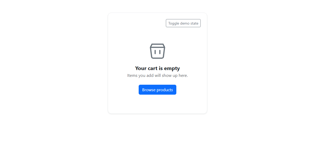
An empty state is the screen most product teams forget to design on purpose, so this snippet treats it as a first-class, reusable block rather than an afterthought: a centered inline SVG icon (a simple outlined cart/box drawn with path elements and stroke rather than a raster image, so it scales crisply and inherits currentColor from the surrounding text-secondary class), a bold heading, a muted one-line message, and a primary Bootstrap btn btn-primary call-to-action, all centered inside a real Bootstrap card. Using an inline SVG instead of an <img> means the icon needs zero extra network requests and can be recolored purely through CSS currentColor inheritance, which matters because empty states often need to match a theme's muted-secondary palette rather than a fixed icon color.
The demo itself is built to prove the component actually works both ways, not just render once: a "Toggle demo state" button and the CTA button (#besCta) inside the empty state both call a single setEmpty(isEmpty) function that toggles Bootstrap's own d-none utility class on the #besEmpty and #besPopulated blocks in lockstep, so exactly one is ever visible, and also relabels the toggle button itself to describe the action it will perform next rather than the state it is currently in. A currentlyEmpty boolean tracks state outside the DOM so both entry points (the manual toggle and the CTA click) can flip it consistently without reading the current visibility from the DOM each time.
The non-obvious detail worth calling out is that the CTA button living *inside* the empty state is wired to the same state-changing function as the external toggle button, rather than having its own separate logic — in a real cart or list this is exactly the button a user clicks to leave the empty state, so testing it needs to produce the same populated view as the demo toggle, not a different one. Keeping both entry points calling one shared function also means a future change to what "populated" looks like — say, adding a badge count — only needs to happen in one place.
Because the whole component is two sibling blocks toggled by one boolean, it maps directly onto conditional rendering in any component framework: an isEmpty state variable controlling which JSX/template block renders, with the underlying SVG, heading, and button markup unchanged.
The populated view reuses Bootstrap's own list-group-flush and d-flex justify-content-between utilities to align each item's name on the left and its price on the right without any custom flexbox rules of its own, which keeps the "after" state visually consistent with the rest of a typical Bootstrap-built page rather than looking like a bolted-on demo table.
Build with AI
Build, Understand, Optimize, and Extend It With AI
Ask an AI assistant like Claude to add a subtle fade transition between the empty and populated views instead of an instant swap, or to parameterize the icon, heading, and message so the same component can be reused for multiple empty-state scenarios on one page.
Prompt to recreate it
Copy this into your AI assistant of choice to build the effect from scratch, or as a jumping-off point for your own variant:
Build a reusable Bootstrap 5.3 empty-state placeholder using the real Bootstrap CDN (bootstrap.min.css and bootstrap.bundle.min.js), not custom CSS made to resemble Bootstrap.

Requirements:
- A card containing a centered inline SVG icon (built with real path elements, not an external image), a bold heading, a short muted message, and a primary btn btn-primary call-to-action button.
- A separate populated view (a Bootstrap list-group with sample items) that is hidden by default using the d-none utility class.
- A demo "Toggle demo state" button outside the card that switches between the empty state and the populated view, and relabels itself to describe its next action.
- The CTA button inside the empty state itself must also switch to the populated view when clicked, sharing the same state-toggling function as the external toggle button rather than duplicating the logic.
Want to tighten it up first? Run this prompt through the AI Prompt Studio to score it across 8 quality dimensions, catch anti-patterns, and tune the wording for Claude, ChatGPT, or Gemini before you paste it in.
Step by step
How to Use
- 1Load the snippetThe preview shows a card with a centered outline icon, "Your cart is empty" heading, a short message, and a "Browse products" button.
- 2Click "Toggle demo state"The empty state disappears and a populated list of three cart items with prices appears in its place.
- 3Notice the toggle button relabelsIt now reads "Show empty state" so its next click is predictable.
- 4Click it againThe view switches back to the empty state with the icon, heading, and CTA button.
- 5Click "Browse products" inside the empty stateThe same populated list view appears, proving the CTA is wired to the real state change, not just a decorative button.
Real-world uses
Common Use Cases
Got questions?
Frequently Asked Questions
Yes. Store an isEmpty boolean in useState (React), a ref (Vue), or a component property (Angular), and conditionally render the empty-state JSX/template or the populated one from it; the CTA button and the toggle button both just flip that one variable, exactly like the shared setEmpty() function does here.
An inline SVG has no network request, scales without blurring at any size, and its stroke color inherits from the surrounding text-secondary class via currentColor, so it automatically matches the empty state's muted tone without a separate color override.
Yes — it calls the same setEmpty(false) logic as the external toggle button, switching to the populated view, which mirrors what a real "Browse products" or "Add your first item" button should do in production.
Yes — swap the SVG path, heading text, message, and CTA label; the toggle logic and d-none-based visibility switching stay identical regardless of what the empty and populated content actually is.
Yes — replace the Bootstrap card and btn classes with Tailwind equivalents like a bordered rounded-xl container and a bg-blue-600 button; the inline SVG and the isEmpty toggle logic need no changes at all.
A dedicated currentlyEmpty boolean lets both the toggle button and the CTA button update state through one function call without each needing to inspect and interpret the other element's current CSS classes, keeping the two entry points from drifting out of sync.