Source Code
<div class="container py-5">
<h1 class="text-center bscmp-title mb-4">Compare plans</h1>
<div class="table-responsive">
<table class="table bscmp-table align-middle text-center">
<thead>
<tr>
<th class="text-start">Feature</th>
<th>Starter</th>
<th class="bscmp-featured">Pro</th>
<th>Team</th>
</tr>
</thead>
<tbody>
<tr><td class="text-start">Projects</td><td>1</td><td class="bscmp-featured">Unlimited</td><td class="bscmp-featured">Unlimited</td></tr>
<tr><td class="text-start">Storage</td><td>1 GB</td><td class="bscmp-featured">100 GB</td><td class="bscmp-featured">1 TB</td></tr>
<tr><td class="text-start">Team members</td><td>1</td><td class="bscmp-featured">5</td><td class="bscmp-featured">Unlimited</td></tr>
<tr><td class="text-start">Priority support</td><td>—</td><td class="bscmp-featured">✓</td><td class="bscmp-featured">✓</td></tr>
<tr><td class="text-start">SSO & audit log</td><td>—</td><td>—</td><td class="bscmp-featured">✓</td></tr>
<tr><td class="text-start">API access</td><td>—</td><td class="bscmp-featured">✓</td><td class="bscmp-featured">✓</td></tr>
<tr><td class="text-start fw-bold">Price</td><td>$0/mo</td><td class="bscmp-featured fw-bold">$24/mo</td><td class="bscmp-featured fw-bold">$79/mo</td></tr>
<tr><td></td><td><button class="btn btn-sm btn-outline-dark">Choose</button></td><td class="bscmp-featured"><button class="btn btn-sm btn-dark">Choose</button></td><td class="bscmp-featured"><button class="btn btn-sm btn-outline-dark">Choose</button></td></tr>
</tbody>
</table>
</div>
</div>.bscmp-title { font-weight: 800; letter-spacing: -0.01em; }
.bscmp-table th, .bscmp-table td { border-color: #eceef1; }
.bscmp-table thead th { font-size: 13px; text-transform: uppercase; letter-spacing: .04em; color: #6b7280; border-bottom-width: 2px; }
.bscmp-featured { background: #f8f9ff; }
.bscmp-table thead .bscmp-featured { color: #4338ca; font-weight: 700; }// Purely presentational — the featured "Pro" column is styled via the
// .bscmp-featured class already applied to every cell in that column. No
// JavaScript is needed for this snippet; it's included to keep the file
// shape consistent across the Bootstrap collection.Learn Coding Visually
Learn to code with interactive, live-preview playgrounds — HTML, CSS, JavaScript, React & more.
 HTML Playground42 lessons · Click-based · Live preview
 CSS PlaygroundLearn CSS with a live editor
 JavaScript Playground60 lessons · DOM · Async · Canvas
 React PlaygroundLearn React with a live code editor
 GSAP PlaygroundLearn GSAP animation interactively
 SVG Playground44 lessons · shapes · paths · animation
 SCSS Playground45 lessons · Sass modules · tokens
 Tailwind PlaygroundLearn Tailwind CSS with a live editor
 Bootstrap 5 Playground50 lessons · live preview
Bootstrap Pricing Feature Comparison Table — Free Snippet
Bootstrap Pricing Feature Comparison Table · Pricing · Plain HTML, CSS & JS · Live preview
What's included
Features
About this UI Snippet
Bootstrap Pricing Feature Comparison Table — HTML, CSS & JavaScript
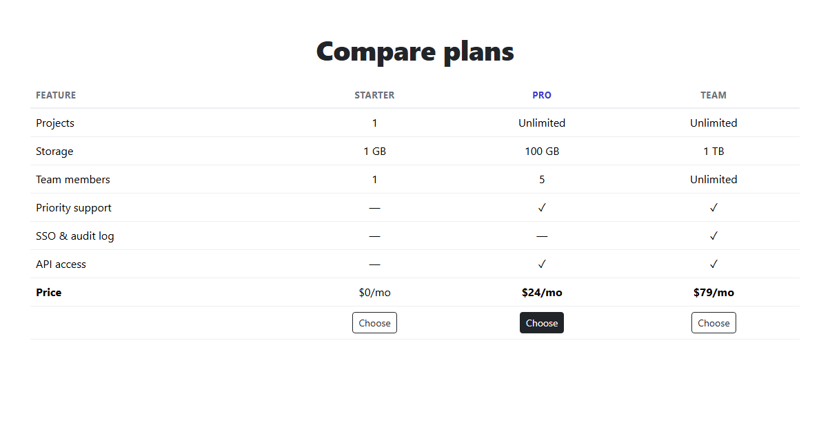
Three pricing cards side by side answer "what does each plan cost" — a table answers the harder question, "what exactly do I lose by picking the cheaper one." This snippet builds that comparison on real Bootstrap 5.3's .table component wrapped in .table-responsive, so a wide feature comparison scrolls horizontally on a narrow screen instead of breaking the layout.
Every cell in the recommended "Pro" column — including its header — carries a shared .bscmp-featured class, giving that entire column a distinct tint and bolder header without needing per-row logic; adding a new feature row just means adding three plain <td>s and one .bscmp-featured one, and the highlight stays consistent automatically.
Build with AI
Build, Understand, Optimize, and Extend It With AI
Hand this snippet's HTML, CSS, and JS to an AI coding assistant like Claude and ask it to add a sticky first column (feature names) so they stay visible while horizontally scrolling on mobile, or to add tooltips on feature names explaining what each one means. It's also a good exercise to ask the assistant to make the table collapse into stacked cards on mobile instead of scrolling horizontally.
Prompt to recreate it
Copy this into your AI assistant of choice to build the effect from scratch, or as a jumping-off point for your own variant:
Build a Bootstrap 5.3 pricing feature comparison table, using the real Bootstrap CDN framework (bootstrap.min.css and bootstrap.bundle.min.js), not custom CSS made to resemble Bootstrap.

Requirements:
- A real Bootstrap table (wrapped in table-responsive) comparing at least three pricing plans across at least six feature rows, using a checkmark or dash convention for boolean features and real values for numeric ones (e.g. storage, seats).
- One plan's entire column (header included) must be visually highlighted via a single shared CSS class applied to every cell in that column, not per-cell inline styling.
- Include a final row with a CTA button per plan.
- The table must scroll horizontally within its own container on narrow screens without breaking the surrounding page layout.
Want to tighten it up first? Run this prompt through the AI Prompt Studio to score it across 8 quality dimensions, catch anti-patterns, and tune the wording for Claude, ChatGPT, or Gemini before you paste it in.
Step by step
How to Use
- 1Load the snippetClick the snippet in the sidebar Library tab. The preview loads a 4-column feature comparison table.
- 2Scan the Pro columnIt's tinted and its header is bolded, drawing the eye toward the recommended plan.
- 3Shrink the preview widthThe table scrolls horizontally within its own container rather than breaking the page layout.
- 4Add a feature rowCopy a <tr> in the HTML panel, adding a fourth <td class="bscmp-featured"> for whichever column(s) should stay highlighted.
Real-world uses
Common Use Cases
Got questions?
Frequently Asked Questions
Yes — the actual .table component from Bootstrap 5.3, wrapped in .table-responsive so it scrolls horizontally on narrow screens instead of squeezing or breaking.
Every cell in that column, including its header, carries a shared .bscmp-featured class giving it a light background tint; the header additionally gets bold, accent-colored text.
Add a new <th> to the header row and a new <td> to every feature row (plus the price and CTA rows), keeping the same column order across every row.
It's meant to complement card-based pricing, not replace it — cards communicate the emotional pitch and headline price quickly, while a table answers detailed feature questions for a more deliberate buyer.
They're plain Bootstrap buttons with no handler attached in this demo — wire them to your real signup or checkout flow, matching each button to its column's plan.