Source Code
<div class="row g-0 bssplit-row">
  <div class="col-lg-6 bssplit-copy d-flex align-items-center">
    <div class="p-5">
      <h1 class="bssplit-title">Start shipping faster.</h1>
      <p class="bssplit-sub mb-4">Create a free account — no credit card, cancel anytime.</p>

      <form id="bssplitForm" novalidate>
        <div class="mb-3">
          <label class="form-label small fw-semibold">Full name</label>
          <input type="text" class="form-control" id="bssplitName" required>
          <div class="invalid-feedback">Enter your name.</div>
        </div>
        <div class="mb-3">
          <label class="form-label small fw-semibold">Work email</label>
          <input type="email" class="form-control" id="bssplitEmail" required>
          <div class="invalid-feedback">Enter a valid email.</div>
        </div>
        <button type="submit" class="btn btn-dark w-100 fw-bold">Create free account</button>
        <p class="small text-muted mt-2 mb-0" id="bssplitStatus"></p>
      </form>
    </div>
  </div>
  <div class="col-lg-6 bssplit-visual d-none d-lg-flex align-items-center justify-content-center">
    <div class="bssplit-mock">
      <div class="bssplit-mock-row" style="--w:70%"></div>
      <div class="bssplit-mock-row" style="--w:45%"></div>
      <div class="bssplit-mock-row" style="--w:85%"></div>
      <div class="bssplit-mock-row" style="--w:60%"></div>
    </div>
  </div>
</div>
body { margin: 0; }
.bssplit-row { min-height: 100vh; }
.bssplit-title { font-weight: 800; letter-spacing: -0.02em; font-size: clamp(1.7rem, 1.3rem + 1.6vw, 2.6rem); }
.bssplit-sub { color: #6b7280; }
.bssplit-visual { background: linear-gradient(135deg, #4f46e5, #7c3aed); }
.bssplit-mock { width: 70%; background: rgba(255,255,255,.1); border: 1px solid rgba(255,255,255,.2); border-radius: 14px; padding: 24px; }
.bssplit-mock-row { height: 12px; width: var(--w); background: rgba(255,255,255,.35); border-radius: 6px; margin-bottom: 12px; }
.bssplit-mock-row:last-child { margin-bottom: 0; }const form = document.getElementById('bssplitForm');
const name = document.getElementById('bssplitName');
const email = document.getElementById('bssplitEmail');
const status = document.getElementById('bssplitStatus');
form.addEventListener('submit', e => {
e.preventDefault();
name.classList.toggle('is-invalid', !name.value.trim());
email.classList.toggle('is-invalid', !email.checkValidity());
if (!name.value.trim() || !email.checkValidity()) {
status.textContent = 'Please fix the highlighted fields.';
return;
}
status.textContent = 'Account created for ' + name.value + ' (' + email.value + ').';
form.reset();
[name, email].forEach(f => f.classList.remove('is-invalid'));
});Learn Coding Visually
Learn to code with interactive, live-preview playgrounds — HTML, CSS, JavaScript, React & more.
 HTML Playground42 lessons · Click-based · Live preview
 CSS PlaygroundLearn CSS with a live editor
 JavaScript Playground60 lessons · DOM · Async · Canvas
 React PlaygroundLearn React with a live code editor
 GSAP PlaygroundLearn GSAP animation interactively
 SVG Playground44 lessons · shapes · paths · animation
 SCSS Playground45 lessons · Sass modules · tokens
 Tailwind PlaygroundLearn Tailwind CSS with a live editor
 Bootstrap 5 Playground50 lessons · live preview
Bootstrap Split Hero with Inline Signup Form — Free Snippet
Bootstrap Split Hero with Inline Signup Form · Heroes · Plain HTML, CSS & JS · Live preview
What's included
Features
About this UI Snippet
Bootstrap Split Hero with Inline Signup Form — HTML, CSS & JavaScript
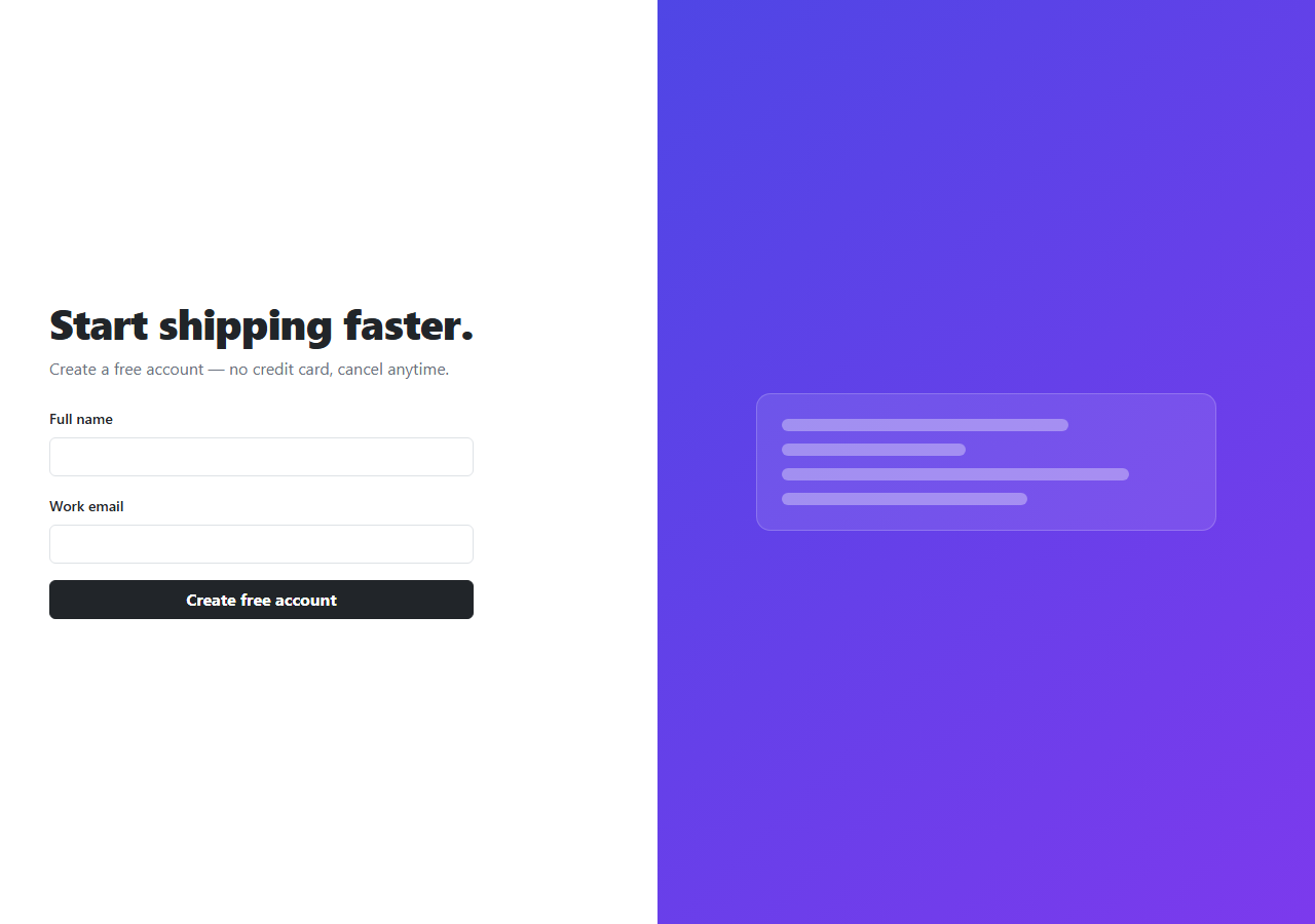
Rather than a form buried below a hero's fold, this snippet puts the signup form directly inside the hero itself, using real Bootstrap 5.3's grid split into two full-height columns: the form and copy on the left, a gradient visual panel on the right (hidden on mobile via d-none d-lg-flex, since a decorative panel isn't worth the space on a phone screen).
The form itself is genuinely validated — both fields are checked on submit (checkValidity() for email, a plain trim check for name), with Bootstrap's real is-invalid state applied to whichever field fails, and a status message confirming the specific name and email once both pass.
Build with AI
Build, Understand, Optimize, and Extend It With AI
Hand this snippet's HTML, CSS, and JS to an AI coding assistant like Claude and ask it to wire the submit handler to a real signup API with fetch() and a loading state on the button, or to add a password field with a strength meter. It's also a good exercise to ask the assistant to swap the gradient mock panel for an actual product screenshot with a subtle parallax effect on scroll.
Prompt to recreate it
Copy this into your AI assistant of choice to build the effect from scratch, or as a jumping-off point for your own variant:
Build a Bootstrap 5.3 full-height split hero with an inline signup form, using the real Bootstrap CDN framework (bootstrap.min.css and bootstrap.bundle.min.js), not custom CSS made to resemble Bootstrap.

Requirements:
- A full-viewport-height two-column layout using Bootstrap's grid: a headline, subtext, and a signup form (name + email fields, a submit button) on the left; a decorative gradient panel on the right, hidden below Bootstrap's lg breakpoint using its d-none/d-flex utility classes.
- The form must validate both fields on submit — the email field via native checkValidity(), the name field by checking it's non-empty — applying Bootstrap's is-invalid class to whichever field fails and blocking submission.
- On successful validation, show a confirmation message that includes the actual submitted name and email, then reset the form.
- The layout must remain fully usable and readable on mobile, with the visual panel removed rather than squeezed.
Want to tighten it up first? Run this prompt through the AI Prompt Studio to score it across 8 quality dimensions, catch anti-patterns, and tune the wording for Claude, ChatGPT, or Gemini before you paste it in.
Step by step
How to Use
- 1Load the snippetClick the snippet in the sidebar Library tab. The preview loads a full-height split layout.
- 2Submit with empty fieldsClick "Create free account" with nothing filled in — both fields get Bootstrap's invalid state.
- 3Fill in valid values and submitEnter a name and valid email — a confirmation message shows both values and the form resets.
- 4Shrink the preview widthNarrow below Bootstrap's lg breakpoint — the gradient visual panel disappears and the form takes the full width.
Real-world uses
Common Use Cases
Got questions?
Frequently Asked Questions
Yes — on submit, the email field is checked with native checkValidity() and the name field with a trim-and-check, both applying Bootstrap's real is-invalid styling on failure and blocking the "success" message until both pass.
It's hidden entirely below Bootstrap's lg breakpoint (992px) via d-none d-lg-flex, so the form gets the full width on a phone screen instead of being squeezed beside a panel that no longer fits.
Nowhere outside the page — this is a front-end demo. Replace the status-message logic in the submit handler with a real fetch() call to your signup API.
Yes — replace .bssplit-mock's content and background with an <img> of your actual product, keeping the same column structure.
The row uses min-height: 100vh, so on a very short screen the content may require scrolling — reduce or remove that min-height if you'd rather it size to its content instead.