Source Code
<div class="demo">
  <div class="chart-card">
    <div class="chart-head">
      <h3>Response Time Control Chart</h3>
      <p>Mean ± 3σ control limits computed live from the plotted samples</p>
    </div>
    <svg class="control-svg" id="controlSvg" viewBox="0 0 480 220" role="img" aria-label="Control chart of response time samples with mean and control limit bands"></svg>
    <div class="chart-legend">
      <span><i class="dot mean"></i>Mean (CL)</span>
      <span><i class="dot band"></i>±3σ limits</span>
      <span><i class="dot oor"></i>Out of control</span>
    </div>
  </div>
</div>
* { box-sizing: border-box; margin: 0; padding: 0; }
body { font-family: system-ui, sans-serif; background: #f8fafc; display: flex; align-items: center; justify-content: center; min-height: 100vh; padding: 24px; }
.chart-card { width: 520px; max-width: 100%; background: #fff; border: 1px solid #e2e8f0; border-radius: 16px; padding: 22px; }
.chart-head h3 { font-size: 14.5px; font-weight: 800; color: #111827; margin-bottom: 3px; }
.chart-head p { font-size: 11px; color: #94a3b8; margin-bottom: 12px; }
.control-svg { width: 100%; height: auto; overflow: visible; }
.chart-legend { display: flex; gap: 16px; margin-top: 10px; }
.chart-legend span { display: flex; align-items: center; gap: 6px; font-size: 11px; font-weight: 600; color: #64748b; }
.dot { width: 9px; height: 9px; border-radius: 50%; display: inline-block; }
.dot.mean { background: #6366f1; }
.dot.band { background: #c7d2fe; }
.dot.oor { background: #ef4444; }// 24 sampled response-time readings (ms) — includes a couple of genuine
// out-of-control points to demonstrate the limit-breach detection.
const samples = [212, 218, 205, 224, 209, 231, 198, 215, 220, 227, 289, 211, 206, 218, 223, 233, 197, 244, 341, 219, 208, 214, 226, 210];
const svg = document.getElementById('controlSvg');
const W = 480, H = 220, PAD_L = 44, PAD_R = 14, PAD_T = 14, PAD_B = 28;
const plotW = W - PAD_L - PAD_R;
const plotH = H - PAD_T - PAD_B;
// --- Compute mean and standard deviation from the sample set itself ---
const mean = samples.reduce((sum, v) => sum + v, 0) / samples.length;
const variance = samples.reduce((sum, v) => sum + (v - mean) ** 2, 0) / samples.length;
const stdDev = Math.sqrt(variance);
const ucl = mean + 3 * stdDev; // Upper Control Limit
const lcl = mean - 3 * stdDev; // Lower Control Limit
const dataMin = Math.min(...samples, lcl);
const dataMax = Math.max(...samples, ucl);
const range = dataMax - dataMin || 1;
function yFor(value) {
return PAD_T + plotH - ((value - dataMin) / range) * plotH;
}
function xFor(index) {
return PAD_L + (index / (samples.length - 1)) * plotW;
}
function svgEl(tag, attrs) {
const el = document.createElementNS('http://www.w3.org/2000/svg', tag);
Object.entries(attrs).forEach(([k, v]) => el.setAttribute(k, v));
return el;
}
// Shaded band between LCL and UCL
svg.appendChild(svgEl('rect', {
x: PAD_L, y: yFor(ucl), width: plotW, height: yFor(lcl) - yFor(ucl),
fill: '#eef2ff',
}));
// Mean (center line), UCL and LCL reference lines
[{ v: mean, color: '#6366f1', dash: '0' }, { v: ucl, color: '#a5b4fc', dash: '4 3' }, { v: lcl, color: '#a5b4fc', dash: '4 3' }].forEach((line) => {
svg.appendChild(svgEl('line', {
x1: PAD_L, x2: W - PAD_R, y1: yFor(line.v), y2: yFor(line.v),
stroke: line.color, 'stroke-width': 1.5, 'stroke-dasharray': line.dash,
}));
});
// Line connecting all sample points
const pathPoints = samples.map((v, i) => `${xFor(i)},${yFor(v)}`).join(' ');
svg.appendChild(svgEl('polyline', {
points: pathPoints, fill: 'none', stroke: '#94a3b8', 'stroke-width': 1.5,
}));
// Individual sample points, colored red when they breach the control limits
samples.forEach((v, i) => {
const outOfControl = v > ucl || v < lcl;
const circle = svgEl('circle', {
cx: xFor(i), cy: yFor(v), r: outOfControl ? 4.5 : 3,
fill: outOfControl ? '#ef4444' : '#6366f1',
stroke: '#fff', 'stroke-width': 1,
});
const title = svgEl('title', {});
title.textContent = `Sample ${i + 1}: ${v}ms${outOfControl ? ' — OUT OF CONTROL' : ''}`;
circle.appendChild(title);
svg.appendChild(circle);
});
// Y-axis labels for mean, UCL, LCL
[{ v: mean, label: `CL ${mean.toFixed(0)}` }, { v: ucl, label: `UCL ${ucl.toFixed(0)}` }, { v: lcl, label: `LCL ${lcl.toFixed(0)}` }].forEach((tick) => {
const text = svgEl('text', { x: PAD_L - 6, y: yFor(tick.v) + 3, 'text-anchor': 'end', 'font-size': 9, fill: '#94a3b8', 'font-weight': 700 });
text.textContent = tick.label;
svg.appendChild(text);
});Learn Coding Visually
Learn to code with interactive, live-preview playgrounds — HTML, CSS, JavaScript, React & more.
 HTML Playground42 lessons · Click-based · Live preview
 CSS PlaygroundLearn CSS with a live editor
 JavaScript Playground60 lessons · DOM · Async · Canvas
 React PlaygroundLearn React with a live code editor
 GSAP PlaygroundLearn GSAP animation interactively
 SVG Playground44 lessons · shapes · paths · animation
 SCSS Playground45 lessons · Sass modules · tokens
 Tailwind PlaygroundLearn Tailwind CSS with a live editor
 Bootstrap 5 Playground50 lessons · live preview
Control Chart (SPC Chart) — Live-Computed Mean and ±3σ Control Limits in SVG
Control Chart with Upper/Lower Control Limits · Charts · Plain HTML, CSS & JS · Live preview
What's included
Features
About this UI Snippet
Control Chart — Computing Real Statistics, Not Just Drawing Fixed Lines
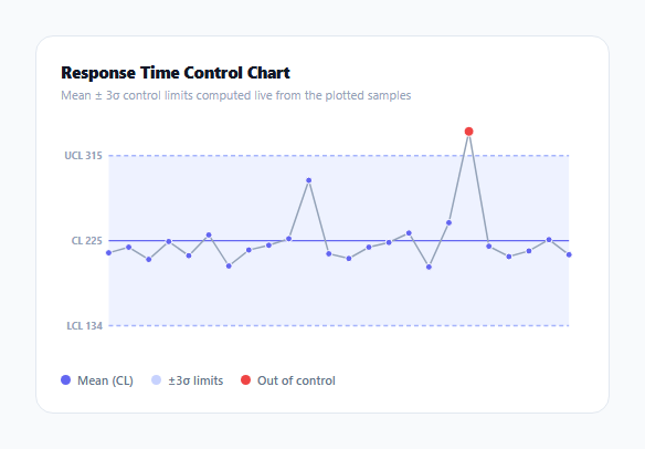
A control chart (also called a Shewhart chart) is the standard tool in statistical process control for telling the difference between normal process variation and a genuine anomaly. Unlike most chart types in this library, the "interesting" lines on this chart — the center line and the two control limits — aren't supplied as static data; they're computed live from the actual sample values plotted, which is what makes the chart meaningful rather than decorative.
The math: mean, variance, and 3-sigma limits, computed in sequence
The mean is the simple average of all samples. Variance is computed as the average squared deviation from that mean — samples.reduce((sum, v) => sum + (v - mean) ** 2, 0) / samples.length — and standard deviation is its square root. The upper and lower control limits are then mean ± 3 × stdDev, the conventional "3-sigma" bounds used in SPC: under normal statistical variation, roughly 99.7% of sample points should fall within these bounds, so a point outside them is treated as a genuine signal worth investigating, not just noise.
Why the y-axis scale accounts for the limits, not just the raw data
dataMin/dataMax are computed as Math.min(...samples, lcl) and Math.max(...samples, ucl) — deliberately including the *computed* control limits in the range calculation, not just the raw sample values. Without this, a tight cluster of samples with a wide computed control band (from one or two extreme outliers inflating the standard deviation) could render the UCL/LCL lines outside the visible chart area entirely, which would silently hide the very information the chart exists to show.
Out-of-control points are detected, not styled by hand
Each sample point's color and radius are set programmatically — const outOfControl = v > ucl || v < lcl — comparing that specific point's value against the *computed* limits, not a hardcoded threshold. This means the "genuine out-of-control" points in the sample data (289 and 341 in the demo) are flagged automatically because they actually exceed the calculated bounds, exactly as a real SPC tool would flag them; changing any other sample value would correctly shift the computed mean and limits and could change which points are flagged.
Raw SVG, not a charting library, because the geometry is simple and the math is the point
Every element — the shaded control band, the three reference lines, the connecting polyline, and each data point circle — is built with plain document.createElementNS calls, computing pixel coordinates from the same xFor/yFor scale functions used throughout. Keeping the rendering this direct makes the statistical computation itself (the actual point of a control chart) the readable, unobscured centerpiece of the snippet.
Build with AI
Build, Understand, Optimize, and Extend It With AI
Ask an AI assistant to walk through the mean/variance/standard-deviation calculation in this chart step by step with a small worked example, and to explain precisely why the y-axis scale needs to account for the computed control limits rather than just the raw data range. It's also worth asking for additional Western Electric-style SPC rules beyond simple limit breaches (e.g. flagging 7 consecutive points on the same side of the mean, or a run of points steadily trending in one direction), or a version that recomputes limits from only a rolling recent window rather than the whole dataset.
Prompt to recreate it
Copy this into your AI assistant of choice to build the effect from scratch, or as a jumping-off point for your own variant:
Build a statistical process control (SPC) chart in HTML, CSS and vanilla JavaScript using raw SVG — no charting library.

Requirements:
- Accept an array of numeric sample values in time order, and compute the mean, standard deviation, and upper/lower 3-sigma control limits (mean ± 3 × standard deviation) directly from that array — do not hardcode these values.
- Render a shaded band between the lower and upper control limits, a solid center line at the mean, dashed lines at the upper and lower control limits, and a connecting polyline through all sample points, all positioned using the same coordinate scale functions.
- Ensure the chart's vertical axis range accounts for the computed control limits as well as the raw sample values, so the limit lines are never pushed outside the visible plot area even when an outlier widens the computed limits significantly.
- Programmatically determine which individual sample points fall outside the computed control limits and render those points with a distinct color and slightly larger radius compared to in-control points — this determination must be a real comparison against the computed limits, not a separately hardcoded list.
- Add a native SVG tooltip (a <title> element) to every data point showing its sample index, value, and whether it is out of control.
- Give the SVG an appropriate role and aria-label describing the chart's purpose for screen reader users.
Want to tighten it up first? Run this prompt through the AI Prompt Studio to score it across 8 quality dimensions, catch anti-patterns, and tune the wording for Claude, ChatGPT, or Gemini before you paste it in.
Step by step
How to Use
- 1Replace the samples array with real measurementsSwap the hardcoded response-time values for your actual process data — mean, standard deviation and control limits recompute automatically.
- 2Adjust the control limit multiplierChange the 3 in ucl = mean + 3 * stdDev (and the matching lcl line) to use 2-sigma or another convention if your process calls for it.
- 3Hover any point for its exact valueEach data point circle includes a native SVG <title> tooltip showing its sample number, value, and out-of-control status.
- 4Adjust the chart dimensionsChange the W, H, and padding constants at the top of the JS panel to resize the plot area.
- 5Add a rule for consecutive-point trendsExtend the point-styling loop to also flag runs of several consecutive points trending in one direction, a common secondary SPC rule beyond simple limit breaches.
Real-world uses
Common Use Cases
Got questions?
Frequently Asked Questions
They are computed live — mean and standard deviation are calculated from the samples array itself, and the upper/lower control limits are derived as mean ± 3 standard deviations. Changing any sample value recalculates all of these automatically.
3-sigma limits are the standard convention in statistical process control: under normal variation, about 99.7% of data points are expected to fall within them, so a point outside is treated as a statistically meaningful signal rather than expected noise. This multiplier is easily adjusted if your use case calls for a different convention (e.g. 2-sigma for tighter sensitivity).
Each point's value is compared directly against the computed ucl and lcl values — v > ucl || v < lcl — so the flagged points are determined by real comparison against the calculated limits, not a separate hardcoded list of "bad" indices.
An extreme value increases the computed standard deviation, which widens the control limits — this is a real property of 3-sigma control charts (a single big outlier can temporarily make the process look more "in control" than it should), which is why real SPC practice often also tracks trend-based rules (e.g. several consecutive points moving in one direction) alongside simple limit breaches.
If the axis scale were based only on the raw sample values, a small cluster of tightly-grouped samples with a wide computed control band (from an outlier inflating the standard deviation) could push the UCL/LCL lines outside the visible chart area, hiding exactly the information a control chart is meant to show.
Yes — any time-ordered numeric sample series benefits from the same statistical framing: latency measurements, error rates, batch processing durations, or any operational metric where you want to distinguish normal variation from a genuine anomaly.