Source Code
<div class="playground">
<div class="preview-panel">
<div class="swatch-large" id="swatch-large"></div>
<div class="code-readout">
<span class="code-label">CSS value</span>
<code id="css-output">oklch(70% 0.15 260)</code>
</div>
</div>
<div class="controls-panel">
<div class="control-row">
<div class="control-label">
<span>Lightness</span>
<span class="control-value" id="l-value">70%</span>
</div>
<input type="range" id="l-slider" min="0" max="100" step="1" value="70" aria-label="Lightness">
</div>
<div class="control-row">
<div class="control-label">
<span>Chroma</span>
<span class="control-value" id="c-value">0.15</span>
</div>
<input type="range" id="c-slider" min="0" max="0.37" step="0.005" value="0.15" aria-label="Chroma">
</div>
<div class="control-row">
<div class="control-label">
<span>Hue</span>
<span class="control-value" id="h-value">260°</span>
</div>
<input type="range" id="h-slider" min="0" max="360" step="1" value="260" aria-label="Hue">
</div>
</div>
<div class="uniformity-section">
<div class="uniformity-header">
<h3>Perceptual uniformity: same L & C, hue sweeping 0–360°</h3>
<label class="model-toggle">
<input type="checkbox" id="compare-toggle">
<span>Compare with HSL at matching lightness</span>
</label>
</div>
<div class="hue-strip" id="oklch-strip"></div>
<div class="hue-strip" id="hsl-strip" hidden></div>
<p class="uniformity-note" id="uniformity-note">Every swatch above shares the same lightness (70%) and chroma (0.15) in OKLCH — notice how they all read as roughly the same brightness as your eye scans across hues.</p>
</div>
</div>* { box-sizing: border-box; margin: 0; padding: 0; }
body { font-family: system-ui, sans-serif; background: #f8fafc; min-height: 100vh; color: #1e293b; }
.playground { max-width: 720px; margin: 0 auto; padding: 32px 20px; display: flex; flex-direction: column; gap: 28px; }
.preview-panel { display: flex; flex-direction: column; align-items: center; gap: 14px; }
.swatch-large {
width: 100%; max-width: 420px; height: 160px; border-radius: 18px;
background: oklch(70% 0.15 260);
box-shadow: 0 12px 32px rgba(0,0,0,0.12);
transition: background 0.08s linear;
}
.code-readout {
display: flex; align-items: center; gap: 10px;
background: #0f172a; color: #e2e8f0;
padding: 10px 16px; border-radius: 10px; font-size: 13px;
}
.code-label { font-size: 11px; text-transform: uppercase; letter-spacing: 0.06em; color: #94a3b8; font-weight: 600; }
.code-readout code { font-family: 'SFMono-Regular', Consolas, monospace; color: #a5b4fc; }
.controls-panel { display: flex; flex-direction: column; gap: 18px; background: #fff; border-radius: 16px; padding: 22px; box-shadow: 0 2px 10px rgba(0,0,0,0.05); }
.control-row { display: flex; flex-direction: column; gap: 8px; }
.control-label { display: flex; justify-content: space-between; font-size: 13px; font-weight: 600; color: #334155; }
.control-value { color: #6366f1; font-variant-numeric: tabular-nums; }
input[type="range"] {
-webkit-appearance: none; appearance: none;
width: 100%; height: 6px; border-radius: 4px; background: #e2e8f0; outline: none;
}
input[type="range"]::-webkit-slider-thumb {
-webkit-appearance: none; width: 20px; height: 20px; border-radius: 50%;
background: #6366f1; cursor: pointer; border: 3px solid #fff; box-shadow: 0 1px 4px rgba(0,0,0,0.25);
}
input[type="range"]::-moz-range-thumb {
width: 20px; height: 20px; border-radius: 50%; background: #6366f1; cursor: pointer;
border: 3px solid #fff; box-shadow: 0 1px 4px rgba(0,0,0,0.25);
}
input[type="range"]:focus-visible::-webkit-slider-thumb { outline: 2px solid #6366f1; outline-offset: 3px; }
.uniformity-section { background: #fff; border-radius: 16px; padding: 22px; box-shadow: 0 2px 10px rgba(0,0,0,0.05); display: flex; flex-direction: column; gap: 14px; }
.uniformity-header { display: flex; flex-direction: column; gap: 10px; }
.uniformity-header h3 { font-size: 14px; font-weight: 700; color: #1e293b; }
.model-toggle { display: flex; align-items: center; gap: 8px; font-size: 13px; color: #64748b; cursor: pointer; }
.model-toggle input { width: 16px; height: 16px; accent-color: #6366f1; }
.hue-strip { display: grid; grid-template-columns: repeat(12, 1fr); gap: 4px; height: 56px; border-radius: 10px; overflow: hidden; }
.hue-strip div { width: 100%; height: 100%; }
.uniformity-note { font-size: 12.5px; color: #64748b; line-height: 1.6; }const lSlider = document.getElementById('l-slider');
const cSlider = document.getElementById('c-slider');
const hSlider = document.getElementById('h-slider');
const lValue = document.getElementById('l-value');
const cValue = document.getElementById('c-value');
const hValue = document.getElementById('h-value');
const swatch = document.getElementById('swatch-large');
const output = document.getElementById('css-output');
const oklchStrip = document.getElementById('oklch-strip');
const hslStrip = document.getElementById('hsl-strip');
const compareToggle = document.getElementById('compare-toggle');
const note = document.getElementById('uniformity-note');
function update() {
const l = Number(lSlider.value);
const c = Number(cSlider.value);
const h = Number(hSlider.value);
lValue.textContent = l + '%';
cValue.textContent = c.toFixed(3);
hValue.textContent = h + '\u00b0';
const cssValue = 'oklch(' + l + '% ' + c.toFixed(3) + ' ' + h + ')';
swatch.style.background = cssValue;
output.textContent = cssValue;
buildStrip(oklchStrip, l, c);
}
function buildStrip(container, l, c) {
container.innerHTML = '';
for (let hue = 0; hue <= 360; hue += 30) {
const div = document.createElement('div');
div.style.background = 'oklch(' + l + '% ' + c.toFixed(3) + ' ' + hue + ')';
div.title = 'oklch(' + l + '% ' + c.toFixed(3) + ' ' + hue + ')';
container.appendChild(div);
}
}
function buildHslStrip(lightness) {
hslStrip.innerHTML = '';
// Map OKLCH lightness (perceptual) directly onto HSL lightness (non-perceptual)
// to demonstrate that equal HSL lightness does NOT look equally bright.
for (let hue = 0; hue <= 360; hue += 30) {
const div = document.createElement('div');
div.style.background = 'hsl(' + hue + ', 70%, ' + lightness + '%)';
div.title = 'hsl(' + hue + ', 70%, ' + lightness + '%)';
hslStrip.appendChild(div);
}
}
[lSlider, cSlider, hSlider].forEach(el => el.addEventListener('input', update));
compareToggle.addEventListener('change', () => {
const showCompare = compareToggle.checked;
hslStrip.hidden = !showCompare;
if (showCompare) {
buildHslStrip(Number(lSlider.value));
note.textContent = 'Top row: OKLCH swatches at the same L and C \u2014 uniform perceived brightness across every hue. Bottom row: HSL swatches using the same numeric lightness \u2014 yellows and greens look far brighter than blues and purples because HSL lightness ignores human luminance perception.';
} else {
note.textContent = 'Every swatch above shares the same lightness (' + lSlider.value + '%) and chroma (' + Number(cSlider.value).toFixed(3) + ') in OKLCH \u2014 notice how they all read as roughly the same brightness as your eye scans across hues.';
}
});
lSlider.addEventListener('input', () => { if (compareToggle.checked) buildHslStrip(Number(lSlider.value)); });
update();Learn Coding Visually
Learn to code with interactive, live-preview playgrounds — HTML, CSS, JavaScript, React & more.
 HTML Playground42 lessons · Click-based · Live preview
 CSS PlaygroundLearn CSS with a live editor
 JavaScript Playground60 lessons · DOM · Async · Canvas
 React PlaygroundLearn React with a live code editor
 GSAP PlaygroundLearn GSAP animation interactively
 SVG Playground44 lessons · shapes · paths · animation
 SCSS Playground45 lessons · Sass modules · tokens
 Tailwind PlaygroundLearn Tailwind CSS with a live editor
 Bootstrap 5 Playground50 lessons · live preview
OKLCH Color Picker & Playground — Free HTML CSS JS Snippet
OKLCH Color Picker & Playground · Forms · Plain HTML, CSS & JS · Live preview
What's included
Features
About this UI Snippet
OKLCH Color Picker & Playground — Perceptually Uniform Color with CSS Color Level 4
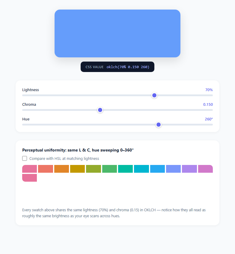
Color on the web has quietly moved past hex codes and hsl(). CSS Color Module Level 4 introduced the oklch() function, and as of 2025 it has full support across Chrome, Firefox, and Safari. OKLCH stands for OK Lightness Chroma Hue, a color space built on Björn Ottosson's Oklab model, specifically engineered so that equal changes in each channel produce equal perceived changes in the resulting color. This snippet is a hands-on playground for understanding why that property matters and how to actually author colors with it.
Why HSL lightness lies to you
HSL was designed in the 1970s to be easy for humans to reason about numerically, not to match human vision. Set hsl(60, 70%, 50%) (yellow) next to hsl(240, 70%, 50%) (blue) and, despite having identical "lightness" values, the yellow looks dramatically brighter than the blue. That's because HSL lightness is computed from the raw RGB channel maximum and minimum, with no adjustment for the fact that the human eye is far more sensitive to green and yellow wavelengths than to blue. Designers building a color palette in HSL frequently have to hand-tune the lightness of every hue to make a set of swatches "feel" balanced, which is fragile and subjective.
How OKLCH fixes this
OKLCH's L channel is derived from a perceptual lightness model calibrated against actual human contrast sensitivity data, so oklch(70% 0.15 260) and oklch(70% 0.15 30) really do look like they share the same lightness, no matter the hue. The three channels are: L (lightness, 0% to 100%), C (chroma, roughly 0 to 0.4 in practice, representing colorfulness/saturation), and H (hue, 0 to 360 degrees, same wheel concept as HSL but operating in a perceptually uniform space). Because chroma and hue are decoupled from lightness, you can shift a color's hue for a themed variant, or generate a tint/shade ramp, by changing exactly one number and trusting that perceived brightness stays put.
What this playground demonstrates
The three sliders build a live oklch(L% C H) string, immediately applied to the large swatch and echoed as literal CSS text so you can copy it straight into a stylesheet. The chroma slider is capped around 0.37, which is roughly the outer edge of what sRGB displays can render before a color starts clipping (an unavoidable byproduct of OKLCH's wider gamut ambitions, and part of why the CSS Color 4 spec also defines color-gamut media queries and gamut-mapping algorithm). Below the main controls, a strip of swatches locks lightness and chroma constant while stepping hue from 0 to 360 degrees in 30-degree increments — every tile should read as roughly the same brightness. Toggling "Compare with HSL" renders a second strip using the identical numeric lightness value in hsl() instead, so you can see yellows and greens blow out brighter while blues and purples sink darker, purely as an artifact of HSL's math.
Practical use in 2025/2026 CSS
Design systems increasingly define their entire palette in OKLCH because it makes programmatic palette generation trivial and reliable: darkening a brand color for a hover state is just decreasing L by a fixed percentage, and it looks correct for every hue in the palette without manual tuning. OKLCH also supports values outside the traditional sRGB gamut, which browsers gamut-map down to the nearest displayable color automatically, future-proofing designs for wide-gamut (P3) displays. Browser support landed in Chrome 111, Safari 15.4, and Firefox 113, so as of 2026 it is safe to use without a fallback in almost all production contexts; for the rare legacy target, pair it with an hsl() fallback declared before the oklch() line, since CSS silently ignores a color function it can't parse and falls back to the previous valid declaration.
Build with AI
Build, Understand, Optimize, and Extend It With AI
Paste this snippet's HTML, CSS, and JS into an AI coding assistant like Claude and ask it to walk through exactly how the update() function builds the oklch() string from three range inputs, and why locking L and C while sweeping H produces the perceptually flat hue strip you see on screen. You can also ask it to explain the sRGB gamut-clipping behavior that causes some high-chroma combinations to look identical, or have it add an alpha-channel slider following the same pattern as the existing lightness, chroma, and hue controls. It's also a good candidate for extension: ask the assistant to add a "copy to clipboard" button next to the CSS readout, generate a full tint/shade ramp export from the current hue and chroma, or add a P3-gamut warning badge that appears when the current color exceeds sRGB using the CSS color-gamut media feature. Treat the code as a working reference to interrogate and build on, not a finished black box.
Prompt to recreate it
Copy this into your AI assistant of choice to build the effect from scratch, or as a jumping-off point for your own variant:
Build an interactive OKLCH color playground in plain HTML, CSS, and JavaScript that teaches perceptual color uniformity.

Requirements:
- Three range inputs controlling Lightness (0-100%), Chroma (0-0.37), and Hue (0-360deg), each wired with an input event listener that rebuilds an oklch(L% C H) CSS string and applies it live to a large preview swatch's background.
- A text readout that always displays the exact, currently-applied oklch() CSS string as copyable code.
- A row of swatches generated by looping hue from 0 to 360 in fixed steps while holding the current lightness and chroma constant, demonstrating that OKLCH keeps perceived brightness constant across all hues.
- A toggle that reveals a second comparison row using hsl() with the identical numeric lightness value, so the user can visually confirm that HSL lightness does NOT produce uniform perceived brightness across hues (yellows/greens read brighter than blues/purples at the same HSL L value).
- Custom-styled range slider thumbs with a visible focus-visible outline for keyboard users.
- Live-updating numeric labels next to each slider showing its current value with appropriate units (%, unitless chroma to 3 decimals, degrees).
- No external color-math libraries — rely entirely on the browser's native oklch() and hsl() CSS parsing to do the color conversion.
Want to tighten it up first? Run this prompt through the AI Prompt Studio to score it across 8 quality dimensions, catch anti-patterns, and tune the wording for Claude, ChatGPT, or Gemini before you paste it in.
Step by step
How to Use
- 1Drag the Lightness sliderThe #l-slider input ranges from 0 to 100 and maps directly to the L channel of the generated oklch() string. Watch the #swatch-large background update in real time and notice that low values always look dark and high values always look light, regardless of what hue is currently selected.
- 2Drag the Chroma sliderThe #c-slider ranges from 0 to 0.37 in steps of 0.005. At 0 the color is fully desaturated (a pure gray at the current lightness); as chroma increases the color becomes more vivid. Very high chroma values combined with certain hues will exceed the sRGB gamut and get clipped by the browser to the nearest displayable color.
- 3Drag the Hue sliderThe #h-slider sweeps 0 to 360 degrees, exactly like the hue wheel in HSL. Because OKLCH decouples hue from lightness perception, changing only this slider should feel like the swatch is genuinely just "changing color" without getting subjectively brighter or darker.
- 4Read the generated CSS stringThe #css-output element always mirrors exactly what is applied to the swatch, formatted as valid CSS: oklch(70% 0.150 260). Copy this string directly into any background, color, or border-color property in your stylesheet.
- 5Compare the hue strip against HSLCheck the "Compare with HSL" checkbox to reveal a second strip built with buildHslStrip(), which uses the exact same numeric lightness value inside an hsl() function instead of oklch(). The visual brightness mismatch across the two strips is the core lesson of this demo.
- 6Adapt the ranges for your design systemIf your brand palette only ever uses mid-range chroma, tighten the #c-slider max attribute in the HTML to match, and consider hard-coding the default #l-slider value to your design system's base lightness so the picker opens already close to your production values.
Real-world uses
Common Use Cases
Got questions?
Frequently Asked Questions
oklch() has been supported since Chrome/Edge 111 (March 2023), Safari 15.4 (March 2022), and Firefox 113 (May 2023). As of 2026 that covers effectively all modern browser usage. For the rare project still supporting older engines, declare an hsl() or hex fallback as the first background/color rule and the oklch() rule after it — browsers that cannot parse oklch() silently skip that declaration and keep the earlier fallback value.
Chroma in OKLCH is theoretically unbounded, but real sRGB displays can only render colors up to a certain saturation before a hue clips to the edge of the gamut and stops changing visibly. Around 0.35-0.4 is roughly the practical ceiling for most hues on a standard monitor; pushing higher just produces the same visually maxed-out color while the underlying number keeps climbing, which is why this playground caps the slider near that boundary.
They are related but distinct. CIE Lab/LCH (also supported in CSS Color 4 via lab() and lch()) were designed in the 1970s to approximate human perception using period display technology as a reference; OKLCH is a 2020 refinement by Björn Ottosson that corrects known perceptual inaccuracies in Lab, particularly around blue hues, using modern colorimetric data. In practice OKLCH is more perceptually accurate and is the model most current design systems and this snippet standardize on.
Yes — add a fourth value separated by a slash, e.g. oklch(70% 0.15 260 / 0.5) for 50% opacity, using the same slash syntax as modern rgb() and hsl() notation. This snippet does not expose an alpha slider, but you can add one following the same pattern as the existing L, C, and H sliders and append the value in the update() function's cssValue string.
That happens when the requested color falls outside the sRGB gamut and gets clipped to the same boundary color by the browser's gamut-mapping algorithm. It is most noticeable at high lightness or high chroma with blue and purple hues, which have a naturally smaller renderable gamut in sRGB than yellows and greens — try lowering lightness slightly to bring the color back inside the renderable range.