Source Code
<div class="shell">
<nav class="rail" id="rail" aria-label="Primary">
<div class="rail-item active" data-section="home" tabindex="0">
<span class="rail-icon">⌂</span>
<div class="flyout">
<p class="flyout-title">Home</p>
<a href="#" class="flyout-link">Overview</a>
<a href="#" class="flyout-link">Recent activity</a>
<a href="#" class="flyout-link">Shortcuts</a>
</div>
</div>
<div class="rail-item" data-section="projects" tabindex="0">
<span class="rail-icon">▣</span>
<div class="flyout">
<p class="flyout-title">Projects</p>
<a href="#" class="flyout-link">All projects</a>
<a href="#" class="flyout-link">Templates</a>
<a href="#" class="flyout-link">Archived</a>
<a href="#" class="flyout-link">Shared with me</a>
</div>
</div>
<div class="rail-item" data-section="team" tabindex="0">
<span class="rail-icon">☶</span>
<div class="flyout">
<p class="flyout-title">Team</p>
<a href="#" class="flyout-link">Members</a>
<a href="#" class="flyout-link">Roles & access</a>
<a href="#" class="flyout-link">Invitations</a>
</div>
</div>
<div class="rail-item" data-section="reports" tabindex="0">
<span class="rail-icon">≡</span>
<div class="flyout">
<p class="flyout-title">Reports</p>
<a href="#" class="flyout-link">Usage</a>
<a href="#" class="flyout-link">Billing</a>
<a href="#" class="flyout-link">Exports</a>
</div>
</div>
<div class="rail-spacer"></div>
<div class="rail-item" data-section="settings" tabindex="0">
<span class="rail-icon">⚙</span>
<div class="flyout flyout-bottom">
<p class="flyout-title">Settings</p>
<a href="#" class="flyout-link">Preferences</a>
<a href="#" class="flyout-link">Notifications</a>
<a href="#" class="flyout-link">Integrations</a>
</div>
</div>
</nav>
<main class="content">
<h2 id="content-title">Home</h2>
<p>Hover or focus a rail icon to reveal its submenu. Click a submenu link, or a rail icon itself, to set the active section.</p>
</main>
</div>* { box-sizing: border-box; margin: 0; padding: 0; }
body { font-family: system-ui, sans-serif; background: #f1f5f9; min-height: 100vh; }
.shell { display: flex; min-height: 100vh; }
.rail {
width: 64px; flex-shrink: 0;
background: #1e293b; padding: 16px 0;
display: flex; flex-direction: column; align-items: center; gap: 4px;
}
.rail-spacer { flex: 1; }
.rail-item {
position: relative; width: 44px; height: 44px; border-radius: 12px;
display: flex; align-items: center; justify-content: center;
cursor: pointer; outline: none;
}
.rail-icon { font-size: 19px; color: #94a3b8; transition: color 0.15s; }
.rail-item:hover .rail-icon, .rail-item:focus-visible .rail-icon { color: #f1f5f9; }
.rail-item.active { background: rgba(99,102,241,0.16); }
.rail-item.active .rail-icon { color: #a5b4fc; }
.rail-item:focus-visible { box-shadow: 0 0 0 2px #6366f1; }
.flyout {
position: absolute; left: calc(100% + 10px); top: 50%; transform: translateY(-50%) translateX(-6px);
min-width: 190px; background: #fff; border-radius: 12px; padding: 10px;
box-shadow: 0 16px 40px rgba(15,23,42,0.25);
opacity: 0; pointer-events: none; visibility: hidden;
transition: opacity 0.14s ease, transform 0.14s ease, visibility 0.14s;
z-index: 20;
}
.rail-item:hover .flyout, .rail-item:focus-within .flyout {
opacity: 1; pointer-events: auto; visibility: visible; transform: translateY(-50%) translateX(0);
}
.flyout.flyout-bottom { top: auto; bottom: 0; transform: translateX(-6px); }
.rail-item:hover .flyout.flyout-bottom, .rail-item:focus-within .flyout.flyout-bottom { transform: translateX(0); }
.flyout-title { font-size: 10.5px; font-weight: 800; letter-spacing: 0.04em; text-transform: uppercase; color: #94a3b8; padding: 4px 10px 8px; }
.flyout-link {
display: block; padding: 8px 10px; border-radius: 8px;
font-size: 13px; font-weight: 600; color: #334155; text-decoration: none;
}
.flyout-link:hover { background: #f1f5f9; color: #6366f1; }
.content { flex: 1; padding: 40px; }
.content h2 { font-size: 20px; font-weight: 800; color: #1e293b; margin-bottom: 8px; }
.content p { font-size: 13.5px; color: #64748b; max-width: 420px; line-height: 1.6; }const items = document.querySelectorAll('.rail-item');
const titleEl = document.getElementById('content-title');
function setActive(item) {
items.forEach(i => i.classList.remove('active'));
item.classList.add('active');
const section = item.dataset.section;
const label = item.querySelector('.flyout-title').textContent;
titleEl.textContent = label;
}
items.forEach(item => {
item.addEventListener('click', e => {
if (e.target.classList.contains('flyout-link')) return;
setActive(item);
});
item.addEventListener('keydown', e => {
if (e.key === 'Enter' || e.key === ' ') {
e.preventDefault();
setActive(item);
}
});
item.querySelectorAll('.flyout-link').forEach(link => {
link.addEventListener('click', e => {
e.preventDefault();
setActive(item);
titleEl.textContent = item.querySelector('.flyout-title').textContent + ' \u2013 ' + link.textContent;
});
});
});Learn Coding Visually
Learn to code with interactive, live-preview playgrounds — HTML, CSS, JavaScript, React & more.
 HTML Playground42 lessons · Click-based · Live preview
 CSS PlaygroundLearn CSS with a live editor
 JavaScript Playground60 lessons · DOM · Async · Canvas
 React PlaygroundLearn React with a live code editor
 GSAP PlaygroundLearn GSAP animation interactively
 SVG Playground44 lessons · shapes · paths · animation
 SCSS Playground45 lessons · Sass modules · tokens
 Tailwind PlaygroundLearn Tailwind CSS with a live editor
 Bootstrap 5 Playground50 lessons · live preview
Icon Rail with Flyout Submenu — Free HTML CSS JS Snippet
Icon Rail with Flyout Submenu · Navigation · Plain HTML, CSS & JS · Live preview
What's included
Features
About this UI Snippet
Icon Rail with Flyout Submenu — Compact Vertical Navigation with Hover/Focus-Revealed Submenus
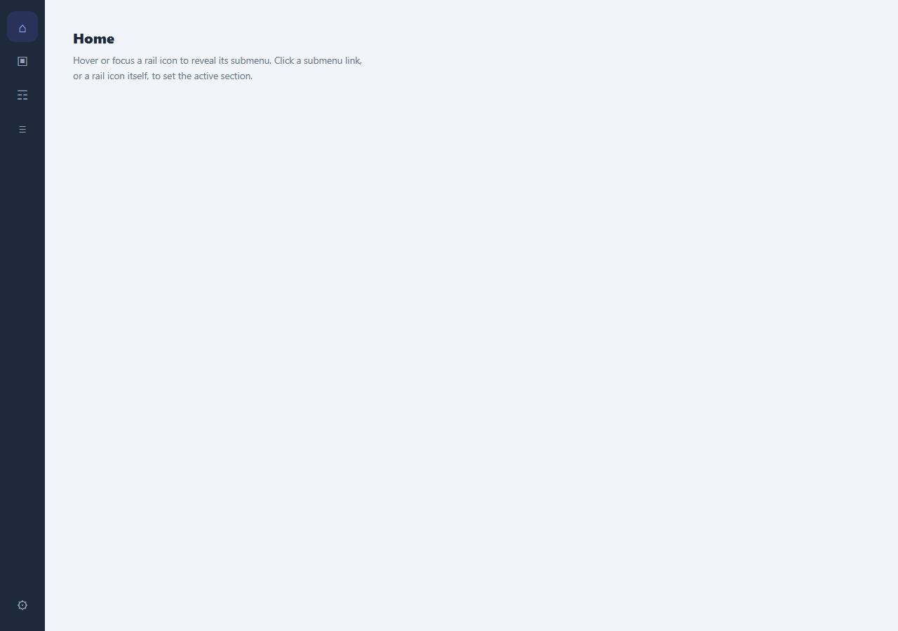
Admin dashboards and desktop-style web apps often need dense primary navigation that doesn't eat much horizontal space, while still giving each top-level section room for several sub-links. A narrow icon-only rail solves the space problem, but icons alone are ambiguous without labels — this pattern solves both at once: a 64px-wide vertical rail of icons, where hovering or focusing any icon reveals a labeled flyout panel of sub-links positioned directly beside it, closing again the instant focus or hover moves away.
CSS-only reveal via :hover and :focus-within
The flyout panels have no JavaScript show/hide logic at all — visibility is handled entirely in CSS. Each .flyout starts at opacity: 0, visibility: hidden, and pointer-events: none, and the rule .rail-item:hover .flyout, .rail-item:focus-within .flyout flips all three to their visible state. Using :focus-within rather than plain :focus on the parent .rail-item is what keeps the flyout open while the user tabs from the rail icon itself into one of the flyout's own links — :focus alone would close the panel the instant focus moved off the icon and onto a link inside it, breaking keyboard navigation entirely.
Why pointer-events is toggled alongside opacity
Setting pointer-events: none on the hidden state, in addition to opacity: 0, prevents an invisible-but-still-in-the-DOM flyout from silently intercepting clicks or hover events meant for whatever sits underneath it — a common bug with opacity-only show/hide techniques where a "hidden" element still occupies interactive space. Re-enabling pointer-events: auto only in the hover/focus-within state ensures the flyout is genuinely inert until it's actually visible.
Handling the bottom-most item's flyout direction
The Settings rail item sits at the very bottom of the rail (pushed there by a flexible .rail-spacer above it), so a flyout centered vertically on that icon like the others would render partially below the viewport. It gets a .flyout-bottom modifier class that switches its vertical anchor from top: 50% (centered on the icon) to bottom: 0 (aligned to the icon's bottom edge, growing upward instead), a small but important detail for any rail where item count and viewport height aren't guaranteed to leave room for a centered flyout at every position.
Distinguishing a rail-icon click from a flyout-link click
Both the rail icon itself and any of its flyout links can set the active section, but they need different behavior: clicking the bare icon should set that section active without navigating anywhere in particular, while clicking a specific flyout link should set the section active *and* record which sub-item was chosen. The shared click handler on .rail-item checks e.target.classList.contains('flyout-link') and returns early if the click originated on a link (since that link has its own more specific handler attached separately), preventing the parent handler from firing redundantly and overwriting the more specific navigation state the link's own handler just set.
Full keyboard equivalence
Every rail item is a genuinely focusable element (tabindex="0") with its own keydown listener treating Enter and Space as activation, mirroring native button behavior for a <div>-based interactive element. Combined with the :focus-within-driven flyout reveal, this means a keyboard-only user can Tab to a rail icon, see its submenu appear, Tab further into the submenu's own links, and activate any of them — the entire interaction is reachable without a mouse, not just visually mirrored for sighted mouse users.
Build with AI
Build, Understand, Optimize, and Extend It With AI
Paste this snippet's HTML, CSS, and JS into an AI coding assistant like Claude and ask it to explain exactly why :focus-within is required instead of :focus for the flyout to stay open while tabbing into its own links, and why pointer-events is toggled alongside opacity rather than relying on opacity alone. It's also a good candidate for extension — ask it to add a short open/close delay (so briefly passing the mouse over an icon on the way to somewhere else doesn't flash the flyout open), touch-device support via a tap-to-toggle fallback since hover doesn't exist on touchscreens, or an animated indicator that slides between rail icons to show which one is currently active.
Prompt to recreate it
Copy this into your AI assistant of choice to build the effect from scratch, or as a jumping-off point for your own variant:
Build a vertical icon-only navigation rail with flyout submenus in plain HTML, CSS, and JavaScript — no libraries, and no JavaScript involved in showing or hiding the flyouts themselves.

Requirements:
- A narrow vertical rail of icon-only items, each with a hidden submenu panel ("flyout") containing a title and several links, positioned to the side of the rail.
- The flyout must reveal purely through CSS :hover and :focus-within on the parent item — not plain :focus — specifically so that tabbing from the rail icon into one of the flyout's own links keeps the flyout visible instead of closing it.
- The hidden flyout state must set both opacity to 0 and pointer-events to none (not opacity alone), so a closed flyout cannot intercept clicks or hover meant for whatever is underneath or beside it.
- Any rail item positioned near the bottom edge of its container needs an alternate flyout anchoring (e.g. anchored to the icon's bottom edge and growing upward) instead of the default vertical centering, so its panel does not render partially outside the viewport.
- Every rail item must be independently focusable via tabindex and respond to Enter and Space key presses as an activation, exactly matching native button semantics, in addition to being clickable.
- Clicking the bare icon should mark that section active generally; clicking a specific link inside its flyout should also mark the parent section active while additionally recording which specific sub-item was chosen — implement this by distinguishing the click target inside one shared handler rather than duplicating logic.
Want to tighten it up first? Run this prompt through the AI Prompt Studio to score it across 8 quality dimensions, catch anti-patterns, and tune the wording for Claude, ChatGPT, or Gemini before you paste it in.
Step by step
How to Use
- 1Hover or focus any rail iconThe matching flyout panel appears beside it, positioned using CSS :hover and :focus-within — no JavaScript is involved in showing or hiding it.
- 2Click a rail icon to set its section activesetActive() applies the .active class to that item and updates the page title, without needing to open the flyout first.
- 3Click a flyout link for a specific sub-itemEach .flyout-link has its own click handler that also marks the parent rail item active and records which specific sub-link was chosen.
- 4Tab through with the keyboardEvery .rail-item is focusable with tabindex="0" and responds to Enter/Space; :focus-within keeps a flyout open while tabbing from the icon into its own links.
- 5Adjust the bottom-anchored flyoutAny rail item near the bottom of the viewport should get the .flyout-bottom class, which anchors the panel by its bottom edge instead of vertically centering it, preventing off-screen clipping.
- 6Add or edit rail itemsCopy a .rail-item block, give it a distinct data-section, icon glyph, .flyout-title, and one or more .flyout-link entries — the JS wiring applies automatically via the shared item-level event listeners.
Real-world uses
Common Use Cases
Got questions?
Frequently Asked Questions
:focus applies only to the exact element that has focus, so it would apply to the rail icon itself but stop the moment focus moved to a link inside the flyout via Tab, closing the panel mid-navigation. :focus-within applies to an element whenever it or any of its descendants has focus, so the flyout correctly stays open while a keyboard user tabs from the icon into the flyout's own links.
An element hidden with opacity: 0 alone still occupies its layout space and can still receive pointer events, which can silently block clicks meant for whatever is underneath it. Setting pointer-events: none on the hidden state and pointer-events: auto only when visible ensures a closed flyout is genuinely inert, not just invisible.
Settings sits at the bottom of the rail (pushed there by a flexible spacer element), so a flyout vertically centered on it, like the other items use, would render partially or fully below the viewport. It uses a .flyout-bottom modifier class that anchors the panel to the icon's bottom edge instead, so it grows upward and stays fully visible.
The parent .rail-item has one click listener that checks whether the actual click target has the flyout-link class, and returns immediately without doing anything if so, since each flyout-link already has its own more specific click listener that handles both setting the section active and recording which link was chosen.
Yes. Every rail item has tabindex="0" and its own keydown listener treating Enter and Space as activation, exactly like a native button. Combined with :focus-within driving the flyout's visibility, a keyboard-only user can reach and activate every rail item and every flyout link using only Tab, Shift+Tab, Enter, and Space.
Yes. Use the JSX, Vue, Angular, or Tailwind export buttons on this page. The CSS-driven :hover/:focus-within reveal needs no changes at all in any framework; only the active-section state and click handlers need to move into that framework's state management.