Source Code
<div class="fns-page">
  <main class="fns-content"><p>↑ Page content above the footer</p></main>
  <footer class="fns">
    <div class="fns-split">
      <div class="fns-left">
        <p class="fns-eyebrow">Stay in the loop</p>
        <h2>Get the weekly dispatch</h2>
        <p class="fns-sub">One email a week. Product updates, essays, no noise. Unsubscribe whenever.</p>
        <form class="fns-form" id="fnsForm">
          <input class="fns-input" type="email" placeholder="you@email.com" id="fnsEmail" autocomplete="off">
          <button class="fns-btn" type="submit">Subscribe</button>
        </form>
        <p class="fns-note" id="fnsNote"></p>
      </div>
      <div class="fns-right">
        <p class="fns-eyebrow light">Follow along</p>
        <div class="fns-social-grid">
          <a href="#" class="fns-social">
            <svg viewBox="0 0 24 24" width="20" height="20" fill="currentColor"><path d="M18.244 2.25h3.308l-7.227 8.26 8.502 11.24H16.17l-4.714-6.231-5.401 6.231H2.74l7.73-8.835L1.254 2.25H8.08l4.259 5.63 5.905-5.63zm-1.161 17.52h1.833L7.084 4.126H5.117z"/></svg>
            <span>Twitter/X</span><b id="fnsCount0">128K</b>
          </a>
          <a href="#" class="fns-social">
            <svg viewBox="0 0 24 24" width="20" height="20" fill="currentColor"><path d="M12 0C5.37 0 0 5.37 0 12c0 5.31 3.435 9.795 8.205 11.385.6.105.825-.255.825-.57 0-.285-.015-1.23-.015-2.235-3.015.555-3.795-.735-4.035-1.41-.135-.345-.72-1.41-1.23-1.695-.42-.225-1.02-.78-.015-.795.945-.015 1.62.87 1.845 1.23 1.08 1.815 2.805 1.305 3.495.99.105-.78.42-1.305.765-1.605-2.67-.3-5.46-1.335-5.46-5.925 0-1.305.465-2.385 1.23-3.225-.12-.3-.54-1.53.12-3.18 0 0 1.005-.315 3.3 1.23.96-.27 1.98-.405 3-.405s2.04.135 3 .405c2.295-1.56 3.3-1.23 3.3-1.23.66 1.65.24 2.88.12 3.18.765.84 1.23 1.905 1.23 3.225 0 4.605-2.805 5.625-5.475 5.925.435.375.81 1.095.81 2.22 0 1.605-.015 2.895-.015 3.3 0 .315.225.69.825.57A12.02 12.02 0 0 0 24 12c0-6.63-5.37-12-12-12z"/></svg>
            <span>GitHub</span><b id="fnsCount1">6.4K</b>
          </a>
          <a href="#" class="fns-social">
            <svg viewBox="0 0 24 24" width="20" height="20" fill="currentColor"><path d="M20.447 20.452h-3.554v-5.569c0-1.328-.027-3.037-1.852-3.037-1.853 0-2.136 1.445-2.136 2.939v5.667H9.351V9h3.414v1.561h.046c.477-.9 1.637-1.85 3.37-1.85 3.601 0 4.267 2.37 4.267 5.455v6.286zM5.337 7.433a2.062 2.062 0 0 1-2.063-2.065 2.064 2.064 0 1 1 2.063 2.065zm1.782 13.019H3.555V9h3.564v11.452zM22.225 0H1.771C.792 0 0 .774 0 1.729v20.542C0 23.227.792 24 1.771 24h20.451C23.2 24 24 23.227 24 22.271V1.729C24 .774 23.2 0 22.222 0h.003z"/></svg>
            <span>LinkedIn</span><b id="fnsCount2">41K</b>
          </a>
          <a href="#" class="fns-social">
            <svg viewBox="0 0 24 24" width="20" height="20" fill="currentColor"><path d="M12 2.163c3.204 0 3.584.012 4.85.07 3.252.148 4.771 1.691 4.919 4.919.058 1.265.069 1.645.069 4.849 0 3.205-.012 3.584-.069 4.849-.149 3.225-1.664 4.771-4.919 4.919-1.266.058-1.644.07-4.85.07-3.204 0-3.584-.012-4.849-.07-3.26-.149-4.771-1.699-4.919-4.92-.058-1.265-.07-1.644-.07-4.849 0-3.204.013-3.583.07-4.849.149-3.227 1.664-4.771 4.919-4.919 1.266-.057 1.645-.069 4.849-.069zm0-2.163c-3.259 0-3.667.014-4.947.072-4.358.2-6.78 2.618-6.98 6.98-.059 1.281-.073 1.689-.073 4.948 0 3.259.014 3.668.072 4.948.2 4.358 2.618 6.78 6.98 6.98 1.281.058 1.689.072 4.948.072 3.259 0 3.668-.014 4.948-.072 4.354-.2 6.782-2.618 6.979-6.98.059-1.28.073-1.689.073-4.948 0-3.259-.014-3.667-.072-4.947-.196-4.354-2.617-6.78-6.979-6.98-1.281-.059-1.69-.073-4.949-.073zM12 5.838a6.162 6.162 0 1 0 0 12.324 6.162 6.162 0 0 0 0-12.324zm0 10.162a4 4 0 1 1 0-8 4 4 0 0 1 0 8zm6.406-11.845a1.44 1.44 0 1 0 0 2.88 1.44 1.44 0 0 0 0-2.88z"/></svg>
            <span>Instagram</span><b id="fnsCount3">210K</b>
          </a>
        </div>
      </div>
    </div>
    <div class="fns-bottom"><span>© 2026 Lumenwell Studio</span><span>All rights reserved</span></div>
  </footer>
</div>*{box-sizing:border-box;margin:0;padding:0}
body{font-family:system-ui,-apple-system,sans-serif;background:#fafafa}
.fns-page{min-height:100vh;display:flex;flex-direction:column}
.fns-content{flex:1;display:flex;align-items:center;justify-content:center;color:#a3a3a3;font-size:13px;padding:50px 20px}
.fns-split{display:grid;grid-template-columns:1fr 1fr}
.fns-left,.fns-right{padding:52px 44px}
.fns-left{background:#fff}
.fns-right{background:#171717;color:#e5e5e5}
.fns-eyebrow{font-size:11.5px;font-weight:800;text-transform:uppercase;letter-spacing:.8px;color:#a855f7;margin-bottom:10px}
.fns-eyebrow.light{color:#c4b5fd}
.fns-left h2{font-size:26px;font-weight:800;color:#111;margin-bottom:10px;letter-spacing:-.01em}
.fns-sub{font-size:13.5px;color:#737373;line-height:1.6;margin-bottom:22px;max-width:340px}
.fns-form{display:flex;gap:8px;max-width:380px}
.fns-input{flex:1;border:1.5px solid #e5e5e5;border-radius:10px;padding:12px 14px;font-size:13.5px;font-family:inherit;outline:none;transition:border-color .15s}
.fns-input:focus{border-color:#a855f7}
.fns-btn{background:#171717;color:#fff;border:none;border-radius:10px;padding:12px 20px;font-size:13.5px;font-weight:700;cursor:pointer;font-family:inherit;white-space:nowrap;transition:background .15s}
.fns-btn:hover{background:#000}
.fns-note{font-size:12.5px;margin-top:10px;min-height:16px;font-weight:600}
.fns-note.err{color:#dc2626}
.fns-note.ok{color:#16a34a}
.fns-social-grid{display:grid;grid-template-columns:1fr 1fr;gap:12px;margin-top:18px}
.fns-social{display:flex;flex-direction:column;gap:2px;background:rgba(255,255,255,.05);border:1px solid rgba(255,255,255,.08);border-radius:12px;padding:16px;text-decoration:none;color:#e5e5e5;transition:background .15s,transform .15s}
.fns-social:hover{background:rgba(255,255,255,.1);transform:translateY(-2px)}
.fns-social svg{margin-bottom:8px}
.fns-social span{font-size:12.5px;color:#a3a3a3}
.fns-social b{font-size:16px;font-weight:800;color:#fff}
.fns-bottom{border-top:1px solid #eee;padding:16px 44px;display:flex;justify-content:space-between;font-size:12px;color:#a3a3a3}
@media (max-width:800px){
.fns-split{grid-template-columns:1fr}
.fns-left,.fns-right{padding:36px 24px}
.fns-bottom{flex-direction:column;gap:4px;padding:16px 24px}
}document.getElementById('fnsForm').addEventListener('submit', function (e) {
e.preventDefault();
var input = document.getElementById('fnsEmail');
var note = document.getElementById('fnsNote');
var value = input.value.trim();
var valid = /^[^\s@]+@[^\s@]+\.[^\s@]+$/.test(value);
if (!valid) {
note.textContent = 'Enter a valid email address.';
note.className = 'fns-note err';
return;
}
note.textContent = 'Subscribed — check your inbox to confirm.';
note.className = 'fns-note ok';
input.value = '';
input.disabled = true;
document.querySelector('.fns-btn').disabled = true;
});
document.querySelectorAll('.fns-social').forEach(function (link, i) {
link.addEventListener('click', function (e) {
e.preventDefault();
var counter = document.getElementById('fnsCount' + i);
counter.textContent = 'Opening…';
setTimeout(function () { counter.textContent = counter.dataset.orig || counter.textContent; }, 700);
});
var counter = document.getElementById('fnsCount' + i);
counter.dataset.orig = counter.textContent;
});Learn Coding Visually
Learn to code with interactive, live-preview playgrounds — HTML, CSS, JavaScript, React & more.
 HTML Playground42 lessons · Click-based · Live preview
 CSS PlaygroundLearn CSS with a live editor
 JavaScript Playground60 lessons · DOM · Async · Canvas
 React PlaygroundLearn React with a live code editor
 GSAP PlaygroundLearn GSAP animation interactively
 SVG Playground44 lessons · shapes · paths · animation
 SCSS Playground45 lessons · Sass modules · tokens
 Tailwind PlaygroundLearn Tailwind CSS with a live editor
 Bootstrap 5 Playground50 lessons · live preview
Split Newsletter & Social Footer — Free Snippet
Split Newsletter & Social Footer · Footers · Plain HTML, CSS & JS · Live preview
What's included
Features
About this UI Snippet
Split Newsletter & Social Footer — Two-Panel Newsletter and Social-Follow Layout
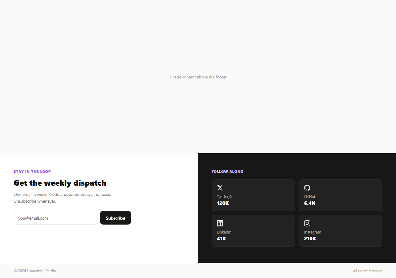
Most footers tuck a newsletter box and a row of social icons into the same crowded column, where neither gets enough visual room to actually convert. This snippet takes the opposite approach: a true 50/50 split-panel footer where the newsletter form gets an entire light panel to itself with headline, subhead, and a real validating form, and the social-follow links get an entire contrasting dark panel with a two-by-two grid of platform cards, each showing a follower count.
Why a full split instead of a shared column
.fns-split is a two-column CSS grid, each side a full padding: 52px 44px panel rather than a narrow sidebar. Giving the newsletter form its own light panel and the social grid its own dark panel creates enough contrast that a visitor's eye immediately understands there are two distinct actions available — subscribe, or follow — rather than skimming past a cramped strip of both. The color contrast itself (white panel, near-black panel) does the section-separation work that a border or heading normally would.
A newsletter form that actually validates
The left panel's fnsForm submit handler calls e.preventDefault(), trims the entered value, and tests it against an email regex before doing anything else. An invalid or empty address gets a red inline message and the form stays interactive so the user can immediately correct it. A valid address gets a green confirmation, clears and disables the input, and disables the submit button — preventing a duplicate submission of the same address, the same disable-after-submit pattern used in the mega footer's newsletter block, but here given a full dedicated panel rather than sharing space with a brand column.
A social grid with a small interaction, not just static icons
Each of the four .fns-social cards shows a platform icon, name, and a follower count in bold. Clicking a card (in this demo, since the links are placeholder # hrefs) briefly swaps the count to "Opening…" before restoring it — read from a dataset.orig value cached on load — giving a moment of tactile feedback that acknowledges the click before the real navigation would occur. In production, remove the preventDefault() and point each href at the real profile URL; the momentary state-swap is a demonstration of the interaction pattern, not something you'd keep in a live outbound link.
Follower counts as social proof
Displaying a follower count next to each platform (128K, 6.4K, 41K, 210K) works because concrete numbers function as social proof — a visitor is more likely to click "Follow" on a channel that visibly has an established audience than one presented as a bare, countless icon. Keep these numbers current; a stale or suspiciously round count undermines the exact trust signal the layout is designed to build.
Responsive collapse
Below 800px, the grid collapses from two columns to one, stacking the newsletter panel above the social panel — light above dark — so the reading order still makes sense on a phone: headline and form first, follow options second. The bottom bar's copyright and rights text also stack rather than staying side-by-side, avoiding cramped text at narrow widths.
Build with AI
Build, Understand, Optimize, and Extend It With AI
Rather than tracing the click-feedback timing by hand, paste this snippet's HTML, CSS, and JS into an AI coding assistant like Claude and ask it to explain exactly how the social card's "Opening\u2026" state gets restored from a dataset.orig value cached on page load, and why the newsletter form's disable-after-submit pattern matters for preventing duplicate subscriptions. The same assistant can help you optimize it, for instance asking whether the email regex used is strict enough for your validation needs or whether a more permissive pattern would reduce false rejections. It is also useful for extending the footer: ask it to wire the newsletter form to a real email-marketing API with proper loading and error states, replace the static follower counts with a live API call to each platform, or add a subtle entrance animation when the split panels scroll into view. Treat the code less like a finished artifact and more like a starting point for a conversation.
Prompt to recreate it
Copy this into your AI assistant of choice to build the effect from scratch, or as a jumping-off point for your own variant:
Build a two-panel "split newsletter and social" footer in plain HTML, CSS, and JavaScript, no libraries.

Requirements:
- A full 50/50 CSS grid split into a light-background left panel and a contrasting dark-background right panel, each with generous padding — not a shared narrow column.
- The left panel contains a headline, a short subhead, and a newsletter signup form (email input plus submit button) whose submit handler prevents default page reload, trims and validates the entered value against an email regex, shows an inline red error message for invalid input without clearing the field, and on valid input shows a green confirmation message while disabling both the input and the button to prevent a duplicate submission.
- The right panel contains a two-by-two grid of social-platform cards, each with an icon, platform name, and a bold follower-count number; clicking a card must briefly replace its follower count with a loading-style placeholder text and then restore the original count after a short delay, using a value cached from the DOM on page load rather than a hardcoded duplicate string.
- Below an 800px breakpoint, the two panels must stack into a single column with the (formerly left) newsletter panel appearing above the (formerly right) social panel, preserving that reading order.
- All icons must be inline SVG, and the whole component must have zero external dependencies.
Want to tighten it up first? Run this prompt through the AI Prompt Studio to score it across 8 quality dimensions, catch anti-patterns, and tune the wording for Claude, ChatGPT, or Gemini before you paste it in.
Step by step
How to Use
- 1Paste HTML, CSS, and JSA two-panel footer renders — light newsletter form on the left, dark social grid on the right.
- 2Test the newsletter formSubmit an invalid email to see the red error, then a valid one to see the green confirmation and disabled state.
- 3Click a social cardThe follower count briefly shows "Opening…" before restoring — remove preventDefault() for real links.
- 4Swap the platformsEdit the four .fns-social cards\u2019 icons, labels, hrefs, and follower counts to match your channels.
- 5Wire the form to your providerReplace the client-side-only success state with a real POST to your email marketing API.
- 6Export in your formatClick HTML, JSX, or Tailwind to download the version you need.
Real-world uses
Common Use Cases
Got questions?
Frequently Asked Questions
Cramming a newsletter form and social icons into one narrow column forces both to compete for attention and space. Giving each its own full-width, contrasting-color panel makes the two available actions (subscribe vs. follow) immediately distinguishable at a glance, and gives the newsletter form enough room for a proper headline and subhead rather than a single terse label.
Yes — the submit handler prevents the default page reload, trims the input, and tests it against a standard email regex before showing any success state. An invalid address gets an inline red error and the form remains editable; only a valid address triggers the green confirmation and disables the input and button.
In this demo, clicking prevents the default navigation and briefly replaces the follower count text with "Opening\u2026" before restoring the original value from a cached data attribute, purely to demonstrate a tactile click-feedback pattern. In production, remove the preventDefault() call and point each href at your real profile URL so the click navigates normally.
Inside the submit handler, after validation passes, replace the immediate success-message logic with a fetch() POST to your provider\u2019s subscribe endpoint (Mailchimp, ConvertKit, Resend, or a proxied serverless function), and only show the confirmation message once that request resolves successfully — showing failure state if it rejects.
A concrete number next to a follow button acts as social proof — visitors are measurably more likely to follow an account that visibly already has an established audience than one shown as a bare icon with no count. Keep the numbers accurate and current; a stale count undermines the trust signal it is meant to create.
Below 800px, the two-column grid collapses to a single column, and the light newsletter panel stacks above the dark social panel — preserving the intended reading order of "subscribe first, follow second" rather than reversing it or cramming both side by side at a width too narrow to read comfortably.