Source Code
<section class="hero">
  <div class="hero-copy">
    <span class="eyebrow">✦ Now with real-time sync</span>
    <h1>One workspace for <span class="grad">everything</span> your team ships</h1>
    <p>Docs, tasks, and analytics in a single connected surface — no more switching tabs to get anything done.</p>
    <div class="hero-cta">
      <button class="btn primary">Start free trial</button>
      <button class="btn ghost">Watch demo</button>
    </div>
  </div>

  <div class="bento">
    <div class="cell cell-tasks">
      <span class="cell-label">Tasks</span>
      <div class="task-row"><span class="dot done"></span>Ship v2.4 release notes</div>
      <div class="task-row"><span class="dot done"></span>Review design handoff</div>
      <div class="task-row"><span class="dot"></span>Sync with data team</div>
    </div>

    <div class="cell cell-chart">
      <span class="cell-label">Weekly activity</span>
      <div class="bars">
        <span style="height:38%"></span><span style="height:62%"></span><span style="height:44%"></span>
        <span style="height:81%"></span><span style="height:55%"></span><span style="height:90%"></span><span style="height:70%"></span>
      </div>
    </div>

    <div class="cell cell-team">
      <span class="cell-label">Active now</span>
      <div class="avatars">
        <span class="avatar" style="background:#6366f1">A</span>
        <span class="avatar" style="background:#0ea5e9">R</span>
        <span class="avatar" style="background:#f59e0b">M</span>
        <span class="avatar more">+6</span>
      </div>
    </div>

    <div class="cell cell-doc">
      <span class="cell-label">Recently edited</span>
      <div class="doc-row">📄 Q3 roadmap.md</div>
      <div class="doc-row">📄 Onboarding checklist</div>
    </div>
  </div>
</section>
* { box-sizing: border-box; margin: 0; padding: 0; }
body { font-family: system-ui, sans-serif; background: #f8fafc; }
.hero { max-width: 920px; margin: 0 auto; padding: 60px 24px; display: flex; flex-direction: column; align-items: center; gap: 40px; text-align: center; }
.hero-copy { display: flex; flex-direction: column; align-items: center; gap: 16px; max-width: 560px; }
.eyebrow { font-size: 11px; font-weight: 700; color: #7c3aed; background: rgba(124,58,237,0.1); border: 1px solid rgba(124,58,237,0.2); padding: 5px 14px; border-radius: 999px; }
h1 { font-size: clamp(26px,4.2vw,38px); font-weight: 800; color: #0f172a; line-height: 1.2; letter-spacing: -0.5px; }
.grad { background: linear-gradient(90deg,#6366f1,#a855f7); -webkit-background-clip: text; -webkit-text-fill-color: transparent; background-clip: text; }
.hero-copy p { font-size: 14.5px; color: #64748b; line-height: 1.6; }
.hero-cta { display: flex; gap: 10px; }
.btn { border: none; padding: 11px 20px; border-radius: 10px; font-size: 13.5px; font-weight: 700; cursor: pointer; font-family: inherit; }
.btn.primary { background: #4f46e5; color: #fff; }
.btn.primary:hover { background: #4338ca; }
.btn.ghost { background: #fff; color: #334155; border: 1px solid #e2e8f0; }
.btn.ghost:hover { background: #f8fafc; }
.bento { width: 100%; max-width: 640px; display: grid; grid-template-columns: repeat(4, 1fr); grid-auto-rows: 100px; gap: 12px; }
.cell { background: #fff; border: 1px solid #e2e8f0; border-radius: 16px; padding: 16px; text-align: left; display: flex; flex-direction: column; gap: 10px; box-shadow: 0 6px 18px rgba(15,23,42,0.04); transition: transform 0.2s, box-shadow 0.2s; }
.cell:hover { transform: translateY(-3px); box-shadow: 0 12px 24px rgba(15,23,42,0.08); }
.cell-label { font-size: 10.5px; font-weight: 800; text-transform: uppercase; letter-spacing: 0.04em; color: #94a3b8; }
.cell-tasks { grid-column: span 2; grid-row: span 2; justify-content: flex-start; }
.task-row { display: flex; align-items: center; gap: 8px; font-size: 12px; font-weight: 600; color: #334155; }
.dot { width: 14px; height: 14px; border-radius: 50%; border: 2px solid #cbd5e1; flex-shrink: 0; }
.dot.done { background: #6366f1; border-color: #6366f1; position: relative; }
.dot.done::after { content: ''; position: absolute; inset: 0; background: url("data:image/svg+xml,%3Csvg xmlns='http://www.w3.org/2000/svg' viewBox='0 0 24 24' fill='none' stroke='white' stroke-width='4'%3E%3Cpath d='M20 6 9 17l-5-5'/%3E%3C/svg%3E") center/60% no-repeat; }
.cell-chart { grid-column: span 2; grid-row: span 1; }
.bars { display: flex; align-items: flex-end; gap: 5px; flex: 1; }
.bars span { flex: 1; background: linear-gradient(180deg,#a5b4fc,#6366f1); border-radius: 3px 3px 1px 1px; }
.cell-team { grid-column: span 1; grid-row: span 1; }
.avatars { display: flex; }
.avatar { width: 26px; height: 26px; border-radius: 50%; display: flex; align-items: center; justify-content: center; font-size: 10px; font-weight: 800; color: #fff; border: 2px solid #fff; margin-left: -8px; }
.avatar:first-child { margin-left: 0; }
.avatar.more { background: #e2e8f0; color: #64748b; }
.cell-doc { grid-column: span 1; grid-row: span 1; justify-content: center; }
.doc-row { font-size: 11px; font-weight: 600; color: #475569; }
@media (max-width: 600px) {
.bento { grid-template-columns: repeat(2, 1fr); }
.cell-tasks { grid-column: span 2; }
.cell-chart { grid-column: span 2; }
}Learn Coding Visually
Learn to code with interactive, live-preview playgrounds — HTML, CSS, JavaScript, React & more.
 HTML Playground42 lessons · Click-based · Live preview
 CSS PlaygroundLearn CSS with a live editor
 JavaScript Playground60 lessons · DOM · Async · Canvas
 React PlaygroundLearn React with a live code editor
 GSAP PlaygroundLearn GSAP animation interactively
 SVG Playground44 lessons · shapes · paths · animation
 SCSS Playground45 lessons · Sass modules · tokens
 Tailwind PlaygroundLearn Tailwind CSS with a live editor
 Bootstrap 5 Playground50 lessons · live preview
Bento Grid Showcase Hero — Product Screenshot Alternative Using CSS Grid Tiles
Bento Grid Showcase Hero · Heroes · Plain HTML & CSS · Live preview
What's included
Features
About this UI Snippet
Bento Grid Showcase Hero — Many Small Product Glimpses Instead of One Screenshot
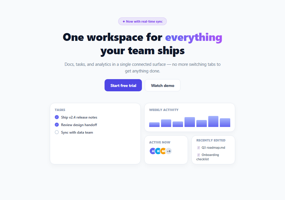
Most SaaS hero sections pair headline copy with a single large product screenshot or illustration. This variant replaces that one image with a bento-box grid of several small, self-contained UI tiles — a task list, an activity chart, a team avatar stack, a recent-documents list — each a miniature glimpse of a different part of the product, composed together in one asymmetric grid.
Why several small glimpses beat one big screenshot
A single hero screenshot forces a visitor to parse one dense, busy image and infer everything the product does from it. A bento grid instead pre-segments the story into discrete, individually legible pieces — "it does task tracking," "it has analytics," "it's collaborative," "it stores docs" — each with its own small label, so a skimming visitor absorbs the product's breadth in a few seconds without having to study a screenshot closely.
Reusing the magazine-grid span technique for a different purpose
Structurally, this hero is built the same way as an asymmetric editorial grid — a shared 4-column base with grid-auto-rows, and tiles spanning different amounts (.cell-tasks spans 2×2, .cell-chart spans 2×1, .cell-team and .cell-doc each span 1×1). The technique is identical; what changes is the content inside each cell, which is styled to *look* like live product UI (checkbox rows with a checked SVG icon, a small CSS bar chart, overlapping avatar circles) rather than editorial text, reinforcing the "peek into the real product" framing a hero section wants.
Small interactive-feeling details reinforce the illusion
Details like the .dot.done checkbox rendering a checkmark via an inline SVG data URI, the avatar stack's overlapping margin-left: -8px circles, and the chart bars' gradient fills are all static CSS, but are deliberately styled to *read* as live application chrome rather than generic placeholder shapes — the goal is for a visitor's eye to register "this looks like a real, currently-running product" even though nothing on the page is actually connected to data.
Where a bento hero fits versus a single screenshot or video
This pattern works best for products with genuinely multiple distinct feature areas worth signaling at a glance — a workspace, an all-in-one tool, a platform with several modules — where breadth itself is part of the pitch. A product with one focused core feature is usually still better served by a single, larger, more detailed screenshot or a short product video rather than fragmenting into several small tiles that would each feel underweight.
Build with AI
Build, Understand, Optimize, and Extend It With AI
Ask an AI assistant to discuss when a bento-grid hero communicates a product's value more effectively than a single hero screenshot or a short product video, and to help decide which of your product's feature areas deserve a large tile versus a small one based on what visitors care about most. It's also worth asking for a version where the tiles subtly animate on a timer (e.g. the chart bars re-randomizing, a new avatar appearing) to feel more "alive" without requiring real data.
Prompt to recreate it
Copy this into your AI assistant of choice to build the effect from scratch, or as a jumping-off point for your own variant:
Build a SaaS hero section in HTML and CSS that uses a bento-style grid of small UI-mimicking tiles instead of a single product screenshot — no JavaScript, no image assets.

Requirements:
- A centered hero with an eyebrow badge, a large headline with a gradient-text highlighted phrase, supporting body copy, and two call-to-action buttons (primary and secondary/ghost style).
- Below the copy, a CSS Grid "bento" layout of at least four tiles of varying sizes (e.g. one large 2x2 tile, one wide 2x1 tile, and two small 1x1 tiles) built on a shared base grid with no manual absolute positioning.
- Each tile should visually mimic a different piece of real product UI using only HTML/CSS: for example a small checklist with checked/unchecked items, a simple CSS-only bar chart, a stack of overlapping colored avatar circles, and a short list of document-style rows.
- Give each tile a small uppercase label identifying what it represents, and a hover state that lifts the tile slightly with an added shadow.
- Make the whole hero responsive, collapsing the bento grid to fewer columns with adjusted tile spans at a mobile breakpoint.
Want to tighten it up first? Run this prompt through the AI Prompt Studio to score it across 8 quality dimensions, catch anti-patterns, and tune the wording for Claude, ChatGPT, or Gemini before you paste it in.
Step by step
How to Use
- 1Edit the headline and eyebrow textUpdate h1 and .eyebrow in the HTML panel with your own product's positioning.
- 2Swap each bento cell's content for your own product's UIKeep the .cell-label + content structure, but replace the task list, chart, avatars and doc list with your actual feature areas.
- 3Adjust the grid spans to fit your contentChange the grid-column/grid-row span values on .cell-tasks, .cell-chart, .cell-team and .cell-doc to rebalance tile proportions.
- 4Add or remove tilesThe 4-column base grid can hold more or fewer tiles — just keep spans that sum sensibly per row to avoid uneven auto-placement gaps.
- 5Wire up the CTA buttonsReplace the primary and ghost button click behavior with your actual signup/demo links.
Real-world uses
Common Use Cases
Got questions?
Frequently Asked Questions
A single dense screenshot requires a visitor to study it closely to understand what the product does; several small, individually labeled tiles pre-segment the story into features that can be absorbed in a glance, which tends to work better for products with multiple distinct feature areas.
No — every tile is built from plain HTML and CSS (a checklist with an SVG-based checkmark, CSS-only bar chart, avatar circles styled with background colors) so the hero has zero image or JavaScript dependencies and stays lightweight.
The same CSS Grid span technique used in an asymmetric editorial layout — a shared column/row base grid where each tile spans a different number of columns and rows, letting the browser's auto-placement algorithm pack them together without manual positioning.
It works best for products with several genuinely distinct feature areas worth signaling at once. A product with one focused core feature is usually better served by a single larger, more detailed screenshot or a short product video instead.
Keep span combinations that sum to the grid's column count (4 in this demo) per visual row to avoid uneven auto-placement gaps — for example a 2-span tile paired with two 1-span tiles fills a row cleanly.
No — the hover lift and shadow on each tile are pure CSS :hover transitions; the entire component, including all visual states, works with zero JavaScript.