Source Code
<div class="demo">
  <div class="morph-row">
    <button class="morph-btn" id="playBtn" aria-label="Play" aria-pressed="false">
      <svg viewBox="0 0 24 24" width="22" height="22">
        <path id="playPath" d="M8 5 L8 19 L8 19 L8 5 Z M16 5 L16 19 L16 19 L16 5 Z" fill="currentColor" />
      </svg>
    </button>
    <span class="morph-caption">Play / Pause</span>
  </div>

  <div class="morph-row">
    <button class="morph-btn" id="bookmarkBtn" aria-label="Save bookmark" aria-pressed="false">
      <svg viewBox="0 0 24 24" width="22" height="22">
        <path id="bookmarkPath" d="M6 4 L18 4 L18 20 L12 15 L6 20 Z" fill="none" stroke="currentColor" stroke-width="2" stroke-linejoin="round" />
      </svg>
    </button>
    <span class="morph-caption">Bookmark outline / filled</span>
  </div>

  <div class="morph-row">
    <button class="morph-btn" id="menuBtn" aria-label="Open menu" aria-expanded="false">
      <svg viewBox="0 0 24 24" width="22" height="22">
        <line id="lineTop" x1="4" y1="6" x2="20" y2="6" stroke="currentColor" stroke-width="2.2" stroke-linecap="round" />
        <line id="lineMid" x1="4" y1="12" x2="20" y2="12" stroke="currentColor" stroke-width="2.2" stroke-linecap="round" />
        <line id="lineBot" x1="4" y1="18" x2="20" y2="18" stroke="currentColor" stroke-width="2.2" stroke-linecap="round" />
      </svg>
    </button>
    <span class="morph-caption">Menu / Close</span>
  </div>
</div>
* { box-sizing: border-box; margin: 0; padding: 0; }
body { font-family: system-ui, sans-serif; background: #f8fafc; display: flex; align-items: center; justify-content: center; min-height: 100vh; padding: 24px; }
.demo { display: flex; flex-direction: column; gap: 18px; }
.morph-row { display: flex; align-items: center; gap: 14px; }
.morph-btn { width: 46px; height: 46px; border-radius: 12px; border: 1.5px solid #e2e8f0; background: #fff; color: #334155; display: flex; align-items: center; justify-content: center; cursor: pointer; flex-shrink: 0; }
.morph-btn:hover { border-color: #6366f1; color: #4338ca; }
.morph-btn:focus-visible { outline: 2px solid #6366f1; outline-offset: 2px; }
.morph-caption { font-size: 12.5px; color: #64748b; }
/* Morphing an SVG <path>'s "d" attribute between two point-for-point
compatible shapes is itself animatable via CSS transition, as long as
both path strings describe the same NUMBER of points in the same order —
this is what makes a play-triangle able to visually morph into two pause
bars instead of just instantly swapping between two unrelated icons. */
#playPath { transition: d 0.28s ease; }
#playBtn.playing #playPath { d: path('M8 5 L8 19 L11 19 L11 5 Z M13 5 L13 19 L16 19 L16 5 Z'); }
#bookmarkPath { transition: fill 0.2s ease, stroke 0.2s ease; }
#bookmarkBtn.saved #bookmarkPath { fill: #6366f1; stroke: #6366f1; }
#lineTop, #lineMid, #lineBot { transition: transform 0.25s ease, opacity 0.2s ease; transform-origin: center; }
#menuBtn.open #lineTop { transform: translateY(6px) rotate(45deg); }
#menuBtn.open #lineMid { opacity: 0; }
#menuBtn.open #lineBot { transform: translateY(-6px) rotate(-45deg); }const playBtn = document.getElementById('playBtn');
const bookmarkBtn = document.getElementById('bookmarkBtn');
const menuBtn = document.getElementById('menuBtn');
// Every one of these three buttons follows the exact same pattern: toggle
// one state class, and update the ONE aria attribute that actually
// describes this control's semantic state — the visual morph is purely a
// CSS consequence of that class, never driven by separate JS animation code.
playBtn.addEventListener('click', () => {
const isPlaying = playBtn.classList.toggle('playing');
playBtn.setAttribute('aria-pressed', String(isPlaying));
playBtn.setAttribute('aria-label', isPlaying ? 'Pause' : 'Play');
});
bookmarkBtn.addEventListener('click', () => {
const isSaved = bookmarkBtn.classList.toggle('saved');
bookmarkBtn.setAttribute('aria-pressed', String(isSaved));
bookmarkBtn.setAttribute('aria-label', isSaved ? 'Remove bookmark' : 'Save bookmark');
});
menuBtn.addEventListener('click', () => {
const isOpen = menuBtn.classList.toggle('open');
menuBtn.setAttribute('aria-expanded', String(isOpen));
menuBtn.setAttribute('aria-label', isOpen ? 'Close menu' : 'Open menu');
});Learn Coding Visually
Learn to code with interactive, live-preview playgrounds — HTML, CSS, JavaScript, React & more.
 HTML Playground42 lessons · Click-based · Live preview
 CSS PlaygroundLearn CSS with a live editor
 JavaScript Playground60 lessons · DOM · Async · Canvas
 React PlaygroundLearn React with a live code editor
 GSAP PlaygroundLearn GSAP animation interactively
 SVG Playground44 lessons · shapes · paths · animation
 SCSS Playground45 lessons · Sass modules · tokens
 Tailwind PlaygroundLearn Tailwind CSS with a live editor
 Bootstrap 5 Playground50 lessons · live preview
Morphing Icon State Transitions — CSS-Animated Play/Pause, Bookmark, and Menu/Close
Morphing Icon State Transitions (Play/Pause, Bookmark, Menu/Close) · Animations · Plain HTML, CSS & JS · Live preview
What's included
Features
About this UI Snippet
Morphing Icons — Three Real CSS Techniques, and the ARIA State They Represent
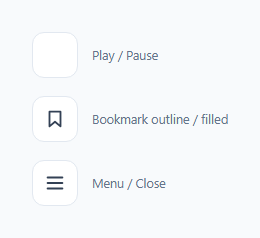
An icon that visually morphs between two states — play triangle to pause bars, an outline star filling solid, three lines merging into an X — reads as noticeably more polished than an instant icon swap, but the *technique* differs meaningfully depending on what's actually changing shape. This snippet demonstrates three distinct, genuinely different CSS morph techniques, each paired with the ARIA attribute that actually describes what the button's state means.
Technique 1: animating the SVG path's `d` attribute directly
The play/pause icon morphs by animating the d CSS property directly on an SVG <path> element — a newer capability where d: path('...') can be treated as an animatable CSS value, interpolated smoothly by the browser exactly like width or opacity would be. This only works correctly when both path strings describe the same number of points, in the same structural order — the play triangle's outline (drawn as a degenerate triangle using repeated points) and the two pause bars are deliberately constructed with matching point structures specifically so the browser can interpolate between them smoothly rather than sharply snapping.
Technique 2: fill/stroke color transition (a shape that stays, but changes weight)
The bookmark icon doesn't change its outline shape at all — it stays exactly the same path throughout. What morphs is purely its fill and stroke color, transitioning from unfilled (outline only) to a solid fill color. This is a meaningfully simpler technique than path morphing, appropriate specifically because "saved" versus "not saved" is a difference in *visual weight/emphasis*, not a difference in the icon's actual represented shape.
Technique 3: independent transform choreography on separate elements
The hamburger-to-X icon is built from three *separate* <line> elements, each animated independently via CSS transform — the top line translates and rotates 45°, the middle line fades to opacity: 0, and the bottom line translates and rotates -45°. This is a fundamentally different technique from path morphing: rather than one shape reinterpolating into another, three independent elements each transform in coordinated but separate ways to visually compose into a new overall shape.
Every morph is paired with exactly one meaningful ARIA attribute update
Each button's click handler does two things, and only two: toggle a state class (driving the CSS morph) and update the *one* ARIA attribute that actually describes that control's semantic meaning — aria-pressed for the two toggle buttons (play/pause and bookmark, both genuinely binary "is this currently active" states) and aria-expanded for the menu button (which specifically represents whether it controls something currently expanded, not just "on/off"). Choosing the *correct* attribute for each control's actual semantics — rather than defaulting to aria-pressed everywhere — is what makes the accessible experience match the visual one rather than merely mimicking it.
Build with AI
Build, Understand, Optimize, and Extend It With AI
Ask an AI assistant to explain in detail why SVG path d-attribute animation requires matching point structure between the start and end shapes, with a concrete example of what happens if that structure doesn't match. It's also worth asking for guidance on choosing between aria-pressed and aria-expanded for a given custom toggle control, or for a fourth morph example demonstrating a technique this snippet doesn't cover, like a clip-path-based reveal animation.
Prompt to recreate it
Copy this into your AI assistant of choice to build the effect from scratch, or as a jumping-off point for your own variant:
Build three separate morphing icon buttons in HTML, CSS, and vanilla JavaScript, each demonstrating a genuinely different CSS animation technique — no external icon library or animation library.

Requirements:
- A play/pause button whose SVG icon morphs by animating the "d" attribute directly on a single <path> element between a play-triangle shape and a two-bar pause shape — construct both path strings with the SAME number of points in the SAME structural order, so the browser can interpolate smoothly between them via a CSS transition rather than snapping instantly.
- A bookmark/save button whose icon shape does NOT change at all between its two states — only its fill and stroke color transition (from unfilled outline to solid fill), demonstrating that not every icon state change needs a shape morph.
- A hamburger-menu-to-close button built from three separate SVG line elements, each animated independently via CSS transform (rotation and translation) and opacity, composing together into an X shape — not a single-path morph.
- Each button must toggle exactly one CSS class on click to drive its entire visual transition — no JavaScript-driven animation timing or interpolation logic, only class toggling.
- Apply the semantically correct ARIA attribute to each button based on its actual meaning: aria-pressed for the two genuine on/off toggle buttons (play/pause and bookmark), and aria-expanded for the menu button (since it represents something being expanded/collapsed, not a plain toggle) — and update each button's aria-label to describe what clicking it will do next, in sync with its current visual state.
Want to tighten it up first? Run this prompt through the AI Prompt Studio to score it across 8 quality dimensions, catch anti-patterns, and tune the wording for Claude, ChatGPT, or Gemini before you paste it in.
Step by step
How to Use
- 1Click the play/pause iconThe triangle path smoothly morphs into two vertical bars via direct SVG path-d animation, not a cross-fade or instant swap between two separate icons.
- 2Click the bookmark iconIts outline shape stays exactly the same; only its fill and stroke color transition from empty to solid — a genuinely different, simpler technique than path morphing.
- 3Click the menu iconThree independently-transformed lines rotate and fade in coordination to compose into an X shape — a third distinct technique from the other two.
- 4Inspect each button's ARIA attributePlay/pause and bookmark use aria-pressed (genuine toggle semantics); the menu button uses aria-expanded (it represents something being opened/closed, not just on/off).
- 5Apply whichever technique matches your own icon's changeUse path-d morphing only when both shapes share the same point structure; use fill/stroke transition when the shape stays constant but its visual weight changes; use independent line transforms when several distinct elements compose into a new form.
Real-world uses
Common Use Cases
Got questions?
Frequently Asked Questions
CSS interpolates an animated d value point by point — if the play-triangle path and the pause-bars path had a different number of points or a different structural order, the browser would have no consistent way to interpolate between them smoothly and would likely just snap instantly instead. Constructing both paths with matching point counts (the triangle drawn as a degenerate shape with repeated points) is what enables the smooth morph.
The bookmark's outline shape never actually changes between its two states — only its fill and stroke color change, reflecting a difference in visual weight/emphasis (saved vs not saved) rather than a difference in represented shape. A simpler color transition is the appropriate, less complex technique for that kind of change; reaching for path morphing here would be unnecessary complexity for no visual benefit.
The hamburger-to-X transformation is fundamentally about three independent elements moving and rotating in coordination, not one shape reinterpolating into another — using separate <line> elements with independent CSS transforms is both simpler to implement correctly and matches the actual nature of that visual transformation better than attempting a single-path morph would.
aria-pressed communicates a genuine binary toggle state ("is this control currently active"), which correctly describes both play/pause and bookmark saved/unsaved. aria-expanded specifically communicates whether the control has revealed or hidden something else (like a menu panel) — the menu button's actual semantic role is "controls whether something is expanded," which is a meaningfully different concept from a plain on/off toggle, so it gets the attribute that actually matches its real behavior.
Yes — each click handler updates both the toggled state class (driving the CSS morph) and the button's aria-label (e.g. "Play" becomes "Pause") together, so the accessible name always describes what clicking the button will do NEXT, matching the current visual state.
All three morph animations are pure CSS transitions triggered by a single toggled class per button — the JavaScript click handlers only toggle that class and update the relevant ARIA attributes; none of them contain any animation timing or interpolation logic themselves.