Source Code
<div class="page-mock" id="pageMock">
  <header class="site-header" id="siteHeader">
    <div class="logo">
      <span class="logo-mark"></span>
      <span class="logo-text">Aurora</span>
    </div>
    <nav class="header-nav">
      <a href="#">Products</a>
      <a href="#">Pricing</a>
      <a href="#">About</a>
    </nav>
  </header>
  <div class="scroll-content">
    <div class="content-block"></div>
    <div class="content-block"></div>
    <div class="content-block"></div>
    <div class="content-block"></div>
  </div>
</div>
* { box-sizing: border-box; margin: 0; padding: 0; }
body { font-family: system-ui, sans-serif; background: #f8fafc; padding: 24px; display: flex; align-items: center; justify-content: center; min-height: 100vh; }
.page-mock { width: 100%; max-width: 640px; margin: 0 auto; height: 340px; overflow-y: auto; border: 1px solid #e2e8f0; border-radius: 12px; background: #fff; }
.site-header {
position: sticky;
top: 0;
z-index: 10;
display: flex;
align-items: center;
justify-content: space-between;
padding: 32px 28px;
background: #ffffffee;
backdrop-filter: blur(8px);
border-bottom: 1px solid transparent;
transition: padding 0.25s ease, box-shadow 0.25s ease, border-color 0.25s ease;
}
.site-header.scrolled {
padding: 12px 28px;
box-shadow: 0 4px 16px rgba(15,23,42,0.08);
border-bottom-color: #e2e8f0;
}
.logo { display: flex; align-items: center; gap: 10px; }
.logo-mark {
width: 32px;
height: 32px;
border-radius: 9px;
background: linear-gradient(135deg, #6366f1, #a855f7);
transition: width 0.25s ease, height 0.25s ease;
flex-shrink: 0;
}
.site-header.scrolled .logo-mark { width: 22px; height: 22px; border-radius: 6px; }
.logo-text {
font-size: 20px;
font-weight: 800;
color: #1e293b;
transition: font-size 0.25s ease;
}
.site-header.scrolled .logo-text { font-size: 15px; }
.header-nav { display: flex; gap: 24px; }
.header-nav a { font-size: 14px; font-weight: 600; color: #475569; text-decoration: none; }
.header-nav a:hover { color: #6366f1; }
.scroll-content { padding: 28px; display: flex; flex-direction: column; gap: 16px; }
.content-block { height: 100px; border-radius: 10px; background: linear-gradient(135deg, #eef2ff, #f5f3ff); border: 1px solid #e2e8f0; }const pageMock = document.getElementById('pageMock');
const header = document.getElementById('siteHeader');
const SCROLL_THRESHOLD = 30;
pageMock.addEventListener('scroll', () => {
header.classList.toggle('scrolled', pageMock.scrollTop > SCROLL_THRESHOLD);
});Learn Coding Visually
Learn to code with interactive, live-preview playgrounds — HTML, CSS, JavaScript, React & more.
 HTML Playground42 lessons · Click-based · Live preview
 CSS PlaygroundLearn CSS with a live editor
 JavaScript Playground60 lessons · DOM · Async · Canvas
 React PlaygroundLearn React with a live code editor
 GSAP PlaygroundLearn GSAP animation interactively
 SVG Playground44 lessons · shapes · paths · animation
 SCSS Playground45 lessons · Sass modules · tokens
 Tailwind PlaygroundLearn Tailwind CSS with a live editor
 Bootstrap 5 Playground50 lessons · live preview
Shrink on Scroll Header — Free HTML CSS JS Sticky Shrinking Header Snippet
Shrink on Scroll Header · Scroll · Plain HTML, CSS & JS · Live preview
What's included
Features
About this UI Snippet
Shrink on Scroll Header — HTML, CSS & JavaScript Adaptive Header
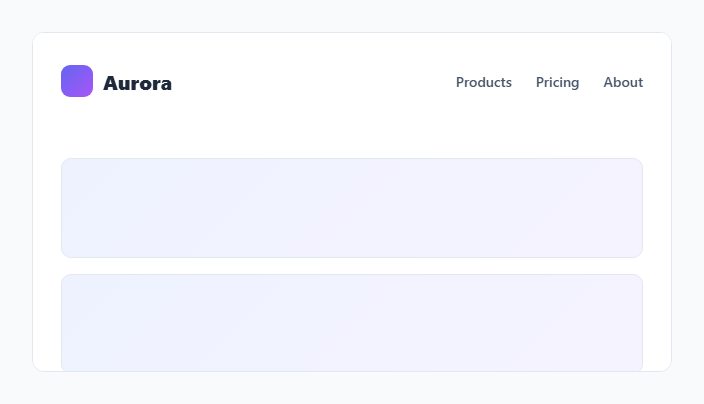
A tall, spacious header looks great at the very top of a page, but taking up that much vertical space is wasteful once someone has scrolled down and is trying to read content. This snippet builds a header that starts large and roomy, then smoothly shrinks its padding, logo size, and text size once the page scrolls past a small threshold — a pattern used by countless modern marketing sites.
How the scroll detection works
A single scroll listener on the scrolling container compares scrollTop against a SCROLL_THRESHOLD constant (30px). Crossing that threshold toggles a .scrolled class on the header — that's the entire JavaScript logic. Using a small threshold rather than > 0 avoids the class flickering on and off from tiny scroll bounces (like the rubber-band overscroll effect on some trackpads/touch devices), which would otherwise cause a jittery, distracting shrink/grow flicker right at the top of the page.
How the shrink animation is built entirely in CSS
Every visual change — the header's own padding, the logo mark's width/height, and the logo text's font-size — is defined as two states (default and .scrolled) with a matching transition property on the base selector. Because all three properties transition together with roughly the same duration, the header appears to shrink as one cohesive unit rather than having its parts animate out of sync. JavaScript only ever toggles the one class; it never touches any style property directly, keeping the animation definition entirely in CSS where it's easier to tune.
Why the header uses position: sticky
Just like the sticky filter bar pattern elsewhere in this library, position: sticky; top: 0 keeps the header pinned to the top of its scrolling container without any manual fixed-positioning math. The header needs to remain pinned throughout the scroll for the shrink effect to be visible and useful — a header that scrolled away entirely would have no reason to shrink in place.
Why border and shadow only appear once scrolled
The header's border-bottom is set to transparent by default and only gets an actual color once .scrolled is active, alongside a new box-shadow. This means at the very top of the page, the header blends seamlessly into the hero content beneath it (no visible seam), and only gains a subtle separating line and shadow once it's floating above scrolled content and needs that visual distinction from what's now moving underneath it.
Build with AI
Build, Understand, Optimize, and Extend It With AI
Ask an AI assistant to explain why a small non-zero scroll threshold prevents flicker compared to checking for any scroll at all, and to walk through how the transition timing on multiple properties needs to be kept consistent so the shrink reads as one motion rather than several uncoordinated ones. It's also worth asking the assistant to adapt this from the inner-container scroll listener used for this live preview to a window-scroll version for a real full-page site, and to add a subtle logo crossfade (swapping a full wordmark for just an icon) as an additional shrink-state enhancement.
Prompt to recreate it
Copy this into your AI assistant of choice to build the effect from scratch, or as a jumping-off point for your own variant:
Build a "shrink on scroll header" in plain HTML, CSS, and minimal vanilla JavaScript for a marketing site.

Requirements:
- A sticky header (position: sticky, pinned to the top) that starts with generous padding and a large logo mark plus wordmark text, sitting above a page of scrollable content.
- A single scroll event listener that compares the current scroll offset against a small, named threshold constant (not zero) and toggles one CSS class on the header based on whether that threshold has been crossed — no other JavaScript logic and no direct style manipulation from JS.
- All visual differences between the default and scrolled states — reduced header padding, a smaller logo mark, smaller logo text, and a border/shadow that only appears once scrolled — must be defined purely in CSS with matching transition durations on every animated property, so the shrink reads as one coordinated motion rather than separate, out-of-sync changes.
- The header must have a transparent border by default so it blends seamlessly with page content at the very top, gaining a visible separating border and drop shadow only in the scrolled state.
- Use a semi-transparent, blurred header background so content scrolling underneath remains only partially visible through it rather than fully hidden or fully visible.
Want to tighten it up first? Run this prompt through the AI Prompt Studio to score it across 8 quality dimensions, catch anti-patterns, and tune the wording for Claude, ChatGPT, or Gemini before you paste it in.
Step by step
How to Use
- 1Load the snippetClick "Shrink on Scroll Header" in the sidebar Library tab to load the tall header and scrollable content.
- 2Scroll the previewScroll down inside the preview panel and watch the header shrink its padding, logo, and text smoothly.
- 3Adjust the scroll thresholdChange SCROLL_THRESHOLD in the JS panel to make the header shrink sooner or later during the scroll.
- 4Tune the shrink amountsAdjust the padding, logo size, and font-size values on .scrolled in the CSS panel to control how dramatic the shrink is.
- 5Adjust the transition speedChange the 0.25s duration on the .site-header transition property to make the shrink feel snappier or more gradual.
- 6Export and saveExport as HTML/JSX/Tailwind or click "Save as" to reuse this header pattern on a real marketing site.
Real-world uses
Common Use Cases
Got questions?
Frequently Asked Questions
Some devices exhibit small overscroll or rubber-band bounce right at the top of a scroll container. Comparing against a small threshold like 30px, instead of exactly 0, prevents the scrolled class from flickering rapidly on and off from that tiny bounce.
Sticky positioning keeps the header pinned to the top of its scrolling container natively, without needing JavaScript to calculate scroll offsets. It only requires the header to remain in normal document flow with a top offset, which position: fixed does not provide.
All three properties are listed in the same transition declaration on the base .site-header/.logo-mark/.logo-text selectors, with matching durations. Toggling one class changes the target values for all three simultaneously, so they visually shrink in unison rather than at different speeds.
The border-bottom is transparent by default and the header has no box-shadow until the .scrolled class is applied. This lets the header blend seamlessly with the page content at the very top, only gaining visual separation once it needs to distinguish itself from scrolled content beneath it.
Yes — every dimension (header padding, logo width/height, logo font-size) is defined explicitly for both the default and .scrolled states in CSS. Adjust either state's values to make the shrink more subtle or more dramatic.
Yes — replace the scroll listener target from the inner scrollable div (used here for the live preview) to window, and read window.scrollY instead of pageMock.scrollTop, keeping the rest of the logic identical.
No — because the header uses position: sticky and stays in the document flow at a consistent position, shrinking its own padding does not push or shift the sticky header's relationship to the content; the content simply gains more visible space as the header becomes shorter.