Source Code
<div class="page-mock">
  <header class="site-header">Store Header</header>
  <div class="filter-bar" id="filterBar">
    <div class="chips">
      <button class="chip active" onclick="selectChip(this)">All</button>
      <button class="chip" onclick="selectChip(this)">Clothing</button>
      <button class="chip" onclick="selectChip(this)">Shoes</button>
      <button class="chip" onclick="selectChip(this)">Accessories</button>
    </div>
    <select class="sort-select" aria-label="Sort products">
      <option>Sort: Featured</option>
      <option>Price: Low to High</option>
      <option>Price: High to Low</option>
      <option>Newest</option>
    </select>
  </div>
  <div class="scroll-content" id="scrollContent">
    <div class="fake-card"></div>
    <div class="fake-card"></div>
    <div class="fake-card"></div>
    <div class="fake-card"></div>
    <div class="fake-card"></div>
    <div class="fake-card"></div>
  </div>
</div>
* { box-sizing: border-box; margin: 0; padding: 0; }
body { font-family: system-ui, sans-serif; background: #f8fafc; padding: 24px; display: flex; align-items: center; justify-content: center; min-height: 100vh; }
.page-mock { width: 100%; max-width: 640px; margin: 0 auto; height: 340px; overflow-y: auto; border: 1px solid #e2e8f0; border-radius: 12px; background: #fff; }
.site-header {
padding: 20px;
font-size: 15px;
font-weight: 700;
color: #1e293b;
background: #fff;
border-bottom: 1px solid #f1f5f9;
}
.filter-bar {
position: sticky;
top: 0;
z-index: 5;
display: flex;
align-items: center;
justify-content: space-between;
gap: 12px;
padding: 12px 20px;
background: #ffffffee;
backdrop-filter: blur(6px);
border-bottom: 1px solid #e2e8f0;
flex-wrap: wrap;
transition: box-shadow 0.2s;
}
.filter-bar.stuck { box-shadow: 0 4px 12px rgba(15,23,42,0.08); }
.chips { display: flex; gap: 8px; flex-wrap: wrap; }
.chip {
padding: 6px 14px;
font-size: 12px;
font-weight: 600;
color: #64748b;
background: #f1f5f9;
border: none;
border-radius: 999px;
cursor: pointer;
transition: background 0.15s, color 0.15s;
}
.chip:hover { background: #e2e8f0; }
.chip.active { background: #6366f1; color: #fff; }
.sort-select {
padding: 6px 10px;
font-size: 12px;
font-weight: 600;
color: #475569;
border: 1px solid #e2e8f0;
border-radius: 8px;
background: #fff;
cursor: pointer;
}
.scroll-content { padding: 20px; display: flex; flex-direction: column; gap: 14px; }
.fake-card { height: 90px; border-radius: 10px; background: linear-gradient(135deg, #eef2ff, #f5f3ff); border: 1px solid #e2e8f0; }function selectChip(btn) {
document.querySelectorAll('.chip').forEach(c => c.classList.remove('active'));
btn.classList.add('active');
}
// Add a shadow once the filter bar is pinned against the header via sticky positioning
const page = document.querySelector('.page-mock');
const bar = document.getElementById('filterBar');
page.addEventListener('scroll', () => {
bar.classList.toggle('stuck', page.scrollTop > 4);
});Learn Coding Visually
Learn to code with interactive, live-preview playgrounds — HTML, CSS, JavaScript, React & more.
 HTML Playground42 lessons · Click-based · Live preview
 CSS PlaygroundLearn CSS with a live editor
 JavaScript Playground60 lessons · DOM · Async · Canvas
 React PlaygroundLearn React with a live code editor
 GSAP PlaygroundLearn GSAP animation interactively
 SVG Playground44 lessons · shapes · paths · animation
 SCSS Playground45 lessons · Sass modules · tokens
 Tailwind PlaygroundLearn Tailwind CSS with a live editor
 Bootstrap 5 Playground50 lessons · live preview
Sticky Filter Bar — Free HTML CSS JS Sticky Category & Sort Bar Snippet
Sticky Filter Bar · Scroll · Plain HTML, CSS & JS · Live preview
What's included
Features
About this UI Snippet
Sticky Filter Bar — HTML, CSS & JavaScript Sticky Category Bar
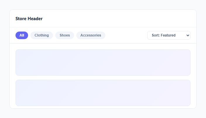
On category and search-results pages, users often scroll well past the top before deciding they want to change a filter or the sort order. Making them scroll back up every time is friction worth removing — this snippet keeps the filter chips and sort dropdown pinned to the top of the viewport as soon as the page scrolls past them, using CSS position: sticky rather than a JavaScript-computed position: fixed.
Why position: sticky instead of position: fixed
A position: fixed element is removed from document flow entirely and needs manual JavaScript to calculate exactly when it should start behaving like it's fixed (typically by comparing scroll offset against the element's original position, and toggling a class). position: sticky with top: 0 does that calculation natively in the browser's layout engine: the element scrolls normally with the page until it reaches the specified top offset, then "sticks" there for as long as its parent container is still in view. No scroll-offset math, no layout thrashing, no janky recalculation on resize.
Why JavaScript is still used here
CSS sticky positioning handles *where* the bar sits, but it doesn't natively expose "is the element currently stuck" as a style hook. To add a drop shadow only once the bar is pinned (a common visual affordance telling users "this is now floating above your content"), a small scroll listener checks scrollTop > 4 and toggles a .stuck class that adds a box-shadow. This is a purely cosmetic enhancement — the sticky positioning itself works with zero JavaScript.
How the filter chips work
Each chip is a plain button; selectChip(btn) removes .active from every chip and adds it to the clicked one — the same single-selection pattern used throughout this snippet library. The sort control is left as a native <select> for built-in keyboard and mobile accessibility, though it could be swapped for the custom sort-dropdown pattern from the companion "Sort Dropdown" snippet.
Stacking context note
The filter bar needs z-index higher than the content beneath it so it visually sits above scrolling cards once stuck, and its background needs to be opaque (or a translucent blur, as used here with backdrop-filter) so content doesn't show through the bar while it's pinned.
Build with AI
Build, Understand, Optimize, and Extend It With AI
Ask an AI assistant to explain the specific difference in browser behavior between position: sticky and a JavaScript-driven position: fixed toggle, including what "nearest scrolling ancestor" means for sticky and why that matters if this bar is nested inside another scrollable container. It's also worth asking the assistant to add a subtle slide-down entrance animation the first time the bar becomes stuck, or to combine this pattern with the custom sort-dropdown snippet for a fully custom-styled sticky toolbar.
Prompt to recreate it
Copy this into your AI assistant of choice to build the effect from scratch, or as a jumping-off point for your own variant:
Build a "sticky filter bar" in plain HTML, CSS, and minimal vanilla JavaScript for an e-commerce or search-results page.

Requirements:
- A horizontal bar containing a row of category filter chip buttons (one marked active at a time via a single JS function) and a sort control, positioned directly below a page header in normal document flow.
- The bar must use CSS position: sticky with a top offset so that once the user scrolls past its original position, it pins to the top of the scrolling container instead of scrolling away — do not calculate this with JavaScript scroll-offset math or position: fixed.
- Add a small scroll listener purely for a cosmetic enhancement: toggle a class that adds a drop shadow to the bar once it is actually in its stuck/pinned state, so users get a visual cue it is now floating above the content.
- The bar's background must be semi-transparent with a backdrop blur so that content scrolling underneath it doesn't create harsh overlaps with the bar's own text.
- The layout must wrap gracefully on narrow viewports (chips wrapping to a second line rather than overflowing) and must work correctly when nested inside a scrollable container, not just the top-level page.
Want to tighten it up first? Run this prompt through the AI Prompt Studio to score it across 8 quality dimensions, catch anti-patterns, and tune the wording for Claude, ChatGPT, or Gemini before you paste it in.
Step by step
How to Use
- 1Load the snippetClick "Sticky Filter Bar" in the sidebar Library tab to load the scrollable page mock.
- 2Scroll the previewScroll down inside the preview panel and watch the filter bar pin to the top and gain a shadow.
- 3Try the chips and sortClick different category chips and open the sort dropdown to see the interactive controls.
- 4Adjust the stick thresholdChange the top: 0 value in .filter-bar to stick a few pixels lower, e.g. below a fixed site header.
- 5Swap the native selectReplace <select> with the custom "Sort Dropdown" snippet if you want fully custom-styled sort options.
- 6Export and saveExport as HTML/JSX/Tailwind or click "Save as" to reuse this bar on a real category page.
Real-world uses
Common Use Cases
Got questions?
Frequently Asked Questions
position: sticky lets the browser handle the transition between normal document flow and a pinned state natively, based on the top offset and the parent container's bounds. position: fixed requires manually calculating scroll offsets in JavaScript and toggling classes, which is more code and more prone to jank.
The JS only adds a drop shadow once the bar is actually stuck, as a visual cue that it is now floating above content. The positioning behavior itself requires no JavaScript at all — the shadow is a purely cosmetic enhancement.
Set the .filter-bar top value to the header's height (e.g. top: 64px if the header is 64px tall) instead of top: 0, so the bar sticks directly beneath the header rather than underneath the viewport edge.
Once the bar is pinned, content scrolls directly underneath it. A translucent, blurred background keeps text from directly overlapping the bar's own text while still feeling connected to the page, rather than looking like a harsh opaque box.
Yes — sticky positioning works relative to the nearest scrolling ancestor, which is why this demo works correctly inside the scrollable .page-mock container used for the preview.
Yes — swap it for a custom-styled dropdown menu (see the companion "Sort Dropdown" snippet) if you want full control over the option list's appearance, at the cost of needing to reimplement keyboard navigation yourself.
position: sticky has broad modern browser support (all evergreen browsers). If you need to support very old browsers without sticky support, the bar will simply scroll away normally as a fallback, with no errors.