Source Code
<div class="mspa-page">
<main class="mspa-content"><p>↑ Page content above the footer</p></main>
<footer class="mspa">
<div class="mspa-inner">
<span class="mspa-left">
<span class="mspa-dot" id="mspaDot"></span>
<span id="mspaSaved">All changes saved</span>
</span>
<nav class="mspa-mid" id="mspaMid">
<a href="#" data-tab="overview" class="active">Overview</a>
<a href="#" data-tab="settings">Settings</a>
<a href="#" data-tab="help">Help</a>
</nav>
<button class="mspa-toggle" id="mspaToggle" aria-label="Toggle theme">
<svg id="mspaIcon" width="15" height="15" viewBox="0 0 24 24" fill="none" stroke="currentColor" stroke-width="2.2"><circle cx="12" cy="12" r="4"/><path d="M12 2v2M12 20v2M4.9 4.9l1.4 1.4M17.7 17.7l1.4 1.4M2 12h2M20 12h2M4.9 19.1l1.4-1.4M17.7 6.3l1.4-1.4"/></svg>
</button>
</div>
</footer>
</div>*{box-sizing:border-box;margin:0;padding:0}
body{font-family:system-ui,-apple-system,sans-serif;background:#fafaf9;transition:background .2s,color .2s}
body.mspa-dark{background:#0f172a;color:#e2e8f0}
.mspa-page{min-height:100vh;display:flex;flex-direction:column}
.mspa-content{flex:1;display:flex;align-items:center;justify-content:center;color:#a8a29e;font-size:13px;padding:50px 20px}
.mspa{background:transparent;border-top:1px solid #e2e8f0;transition:border-color .2s}
body.mspa-dark .mspa{border-color:#1e293b}
.mspa-inner{max-width:900px;margin:0 auto;padding:12px 22px;display:flex;align-items:center;justify-content:space-between;gap:16px;font-size:12px}
.mspa-left{display:flex;align-items:center;gap:7px;color:#64748b;flex-shrink:0}
body.mspa-dark .mspa-left{color:#94a3b8}
.mspa-dot{width:6px;height:6px;border-radius:50%;background:#22c55e;flex-shrink:0}
.mspa-dot.saving{background:#f59e0b;animation:mspaBlink 1s infinite}
@keyframes mspaBlink{50%{opacity:.35}}
.mspa-mid{display:flex;gap:16px}
.mspa-mid a{color:#94a3b8;text-decoration:none;font-weight:600;transition:color .15s}
body.mspa-dark .mspa-mid a{color:#64748b}
.mspa-mid a:hover{color:#475569}
.mspa-mid a.active{color:#0f172a}
body.mspa-dark .mspa-mid a.active{color:#f1f5f9}
.mspa-toggle{background:none;border:none;color:#94a3b8;cursor:pointer;width:26px;height:26px;border-radius:50%;display:flex;align-items:center;justify-content:center;transition:background .15s,color .15s;flex-shrink:0}
.mspa-toggle:hover{background:#f1f5f9;color:#334155}
body.mspa-dark .mspa-toggle:hover{background:#1e293b;color:#e2e8f0}
@media (max-width:480px){
.mspa-inner{flex-wrap:wrap;justify-content:center;text-align:center}
.mspa-mid{order:3;width:100%;justify-content:center}
}var dot = document.getElementById('mspaDot');
var savedText = document.getElementById('mspaSaved');
var mid = document.getElementById('mspaMid');
var toggle = document.getElementById('mspaToggle');
var icon = document.getElementById('mspaIcon');
var saveTimer = null;
function flashSaving() {
clearTimeout(saveTimer);
dot.classList.add('saving');
savedText.textContent = 'Saving\u2026';
saveTimer = setTimeout(function () {
dot.classList.remove('saving');
savedText.textContent = 'All changes saved';
}, 900);
}
mid.addEventListener('click', function (e) {
var link = e.target.closest('a');
if (!link) return;
e.preventDefault();
mid.querySelectorAll('a').forEach(function (a) { a.classList.remove('active'); });
link.classList.add('active');
flashSaving();
});
toggle.addEventListener('click', function () {
var isDark = document.body.classList.toggle('mspa-dark');
icon.innerHTML = isDark
? '<path d="M21 12.8A9 9 0 1111.2 3 7 7 0 0021 12.8z" fill="currentColor" stroke="none"/>'
: '<circle cx="12" cy="12" r="4"/><path d="M12 2v2M12 20v2M4.9 4.9l1.4 1.4M17.7 17.7l1.4 1.4M2 12h2M20 12h2M4.9 19.1l1.4-1.4M17.7 6.3l1.4-1.4"/>';
});Learn Coding Visually
Learn to code with interactive, live-preview playgrounds — HTML, CSS, JavaScript, React & more.
 HTML Playground42 lessons · Click-based · Live preview
 CSS PlaygroundLearn CSS with a live editor
 JavaScript Playground60 lessons · DOM · Async · Canvas
 React PlaygroundLearn React with a live code editor
 GSAP PlaygroundLearn GSAP animation interactively
 SVG Playground44 lessons · shapes · paths · animation
 SCSS Playground45 lessons · Sass modules · tokens
 Tailwind PlaygroundLearn Tailwind CSS with a live editor
 Bootstrap 5 Playground50 lessons · live preview
Minimal Single-Page App Footer — Free HTML CSS JS Snippet
Minimal Single-Page App Footer · Footers · Plain HTML, CSS & JS · Live preview
What's included
Features
About this UI Snippet
Minimal SPA Footer — Single-Row Save Status, Tab Nav & Theme Toggle
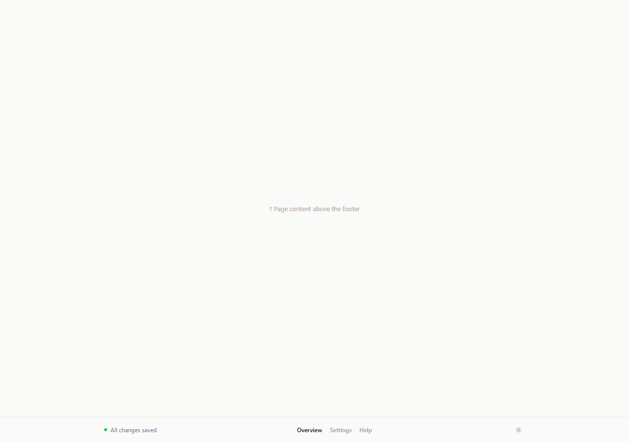
A marketing-site footer with columns of links and a copyright block is the wrong shape for a single-page app, where the "footer" is really just a thin persistent status strip pinned under an interface the user never scrolls past. This snippet is that strip: one row, three zones — a save-status indicator on the left, in-page tab navigation in the middle, and a theme toggle on the right — built to sit at the bottom of an app shell rather than the bottom of a long marketing page.
A save-status dot instead of a page footer's copyright line
.mspa-dot sits next to "All changes saved" — the SPA-appropriate equivalent of a footer message. Calling flashSaving() (wired here to any nav click as a stand-in for a real save trigger) turns the dot amber and blinking with the text set to "Saving…", then reverts to a static green dot and "All changes saved" after setTimeout. This gives a persistent, ambient answer to "did my change actually save" without a toast notification interrupting the interface on every keystroke.
In-page tab navigation, not a sitemap
#mspaMid holds a small set of anchors representing in-app sections (Overview, Settings, Help) rather than separate marketing pages. Clicking one calls e.preventDefault(), removes .active from every link, and adds it to the clicked one — modeling how an SPA router would update the active route indicator without a full page navigation, which is exactly the behavior a footer nav bar needs in a single-page app context.
A theme toggle that lives in the footer, not a settings menu
toggle.addEventListener('click', ...) flips document.body.classList.toggle('mspa-dark') and swaps the icon's inner SVG between a sun and a moon path. Placing the toggle in this persistent strip — rather than one click deep in a settings page — matches how many real dashboard apps surface it, since theme preference is a frequent, low-friction toggle rather than a rare configuration change.
Deliberately no columns, no link lists, no copyright block
Every element other than a marketing site's tangle of footer columns was deliberately left out. An SPA's real "footer content" (terms, privacy, company info) typically lives inside a Help or Settings panel reachable from the tab nav, not repeated in a persistent strip that is visible on every single screen of the app.
Responsive collapse without losing the save-status priority
On narrow viewports, the row wraps and the tab nav moves to its own line below the status and toggle, keeping the save-status dot and the theme toggle — the two elements a user might need to check or use quickly — on the first, most prominent row.
Wiring it to a real app
Replace flashSaving()'s click-triggered stand-in with a real save/debounce cycle tied to your form or editor state, and replace the manual .active class toggling on the tab nav with your router's actual current-route state (e.g. a React Router NavLink's built-in active styling) so the indicator reflects real navigation, not just the last click.
Build with AI
Build, Understand, Optimize, and Extend It With AI
Rather than tracing the save-status and theme-toggle logic by hand, paste this snippet's HTML, CSS, and JS into an AI coding assistant like Claude and ask it to explain exactly how flashSaving() and the theme toggle each manage their own small piece of state independently in a single-row layout meant for an app shell rather than a marketing page. The same assistant can help you optimize it, for instance asking whether the save-status dot should debounce rapid successive saves so it doesn't flicker between saving and saved states during fast typing. It is also useful for extending the footer: ask it to persist the theme preference in localStorage, wire the tab nav to a real client-side router's active-route state, or add a small connection-status indicator (online/offline) alongside the save-status dot. Treat the code less like a finished artifact and more like a starting point for a conversation.
Prompt to recreate it
Copy this into your AI assistant of choice to build the effect from scratch, or as a jumping-off point for your own variant:
Build a minimal single-row footer strip in plain HTML, CSS, and JavaScript meant for a single-page app shell, not a marketing site footer, no library.

Requirements:
- One thin footer row with three zones: a save-status indicator on the left (a small dot plus a text label), a small set of in-page tab navigation links in the middle, and an icon-only theme toggle button on the right.
- The save-status dot and label must flip between a static green "All changes saved" state and an amber blinking "Saving…" state, triggered here by any tab nav click as a stand-in for a real save action, reverting back to saved after roughly a second.
- Clicking a tab nav link must prevent default navigation, mark that link as the active tab by toggling a class (removing it from all other links first), and not cause a full page reload.
- The theme toggle button must flip a class on the document body to switch between light and dark styling for the whole page, and swap its own icon between a sun and a moon SVG path to reflect the current mode.
- On narrow viewports, the row must wrap so the tab nav moves to its own line while the save-status indicator and the theme toggle remain on the first row.
- Deliberately exclude link columns, a copyright line, and any sitemap-style content — this footer is a persistent status strip, not a marketing footer.
Want to tighten it up first? Run this prompt through the AI Prompt Studio to score it across 8 quality dimensions, catch anti-patterns, and tune the wording for Claude, ChatGPT, or Gemini before you paste it in.
Step by step
How to Use
- 1Paste HTML, CSS, and JSA single-row footer strip renders with a green "All changes saved" status, tab nav, and a theme toggle icon.
- 2Click a tab linkIt becomes the active tab and the save-status dot briefly flashes amber with "Saving…" before reverting.
- 3Click the theme toggle iconThe whole page (and the footer) switch between light and dark, and the sun/moon icon swaps to match.
- 4Wire the save status to real stateCall flashSaving() from your actual save/autosave logic instead of the nav-click stand-in.
- 5Wire the tab nav to your routerReplace the manual .active class toggling with your router's current-route state.
- 6Export in your formatClick HTML, JSX, or Tailwind to download the version you need for your app shell.
Real-world uses
Common Use Cases
Got questions?
Frequently Asked Questions
It is designed for a single-page app shell, where a user is looking at the interface, not scrolling through marketing content. Company info, terms, and privacy links typically live inside a Help or Settings panel in an SPA rather than repeated in a strip visible on every screen.
Clicking any tab nav link calls flashSaving() as a stand-in for a real save action. In production, call the same function from your actual autosave or form-submit logic instead of a nav click.
Clicking a link inside #mspaMid prevents the default navigation, removes the active class from every link in the nav, then adds it to the clicked one — a manual version of what a router's active-link styling does automatically.
Replace the manual classList toggling with your router's built-in active-link behavior (for example React Router's NavLink, which applies an active class automatically based on the current URL) instead of listening for raw click events.
Not in this demo — it only toggles a body class for the current page view. Add a localStorage read/write around the toggle click handler to persist the preference and re-apply it on load.
Yes. Track isDark and activeTab in state, derive the dot/label and icon from isDark and a saving boolean, and drive the active tab class from your router's current route instead of manual click handling.